
That font.
That font is awesome.
That font.

What the hell is wrong with you? That's an awesome title screen.
Look at that compression, those artifacts and the color reduction. That's not due to my jpg image, that's from the original screen. They basically threw the artwork into the cartridge without touching up anything nor pixelart'ing it for a clearer appearance.
I played the original game 20 years ago on my SNES and it looks great an a real tv.
Those are all great, actually. Dunno how in the seven hells they'd get on an "ugliest" list. I mean compared to the example in the OP, they're glorious, even.
Yeah, that was bad. The title screen layout itself is fine but that stupid slow pixellated zoom was just annoying.I think the worst part is that when ever you enter a new screen on the menu, it zooms in, making how pixilated it looks that much worse. The transition was painful to watch when it was new.
Killzone 3, although it's not a start screen but a main menu screen.


At a quick glance it always looked like the front guy has the firefox logo on his arm.
I don't know who on earth looked at this and thought "Yep. This is definitely an appropriate representation of Timothy Dalton," but this title screen looks absolutely hideous. I have no idea if the game is good, though.


Is this really what it looks like now? What a shame.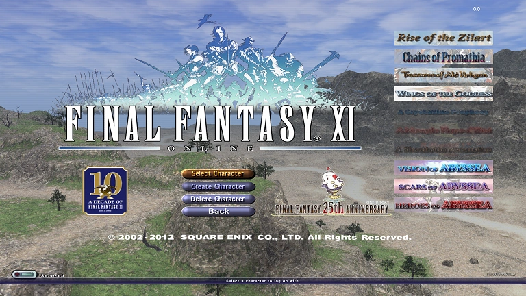
I remember when I started playing it was a nice and clean title screen. But it gradually got worse and worse as they added those mini expansions. I think you can even add seekers of adoulin to the bottom of that list now.
I remember when I started playing it was a nice and clean title screen. But it gradually got worse and worse as they added those mini expansions. I think you can even add seekers of adoulin to the bottom of that list now.
MW2 is my favorite CoD, but the title screen is as ugly and barebones as it gets.
I remember being taken aback, and even wondered if I bought a pirated copy or something.

Looking for a tag quote, I see.
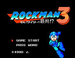
Mega Man 3. So plain.

Especially compared to the Japanese version:
As for Secret of Mana, the title screen is so blurred and pixellated that it ruins the original art.
Gaf said:Batman: Arkham Asylum
Hotline Miami
Secret of Mana

These guys look like they belong on the cover of an action movie VHS being sold for $4.99 at 7/11.
Haha damn I mean I love Hotline Miami as much as the next dude but when I thought of the ugliest title screen that was the first game that came to mind. Didn't realize it was so beloved on gaf but that shit makes my eyes bleed.
He's right, Secret of Mana title screen is one of the worst ever. EXTREMELY compressed, tons of artifacts visible even on the shittiest old TV of that era. I literally thought the title screen must hold some incredible secret since it looked so terrible. Then you have the 15 frames per second pink birds that fly by awkwardly overlaid...
The music is good, that's it.

_01.png)


