• Hey Guest. Check out your NeoGAF Wrapped 2025 results here!

Video game art/designs that just upset you.

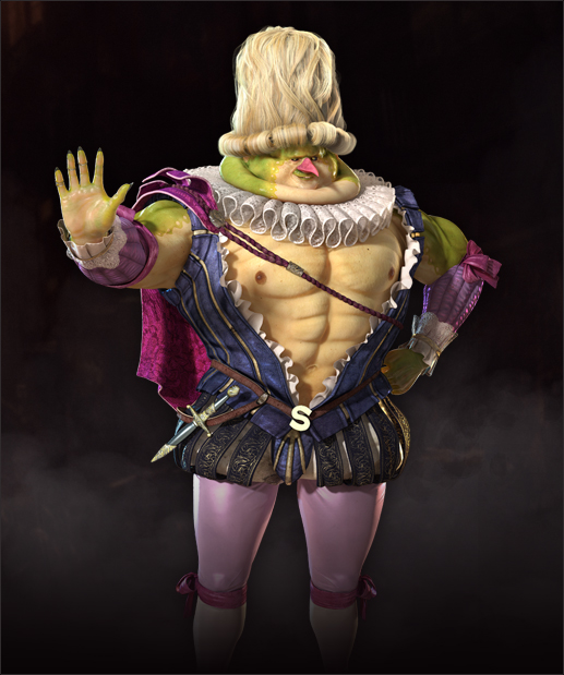
Okay! This is bothering me actually. It's not so much an art style as it is an "art tone." The style of the game I'm talking about is generic and kind of bad. However, the "tone" of the game is what bothers me a lot. I've played through games like this before, but the way that this one is worded is bothering me currently.

I just finished reading that 141 page "My Twisted World" live journal entry from that kid who stabbed three people, shot three more people, and then killed himself. Well, I read it on Monday and then I was browsing through the PSN store on the PS Vita on Tuesday. Usually, there is some "free" stuff on the PS Mobile side of it. So, I was scrolling through that and ran into this gem.

PrbBhWP.jpg


So, I downloaded it. Apparently it's a port of an XBOX Live game? Anyhow, here are the people behind the game.

361ICOp.jpg


But honestly, the thing that really bugged me is that the text in the game was pretty much the same stuff I had just read. Here are some examples of the text.

IzDeuH1.jpg

8cuoBHC.jpg

JvLCqI9.jpg

RkkAPnv.jpg

wZ3ub2Z.jpg

49Qjy9a.jpg

Um. The kid in the "manifesto" has an obsession with the movie "Alpha Dog," as well as spending a lot of paragraphs talking about World of Warcraft. There are also a ton of paragraphs about how much happier and easier it was when he was young and before puberty. So, this just came off as creepy after reading that ridiculous "manifesto."
psNNYtW.jpg

To make my point, of course I named the main character Elliot. It actually gets creepier if you do that, because he goes on for several paragraphs about his younger sister in his "manifesto" including
the time he overheard her and her boyfriend having sex.

So, this is what is bugging me currently. I'm not about to pay $2.99 to these people to see how far down the creepy Elliot Rodger hole this game goes.. so someone who made the mistake of buying it will have to fill me in on what I'm thankfully missing.

But yeah, the artstyle is "okay," but the tone of the game is actually awful. Especially after reading through material related to the recent shooting.
 
What the fuck at the game above me?

I honestly think that deserves its own thread. Seriously.

While the Naoto one is terrible theyre silly optional bonus costumes, its not supposed to matter if theyre "in character" or not, thats why theres super sentai costumes, etc. its a bonus for the player not something youre supposed to imagine the character wearing IC.

But they still drew the design up, modeled it, and included it in the game though...and the fact that it's considered a reward that the player will have to work for probably makes things worse.
 
The original design for her had a darker shade for her hair, a bigger nose that pointed down and wasn't perfect and more fierce eyes that were slightly too big for her face. She had a touch of wildness to her look that was better and had more character. Your average gamer seems to hate it when women in games don't look like dolls so they changed her look.

Look at these pics:
looks_faces.jpg


Edit: Just realized her arms got smaller and less muscular than the original. lol SE.

The first design is so much better. What the hell?
 
But they still drew the design up, modeled it, and included it in the game though...and the fact that it's considered a reward that the player will have to work for probably makes things worse.

Im not sure what your comment has to do with what I wrote. I'm not contesting that the design is crap, my point is that I dont think "that doesnt suit the character" is a particularly worthwhile metric for bonus costumes in any game because they are always a reward for the player so as long as they fit the players tastes it doesnt really matter if they suit the character or not e.g. the modern day costume DLC in recent Dynasty Warriors titles, "crossover" DLC in Soul Sacrifice, Toukiden, etc., any number of the costumes in Saints Row 3 & 4, etc.
 
I'd rather they do it to Rise or something. She's already set up as that sort of sexualised idol, and you don't end up seeing her much in battle scenes at all anyway since she's the overwatcher or whatever.

I don't know, I would have rather they didn't do it at all, and for them to specifically put Naoto in something like that seems completely out of character and wrong.

They've been using Naoto as a springboard for fanservice since the original game; she was exploited in that hospital examination scene or the first hotspring event.

It's ok though, Naoto is a goober.
 
Already mentioned but Dragons Crown:

2342142-sorcererandamazon.jpg


The game is a ton of fun but I hate the character design.
The fact that it's over sexualized isn't even my main problem... the design is just ugly.
The warrior looks like ever since she was born she was fed nothing but steroids, and the Witch looks like she has tumors growing out of her chest rather than having big greasts.
 
Well, the tone I got from your post, and an earlier post in the thread concering the same outfit, was the fact it was a "bonus outfit" made it somehow less problematic and bothersome.

I think there's a difference between a silly costume like a Sentai Suit and one that sexualizes a character whose whole thing is that she detests being looked down upon for being a girl (and furthermore, is also quite young iirc).
 
Quite frankly I blame Tetsuya Nomura for the lack of good character designs in recent ff titles compared to the classic one. Ever since he became the main character designer it's been
-belts
-zippers
-emo/very feminine males
I mean he's not even trying to hide the anime influences anymore.
sas_or_noct_by_blackcatlady01-d3kld2l.jpg

Looking at the dates, FFXV was announced before or nearly at the same time Sasuke appeared in part II.

We've been waiting for 8 fucking years
 
I don't like the giant boots either, but I don't mind the no-helmet as a stylistic choice that much. Characters, whether they're being played by live actors to show off the acting or being rendered artistically, are more distinctive and memorable by having their faces visible. Another example is that in the 9th episode of season 2 of Game of Thrones, during the Blackwater battle, King Stannis didn't have a helmet on despite joining the fray. It apparently annoyed the original author of the books, and I can understand why. But I also understand why the showrunners filmed him without a helmet as an artistic choice. Same thing in Lords of the Rings:
http://www.reddit.com/r/gameofthrones/comments/1v2anz/no_spoilers_why_cant_they_just_wear_helmets/

I hate when it's one-sided though, such as males having full helmets and women having none (or just a stupid hat, such as this example).

To be clear I understand that it's an artistic choice but the poster I was responding to was making the argument that GeoW-style meatheads are dressed sensibly, I was arguing against that by pointing out the lack of helmets (among other things).
 
Sure, that's fair. I certainly don't think they're dressed that sensibly myself. Unless their bulky-ass armour is made of incredibly lightweight futuristic alloy, I can't imagine how they'd even move. ;)
 
I played FFX, but haven't touched it since release and never really looked at the art for the game and oh christ did Lulu actually have a skirt of belts that's the worst thing in the history of things.

A quick google search reveals this actually happened. How did I never notice this? Was it just so god damned stupid that my brain didn't register it as happening, or is this an example why we all need to go back to SDTV immediately?
 
You sure that game isn't a parody?

I mean, it sounds like it's taking the piss out of people like Eliott.

I played FFX, but haven't touched it since release and never really looked at the art for the game and oh christ did Lulu actually have a skirt of belts that's the worst thing in the history of things.

A quick google search reveals this actually happened. How did I never notice this? Was it just so god damned stupid that my brain didn't register it as happening, or is this an example why we all need to go back to SDTV immediately?

If I remember correctly, most of the CG cutscenes didn't show her bottom half because it was too hard to render all the belts.
 
Halo (all of them) /Advent Rising/KOTOR (and other Bioware rpg)

Halo-2.jpg

halo_4_majestic_map_pack_monolith_06.jpg

advent-rising-lift.jpg

star-wars-knights-of-the-old-republic-ii-the-sith-lords-20050204045259866-000.jpg


It's all so BLAND!


And Torchlight 2/ (and to a lesser extent )DOTA 2/other games with the same style
torchlight_2_lamp.jpg

dota2-2.jpg


It's hard to describe what's wrong with it. It reminds me of those weird filters that you get with SNES emulators and such.

hq3x.png
 
You sure that game isn't a parody?

I mean, it sounds like it's taking the piss out of people like Eliott.

It's from 2012, so it predates the whole thing. However, if it's trying to be parody.. it's doing so incredibly badly. We're talking almost
Eiken
levels of bad, but through the dialogue, not the visuals. The game extends an "off" world view throughout the dialogue and the endings.

This is about video game art/designs that upset me and, currently, this game showed up on PS Mobile for "free" and honestly, it bothered me from the short amount of it I played. Just the tone of it, really.
 
You sure that game isn't a parody?

I mean, it sounds like it's taking the piss out of people like Eliott.


If I remember correctly, most of the CG cutscenes didn't show her bottom half because it was too hard to render all the belts.


Too hard to render, or too hard to find somebody to model that many belts without his or her brain quitting and causing an aneurysm to get out of the responsibility of completing the task?

It really looks like the kind of thing you'd see as a "LOL BELTS" parody of Final Fantasy characters. Somewhere Rob Liefeld just said "That's too god damned many belts" and you know you've made some seriously misguided choices when you can make Rob Liefeld step back from a design and wonder if it's gone too far.
 
Danganronpa's art style and designs are the reason why I'm not playing it. It already had the school setting working against it, but the way how the characters look is just too off-putting. It's a shame, because people tell me it's a game I could enjoy.

670px-0,1920,0,1198-TZ7EgWK.jpg

No thank you.

this for me...

I usually can't play anything that the art style seems off or inconsistent.
 
I agree completely, the guy definitely looks much better than Tidus but there's no rhyme or reason to those straps at all.
7QtQNV8.jpg

Tidus didn't even look that bad during the concept phase so I wonder who went up to Tetsuya and told him that a design with no logic or rhythm whatsoever looks better than the above.

Because Tetsuya Nomura didn't do that concept art and that design is loosely connected to FFX. :p

The above was designed by the great Yusuke Naora back when Kitase/Nojima had a concept design for an original JRPG IP.
Some of the base plot ideas (and character ideas) were taken and moved into a Final Fantasy production. Naora was moved to general art direction, as he had done with FFVII and VIII prior, and Nomura, coming off his success with FFVII & VIII, was given character design duties.

The image you posted is an example of why I'd love to see Naora get the opportunity to do character designs for a main-line FF.
 
I absolutely love 999 + VLR... but some of the character design kinda bugged me of...

and yes, I'm talking about Lotus on 999 and Alice/Clover on VLR. And don't get me wrong, I'm not being a social justice warrior and going all "OMG! BOOBS!!!", I mean, I love boobs, but they could be a little more "coherent" about the character designs and still show boobs.

exhibit A: Lotus on the far left.
999cast1b.jpg


I mean, all of the character designs are kinda "over the top", and I get that... but Lotus is way obvious that they were just going for the cleavage audience... why not give her a "V neck" blouse with nice cleavage... what's with the arabic dancer attire?. She looks WAY off place. (and that is hard to manage with a guy with a matador jacket, a fisherman and a guy who looks like an anime version of Marty McFly)

and of course, exhibit B: Alice and Clover in the center-right
VLR1.png


Alice literally has ONLY a necklace covering her boobs... she obviously don't care. why bother with the jacket?, and I get they were going for the "egyptian look", but it's VERY badly done

and Clover looks basically like a cheap hooker. animal print, high hair, kneehigh stocking, hot pants...

VLR SPOILERS:
basically, when both of them says that they are secret agents or some crap like that... I just couldn't take them seriously...

I get they were aiming for "sexy", but I'm pretty sure that they could manage that and keep the designs on par with the rest of the characters if they tried a little harder.

Again, I don't have anything about "sexy" character desings, but I find that the devs are not taking me (player) very seriously being SO obvious about it.
 
Nobody has really said it yet. I really hate this art style in games.

Dishonored


Brink


Sunset Overdrive


Too realistic to be stylish, too cartoony to take seriously. I don't really know, just looks like shit.


a huge reason why I think Sunset Overdrive is something I never want to play. It's a design that shows off that it dosnt know what it wants to do.

Team Fortress 2 in a way did this, but solved it by playing with more solidified coloring. That's it done right.
 
ITT: I learned everyone hates everything and no matter how much you like a thing, someone hates it so much it makes them physically ill.
 
Do people seriously find this kind of boob physics sexy? It's gross. Looks like they're gonna fall off any minute.
I'd really dig the designs themselves if they were not sexualized this much.

It's crazy, but you hit the nail on the head. That';s a stylistic issue not a design one, the Sorceress' dress is well designed, just stylistically over the top. Kamitani is a great artist with a very particular style (read: breasts, breasts everywhere!).

Y'all have hit on the majors; Pizza Cutter, Nooj, New Spyro, Putty Squad. I've gotta go with PayDay 2. The mask designs get me irrationally irritated.


Something about them, just infuriating to look at.
 
Already mentioned but Dragons Crown:

2342142-sorcererandamazon.jpg


The game is a ton of fun but I hate the character design.
The fact that it's over sexualized isn't even my main problem... the design is just ugly.
The warrior looks like ever since she was born she was fed nothing but steroids, and the Witch looks like she has tumors growing out of her chest rather than having big greasts.

bwahahah the one on the right made me lol
 
I had never seen the Diablo 2 to 3 comparison so starkly presented. I didn't have much concern for the visual style of Diablo 3 until now, and just kinda accepted that it was just more WoW looking but man, that juxtaposition of D3 with the incredibly dark and gothic looking D2 hurts me.

That's the original Diablo, not D2.
 
Holy hell, some of these JRPG's are on some next level shit. Just when I thought they couldn't get any worse, the next post proves me wrong, and Quantum Theory is awful as well, it has a truly disgusting art style.
 
Because Tetsuya Nomura didn't do that concept art and that design is loosely connected to FFX. :p

The above was designed by the great Yusuke Naora back when Kitase/Nojima had a concept design for an original JRPG IP.
Some of the base plot ideas (and character ideas) were taken and moved into a Final Fantasy production. Naora was moved to general art direction, as he had done with FFVII and VIII prior, and Nomura, coming off his success with FFVII & VIII, was given character design duties.

The image you posted is an example of why I'd love to see Naora get the opportunity to do character designs for a main-line FF.

Ever since watching a video of Yusuke Naora doing a Tidus/Yuna painting for the Final Fantasy X HD remaster charity event, I felt he would fit in as a character designer for a main-line FF. So yeah, I agree with you on that, =)
 
Damn you, I was just about to try and sleep hahaha. Seriously, such bad design on so many levels.
Some designs are meant to look creepy or unsettling. Not every Pokemon has to be an awesome steel dragon with sword wings and missile launcher arms.
 
Surprised this hasn't been posted yet
DestinyBoxArt640.jpg


The poses don't offer much in originality and I find the composition really weak. Aside from showing that it is a shooter, It doesn't really offer much insight into the kind of game it really is. And the back of his helmet looks like a visor.

It's almost like they panned the camera behind the Spartans in the Reach cover (which I didn't really like either)
1283378959halo%20reach.jpg


This image does a better job of illustrating the scope of the game IMO. A cover in this vein would have been wiser.

destiny-600x300.jpg
 
My other half is an avid fan of Zelda its her life so when she told me she hated the art style of wind waker I couldn't fathom it because I thought everyone thought it looked pretty amazing. After a while though I can see what she means she really dislikes the atmosphere it gives off and to her just doesn't feel like a Zelda game.
 
Probably not a popular position to take, but the Super Mario All Stars version of Mario 3 looked very bland and generic compared to the original game.
 
It's crazy, but you hit the nail on the head. That';s a stylistic issue not a design one, the Sorceress' dress is well designed, just stylistically over the top. Kamitani is a great artist with a very particular style (read: breasts, breasts everywhere!).

Y'all have hit on the majors; Pizza Cutter, Nooj, New Spyro, Putty Squad. I've gotta go with PayDay 2. The mask designs get me irrationally irritated.


Something about them, just infuriating to look at.

I thought I was the only one. There's a guy on here with a Payday mask avatar. He's the only guy on the site I have on ignore because I just can't stand to look at the fucking thing. It just makes me angry to see it.

Would never have believed others felt the same!
 
What do people really expect from the designs of characters in these games though? I understand why people might dislike them looking pretty samey and generic perhaps but they fit the game.

Yeah, I agree. Dudebro soldiers and scruffy 30-somethings are generic, sure, but that's kinda like complaining that Hollywood is using humans as actors, lol.
 
Yeah, I agree. Dudebro soldiers and scruffy 30-somethings are generic, sure, but that's kinda like complaining that Hollywood is using humans as actors, lol.

Nnnnot really no. It'd be like complaining that Hollywood is using nothing but generic scruffy 30-something year old dudebros. :P There is a lot more human variety in the world than what we get to control in video games.
 
Nnnnot really no. It'd be like complaining that Hollywood is using nothing but generic scruffy 30-something year old dudebros. :P There is a lot more human variety in the world than what we get to control in video games.

Sure, but you just can't use everybody for certain roles. If I'm playing a game about futuristic marines, then I kinda expect to play a muscular dude in his late 20s/early 30s, wearing some type of armor.
 
How can you hate these great mobile game icons?

itCMARclu1Eak.jpg


Sure, but you just can't use everybody for certain roles. If I'm playing a game about futuristic marines, then I kinda expect to play a muscular dude in his late 20s/early 30s, wearing some type of armor.
Why does a futuremarine gotta be a dude
 
Top Bottom