• Hey Guest. Check out your NeoGAF Wrapped 2025 results here!

Video game series with the most disappointing graphical evolution?

Thread is self explanatory.

Pokemon is my submission.

1xsnEZs.jpg
Pokemon Red/Blue
zpB6XZU.jpg
Pokemon Gold/Silver
UA8s5jR.jpg
Pokemon Ruby/Sapphire
0JEJGAh.jpg
Pokemon Diamond/Pearl
uSqROpb.jpg
Pokemon Black/White
cC35nAY.jpg
Pokemon X/Y

I stopped caring about this series after Gold and Silver. I have to admit a large contributing factor was my disappointment in the evolution of the series graphics. Maybe that makes me a shallow graphics whore but meh. Being a handheld series I can somewhat understand how stifling that can be in terms of ability to produce good visuals. Still, the Pokemon series has been around for 20 years and still looks sub PS1 visually.
 
It's especially bad since Pokemon X/Y are a technical mess. Really hope Nintendo finds someone else to make those games or that they at least get some console experience. Might help them make better portable games
 
It's especially bad since Pokemon X/Y are a technical mess. Really hope Nintendo finds someone else to make those games or that they at least get some console experience. Might help them make better portable games

considering how well ALBW runs it's shocking Nintendo didn't just hand them the engine for X/Y/AS/OR
 
I came her for Pokemon, and I'm glad to see justice was done. I'd also nominate SMT mainline, if only because I was disappointed in the route taken from Nocturne -> 4.
 
After Ruby Sapphire each game just started looking so much uglier. It is so crazy how that happened.

I would also mention the mass effect games. Sure they upressed some textures and changed some stuff. But the games all look remarkably similar.
 
I feel that the latest Advance Wars loses all of the charm found in the original games artwork, though I suppose that doesn't count as graphics.
 
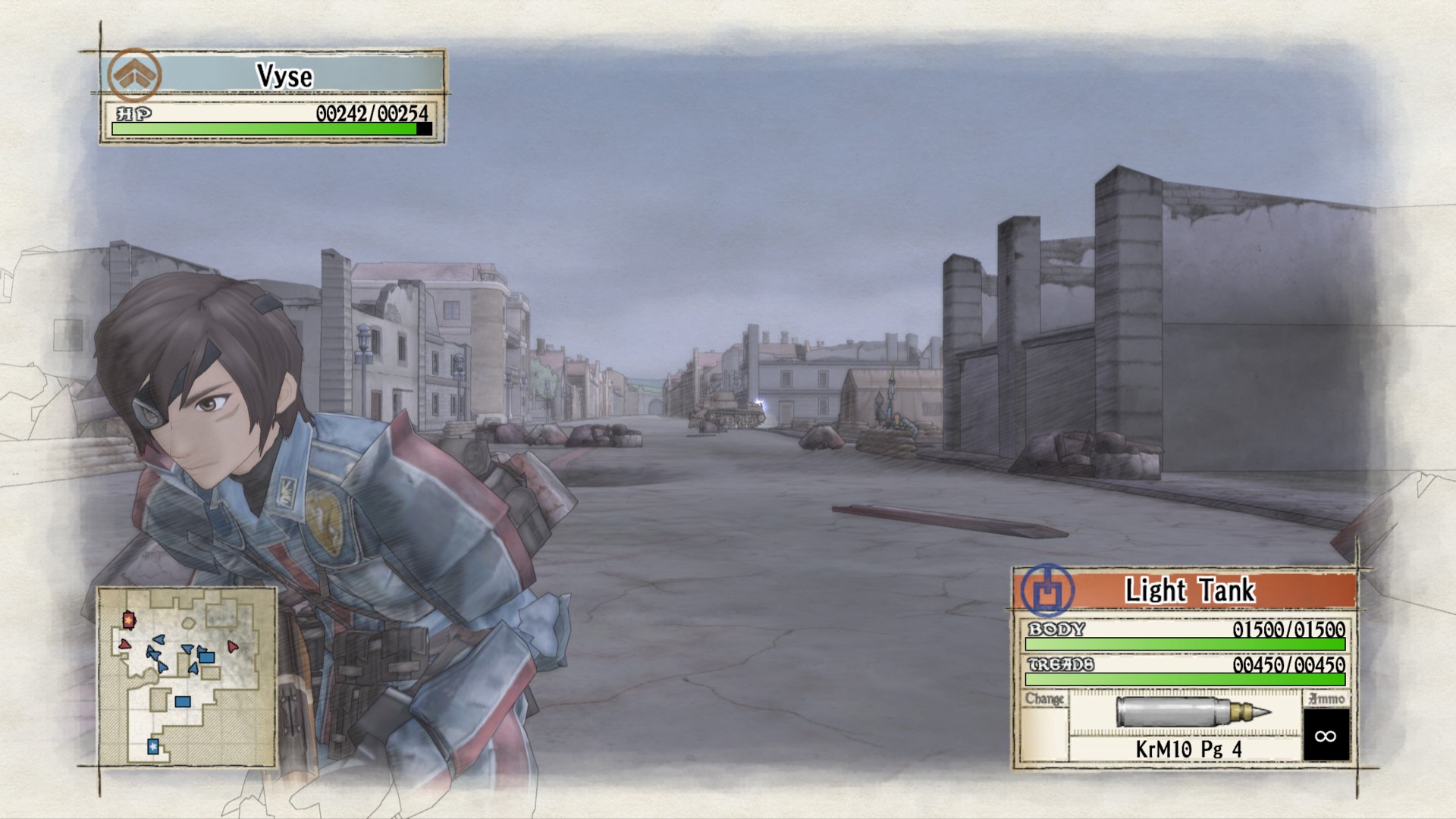
Valkyria Chronicles:

From this:


To this...

Valkyria-Chronicles-II-Screen-shot-2.jpg


Maybe we'll be able to fix it up if a PC port happens, but ugh, going from something that at worst looked like a higher-end OG Xbox game (It originally was IIRC) with VC1 to VC2 being a good looking Saturn game at best with character models that make Xenoblade's look cutting edge.

EDIT: GAF, I didn't get ninja'd by 20 people when posting this. I am disappointed.
 
Megaman Battle Network series recieved a nasty change from 3 to 4, 4 being the worst in the series.

Prince of Persia series changes a lot, sometimes looking better, others much worse.


Mario 2D series.
 
Pokemon games became ugly the moment they started to blend 3D/2D together. Gen3's spritework has aged really well (FR/LG being my favorite "look" in the series by far), but Diamond/Pearl and onward already look ugly.
 
Pokémon had some ups and downs. I would rank it like this:

Gen 1 > Gen 2 > Gen 5 > Gen 4 > Gen 3 > Gen 6.

Obviously, that takes each era's limitations into account.

I found BW/B2W2 to be a big improvement from DPPt/HGSS graphically due to the vivid colours and the more varied graphical details and was looking forward to what was coming next. Sadly, XY was a train wreck visually in the overworld -- a stark contrast from their incredibly battle graphics. ORAS weren't a big improvement either.

Regarding Gen 3's look, it's okay, but when you put it next to a game like Mother 3, you can tell that it's the bare minimum.
iWSz6pq.jpg
GcVS8gI.jpg
 
Zelda.

From Twilighat Princess to Skyward Sword to the beautiful Tech Demo to the okay Zelda U.

Mario actually improves over time while Zelda can't figure out what their doing for a whole year a new game is being thought out.
 
Looking at Pokemon makes me wonder how much thought is put in when people ask for a full fledged Pokemon game on a console. Game Freak is the opposite of technical wizards
 
Zelda.

From Twilighat Princess to Skyward Sword to the beautiful Tech Demo to the okay Zelda U.

Mario actually improves over time while Zelda can't figure out what their doing for a whole year a new game is being thought out.

SS looks better than TP, Zelda U looks better than tech demo imo (maybe not technically, as one is rendering a room)

Crysis raised the bar in graphics progressively through the series. In fact 2 was one of the best looking games of its time as was 3.
ok i never played but read a lot of complaints about Crysis 1 being superior tech wise back in the day.
 
Zelda.

From Twilighat Princess to Skyward Sword to the beautiful Tech Demo to the okay Zelda U.

Mario actually improves over time while Zelda can't figure out what their doing for a whole year a new game is being thought out.
I disagree. Zelda U looks super nice. I like that each installment is very different looking.
 
I'm not really a fan of how Dragon Age has progressed.

DA2 is pretty ugly and stale compared to DAO and while DAI has really pretty environments, there's still something weird about the way the characters look.
 
Guess I'll go with Halo. 1 to 2 was a step down IMO. Color palette was drab and boring, and textures looked worse in most cases. I can't stand playing Halo 2 in original graphics mode in the MCC.

3 was nice looking enough, but couldn't compete on raw 'wow' factor when it released. HDR was welcome, but sub 720p wasn't. Reach upped environmental and character detail, but had that awful ghosting going on. It really hampered my ability to enjoy the game.

4 looked good, but sacrificed a lot of the lighting present in 3 and Reach. Textures were at their all time worst as well.
 
Megaman Battle Network series recieved a nasty change from 3 to 4, 4 being the worst in the series.

Prince of Persia series changes a lot, sometimes looking better, others much worse.


Mario 2D series.

I agree. I remember when I first popped in MMBN 4 and everyone looked all shrunk down. It did not exceed my expectation after 3 at all.
 
I knew this would be about Pokémon. Yeah, the overworld graphics progression is glacially slow.

The battle graphics, on the other hand, have improved tremendously. I really like how X/Y made the battle models look faithful to the original art - the cel shading is spot-on.

jV1P81M.jpg
UvPXfwy.jpg


Original art for comparison:

qHztxfk.jpg
 
Huh, I actually like the 2D/3D hybrid look from Gen4/5 of Pokémon. I like how colorful the worlds are. Gen 6 overworld could look (and run) better though, given the system it's on. At least the battles look nice (but run terribly).

My nomination for this thread is Animal Crossing. Disappointing in that there is not much visual evolution at all.
 
3D Castlevania has had it pretty rough. For every time they manage to nail the art direction and the production values are there, there's another entry where things go slightly awry or they just don't have the budget.

The 2D entries recycled a lot, too, but that never seemed so bad by comparison.
 
My thought was Pokémon as well. It's a certain visual style, but it's just that.
But I agree the battle sequences and the way they're handling 3D models for the Pokémon in recent games is really nice.
 
Saints Row was never a good looking game, but I can't stand the 'every character looks like a GI Joe' build they went with in Saints Row 3 and 4.
 
considering how well ALBW runs it's shocking Nintendo didn't just hand them the engine for X/Y/AS/OR

A Link Between world is a Top down 3D Zelda game, Pokémon gen 6 is a full blown 3D game.

Definitely Pokemon, very slow progress.

It gets worse because Game Freak keep adding new feature and then stripping them away in the next game.

Looking at Pokemon makes me wonder how much thought is put in when people ask for a full fledged Pokemon game on a console. Game Freak is the opposite of technical wizards

Agreed, Game Freak had always had trouble developing the Pokémon games since gen 1.

I knew this would be about Pokémon. Yeah, the overworld graphics progression is glacially slow.

The battle graphics, on the other hand, have improved tremendously. I really like how X/Y made the battle models look faithful to the original art - the cel shading is spot-on.

jV1P81M.jpg
UvPXfwy.jpg


Original art for comparison:

qHztxfk.jpg

Yeah agreed, Game Freak effort in the 3D battle really paid off.
 
My favorite Pokémon graphics are Platinum/Heart Gold/Soul Silver. They are also my favorite games in the series, but HG/SS is the peak of the series for me.

I remember first seeing the wind lines and color palette of New Bark Town (the starting town) and being amazed. For me, that is what Pokémon should always look like. That will always be Pokémon to me. The way Gen IV handled 2.5D is something I wish more games would do, not just Pokémon.
 
Castlevania games with their sprite recycling fall into this category, kind of. The series looked pretty similar all the way from Rondo of Blood to Order of Ecclesia. Not that I really expected the series to look that much better in going from Saturn -> PSX -> GBA -> DS though.
 
Pokemon was my first thought too, then immediately replaced by Diablo. Diablo 3 was a huge let down for me graphically, the cartoon style removed almost all of the horror atmosphere of the first two games.
 
Guess I'll go with Halo. 1 to 2 was a step down IMO. Color palette was drab and boring, and textures looked worse in most cases.
Halo has always had an extremely serious case of compromization over the generation.

Halo 1 was an absolute beast in terms of dynamic lighting and effects; huge lights with specularity and normal-mapped everything, particle system that looks impressive to this day, lots of alpha and decals...
Halo 2 had a more refined authoring pipeline and a greatly expanded graphical toolset, but it lost so much of what made Halo 1's visuals special. Alpha was drastically reduced, decals are smaller and vanish faster and have fewer generators, particle counts are drastically reduced, very few lights use specularity, the game aggressively limits simultaneous light sources, and there's loads of pop-in.

Similar stuff happened on the 360, really. Halo 3 was similar to Halo 1 with regards to the extreme focus on expressive shading, and its successors compromised there (and with a few other things) as the generation progressed.
 
Would 2D Mario count as its own series?

Because if so, then that. The whole "New Super Mario Bros" line look awful. Like the 3D equivalent of a flash game.
 
edit: wait this is about disapointing transitions lol, I love SF5's art

err...I got nothing
 
MDK to MDK2 was a pretty jarring transition in my opinion. The original game had a wonderfully designed dark sci-fi feel that was beautiful and felt original, MDK2 just felt like generic fanservicing sci-fi, I just detested it.
 
It's especially bad since Pokemon X/Y are a technical mess. Really hope Nintendo finds someone else to make those games or that they at least get some console experience. Might help them make better portable games

What the fuck? GameFreak made the series and they have joint ownership of it. Nintendo wouldn't, and can't toss them out because XY aren't great on the technical side.
 
Vandal Hearts. Went from really cool anime-styled sprites, to drab realistic sprites, to hideously ugly 3D super deformed characters. (Sorry I'm on mobile so no pics)
 
Top Bottom