Gentleman Jack
Member
Provo, Utah

Actually, they're changing it this year. I'm assuming because it looks like 90's MS Office shit.
Haha looks like a box of detergent
Provo, Utah
Actually, they're changing it this year. I'm assuming because it looks like 90's MS Office shit.

OMG BROWN COUNTY, NEBRASKA HAHAHAHA. Looks like it was made in microsoft paint hahahahahah
Why would complimentary colors hurt eyes? Green and red compliment each other, that's what complementary means.
Wikipedia said:Complementary colors are pairs of colors which, when combined, cancel each other out. This means that when combined, they produce a grey-scale color like white or black. When placed next to each other, they create the strongest contrast for those particular two colors. Due to this striking color clash, the term opposite colors is often considered more appropriate than "complementary colors".
Worst Flag:
Northern Mariana Islands


Why couldn't we have a cool flag like Chatanooga?
Maryland, USA
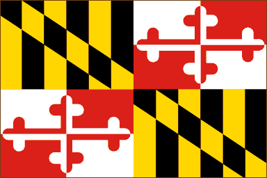
Yep. They went from worst flag to best flag.


Provo, Utah
Actually, they're changing it this year. I'm assuming because it looks like 90's MS Office shit.
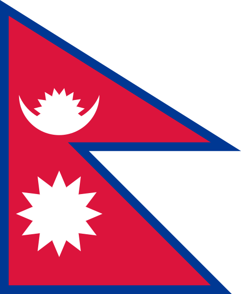
the nepal flag
It's not even a f***ing rectangle.
Flag layout
There is a precise description of the Nepalese national flag in the Constitution of the Kingdom of Nepal, Article 5, Schedule 1, adopted 9 November 1990.
National Flag
(A) Method of Making the Shape inside the Border
(1) On the lower portion of a crimson cloth draw a line AB of the required length from left to right.
(2) From A draw a line AC perpendicular to AB making AC equal to AB plus one third AB. From AC mark off D making line AD equal to line AB. Join BD.
(3) From BD mark off E making BE equal to AB.
(4) Touching E draw a line FG, starting from the point F on line AC, parallel to AB to the right hand-side. Mark off FG equal to AB.
(5) Join CG.
(B) Method of Making the Moon
(6) From AB mark off AH making AH equal to one-fourth of line AB and starting from H draw a line HI parallel to line AC touching line CG at point I.
(7) Bisect CF at J and draw a line JK parallel to AB touching CG at point K.
(8) Let L be the point where lines JK and HI cut one another.
(9) Join JG.
(10) Let M be the point where line JG and HI cut one another.
(11) With centre M and with a distance shortest from M to BD mark off N on the lower portion of line HI.
(12) Touching M and starting from O, a point on AC, draw a line from left to right parallel to AB.
(13) With centre L and radius LN draw a semi-circle on the lower portion and let P and Q be the points where it touches the line OM respectively.
(14) With centre M and radius MQ draw a semi-circle on the lower portion touching P and Q.
(15) With centre N and radius NM draw an arc touching PNQ [sic] at R and S. Join RS. Let T be the point where RS and HI cut one another.
(16) With Centre T and radius TS draw a semi-circle on the upper portion of PNQ touching it at two points.
(17) With centre T and radius TM draw an arc on the upper portion of PNQ touching at two points.
(18) Eight equal and similar triangles of the moon are to be made in the space lying inside the semi-circle of No. (16) and outside the arc of No. (17) of this Schedule.
(C) Method of making the Sun
(19) Bisect line AF at U and draw a line UV parallel to line AB touching line BE at V.
(20) With centre W, the point where HI and UV cut one another and radius MN draw a circle.
(21) With centre W and radius LN draw a circle
(22) Twelve equal and similar triangles of the sun are to be made in the space enclosed by the circles of No. (20) and of No. (21) with the two apexes of two triangles touching line HI.
(D) Method of Making the Border
(23) The width of the border will be equal to the width TN. This will be of deep blue colour and will be provided on all the sides of the flag. However, on the five angles of the flag the external angles will be equal to the internal angles.
(24) The above mentioned border will be provided if the flag is to be used with a rope. On the other hand, if it is to be hoisted on a pole, the hole on the border on the side AC can be extended according to requirements.
Explanation: The lines HI, RS, FE, ED, JG, OQ, JK and UV are imaginary. Similarly, the external and internal circles of the sun and the other arcs except the crescent moon are also imaginary. These are not shown on the flag.
Aspect ratio
According to the stated geometric construction law, the circumscribing rectangle has an irrational ratio of 1:1.21901033 (OEIS A230582).

Virginia's state flag is definitely something out of Game of Thrones. A woman with her breast exposed killing a man with her spear. "The speared man" maybe?
That one isn't bad at all? Or is this some sort of sportball rivalry thing against The Ducks?
Virginia's state flag is definitely something out of Game of Thrones. A woman with her breast exposed killing a man with her spear. "The speared man" maybe?
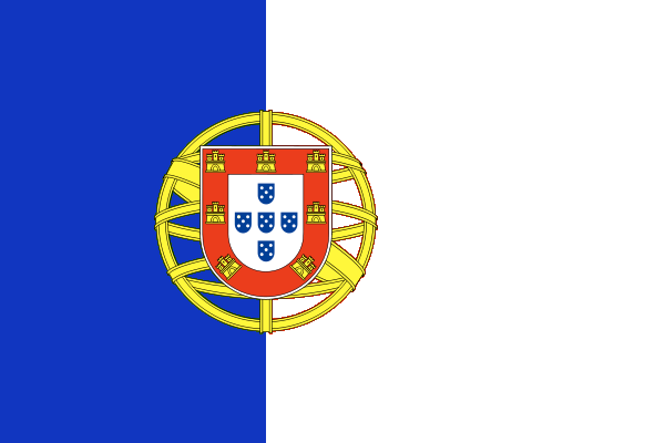
Portugal flag was so beautiful.it saddens me that Portugal ditched their historic White+Blue colors for the ugly Republican Red+Green

Blue on White has been Portugal's colors since its foundation.
The Red and Green is borrowing from the late 19th and early 20th Century Republican Party (Portugal's) colors
IMO, Portugal should revert back to White n Blue (without the crown)
I want this:
Maryland, USA
Also, Nepal's flag is rather unique in that it's neither square, nor rectangular.
Oh boy, Vexillology!

Pocatello, Idaho
Anyway, here's Sicily's flag. Never liked it lol


Stands for everything wrong with America (steroids, corporate greed and herpes)
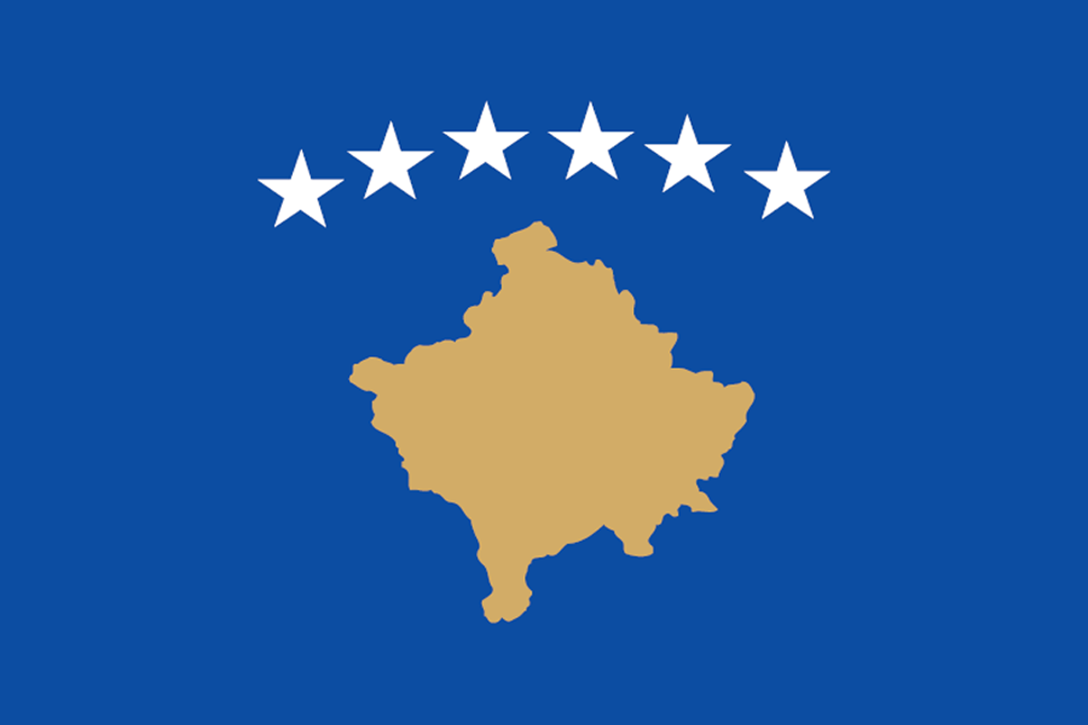
The flag of Kosovo looks like it was made with google maps.
It also looks like you are wanted in GTA.
There are too many state flags that are just the state seal on a blue background: https://en.wikipedia.org/wiki/Flags_of_the_U.S._states
We need an amendment banning this boring ass bullshit.
Flag of Manitoba
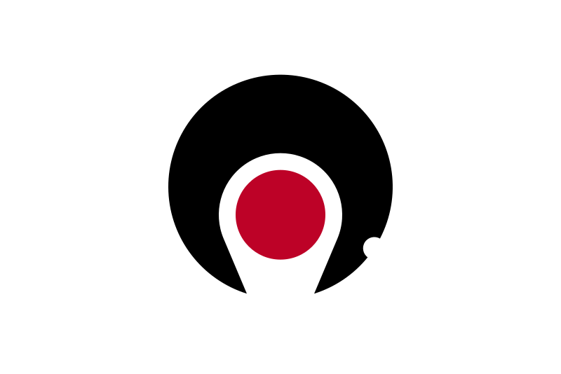
Unless they are Japanese municipal flags, in which case they are awesome and remind me of Wipeout.
https://en.wikipedia.org/wiki/List_of_Japanese_municipal_flags
their prefecture flags are great as well
https://en.wikipedia.org/wiki/List_of_Japanese_flags#Prefectural_flags

Complete garbage.
Flag of the Libyan Arab Jamahiriya


Complete garbage.
Ah I was wondering how long it would take for someone to try to be controversial and edgy. Only 7 posts.
Brown County, Nebraska

All I can see is Pac-Man, but that just makes it even better. Cool Flag.Kagoshima is beautiful.
Provo, Utah
Actually, they're changing it this year. I'm assuming because it looks like 90's MS Office shit.