• Hey, guest user. Hope you're enjoying NeoGAF! Have you considered registering for an account? Come join us and add your take to the daily discourse.

Worst gaming interfaces ever

rdytoroll

Member
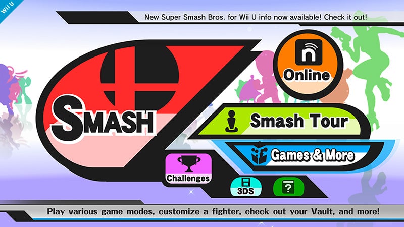
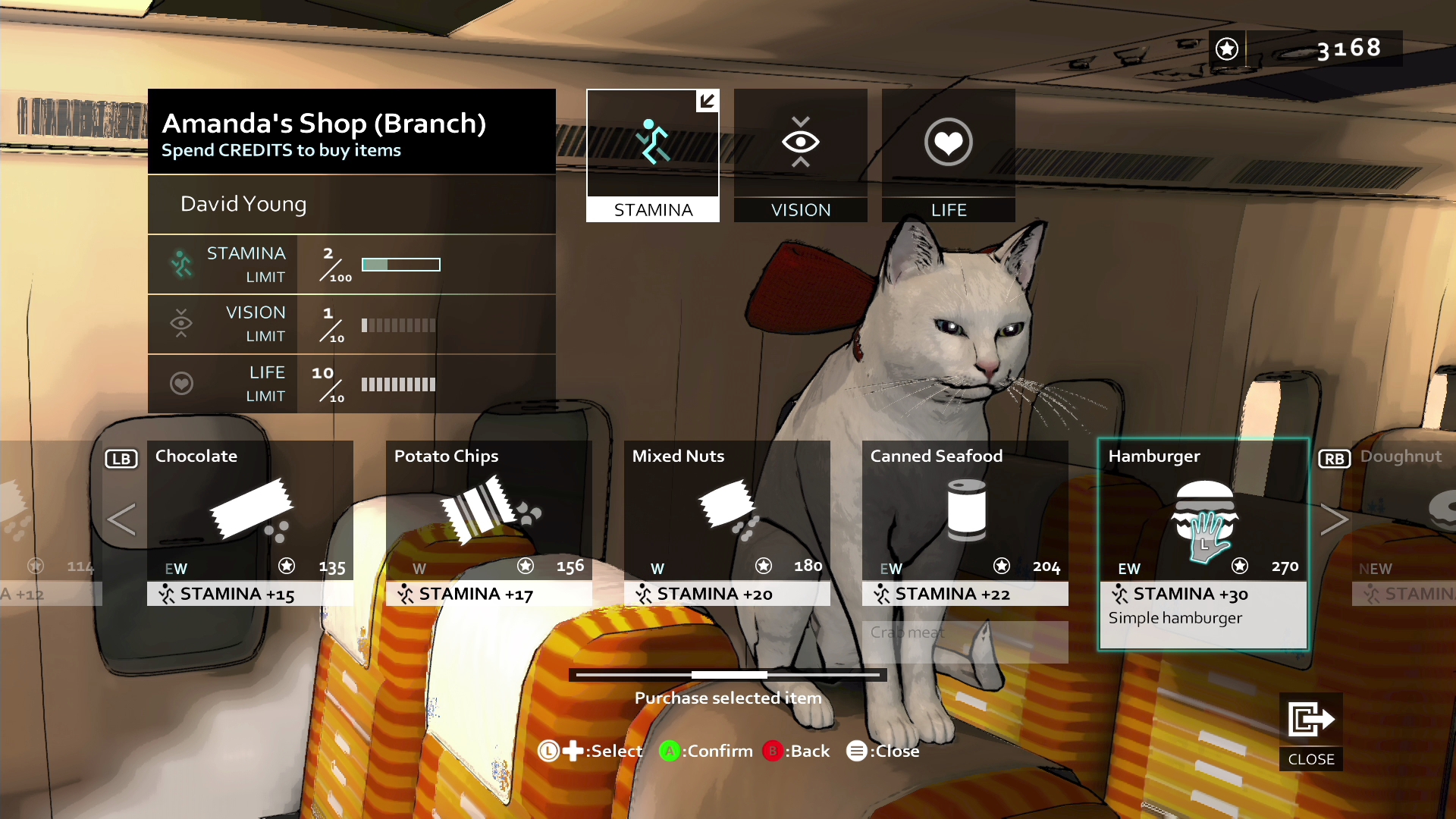
We've all seen them. They're either horribly confusing, ugly, non responsive or all of those things. They can turn the most beautiful games into a disaster.

Two examples come to mind instantly: Fallout 4 and Ark: Survival Evolved. I know, I know, one of those is in Early Access, but still look at that abomination of an UI.

9745cd_6df7fca57e3e46c5a6cfc7f5eabf7fab.jpg


It clashes so much with the overall aesthetic of the game, it's kinda hilarious.

Then there's the mentioned Fallout 4. Yes, there are worse as seen above. But it's just so outdated in every possible way.


Hit me with the worst UIs of all time, I'm interested to know if there are even worse ones out there. Please post pictures where possible
 

Glowsquid

Member
There's probably a lot worse, but Darkstar One on PC is honestly the one time I felt confused and annoyed by the UI in a game.
 

B3N1

Member
Recently, Witcher 3 Inventory on Xbox One.

Don't know about other platforms, but going into the menu mid-fight to apply potions/switch bombs would be cumbersome on its own, but the slow ass UI just tops it.

With B&W patch they organized a bit, so you don't have to page that much, but it's still far from effortless, as it takes 3-4 seconds to load each page. Cursor might lag too when scrolling down, it's just an absolute pain in the ass.

Crafting is similar, you can't scroll in an efficient way. It's better now that you can close categories, but I wouldn't mind some quick jump to crafting ingredients instead of going back up and finding the stuff you need.
 
I have to say I absolutely love pip boys, and personally it's probably my favorite interface of any rpg just because of how it mixes mechanical and narrative needs.
 

Sanctuary

Member
Obligatory

Gotta love how even in 2008 someone didn't know how to spell "you're".

I don't know if this counts, but as mentioned above, TW3 had a pretty crummy inventory and Divinity Original Sin has one of the worst inventories I've seen in decades.
 

TDonk

Member
Ark's menus are a complete mess. And the game itself is terrible to boot.

Witcher 2 had menus I found to be quite a ball ache.
 
While not the worst, The Witcher games all have pretty terrible menus in different ways.


W1 is just a mess of overly designed stat screens. Loads of options + ugly as sin art.
W2 couldn't decide if it wanted to be a controller UI or a KB+M UI so it decided to not be very good on both.
W3 is just a slog. So slow. Everything is about 2 menus deeper then it should be.
 

antitrop

Member
This is the new Attack on Titan game that just came out. The game is as good as the UI is horrible, though. It's a ton of fun, when you can actually make out what's happening.

zODBt7N.jpg
 

wheapon

Member
This. When it's easier to find a specific file on my trash heap of a hard drive than the option I want on your UI, you've fucked up.

I feel like the biggest mistake was squirreling away all of the single player content behind the ambiguous Games & More. That and giving Smash Tour top billing.
 

Corpekata

Banned
The Helmet / Eye Piece huds/ UI of the late 6th gen / early 7th in FPS games. A lot of PC developers ruining things like Deus Ex Invisible War and FEAR 2 chasing after consoles and insuring things would look stupid only a year or two later when widescreen became so widespread. Looked stupid and was often less functional than counterparts or previous games.
 

lazygecko

Member
Bethesda deserves the crown for ineptitude in UI design. We've had almost 15 years of the same complaints about their problems with little to no improvements, and in several occasions just making them worse (mainly by making the presentation increasingly form over function with stuff like the Skyrim UI and Fallout 4 Pipboy). The way they seem completely insulated from widespread criticism for such a long time is completely absurd.
 

Spukc

always chasing the next thrill
Witcher 3 day 1.
Still clueless how they let that shit fly day 1 .

60 inch tv here.
Needed to get closer.
What the f
 

Spukc

always chasing the next thrill
Surprised by the lack of Playstation All-Stars Battle Royale.

Definitely the worst piece of shit to ever be considered a UI.


Absolutely disgusting.
Omf that stuff needs a NSWF tag yuck
 

AAK

Member
Surprised by the lack of Playstation All-Stars Battle Royale.

Definitely the worst piece of shit to ever be considered a UI.


Absolutely disgusting.

It's bland, but it's BY FAR the most efficient menu system in all of fighting games. From the second you have control of the menu it can take less than 10 seconds to enter a single player match or look for an online lobby/ranked match. I wish other developers prioritized function over style especially in fighting games. Entering the character select screen in PSABR is instant while some other games like Tekken 6 have to load them between the menus.
 

lazerfox

Member
People seem to mistake UI for HUD. UI is where you manage your items etc.
HUD is the display while playing.

Then there's the mentioned Fallout 4. Yes, there are worse as seen above. But it's just so outdated in every possible way.

I like the Pip Boy UI in Fallout 4. It's a bit weird but once you get used to it it feels great. At least with MKB.
 

Mature

Member
Yeah, in terms of just visual appearance and not actual functionality, that psabr one is super ugly and uninspired.
 
Was gonna say Fallout 4 (time to drop the pip boy) or Witcher 3 but Arc is something else. What really irks me is stuff like Fallout 4 where your inventory gets clogged fast as shit and there's no personal sorting.


This is bad on purpose, but some peoples setups in early WoW weren't far from that.
 
The Pip Boy UI is a disaster but I still enjoy the aesthetic.

Definitely World of Warcraft though. Even now when I watch my roommates play it it's still shockingly bad.
 
Which Fable was it where you had to traverse a small stage in order to select anything? 3?

I believe it was Fable 3.


Was gonna say Fallout 4 (time to drop the pip boy) or Witcher 3 but Arc is something else. What really irks me is stuff like Fallout 4 where your inventory gets clogged fast as shit and there's no personal sorting.


This is bad on purpose, but some peoples setups in early WoW weren't far from that.

I just shove everything in a box and call it a day, my Red Rocket has a ton of boxes with loads of stuff in them, ugh I'm such a hoarder in that game, and my OCD does me no favors lol.
 
A lot of you are spelling SWTOR incorrectly.

1. Mostly ugly, with a lot of wasted space and bad typography.

2. Limited customization. You can fix some things but not all. Precision is terrible. No mods.

3. And the worst part: ridiculously unresponsive and inconsistent. How long will it take to open my inventory today? Could be instant. Could take a second to open and another to actually load the info from the server. Oh, the UI bugged and I have to reset it again? No big deal, just the third time today.
 
Top Bottom