Neoleo2143
Member
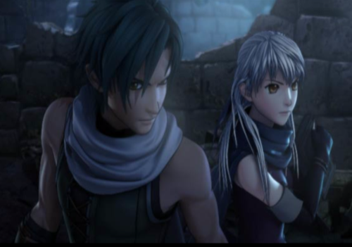
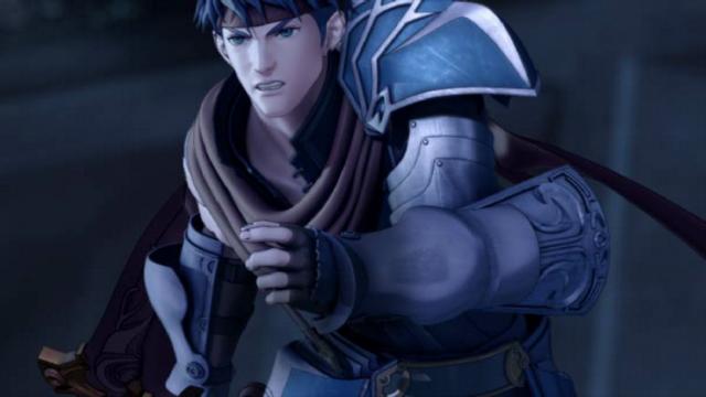
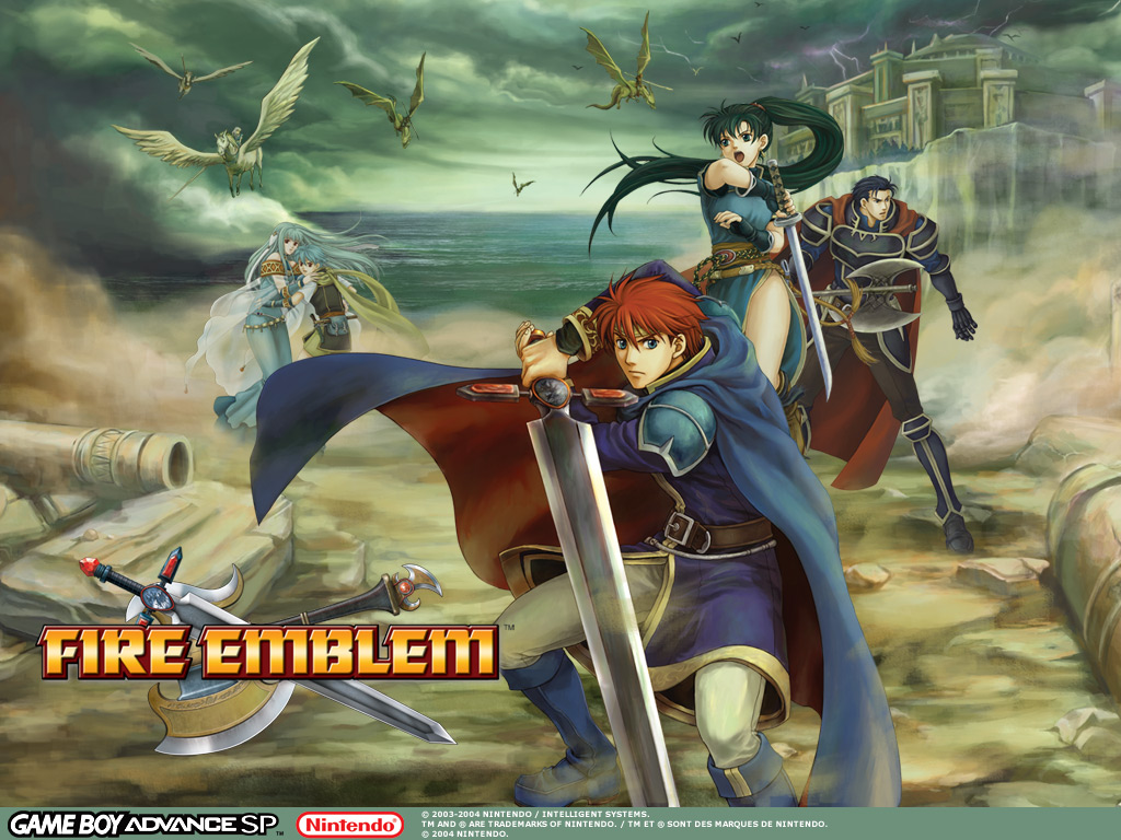
I honestly hate what they've done to Fire Emblem. The art for the series used to be beautiful but then from Awakening and onward it's been some generic ugly shit... and now... this. Even the cutscenes look fugly because of the style of the artwork, IMO.
Would you kindly name some series that use the same artstyle as Awakening before calling the art generic?