• Hey, guest user. Hope you're enjoying NeoGAF! Have you considered registering for an account? Come join us and add your take to the daily discourse.

Worst UIs and menus in gaming?

IrishNinja

Member
4rVYjfQ.jpg


Miracle Warriors, SMS
i know it's a PC port but goddamn

Fable 3 has the absolute worst menu system of all time.

That's not a random screenshot of the game, that's the menu. You actually have to walk around the menu and interact with things in game. It's slow and clunky and just plain moronic.

this shit literally put me off playing that game
 
Mass Effect 1 by far.

It really hurts the game in a way I haven't seen with other titles.

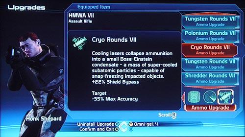
Yea Mass Effect 1's UI was terrible, I really like the game but this is a mess:
mass_pt2_equip_upgrade.jpg


You would get so many Ammo types and upgrades that it take forever to scroll through both on 360 and PC. 90% of it I would just turn into Omni-gel make opening doors so much easier!
 

RiZ III

Member
Xbox One Dashboard. It's so aesthetically ugly and cluttered that it completely turns me off from wanting to play any game on it.
 

Trigg

Banned
Posting images and not naming the game should be a bannable offence. There is no reason to do it. It's classic attention seeking behaviour - you're hoping people ask you what it is. Edit your post. Name the game. Don't do it again.

File names don't count by the way. Think of the search function. Think of your fellow GAFfers.

I hope this is satire... Google image search.. or just deal with it.
 

Dunan

Member
The UI in Assassin's Creed games have always been horrendous imo.

AC1 and the 2 family have quite nice UIs -- I quite liked the just-slightly-off Helvetica font that Abstergo used -- but in AC3 it fell to pieces and has never recovered.

I hope this is satire... Google image search.. or just deal with it.

Satire? TerryWogan is absolutely correct. Nobody should have to step away from the thread to do a Google image search (possibly repeatedly) just to participate in a discussion. It takes far less effort for the poster to just offer up some context.
 

atbigelow

Member
Xenogears has so many UI/UX issues that it was even hard to play back when it was new. What could be a decent game is actively hostile to get through.
 

Gin

Member
not a game - but ps store is terrible.. i HATE using it on my ps4

UI is trash .. dunno why Sony can only get hardware right ..
 

a916

Member
Dragon Age Inquisition... what a terrible useless and infuriating UI that completely turned me off from the game. Not sure if they addressed it with an update because I didn't bother sticking around.

How many of these are issues of "well it's a PC game at some point, so we'll just through EVERYTHING everywhere because you have a mouse and can go anywhere".

 
I have no idea what developers are thinking with 99% of game UIs. I love RPGs, and more often than not, the inventory UI is just a fucking mess. I'd have to take breaks from playing Divinity: OS (great game) when my inventory got overloaded.

One nasty "trend" I really hate is how the audio team always seems to feel the need to let the player know they are there. Big bloops, beeps, thuds, and other random shit when going through the menus. Far Cry 3 is one that comes to mind when opening the menu screen (which you do often). The death and load sound effect in Witcher 3 is out of this world loud, too.
 

tuxfool

Banned
Dragon Age Inquisition... what a terrible useless and infuriating UI that completely turned me off from the game. Not sure if they addressed it with an update because I didn't bother sticking around.

How many of these are issues of "well it's a PC game at some point, so we'll just through EVERYTHING everywhere because you have a mouse and can go anywhere".

It is actually an annoying consolized menu to use with a mouse too.
 
It baffles me that I cant use the mousewheel in this screen. Or that pictures of the tables were replaced with terrible pinball shaped logos

Pinball Arcade is an amazing case study. They've done like 6 complete UI redesigns from scratch, and each one ends up being worse than the last.
 

Mista Koo

Member
These are so fucking ugly. UIs should be consistent in the size of their icons and placement.
I disagree. Just look at your keyboard, the buttons are of different sizes.

It's Smash Bros. and as a player I should be able to decide what's prioritized, and the menus should facilitate that, as they have in the past. There's no excuse for Smash 4's shit UI
This is absurd. How would you decide what's prioritized? Should they just remove all sub menus and throw everything on the main screen??
It's not traditional, but that doesn't necessarily mean traditional menus are better.
 

Chrisdk

Member
I'm kinda surprised by this thread. Interesting that so many have problems with UIs that i don't think are anywhere near the bottom of the list. Witcher 3, The Division, Halo 5, Xbox UI. They don't seem bad to me.

Pro Evolution Soccer though... just awful...
 
Coming back to Witcher 3 for the DLC. How have they not fixed the UI? It can take seconds to switch tabs. They're waiting for EVERY icon in the panel to load, even the ones off screen. No threading, just lock everything and wait for the disk.

Still a great game though.
 

DaciaJC

Gold Member
I hope this is satire... Google image search.. or just deal with it.

There's nothing satirical about requesting people who post pictures of a game to spend three seconds typing the name's game if it's not immediately clear from the image. You'd think this would be common sense.
 
Dragon Age Inquisition... what a terrible useless and infuriating UI that completely turned me off from the game. Not sure if they addressed it with an update because I didn't bother sticking around.

How many of these are issues of "well it's a PC game at some point, so we'll just through EVERYTHING everywhere because you have a mouse and can go anywhere".

The crafting interface in this game was a goddamn war crime. Witcher 3's crafting system combined with the crafting UI was arguably even worse. To craft 1 item, you need 4 mats. Mat 1 requires X, but to make X you need A, B, and C, but to craft those you need yet more items, and so on and so forth. It's heinous. And there's no way to compare stats of items in the crafting UI to what you're wearing.
 
Top Bottom