-
Hey, guest user. Hope you're enjoying NeoGAF! Have you considered registering for an account? Come join us and add your take to the daily discourse.
You are using an out of date browser. It may not display this or other websites correctly.
You should upgrade or use an alternative browser.
You should upgrade or use an alternative browser.
Worst UIs and menus in gaming?
- Thread starter Enter the Dragon Punch
- Start date
CharminUltra
Member
GT5 and Smash.
It's like, what?
It's like, what?
Morrowind is my favorite game of all time. That UI though...
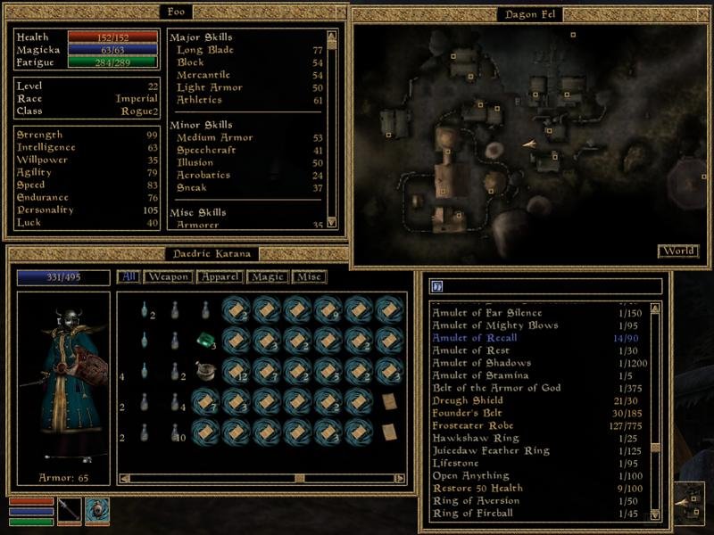
At least it gives you all the info you need on the same screen without having to wade through sub menus. Later entries barely solved any problems and just introduced new ones instead.
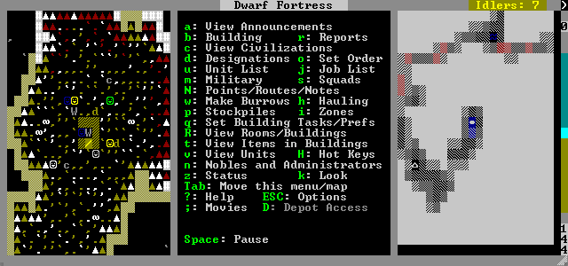
Dwarf Fortress. The best game, with the worst UI.
Yeah, it's not great is it? Still, I suppose once you know where things are it's just a matter of hitting letters.
Look at this and tell me where the single player content modes are.
Perhaps because they are prioritizing multiplayer?Smash 4 has a terrible menu too. Why is training hidden away behind menus and as a small icon?
You should've posted the character select screen:Yatagarasu's looks pretty terrible. Functional, but awful looking.

SneakyStephan
Banned
Borderlands UI, comparing items is impossible
Skyrim UI, equipping stuff and sorting through items is a constant ordeal, awful awful UI one of the worst rpg uis I have ever seen
I seem to remember that mass effect 1 had a terrible UI too but it's been too long I don't remember much about that game
Another one is divinity original sin. It could have had a great UI but the split inventories make using the inventory a chore. Did they ever make a UI that merges all the inventories of the characters?
Morrowind is my favorite game of all time. That UI though...

It's really ugly but it's easier/faster to use than any of its sequels'. It's also designed from the ground up for m/kb which is a good thing on PC.
At least it gives you all the info you need on the same screen without having to wade through sub menus. Later entries barely solved any problems and just introduced new ones instead.
Indeed, the only menu element I found improved in the sequels was the alchemy menu.It's really ugly but it's easier/faster to use than any of its sequels'. It's also designed from the ground up for m/kb which is a good thing on PC.
Morrowind has a PC-ass PC menu, completely customizeable. It's ugly but extremely functional
Cow Mengde
Banned
Infinite Space on the DS. I had no idea if I was equipping or unequipping new items and weapons. That's how bad it was.
I'm certain it's technically not the worst but the Witcher 3 inventory is pretty fucking bad. It got a little better after the patch but it still feels like you're scrolling through stuff forever to get what you want.
Other than that Mass Effect 1 inventory might actually be the angriest I've ever been at a goddamn menu. SO bad.
Then they fixed it in the sequels in the worst way by just removing most of the RPG/Gear elements altogether.
Other than that Mass Effect 1 inventory might actually be the angriest I've ever been at a goddamn menu. SO bad.
Then they fixed it in the sequels in the worst way by just removing most of the RPG/Gear elements altogether.
Look at this and tell me where the single player content modes are.

Baffled?They're in "games & more".
In Smash 4's defense, you get 0-game in no time. I can't even think of the last time I went to a menu other than "Smash". The thing you're gonna use the most takes up the most space.
Ubisoft thread?
Yeah, their games.
I agree. The Crew UI is very loud.
bolkiebasher
Banned
Definitely all the GT games, not intuitive and I was always looking around for ages.
I think most Japanese games have terrible UIs, also, Sony has terrible UIs on their consoles, the XMB on PS3 and PSP was always terrible to me and the PS4 is just as bad if not worse and makes me not want to use my PS4 as much as I should.
Smash Wii U is terrible though, until this thread I actually didn't know there was a solo mode like the first 3 Smash Bros, I never gave the game a chance after buying it because there seemed to be no solo mode where I could make it to the end to fight the hand.
Smash Wii U is terrible though, until this thread I actually didn't know there was a solo mode like the first 3 Smash Bros, I never gave the game a chance after buying it because there seemed to be no solo mode where I could make it to the end to fight the hand.
I don't know if they've changed it since Vanilla, but Destiny's HUD was the worst ever on my Plasma. That shit gave me IR for a good 4 months while other games I've played for 100-200 hours fade almost immediately.
Did they ever give Destiny opacity options or auto-hide the HUD? Because that would go a lonnnng way to make it not suck. I really, really hate when HUDs don't auto-hide.
Did they ever give Destiny opacity options or auto-hide the HUD? Because that would go a lonnnng way to make it not suck. I really, really hate when HUDs don't auto-hide.
Spring Drive
Banned
Dark Souls: The Thread
matrix-cat
Member
I played an old point'n'click adventure game on Steam a few weeks ago called Post Mortem, which made practically every interaction feel like pulling teeth. Your method of navigating the environment in first person, moving your character to predetermined points in a 3D space from which you can swivel around and look up and down (only with the mouse). When you pixel hunt long enough to find an interact-able object to click on, it'll immediately disappear into your inventory without being labeled, so if you want to know what it was you have to slowly scroll through your entire inventory to find it again. There are no keyboard shortcuts for anything, it's all just shitty mouse control.
You can't skip any dialogue, which you'll find out when you first Alt-Tab out to GameFAQs to solve one of the ridiculous, inscrutable puzzles and find that the game has crashed on you. This is the kind of game where the only way to solve the puzzles is to use a guide or actually be the person who designed them, so you either have to have a second device to look at a walkthrough on or just get into the habit of saving before you Alt-Tab.
You can't skip any dialogue, which you'll find out when you first Alt-Tab out to GameFAQs to solve one of the ridiculous, inscrutable puzzles and find that the game has crashed on you. This is the kind of game where the only way to solve the puzzles is to use a guide or actually be the person who designed them, so you either have to have a second device to look at a walkthrough on or just get into the habit of saving before you Alt-Tab.
In Smash 4's defense, you get 0-game in no time. I can't even think of the last time I went to a menu other than "Smash". The thing you're gonna use the most takes up the most space.
Smash 4's menus could benefit from simplification. You don't need separate menus for Smash and 8-player Smash, especially since every stage lights up based on the number of players you have. You don't need separate menus for Single Player and Co-Op, either. Just make it one menu.
flatearthpandas
Member
Shout out to my PS4. Worst UI of the 8th gen imo.
Vita looks down on it from the roof of a shanty.
Dragon Age Inquisition had a pretty shit UI as well.
Vita looks down on it from the roof of a shanty.
Dragon Age Inquisition had a pretty shit UI as well.
Everything about Fallout 4's UI is terrible. The look. The function. Everything.
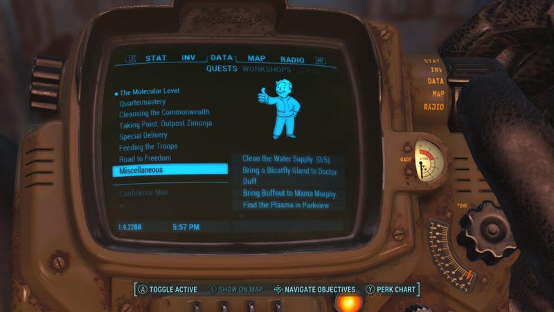

Images from a great article on Kotaku about the utter awfullness of this game's UI.


Images from a great article on Kotaku about the utter awfullness of this game's UI.
Cropduster89
Neo Member
Witcher 2

They consolized the ui for a game that wasn't even available on consoles on release. Ugly, slow to load, and slow to use.
Inventory had no grid+icons, just long, long lists. The hotkeys didn't work between menu items, you had to leave the menu, and press the hotkey from the game to change menu payne. And moving from crafting to buying with a vendor meant having to leave the menu and restart the conversation (which you had to do a lot).
Witcher 1s ui was ugly but was also fast, functional and had drag and drop functionality which is pretty amazing to have in an rpg where you're constantly messing with your inventory. W3's wasn't amazing but was perfect compared to 2.
Edit - Fallout 4 seconded as well, I remember Bethesda pre-release promising it would have decent PC functionality this time, and it's worse than ever, pure style>substance. Roll out the mods boys.
Spiritwalker
Member
DA:I has a garbage UI
Smash 4's menus could benefit from simplification. You don't need separate menus for Smash and 8-player Smash, especially since every stage lights up based on the number of players you have. You don't need separate menus for Single Player and Co-Op, either. Just make it one menu.
I mean you kinda do. The death zones are different in Smash and 8-player Smash. It's much easier to die from the side of the screen in 8-player Smash as opposed to regular Smash. Plus 8 player Smash doesn't track your kills and that in between menu is perfect for quickly editing individualized control inputs.
And having separate menus keeps the game from automatically setting inactive controllers as players as well and there's separate events in the event mode for single player and co-op and there's different stats for single player and co-op in the stadium, classic and all-star modes.
MidnightMania
Member
Seriously no one has mentioned ARK: Survival Evolved yet? Hideous menu system.
Kvalsternacka
Neo Member
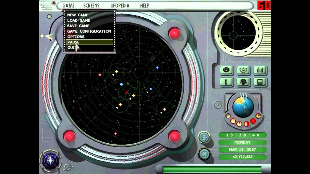
x-com interceptor. The knobs and stuff all do things. I never figured out how to quit the game.

x-com apocalypse
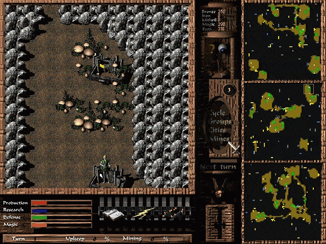
Cave wars

Deadlock 2
The 90's was a magical time.
I've been playing The Witcher 3 recently, and while the layout of the UI is fine, if nothing spectacular. The actual navigation of the UI is some of the least responsive stuff I've ever used, it's takes literal seconds to flip between pages, it's rough. Fortunately the quick select menu is a lot tighter.
Rolodzeo
Member
Playstation All Stars Battle royale.
There is hard to use and ugly bad, and then there is "looks like a fan made menu made in 4 minutes by someone with basic photoshop skills" bad

Basically this, it seems that they did the menus on the last day in 10 minutes. Awful.
Darkstorne
Member
Everything about Fallout 4's UI is terrible. The look. The function. Everything.


Images from a great article on Kotaku about the utter awfullness of this game's UI.
Yep, I love the series but I f***ing hate the Pip Boy. I know it's supposed to be a big piece of the game's image, but when an ironically shit piece of tech is used as the game's UI... It's just better not to use it all. It's not immersive, it's disgustingly restrictive.
Really hoping for a mod that abolishes the Pip Boy completely and just gives me a UI similar to modded Skyrim's UI. Press the menu button, the game pauses, and the whole screen is used for inventory management and maps. I don't need the Pip Boy screen to feel immersed.
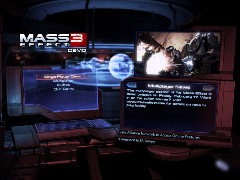
Mass Effect 3 is also a pet peeve for main menu design. Too much emphasis on fancy animations of desktop screens opening up and loading, when all I really want is a menu that is instantaneous. Not something that deliberately takes a long time to load in an attempt to be "immersive".
SomedayTheFire
Member
The Persona games have awful UI's and Menus.
Everything about Fallout 4's UI is terrible. The look. The function. Everything.


Images from a great article on Kotaku about the utter awfullness of this game's UI.
... does Kotaku know that you can zoom in on the pipboy?
mcwizardry
Member
Pip Boy and Dragon Age Inquisition come to mind.
toddhunter
Member
Has Dragon Age: Inquisition been mentioned yet?
It should be, but the UI was consistent with the quality of the rest of the game and it is still nothing compared to Dragons Dogma.
It had two completely different ways to manage your inventory and both were fucking broken. You also had to do the stupid pawn world thing which was a glorified menu.
Although thinking about it, Fable 3 is right up there too.
Dr. Benton Quest
Banned
At least it gives you all the info you need on the same screen without having to wade through sub menus. Later entries barely solved any problems and just introduced new ones instead.
It's really ugly but it's easier/faster to use than any of its sequels'. It's also designed from the ground up for m/kb which is a good thing on PC.
Indeed, the only menu element I found improved in the sequels was the alchemy menu.
Morrowind has a PC-ass PC menu, completely customizeable. It's ugly but extremely functional
Yeah it's mostly just aesthetic. There could be some improvement with equipping items and selecting consumables but it's very functional.
I'm glad to see so many fans around here though. You mostly just see people shitting on Morrowind.
... does Kotaku know that you can zoom in on the pipboy?
They talk about it too.
Even with the zoom, however, theres still a huge amount of dead space:

All MMO's have ugly UI's, I have never seen an MMO with a clean decent looking UI.
They all have that over-designed tacky look with a million tiny icons covering the screen.
Not sure if this would count for you but
Ragnarok Online's default menu style is pretty straight forward, and a lot of the UI can be closed to simplify things. (As some players do, I think, once they know all the shortcuts for their items)

Do I need to explain this?
To be fair, they fixed this in one of the numerous updates.
Blueingreen
Member
Way played, I lost it with the paperclip icon lol
alice_kiss_lara
Banned
all MMORPG for me...
I could never image how people can play FF14 on consoles
I could never image how people can play FF14 on consoles
Yeah it's mostly just aesthetic. There could be some improvement with equipping items and selecting consumables but it's very functional.
I'm glad to see so many fans around here though. You mostly just see people shitting on Morrowind.
Most of Bethesda's UI problems have been there from day 1, like their abysmal inventory sorting. You can't sort potions via type/magnitude for instance, and since the different potion tiers are named completely different like Vial of Health or Philter of Health, they'll be scattered all over the place. For a company that has said they don't want you spending too much tmie looking at menus, that sure seems very counter-intuitive.
The new UI problems introduced in their later titles is mostly how they favor form over function, like the Fallout 4 example. People often blame their UIs for being designed for consoles, but I don't think that has much to do with it at all. They are just plain bad period.
PrivateRyan
Member
PlayStation All Stars


