http://www.perfectly-nintendo.com/u...l-challengers-additional-details-screenshots/
More after the jump.
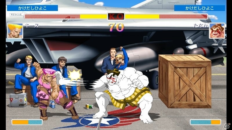
Can you mock at me? Sure you can, if old.
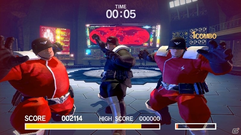
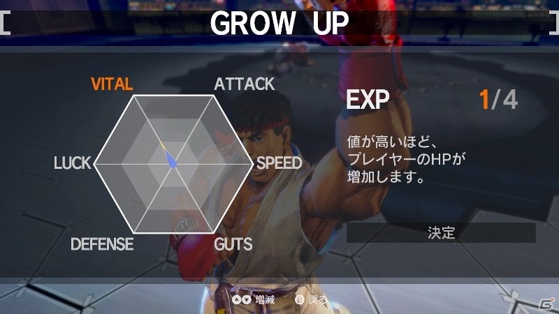
Besides the two modes mentioned in that post, theres a also Practice mode, that lets you practice your moves. About the XP, you can use them to improve the following parameters:
VITAL (health)
ATTACK
SPEED
GUTS
DEFENSE
LUCK
Regarding the many illustrations from the official artbook, found in the Gallery, we learn that theres over 1400 of them. Theyre available at a high resolution (250dpi), which means users will be able to zoom on each page to read text.
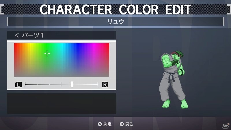
Finally, about the Color Edit mode, that lets you edit the colours of a given character, Capcom specifies that you can save up to 10 colours for each character. Naturally, you can use your custom character in all game modes, even online.
More after the jump.
Can you mock at me? Sure you can, if old.