• Hey, guest user. Hope you're enjoying NeoGAF! Have you considered registering for an account? Come join us and add your take to the daily discourse.

X-Men Blue: Things To Come....

Status
Not open for further replies.

Dalek

Member
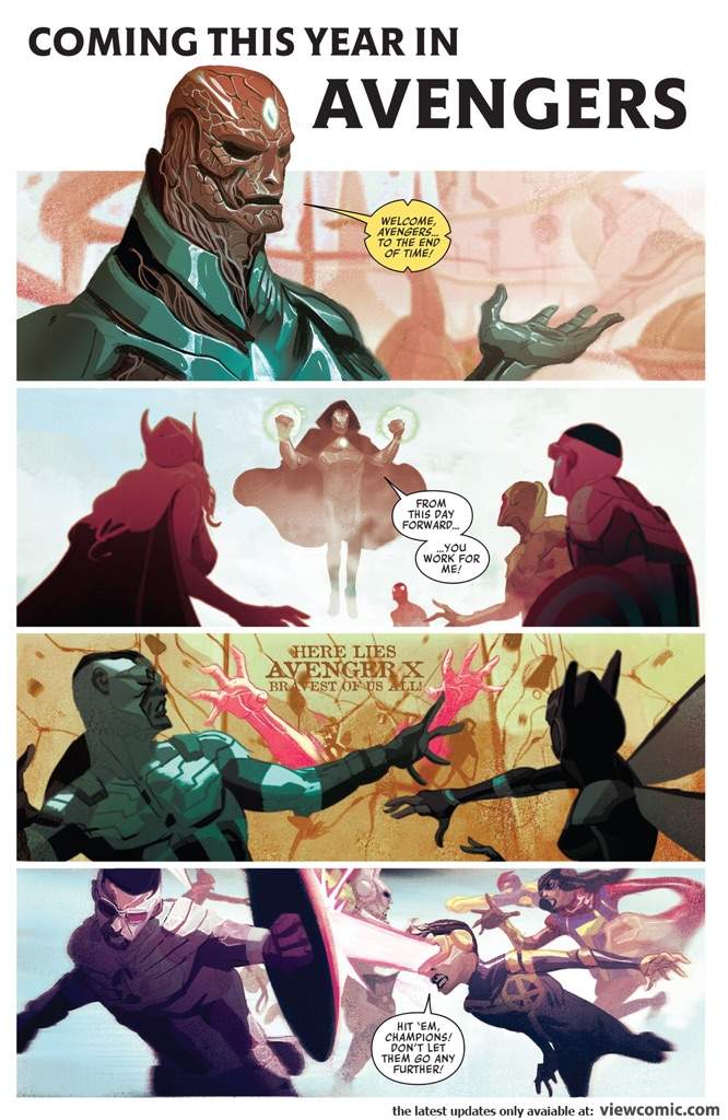
One of my favorite things Marvel has done with the X-Men over the years as far back as when I was a kid and picked up X-Men 1 and Uncanny X-Men 1 was their "Things To Come..." tease in the back of the first issues.

X-Men 1 from the 90's:

tumblr_n1su9dSRKl1rk7w2qo2_1280.jpg


Today's X-Men Blue has some good ones:

20170412_110505.jpg


n a series of four panels, several major returns were teased. In the first panel, the team confront Jimmy/Wolverine. In the second, we see the original line-up of Generation X assembled for a fight, with Chamber saying "Who the hell are you wankers?". Could this be another time-displaced team?

Following that theme, the third panel features the future X-Men the team fought way back in Brian Michael Bendis's run, with Deadpool calling for a rematch.

And finally, in classic hand-to-the-temple pose, we see an image of Professor X saying "To me, my X-Men."
http://www.newsarama.com/34006-could-the-x-men-s-redacted-be-resurrected-in-resurrxion-spoilers.html

A team up with the original Generation X is genius!
 

Slayven

Member
He said Wankers cause he is british, lol

And he wouldn't have a speech bubble cause he doesn't have a mouth or chest.
 

Dalek

Member
Dat Jim Lee art.

Greatest of all time.

I got to meet him when I was a kid-he and Mark Silvestri were doing a signing at a comic book store in Delaware and they signed my X-Men books. This was right before Image was launching and they had promo art behind them showing off WildCATS and WetWorks characters.
 
Del Mundo is amazing yeah but that shit was rushed like mad. WTF is up with Cyclops and Kamala's mouths and why does Cyclops look like he's 10?
 
X-Men #1 kinda had two, in fact... the version with the full poster cover had that crazy awesome group shot on the inside with "and the best is yet to come" in the corner in the same Tom Orzechowski master lettering. I had a huge jumbo print of it in my bedroom as a kid:

a5113d48b7d9cda546199f1248f7e533.jpg


My 90's childhood, distilled.
 

Dalek

Member
X-Men #1 kinda had two, in fact... the version with the full poster cover had that crazy awesome group shot on the inside with "and the best is yet to come" in the corner in the same Tom Orzechowski master lettering. I had a huge jumbo print of it in my bedroom as a kid:

a5113d48b7d9cda546199f1248f7e533.jpg


My 90's childhood, distilled.

Man, those lineups. This was when X-Men were on top.
 

LifEndz

Member
Those Jim Lee drawn X-Men comics are right up there with McFarlane's Spiderman. Beautifully drawn and inked.
 

IronRinn

Member
X-Men #1 kinda had two, in fact... the version with the full poster cover had that crazy awesome group shot on the inside with "and the best is yet to come" in the corner in the same Tom Orzechowski master lettering. I had a huge jumbo print of it in my bedroom as a kid:

a5113d48b7d9cda546199f1248f7e533.jpg


My 90's childhood, distilled.
Teen years for me but, yeah, pretty much the same.
 

Dalek

Member
What about that team of Future X-men teased in the third panel?

They're the future Brotherhood of Evil Mutants. From Bendis's X-Men run and the story Children of the Atom. I thought they were a cool team-but overall that story wasn't done well. There was Deadpool, Xavier's evil grandson, a mentally unstable Jean Grey, an evil Iceman-Hulk and Molly from Runaways.
 
One of my favorite things Marvel has done with the X-Men over the years as far back as when I was a kid and picked up X-Men 1 and Uncanny X-Men 1 was their "Things To Come..." tease in the back of the first issues.

X-Men 1 from the 90's:

tumblr_n1su9dSRKl1rk7w2qo2_1280.jpg


Today's X-Men Blue has some good ones:

20170412_110505.jpg


http://www.newsarama.com/34006-could-the-x-men-s-redacted-be-resurrected-in-resurrxion-spoilers.html

A team up with the original Generation X is genius!

Now i know that i'm old. I sound like an old man but I like the old ones better. The new ones are just like modern movie trailers. There's WAY too much information. It's just lazy. The old style was just in image that hinted at sooooooo much cool shit. Your imagination would run wild. Oh my God! Look at him? He's coming soon? Who the HELL is THAT? Oh shit, they're coming back?? Is that THE BROOD????

Now, they just take panels from work that artist already turned in, dialogue bubbles and all.

I don't know if any of you have ever been into old anime, but the end credits had a similar philosophy as the old Best is yet to come splash pages. You'd see your protagonist in a completely new/different situation that only hints at a future that could be in the show if you keep watching.

Yeah, I"m old. I don't miss modern spandex comics at all.
 

Dalek

Member
Technically those issues haven't been drawn yet. The writer most likely just gave the artist a few panels of ideas to draw.
 
The collage is still cooler. Feels a lot more mysterious without any context.

The problem is it's basically no different than the cover of any comic book. It's not saying anything other than "These cool ass characters will be in future stories! How? I don't know, we'll think of something!"
 
this just makes me sad about the current state of comic art

It shouldn't. Current marvel is light years past where Marvel was after 92 or so when they lost all their talent to Image.

Those years were painful.

Those of you shitting on Del Mundo need to check yourselves though, for real
 

Dalek

Member
There are a shitload of talented artist with unique styles now compared to the 90s where everyone just wanted to draw like Jim Lee, Joe Mad, Marc Silvestri, Todd McFarlane, and Rob Liefeld.

The worst is when you see someone TODAY still trying to ape that style. I'm talking about scum like that load Brett Booth.
 
It shouldn't. Current marvel is light years past where Marvel was after 92 or so when they lost all their talent to Image.

Those years were painful.

Those of you shitting on Del Mundo need to check yourselves though, for real
Nah. The only difference between then and now is you're paying $4 for the privilege.

fJBZxLb.jpg
 
The worst is when you see someone TODAY still trying to ape that style. I'm talking about scum like that load Brett Booth.

Brett Booth is not a good example cuz:
A. He's great.
Sorry not sorry.
B. He's not aping anyone. He's got his own style. He's far from the traditional house style. Him and Mad paved the way for manga inspired artists we see nowadays.

A better example are the artists that work for Zenescope or Aspen.
 
Frank Quietly is like if they took those little children who look old in Akira and made EVERYONE look like that


I felt like I was taking crazy pills back when people endlessly praised Quitely's X-Men art.

Even today I will see people argue that it just hasn't aged well. That shit looked bad then, now, and every moment in between.
 
Status
Not open for further replies.
Top Bottom