Looks like a Silent Hill tit monster.
-
Hey, guest user. Hope you're enjoying NeoGAF! Have you considered registering for an account? Come join us and add your take to the daily discourse.
You are using an out of date browser. It may not display this or other websites correctly.
You should upgrade or use an alternative browser.
You should upgrade or use an alternative browser.
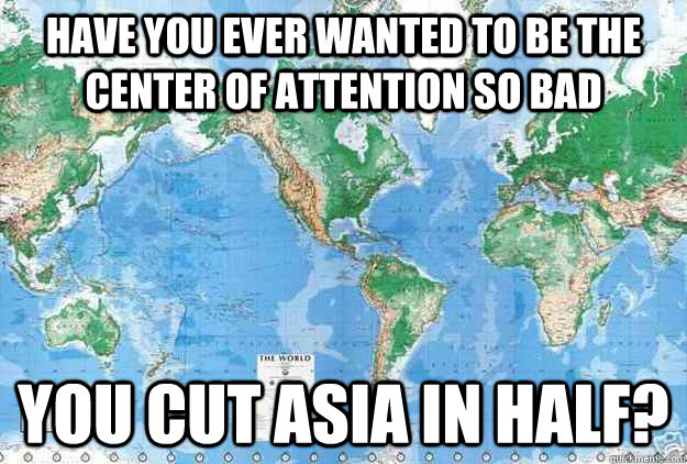
I never knew the world map was actually like this
- Thread starter nhlducks35
- Start date
- Status
- Not open for further replies.

Perspicacity
Banned

Sexiest map.

Escape Goat
Member
Peters Projection flipped is truly the best map.

You know there is no "right side up" for our planet or solar system. I think we ought to flip it for kicks.
The fact that maps are centered around Germany is indeed an effect of Europeans making the maps popular. But some place has to be in center so honestly there's no reason to change that now. The fact that Europe is oversized has nothing to do with euro-centrism though, the Peters projection is useless for navigation which is historically the main purpose of the maps.Cartography, unsurprisingly, is very Euro/West-centric.
Pagusas
Elden Member
So I was watching The West Wing on Netflix, when the episode "Somebody's Going to Emergency, Somebody's Going to Jail" comes up. During it, CJ interviews some guys who want the map used in schools changed to the Peters Projection, instead of the Mercator one used today.
I never knew the map I had been looking at all this time was wholly inaccurate when it came to the actual sizes of the continents and countries.
I dont understand the point of this, both maps depictions are trying to display a 3D object as a 2D one, you are going to get skewed results no matter how you do it (thus why there are so many ways to do it)
Neither is a proper represenation of land mass, and the 2nd one is a joke if you think it represents true scale of the continents.
Peters Projection flipped is truly the best map.
This really accentuates how much fucking water there is.
Peters Projection flipped is truly the best map.
My LA/SS professor in middle school had one of these in his classroom, on the first day of school in sixth grade I told him his map was upside-down haha.
You know there is no "right side up" for our planet or solar system. I think we ought to flip it for kicks.
Well if you ignore hundreds of thousands of years of using the north star for navigation sure we could just flip it.
No. The Peters is accurate for relative areas of things, in the same way Mercator is accurate for constant bearings. Africa really is that big relative to everything else.
Is it really? Maybe it is just my terrible eyesight, but despite Africa being about 2/3 the size of Asia in reality, it looks like it could be bigger in that map.
Mr. Poolman
Member
This is interesting. Thanks.
The fact that maps are centered around Germany is indeed an effect of Europeans making the maps popular. But some place has to be in center so honestly there's no reason to change that now. The fact that Europe is oversized has nothing to do with euro-centrism though, the Peters projection is useless for navigation which is historically the main purpose of the maps.
Actualy .... each place has a map that fit its porpuese =P
Most brazilian news has the mercator map centered on brazil ...
but I like more the version one of my uncles has !
A map that is the upside down peters projection centered on brazil.
Why ? Because it is all he wants to know is stuff related to his country =P
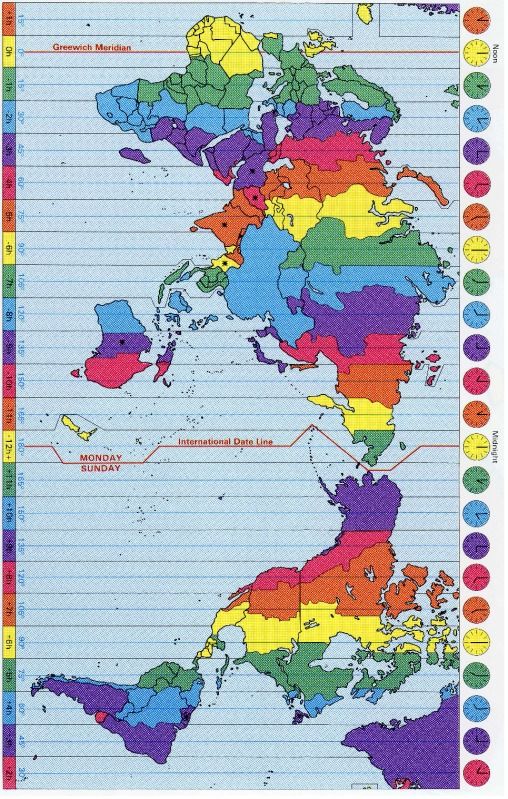
edit : what we CAN'T change that easily is the timezones .. that are all based on the mercator europe centric map
I dont understand the point of this, both maps depictions are trying to display a 3D object as a 2D one, you are going to get skewed results no matter how you do it (thus why there are so many ways to do it)
Neither is a proper represenation of land mass, and the 2nd one is a joke if you think it represents true scale of the continents.
Pretty much what I was going to say. I also came to post the xkcd-comic, and yeah, I'm with him on the Gall-Peters.
Are educational maps in North-America really like this?
MistakenMobius
Member
UK is the centre not Germany

I guess it's basically centered around Greenwich meridian.
You know there is no "right side up" for our planet or solar system. I think we ought to flip it for kicks.
Yeah, who says the direction "North" is really "North." Imagine that we decided the magnetic North is called South. Sun rises in the west, sets in the east. I'm sure there'd be a way to switch the idea of seasons around.
Which brings up an idiotic thing I've thought about before. For the Southern Hemisphere crowd: Is February considered a summer month? It's stupid, but I get weirded out that June/July/August could be considered cold months :lol
Are educational maps in North-America really like this?
Pretty normal for maps to center on whatever market they're being produced for. Where should it be centered?
Pagusas
Elden Member
Is it really? Maybe it is just my terrible eyesight, but despite Africa being about 2/3 the size of Asia in reality, it looks like it could be bigger in that map.

It kinda is.. But the map is still skewed to give improper impressions. I really wish people would just be taught with globes

"What the hell is that?"
"It's where you've been living, this whole time."
http://www.youtube.com/watch?v=n8zBC2dvERM
"It's where you've been living, this whole time."
http://www.youtube.com/watch?v=n8zBC2dvERM
GoldenEye 007
Member
I always liked the globe with the raised landmasses to signal elevation. My fav.
I'd just run my hands across the surface!
I'd just run my hands across the surface!
T
Transhuman
Unconfirmed Member
Peters Projection flipped is truly the best map.
Yeah, I came to post this (or specifically, this).
It's weird that people think of North as "up" and South as "down". Hell, even a world map tilted by 90 degrees makes perfect sense.
I want to see THIS map on a wall somewhere.
Escape Goat
Member
It kinda is.. But the map is still skewed to give improper impressions. I really wish people would just be taught with globes
Thank God US claimed sub saharan africa. I dont like sand.
UncleSporky
Member
Actually the standard map is more western-focused because we read left to right. US comes first.
Cutting a continent in half still puts focus on the island in the middle, but the regular map is just as US-centric.
Like the hat?
Banned
I don't think I ever saw a map like that in any class. It was always the Americas on the left and Europe/Asia/Africa/Australia on the rightAre educational maps in North-America really like this?
Escape Goat
Member
US map put US in center is...bad? Seems like a common sense thing to do.
Are educational maps in North-America really like this?
Never seen a map like that in primary/secondary school here (US)
QuicheFontaine
Member
Pretty normal for maps to center on whatever market they're being produced for. Where should it be centered?
Britain
Peters Projection flipped is truly the best map.
This map gave me some really strange feels. Like my mind refuses to comprehend it.
Dark Octave
Banned
That looks scary as hell.

Part of it is that it looks so alien and another part of it is that it's the hidden reality of what we all know as this other thing.
It kinda is.. But the map is still skewed to give improper impressions. I really wish people would just be taught with globes
Well, sure. I mean, I know Africa is huge; I just think the projection makes it look bigger than (or at least similar in size to) Asia, and it isn't.
The Technomancer
card-carrying scientician
Are educational maps in North-America really like this?
Never that I've seen
Wyndstryker
Member
Imagine the highways on this:

I want an rpg in that world now =/
NoAre educational maps in North-America really like this?
SolidusDave
Member
Meh, if you want to compare continent sizes etc., this is pretty much the only way to represent the actual land mass on a 2D plane:

Imagine the highways on this:
This is blowing my mind.
Kung Fu Jedi
Member
Meh, that's pretty much the only way to represent the land mass on a 2D plane:
How do you figure? The only thing that is good for is displaying relative sizes to one another and thats about it.
Are educational maps in North-America really like this?
I have seen a map like that once. In my 30+ years of living in the US.
UncleSporky
Member
In fact when I first saw the map with the US in the middle, it was explained to me that it never caught on due to the expense of replacing existing maps, and everyone realized it didn't make any difference anyway because the US still comes first and remains the focus on the standard map.
Yeah, I came to post this (or specifically, this).
This makes Canada look badass. And Russia looks like it owns the world.
SolidusDave
Member
How do you figure? The only thing that is good for is displaying relative sizes to one another and thats about it.
Actual/relative continent size is what the OP and many posts here are discussing though.
edit: added "actual"
edit2: mh, another circle for the total ocean (water) surface would be nice.
Kung Fu Jedi
Member
Actual/relative continent size is what the OP and many posts here are discussing though.
edit: added "actual"
Maybe, but you said that map was "pretty much the only way to represent the land mass on a 2D plane" which just isn't true.
Actually, we can't even call that image a map at all. Just a super simplified way of comparing sizes. It is a decent way to see how they relate to one another if that is the only thing you're looking at things I guess.
All maps are inaccurate, you can't map an ellipsoid to a plane without creating distortions, the question is mostly about what you want to preserve (distance vs. shape is the most common trade-off people talk about).I never knew the map I had been looking at all this time was wholly inaccurate when it came to the actual sizes of the continents and countries.
The Peters projection is generally considered useless by cartographers; yet another thing The West Wing got wrong.
p.s.
Have you heard of geodetic datum?
Enjoy your wikihole.
- Status
- Not open for further replies.
Similar threads
- 31
- 2K
Madonis
replied