Hazelhurst
Member
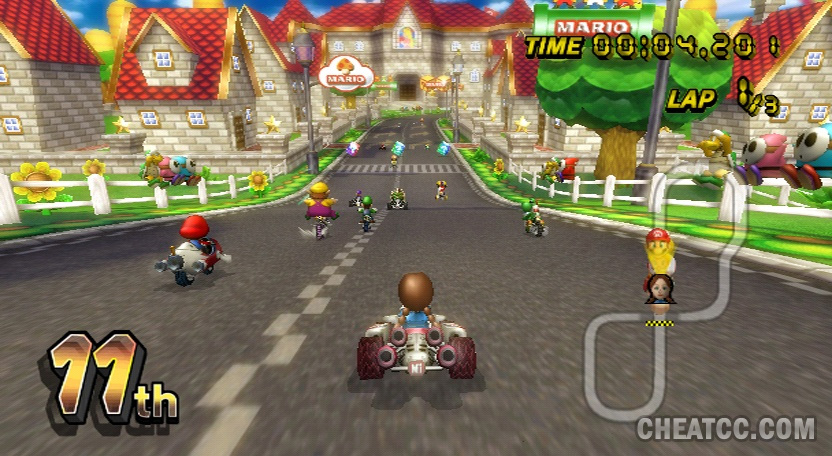
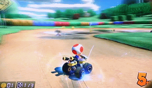
Came in expecting pictures.
Today I learned that lighting lends absolutely nothing to the style and look of a game.
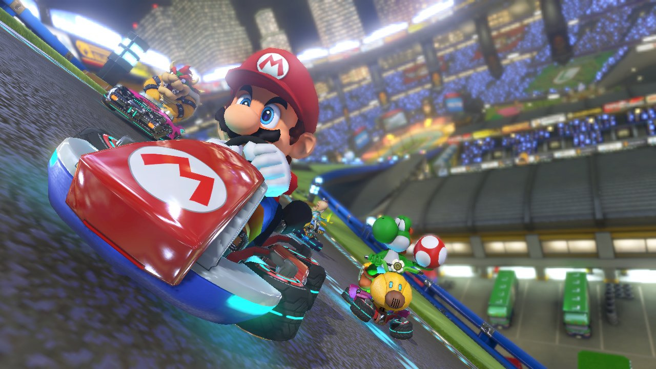
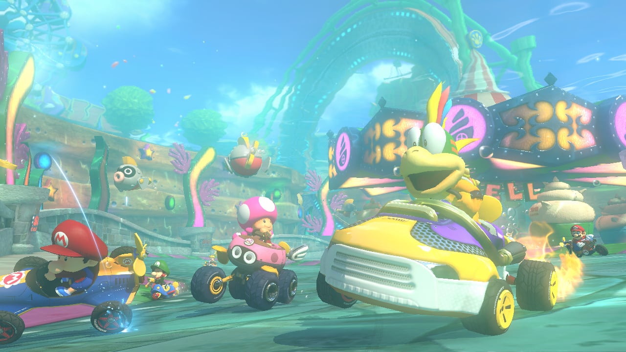
This games lighting alone differentiates its look from other Mario Karts pretty well. It's not just indicative of a power bump, it helps to give the game its bright, poppy, often watercolory look, and no, the other games don't look quite the same. Same goes for the clean, sharp geometry. Stylistically it's not the same, especially when you factor in stages that go heavy into the anti-grav gimmick. Have you played the same game I have? Would you care to make a few image comparisons so I can see what you mean? You've well and truly lost me.


It looks decent for a Wii U game.
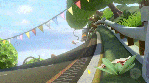
Depends on the track. I notice jaggies mainly on the retro rainbow road course when hugging the inside edge of curves in the track.Funny--my 60" Panny plasma is also calibrated and I don't see many jaggies.
Lighting has nothing to do with the style. The Wii wasn't capable of that kind of lighting. Anti-grav gimmick has nothing to do with style.
Obviously the lower resolution doesn't help, but it's the same style (obviously) with more processing power. Obviously there are more details and things that the Wii was incapable of pulling off.

you should try to compare actual game screenshots... not screenshot vs promo art.

Lighting has nothing to do with the style... Anti-grav gimmick has nothing to do with style.
Lighting and geometry? That's just the extra power. Stylistically it's the same.
Clever girl...
The improved technical prowess of the console allows the "style" of Mario Kart to flourish. It's a "greater than the sum of its parts" kind of thing. Obviously Mario looks like Mario, but the gestalt of the game is blissfully majestic, and its contrast to previous iterations in the series is huge.
Yes I have played the game. It's the exact same style since Mario 64.
Usually when I'm thinking 'image comparison' I'm thinking something like a varied selection of screens at native resolution (or something near it) compared, not a single screen compared against promo art
I just don't see how it could be argued that these games are identical stylistically. They're so not.
And if you honestly earnestly think that then this discussion is utterly pointless and I'm totally out of here
Take out fire hopping as well..Beautiful game, but it makes me rage so hard. I dislike the cheating AI. Need to have those battle arenas added and more maps too.
not technically but I don't know how people can state with total resolve that MK8 is ahead of Tropical Freeze when it comes to art style
i'm omitting shitloads of beautiful and memorable moments and locations here. just a small sample from an incredibly varied game. and this is a game that doesn't look like total hell in screenshots. just saiyan
I don't see how you could say that. watch a MKTV clip of characters doing tricks, hitting others with items, and passing other characters. the animations are just amazing. imo. I love the animations in Tropical Freeze as well (it's my favorite game on the console) but sometimes they seem a little too goofy and over the top.
I do. I'm not saying it's necessarily bad, it's definitely instantly recognizable that's for sure.
Yes I have played the game. It's the exact same style since Mario 64.
Yeah, surprised to see DK pop up in this thread as much as it has. It's (for me) one of Nintendo's least impressive retail HD titles to date outside of the party stuff and NSMBUI just don't see it. Tropical Freeze's graphics are not more impressive than Mario Kart 8. Not technically or artistically.
Yes, they are good, but I don't see how DK's are goofy and over the top and MK's aren't. Plus in MK8, due to the nature of the game, you never really get to see those animations during gameplay. When people talk about MK8 and how great it looks, the majority of the screenshots and footage are those cinematic angles to show off the animations and graphics. But that does very little for me personally as that isn't stuff you see during gameplay (not that it doesn't look and animate great while your playing... It certainly does.)
Of course it allows it to flourish, doesn't mean it's significantly different at its core. You would hope that a new mario kart on a new next gen system would look better than the one on the previous console.
I just don't see how it could be argued that these games are identical stylistically. They're so not.
Calibrate out the jaggies. Holy shit I have heard it all. Thanks for the laugh
I know this post is from the first page, but making it 1080p wouldn't magically remove the jaggies. There's just no AA solution at all.I recently picked it up and it is really beautiful in motion. Obviously when you zoom in/pause it you can see that a lot of the assets/textures are pretty standard, but the lighting, design + style make up for that.
If only it was 1080p - my biggest complaint is the jaggies.
Yeah, surprised to see DK pop up in this thread as much as it has.

Yeah, surprised to see DK pop up in this thread as much as it has. It's (for me) one of Nintendo's least impressive retail HD titles to date outside of the party stuff and NSMBU
Actually, maybe it's the PS3's lack of internal upscaling that makes GTA V and TLOU look much more aliased than MK8 for me. Monitors usually have bad upscalers.
Mario Kart 8 is, in my opinion, the best looking game currently available on any console. Next-gen, current gen, nothing on store shelves right now has wowed me the way that Mario Kart 8 did during those first few tracks.
The reason it looks so good is that ROCK FUCKING SOLID 60 FPS. It does so much.
")
60, with the occasional skipped frame.
The jaggie comments must be coming from people taking the piss, because most games out there are far worse.
Having the sharpness and contrast too high definitely accentuates jaggies.
It's weird to me that out of all the jaggy-as-hell AAA games out there, MK8 is getting singled out. GTA V and TLOU are much worse on the jaggies front.
(To be fair, I've only played for about 30 min, so maybe it'll be more apparent as I play more.)
this should be on page 1
I almost posted this in parenthesis but decided it was close enough ;p
Maybe because GTA and TLOU have more geometric forms and details.
You risk to see them more often. I think.