• Hey, guest user. Hope you're enjoying NeoGAF! Have you considered registering for an account? Come join us and add your take to the daily discourse.

I dislike colorful 2D graphics nowadays and i don't know why exactly.

nkarafo

Member
I feel this way and i can't put my finger on it to explain exactly why i do. This started on mobile games but now i feel the same for consoles well.

This time i'm not talking about "low def" or "8-bit" looking modern games with stick figures. I'm talking about games that have colorful, detailed, cartoony graphics at higher definitions, etc. Things like Castle Crashers, Rayman Origins, Ori and the blind forest, Kingdom Rush games, Cut the rope, Candy crush, Clash of Clans, Plants vs Zombies, Angry Birds, Braid, etc.

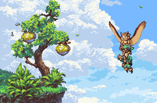
Surely, these would not be possible on the older 16/32 bit machines, right? But i still don't like them as much as something like the original Jaguar Rayman, Sonic 1/2/3, Yoshi's Island, DKC 1/2/3, Yoshi's Story, Flink, Adventures of Lomax, Metal Slug series, classic Disney Genesis games like Aladdin, Mickey Mania, Lion King, World of Illusion, etc... Before you say these are higher budget, wait until the end of the post.

Now, i still like the look of some of the darker or weirder looking modern games. I like LIMBO. I like Slain. I also like Rainworld, even though it has static backgrounds instead of scrolling ones. But all these have a darker art style. It seems like there's something about modern bright/colorful games that i don't like.

Is it because they remind me of Newgrounds FLASH animations/games? I used to go there back in 1999-2003 and play all kinds of shitty free games. These also had the exact same clean, sharp, colorful look as most modern 2D games do. Maybe in my mind i connect that kind of look with cheap/shitty/dank games during that period? But still, what exactly is the thing that makes all these games look alike? As if they were made with the same engine or something? (well, in Newgrounds they were all made with Flash).

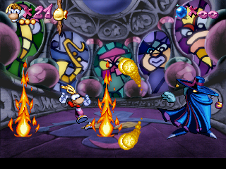
Having said that, there are rare exceptions. First game that comes to mind is Cup Head. But that's an obvious one since it looks leagues ahead any other game when it comes to detail and animations. And this is where i need to talk about the budget. Many people say that older 2D games may look better because of the higher budgets. Yet, Cup Head looks like it's on the same level as something like Metal Slug, yet i'm sure the budgets are on a different league here. So maybe budget isn't the only thing that affects 2D graphics quality?
 

UrbanRats

Member
Erm, maybe you just don't like those specific art directions? There's no accounting for taste.
Also, it doesn't really apply to Ori and Braid, but animation warping is foul and looks like shit, so theres that too, and some of the examples you gave aren't exactly outstanding.
 

Hugstable

Banned
OP have you heard of Owlboy? I just heard about this game today and the sprites are beautiful

1AYh1ES.jpg
 

nkarafo

Member
OP have you heard of Owlboy? I just heard about this game today myself and the sprites are beautiful

1AYh1ES.jpg
This looks like an adventure game with static backgrounds.

I'm mostly talking about scrolling 2D games. Static background games like point & click never really interested me. But graphically i'd say they look better now than before in most cases.
 
This looks like an adventure game with static backgrounds.

I'm mostly talking about scrolling 2D games. Static background games like point & click never really interested me. But graphically i'd say they look better now than before in most cases.

what are you talking about. nearly everything is animated in owlboy. plus it's a metroidvania

tumblr_og0r01T4QD1tah9pwo7_r2_540.gif
 

nkarafo

Member
I don't think sprites are what he's talking about, it's those McDonalds color pallet looking games with no gradients.
Yes, the gradient part may be the key word i'm looking for here.

If you compare the original Rayman with the new ones, you will see that the old one has different shading that adds depth, while the new ones are completely flat, almost like anime. Maybe that's what makes the whole difference?

RaymanJaguarMosquito.png


rayman-1.png


rayman-origins-e3-2011-screenshots.jpg


What are you talking about. nearly everything is animated in owlboy. plus it's a metroidvania
I haven't played the game. Is it a 2D scrolling game or you go from screen to screen? I'm talking about scrolling games mostly.
 

pagrab

Member
I think that the reason may be that the technology achieved a point where the cartoon graphics in games is so good technically that we automatically start to compare it with art in other media (comics, cartoons, drawings). And once you do this, many of them (especially on mobile) start to look rather cheap and tacky.
 
Yes, the gradient part may be the key word i'm looking for here.

If you compare the original Rayman with the new ones, you will see that the old one has different shading that adds depth, while the new ones are completely flat, almost like anime. Maybe that's what makes the whole difference?

RaymanJaguarMosquito.png


rayman-origins-e3-2011-screenshots.jpg


I haven't played the game. Is it a 2D scrolling game or you go from screen to screen? I'm talking about scrolling games mostly.

owlboy is majority scrolling with some screen transitions
 

sanstesy

Member
I know what you mean. I absolutely despise the feel of 2D games that have no proper shading and as a result have no objectable depth and look completely flat. You can hardly distinct between foreground or background and nothing you do in the game feels meat-y or satisfying.

The new Rayman games you mentioned are a good example even if they do look gorgeous from an artistic point of view.
 
I dunno. In that modern Rayman image OP posted, I feel like I can pretty clearly see depth and the distinction between the background and the foreground. Maybe that's not the best example image?
 

Mabufu

Banned
OP, can you take out Ori and the blind forest out from that group of C-Tier art games, please?

Thank you : 3
 

orioto

Good Art™
I have a problem to with them but i can explain my personal dislike. They try to look like concept art.

The popular idea is that next gen 2d graphics should look like traditional material, like cartoons.

But pixel art was organic and generated by the computer, i mean it was (except in some particular cases) done to look like something done on photoshop or even on paper. it was it's own small lively binary form.

Also translation or rotations for animation looks flash yes. Even in the new Sonic mania the way Sonic rotate on itself is gross.

For the game i'm trying to do right now (not saying it's better but it's a different approach) i'm looking for something painterly and animating frame by frame with lots of deformation, to give it something organic and dense, and that moves not like a robot.

That said there are games like cuphead indeed or others like Skullgirls that look fucking great having a celluloid style, cause the animations are insane.
 

nkarafo

Member
I dunno. In that modern Rayman image OP posted, I feel like I can pretty clearly see depth and the distinction between the background and the foreground. Maybe that's not the best example image?
But it still feels like the world is made of flat, paper props.
 

tearsofash

Member
I know what you mean. Stuff like Rayman and Mickey Mouse just didn't do it for me visually. They feel cookie cutter and soulless. Although games like KOF XII and XIII didn't take me out of the element, I feel like these modern sidescrolling games you're talking about just don't feel real to me. That's not to say they aren't fun, but they feel sterilized somehow.
 

Coreda

Member
Is it because they remind me of Newgrounds FLASH animations/games? I used to go there back in 1999-2003 and play all kinds of shitty free games. These also had the exact same clean, sharp, colorful look as most modern 2D games do. Maybe in my mind i connect that kind of look with cheap/shitty/dank games during that period?

I'm also not attracted much to games that remind me of certain similar things, though I've only played Ori from that list and didn't think it fitted within the typical mold. Can see where you're coming from.

For me I have no issues with a colorful style, rather:


  • Inconsistent stylistically. Eg: a game goes after a 'retro' style with pixel graphics but abuses the grid based system inherent to pixel art, or doesn't successfully pull off a blend of 3D and 2D. One of the reasons I appreciated Shovel Knight so much was its adherence to sprites moving along the pixel grid among other choices that made the game beautifully cohesive. Quoting myself from a similar thread:

    Mostly though it comes down to consistency and coherence to an art style. David OReilly wrote an excellent essay about artistic consistency called 'Basic Animation Aesthetics' (PDF). I'm always reminded of it when framing why some designs work better than others as a whole.
  • Character models and/or UI aren't harmonious in proportion to other graphics from the game and feel patronizing in a mobile-esque way.
  • Has floaty animations that remind me of a Flash game.
 

True Fire

Member
Nothing wrong with that OP. A lot of devs are going for a "nostalgic 2D" look by throwing whatever McGraphics they can into the game. And it looks tacky as hell.

Old school 2D games put a lot of care into their graphics and aesthetics. Things like Shovel Knight understand old school development
 
pixel 8 bit graphics piss me off when they try to push it as "art" and "retro"

no its just lazy and ugly in 2016


actual 2d graphics with proper art design can be beautiful though. like the ubiart rayman games, ori etc.
 

Teeth

Member
Cuphead ain't cheap.

eDIT: if I had to guess, I'd say you have an aversion to morph-mation and marionetting, which are hallmarks of modern high resolution 2D art. Bad versions of those techniques are used in a lot of Flash games to lighten the art load (you paint one or a couple of frames then morph or move the bones around in code).

Classic animation is incredibly time consuming in high resolution. Therefore, expensive.
 

KooopaKid

Banned
I know what you mean. I absolutely despise the feel of 2D games that have no proper shading and as a result have no objectable depth and look completely flat. You can hardly distinct between foreground or background and nothing you do in the game feels meat-y or satisfying.

The new Rayman games you mentioned are a good example even if they do look gorgeous from an artistic point of view.

Yeah all the sprites look flat like Paper Mario.
 
Because those new ones you mentioned mostly have those showy palette combined with everything in 100% color saturation. The combination are almost always a receipe for disaster(IMO).
 

nkarafo

Member
Another thing i forgot to mention is that many 2D games today use visual effects that clash with the 2D art. For instance sometimes they use explosions, lens flare, sparks and other shiny effects using the hardware instead of hand-crafting those effects like the rest of the game. I never liked that.
 

llehuty

Member
Hmm, I see where the OP is coming from, but is not really a big issue for me. One game I'm not seeing mention and that has solid and consistent art style is Spelunky.
 

nkarafo

Member
Cuphead ain't cheap.
Well, i didn't want to make the game sound like it's cheap to make (you are working on it, so you know better). But i would guess something like Metal Slug or Aladdin on the Genesis have much higher budgets with a larger staff working on them, no?

I think budget matters but it's not the only thing. Talent, dedication, how much the devs love the project and willing to put in the extra detail and work, etc, also matter. Maybe even more so than budget.
 
Another thing i forgot to mention is that many 2D games today use visual effects that clash with the 2D art. For instance sometimes they use explosions, lens flare, sparks and other shiny effects using the hardware instead of hand-crafting those effects like the rest of the game. I never liked that.

I prefer it. I like the lighting and physics simulations in modern 2D games.
 
Maybe you're turning into an Edgelord?

I feel the same about modern Street Fighter. I yearn for the days of moody backstreets and dark temples.
 

gelf

Member
I can see where you coming from. The flat shaded flash like stuff can certainly be a turn off to me. I understand it's expensive to make good hi-res art though. It's going to be hard in terms of both money and talent to complete with some SNK tier pixel art.
 

Teeth

Member
Well, i didn't want to make the game sound like it's cheap to make (you are working on it, so you know better). But i would guess something like Metal Slug or Aladdin on the Genesis have much higher budgets with a larger staff working on them, no?

I think budget matters but it's not the only thing. Talent, dedication, how much the devs love the project and willing to put in the extra detail and work, etc, also matter. Maybe even more so than budget.

I've never really looked into how many animators worked at Shiny during the Aladdin/EWJ days, but I do remember them bragging that they got real Disney animators, so I doubt they were cheap. But that's a different setup than an indie project; they were professional mercenary work so they would be paid high end professional wages. As a passion project like Cuphead, the financials get wonky.

I'm curious what you think of Banner Saga's art.
 

lazygecko

Member
I think a lack of proper, handmade shading can in part be explained by how plenty of games animate their characters more cheaply by rotating and distorting individual parts Flash-style.

There are plenty of pet peeves I have with modern 2D games, and in particular those that try for a retro aesthetic. Color-wise I think they often end up with objects and backgrounds with too smooth shading and an ovrerall very "soft" feel to the palettes. I prefer the styles that look more sharp and high contrast, but you generally don't see a lot of those today.

Then there's an overdependance on stuff like scaling and modern lighting effects. The way these are used IMO tend to ruin the "pixel consistency" of the presentation by operating at resolutions independant of the resolution the rest of the game's art displays at.
 

nkarafo

Member
I'm curious what you think of Banner Saga's art.
It's an odd one.

I like the cell animation art style but not for this isometric strategy game genre. The 3D-ish isometric look doesn't fit the flat 2D cell animation style IMO. This style is something i prefer to see in other genres like fighting games or scrolling beat em ups where you need big characters moving around so the animation and look can stand out more.

For isometric/strategy games i prefer something like the original Starcraft or Disciples 2. Something with a lot of shading and detail.
 
Cuphead ain't cheap.

eDIT: if I had to guess, I'd say you have an aversion to morph-mation and marionetting, which are hallmarks of modern high resolution 2D art. Bad versions of those techniques are used in a lot of Flash games to lighten the art load (you paint one or a couple of frames then morph or move the bones around in code).

Classic animation is incredibly time consuming in high resolution. Therefore, expensive.

The morph-mation and marionetting really bugs me. It usually results in really stiff looking characters. Also games like Jetpack Joyride, Spelunky, Angry Birds, and others, just look too much alike, and the style looks so generic. I also tend to prefer a darker style to my games, like Slain and Limbo. Generally anything with a horror theme automatically catches my attention more, but I won't turn down a good game based on light and colorful visuals. Something just doesn't click with me for the newer Rayman games though, and I can't put my finger on it. I don't know if it's the art style or what. I like they way they look, they're well animated and seem interesting mechanically, but I just don't have any interest in playing them. I played like 1-2 levels of Origins when I got it as part of GWG and wasn't interested after that.

Another thing that bugs me is the Team Fortress 2 art style. I don't recall seeing it much before TF2, so it felt fresh at the time, but now when games use it I just find it really boring and uninspired. The worst offender in recent memory is Battleborn. The whole thing just looked like they didn't know what to do and were trying too hard.

Also, I wouldn't personally lump Cuphead in with the games talked about in the OP. It's got a specific art style and achieves it very well. The work being put into it really shows, and I can't imagine what it's like for an indie studio to do that much animation work. As for being "colorful", I always felt a certain sinister vibe from those style of cartoons, and I think Cuphead achieves that well. Even if it's using a bright color palette, it's got a darker vibe to it that I appreciate.
 

SmokedMeat

Gamer™
I get where you're coming from OP, and in most cases I agree. Something like Slain is right up my alley. Visually it trumps the super clean, but blah visuals of something like Double Dragon Neon. I prefer my 2D titles to have that pixellated "videogame" look.

I don't agree with Rayman though. I think the recent Rayman titles look fantastic.
 

edeo

Member
A game whose visual style everyone champions but I can't stand is Guacamelee. Something about it really rubs me wrong. And the whole mexican luchador thing strikes me as too obvious a motif as executed.
 

Teeth

Member
It's an odd one.

I like the cell animation art style but not for this isometric strategy game genre. The 3D-ish isometric look doesn't fit the flat 2D cell animation style IMO. This style is something i prefer to see in other genres like fighting games or scrolling beat em ups where you need big characters moving around so the animation and look can stand out more.

For isometric/strategy games i prefer something like the original Starcraft or Disciples 2. Something with a lot of shading and detail.

I more meant stylistically. For instance, the giant conversation portraits are very flat, with minimal line weight differentiation and little shading, but they are muted colours and a more "mature" style.
 
It's the animation, sprite animation is hand drawn, while vectors can be manipulated to save time.

It can be done in ways that look pretty nice though, such as Ori and the new Shantae.
 

Narroo

Member
eDIT: if I had to guess, I'd say you have an aversion to morph-mation and marionetting, which are hallmarks of modern high resolution 2D art. Bad versions of those techniques are used in a lot of Flash games to lighten the art load (you paint one or a couple of frames then morph or move the bones around in code).

And there we go. This, plus the odd obsession with blurry impressionist backgrounds in every new 'high quality 2D game,' like Child of Light, Ori, or Transistor. Either that, or it's Atari resolution pixel art. i.e. Sword and Sworcery.

Personally, I've always been a fan of the SNES/PS1 styles of 2D, so I'm not really a fan of modern 2D. Most people are always going about how XXX 2D game looks amazing, but I've never really understood that well because most modern 2D games either have terrible animation, flat colors, low resolutions, or high resolutions and a ton of impressionistic blur.
 

kevm3

Member
Probably the 'flash' like look of modern 2d games where things are overly clean looking and look like or actually were generated from a computer but modified to look 2d. I feel that way about modern cartoons compared to old ones.
 

nkarafo

Member
I more meant stylistically. For instance, the giant conversation portraits are very flat, with minimal line weight differentiation and little shading, but they are muted colours and a more "mature" style.
I would probably like it if there was animation. But the ones i have seen are completely static with little to no animation. Thus, i don't care about them as in i would skip those scenes since they don't look interesting enough.

This flat color with no shading look is supposed to look that way in, say, Disney cartoons because these things need to animate. And i'm talking about lush, rich animation, not 3 or 4 different frames repeated to fill the 24 frames per second timeframe. There is no point having this style with static images IMO.

Basically, the less detailed a character is, the more animation frames it needs to balance it out IMO. It's like 90's anime vs Disney cartoons. Some of the 90's anime OVAs had incredible level of detail in each cell. But there were less animation frames compared to a Disney film where the "sprites" had less small details but they moved much more graciously. I loved both because of that balance.

Then there are the rare "frame to frame" masterpieces that have incredible animation and lots of details at the same time, like Akira, Ghost in the Shell, the Roger Rabbit intro, The thief and the Cobbler. If only there was a game that looked like that, in real time....

I feel like i went off topic though, sorry for the rant.


Probably the 'flash' like look of modern 2d games where things are overly clean looking and look like or actually were generated from a computer but modified to look 2d. I feel that way about modern cartoons compared to old ones.
This too. I miss the hand crafted, imperfect but smooth, look of the old Looney Tunes. Especially the ones made by Chuck Jones.
 
Top Bottom