TheMoon
Member
First draft at Super Mario RPG PAL design

Though, if one is picky, I believe by the time this game came out, all European games started adopted the German design (which is turn is based on the American design).
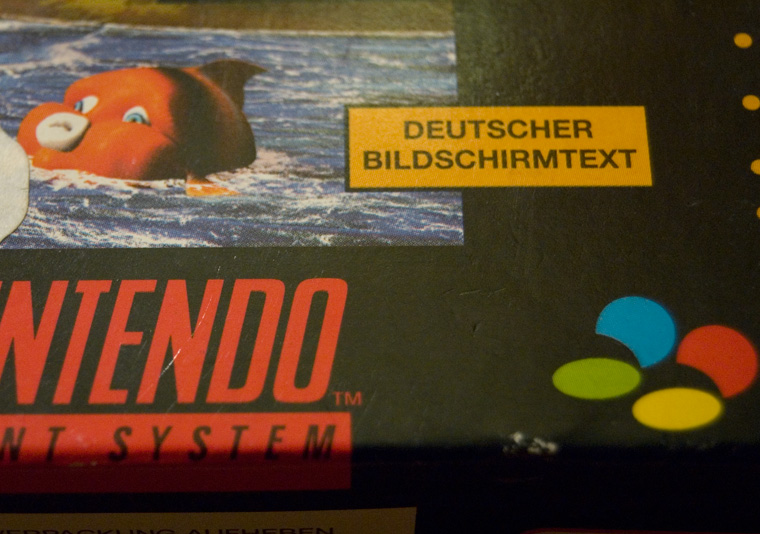
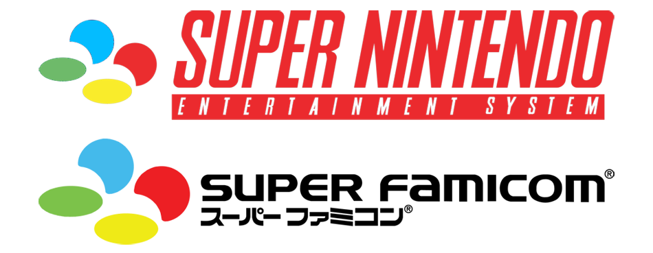
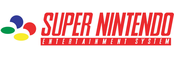
Also, I've noticed that most of the results for the Super Nintendo logo that google finds are wrong. The red strip with Entertainment System on it should have the same width at the Super Nintendo text, with the right hand edge lining up with the top of the O. However most result have the right hand edge lining up with the bottom of the O.
not only that, but the four beans have a wrong color tone as well:
this is the graphic from my short lived replacement OT. the top SNES logo is had the wrong colors initially (also has the wrong bottom bar as you pointed out), I adjusted it by hand to be more like the SFC logo colors below. but they all had the same, light blue shade.
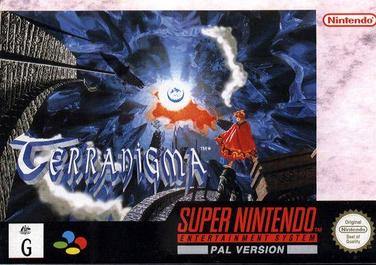
this is the wrong one (green and blue are off):
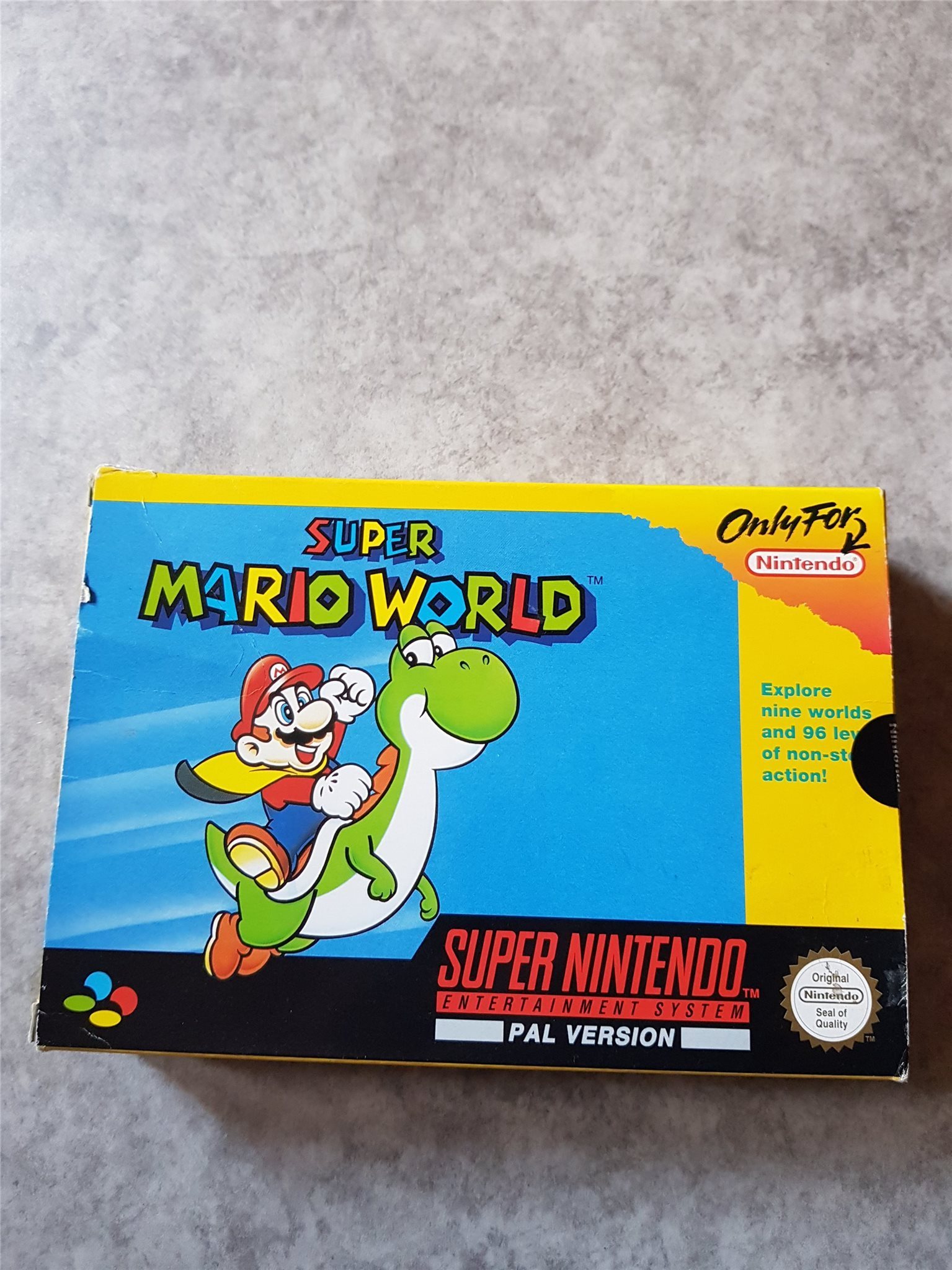
PAL box and SFC box:
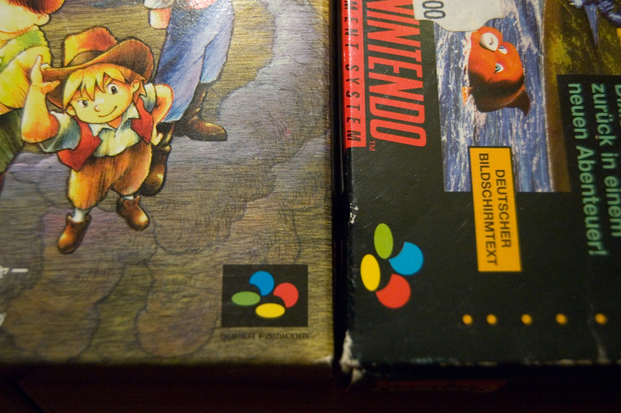
the red bar: