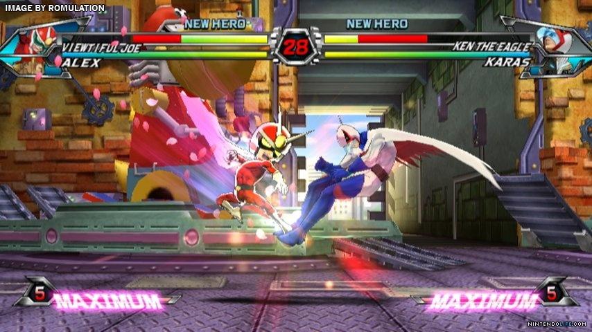
Actually since the TVC community has long since migrated to Dolphin for the netplay and since Frosty Faustings is making the Dolphin setup standard for the tournament (likely so folks can use sticks more readily and since this is how folks are used to it running now) what we play looks more like this.
 https://giant.gfycat.com/SafeGlitteringAngelwingmussel.webm
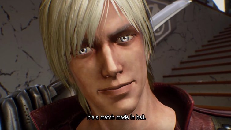
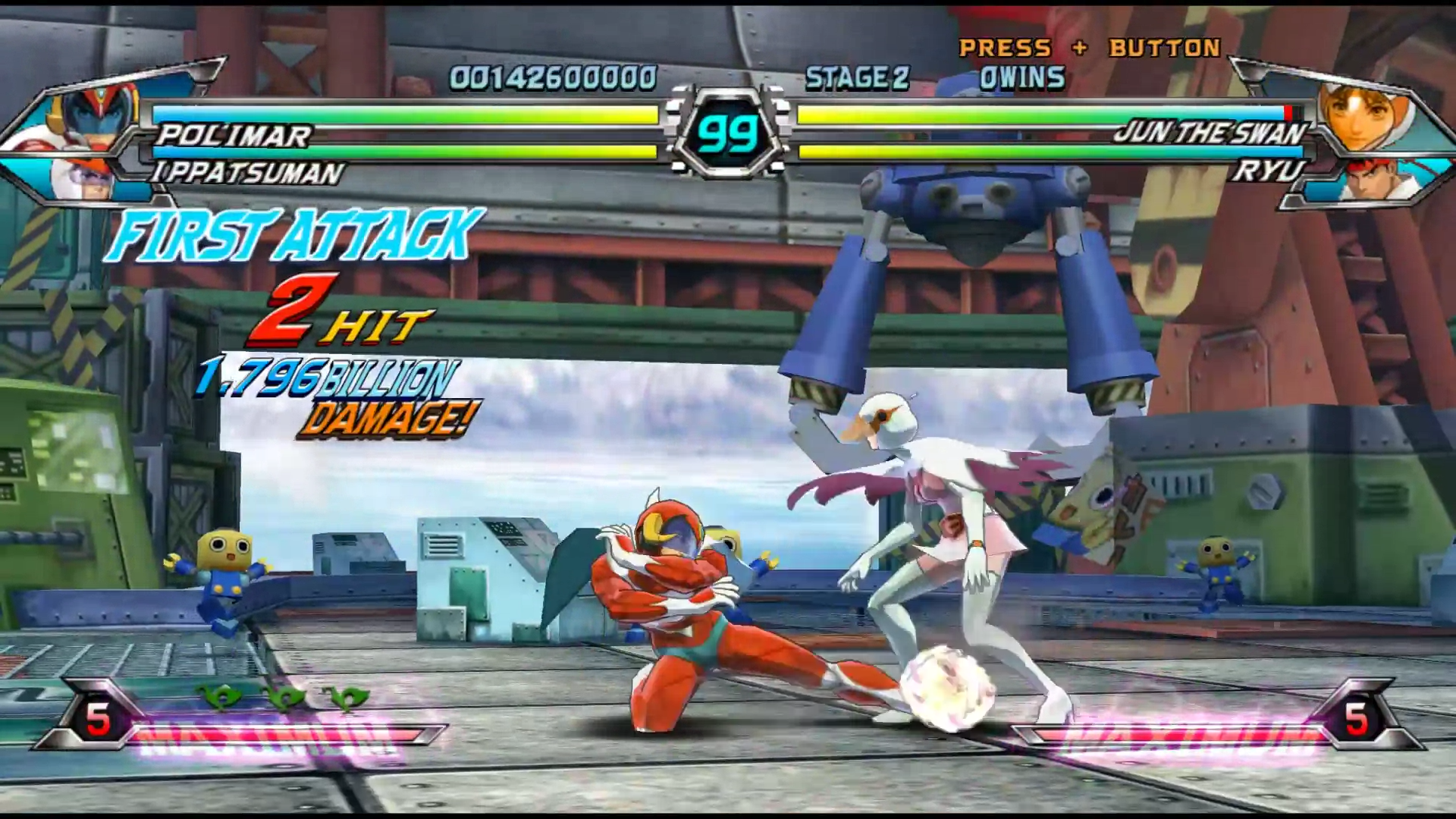
Nothing amazing. Models were still built a bit blocky back in those days, but its not nearly as bad as that still shot above. MVCI has problems, its proportions are definitely a lot worse than TVC and the Chromatic Aberation is hurting it a ton, but overall MVCI doesn't look like a polygonal Wii title. Just a poorly made current one.