• Hey, guest user. Hope you're enjoying NeoGAF! Have you considered registering for an account? Come join us and add your take to the daily discourse.

id Software shows alternative cover arts for DOOM, are 100x better than the default.

BY2K

Membero Americo
Vote here: https://twitter.com/DOOM/status/705424052358418432?lang=en

https://twitter.com/DOOM/status/705422610578980864?lang=en

DOOMVerified account
‏@DOOM
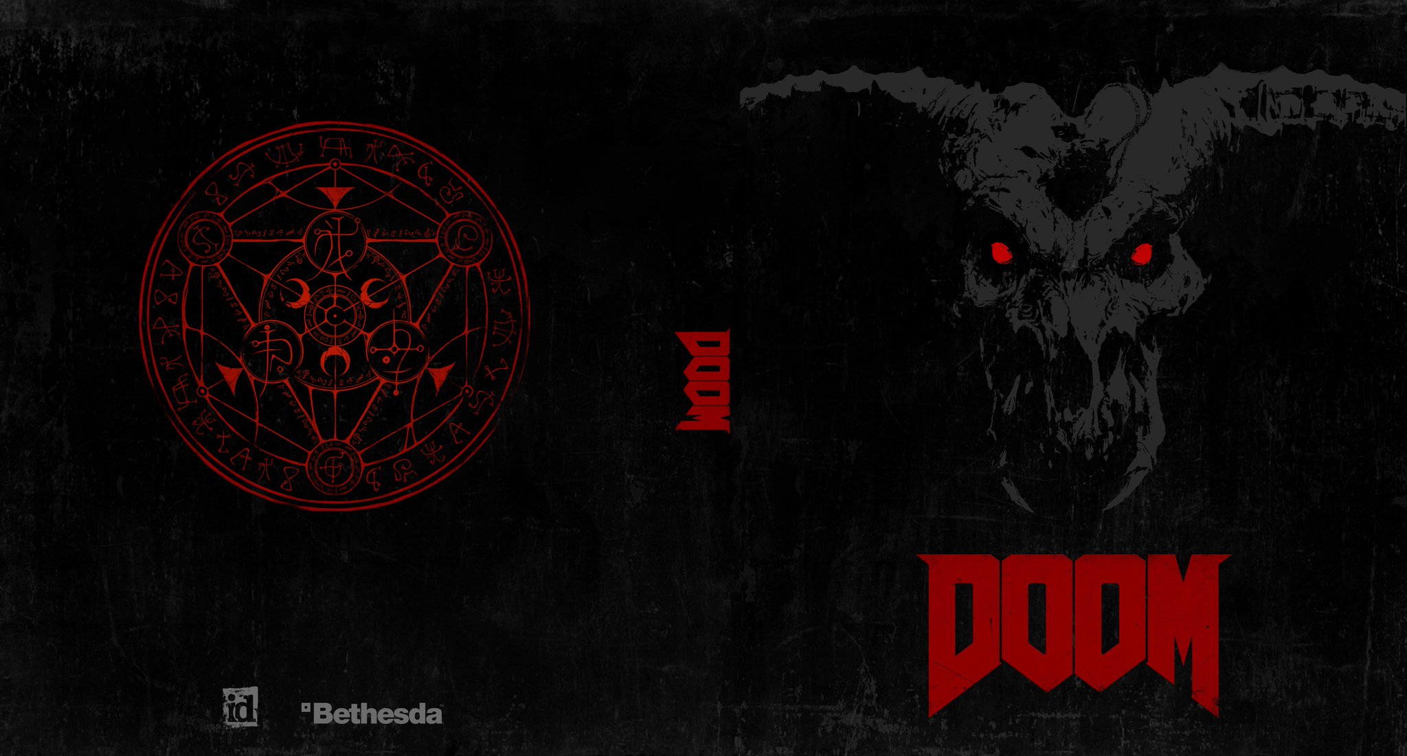
id Software has been working on some #DOOM reverse sleeves. Here’s Option A (Poll Incoming)

CcoqIAVW0AAediE.jpg:large


DOOM ‏@DOOM 3m3 minutes ago
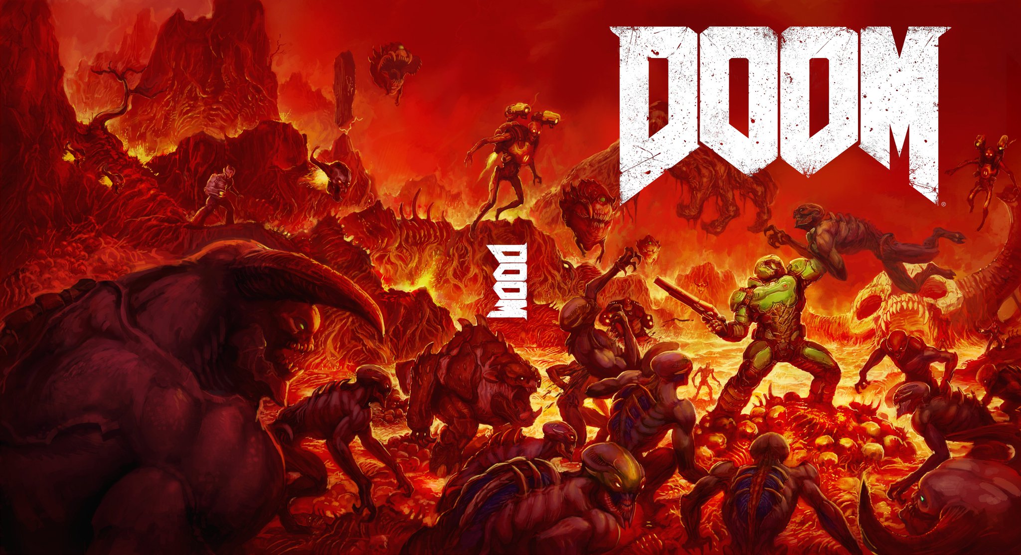
Here’s Option B (Poll incoming) #DOOM

CcoqfRVW8AArVnY.jpg:large
 

Emitan

Member
How could this game stand out on a shelf unless they used the default cover of "generic guy with gun"
 

L~A

Member
#1 should be actual boxart artwork.
#2 as reverse cover.

Throw the "official" one in a fire.
 

scoobs

Member
Holy shit they're both so cool. How could they have decided on that abysmal, god awful looking piece of shit box art when they had these as other options? Blows my god damn mind.

B is the winner, but A is extremely badass.
 

F0rneus

Tears in the rain
Instead, how about you use both of these, and chuck out the bland-ass, utter shit cover you are using right now.
 

Zomba13

Member
Option A is the classy version and B is the throwback. Both are so much better than the actual cover it isn't even funny.
 

Fantastapotamus

Wrong about commas, wrong about everything
I dunno, the first one confuses me. Does the game have shooting and dudes in it? I don't see a gun or a dude on the cover, so I'm not quite sure what this "doom" thing is all about.
Better just buy Call of Duty to be sure.
 

Crayon

Member
Both are great!!! What the fuck!!??

This is a ploy. They're going to switch it to one of these at the last minute, right?
 

Crossing Eden

Hello, my name is Yves Guillemot, Vivendi S.A.'s Employee of the Month!
Too much stuff on B, A is better
It's a clear homage to the original. And remember they're you'd only see the right half on the front. So it'd look more like this:
doomcover.jpg


It's an amazing homage that captures the feel of the original cover in every way, so much so that it's baffling they didn't think of that in the first place compared to that other cover or option A.
 

PMS341

Member
I wish we lived in a world where options like those were default for box art, and the information/branding/legal work was on the reverse side instead.
 

Shig

Strap on your hooker ...
#1 should be actual boxart artwork.
#2 as reverse cover.
I'd say the reverse. I can understand where they'd think A would look a little too subdued and minimalist to customers browsing the shelves. B certainly wouldn't have that problem, though.
 
Top Bottom