German Hops
GAF's Nicest Lunch Thief
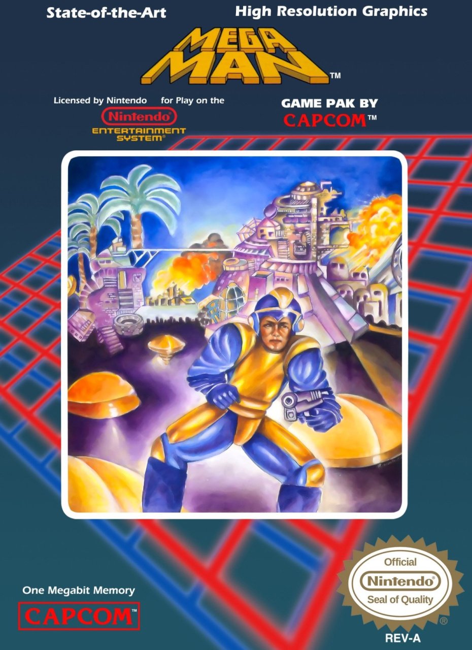
Surely there's nothing worse than this one, right?
It's the actual box art from the North American release of Mega Man on the NES. Is it a monkey? Is it a man?
Does Mega Man actually use a handgun?

So, GAF, my challenge is to present a box art even more ridiculous than the infamous MM1, if you can!
Last edited: