• Hey, guest user. Hope you're enjoying NeoGAF! Have you considered registering for an account? Come join us and add your take to the daily discourse.

show me the absolute WORST character design you can think of

HotHamBoy

Member
Probably worse than Nooj. SE has made some iconic characters over the years, but I can't even imagine what their internal standards look like. Can you imagine the trash designs left on the cutting-room floor?

Fever dreams of belts and zippers....

vendi_transparento8bp1.png


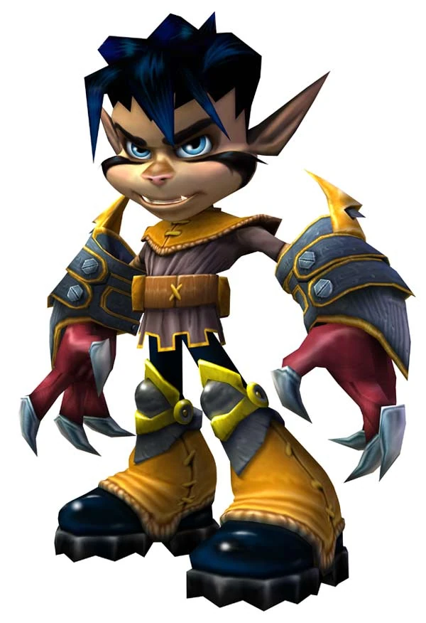
Vendi from Yooka-Laylee.

They nailed that Rare look.
 
Someone actually made a better design for Luso... well, at least he doesn't look that bad in The War of the Lions:

278


Luso and Batman by Netherrealm are the proof that sometimes a good design or character can look worse or the other way around.
 

Kthulhu

Member
How did this:

latest


Become this:

latest


Come on Nintendo.


final_fantasy_15.jpg


I just can't. But If I'm sure I can find worse, I just don't have anything in mind right now.

Nah fam. These are probably some of the best designs to come out of a game Nomura has worked on. FFXIII has far, far worse designs.
 

Pantz

Member
waDcFMy.png


Looks like Fred Durst in a babies body with extra big head. Hated it at first sight. It took gaming down a the ugly path of cel shading. Gross.
 
Literally everyone/thing in Zeno Clash. I really don't mind bad art/graphics in games for the majority of the time but man, Zeno Clash's art is just so baaaaaaad/offensive to me. The character design is like someone going into create a character mode and putting everything on random.

 
Literally everyone/thing in Zeno Clash. I really don't mind bad art/graphics in games for the majority of the time but man, Zeno Clash's art is just so baaaaaaad/offensive to me. The character design is like someone going into create a character mode and putting everything on random.


Wasn't that like the point of the game?
 
Someone actually made a better design for Luso... well, at least he doesn't look that bad in The War of the Lions:

278


Luso and Batman by Netherrealm are the proof that sometimes a good design or character can look worse or the other way around.
By "someone" you mean the exact same artist, right? Didn't Tactics A2 have the same character designer as War of the Lions?
 

Rambler

Member
How did this:

latest


Become this:

latest


Come on Nintendo.


Nah fam. These are probably some of the best designs to come out of a game Nomura has worked on. FFXIII has far, far worse designs.
The Federation Force mechs are embarrassingly bad but at the same time I'll never understand what people see in the Prime 2/3 trooper designs. They look like bootleg Clonetroopers.
 

wuth

Member
blazblues very own makoto squirrelfuck

1415374-makotofight.jpg


her stupid battle outfit is fucking disgusting and there arent a lot of things i hate more on this earth than it. damn it to hell, it makes no fucking sense, and even her little weapons look like a child came up with them

Wow, I forgot about this one. God damn, Blazblue has too many terrible characters.
 
By "someone" you mean the exact same artist, right? Didn't Tactics A2 have the same character designer as War of the Lions?

I really don't know tbh. Art style looks different but that doesn't mean it wasn't made my the same person.

Still you can't deny Luso doesn't look as bad as the first illustration.
 

StoneFox

Member
Code:
[IMG]https://s-media-cache-ak0.pinimg.com/originals/5f/6e/5f/5f6e5fa2841f38adff3b2391f7f76098.jpg[/IMG]

Musashi: Samurai Legend

Just GUESS the artist, it should be obvious :p
 

Kthulhu

Member
The Federation Force mechs are embarrassingly bad but at the same time I'll never understand what people see in the Prime 2/3 trooper designs. They look like bootleg Clonetroopers.

They never needed to be anything more, and somehow Nintendo made them worse.
 
Jak:

latest


the goatee
the mean face
the edge
can't stand this dude, glad the series is dead.

he's the video game version of Fred Durst

fred_durst_2000_01_01.jpg
 
I still dont know if that fucking Barbarian's yellow is supposed to be hair or a helmet or just ugly.

I really don't know tbh. Art style looks different but that doesn't mean it wasn't made my the same person.

Still you can't deny Luso doesn't look as bad as the first illustration.

First is Ryoma Ito, the second is Akihiko Yoshida.

Funny thing? Ryoma can do better, and in the same game:


MartyStu

Member
A lot of actual sinful designs in this thread, but a lot of shitpost too.

I can't decide what is the worst character design I have ever seen in my life, because I normally let myself forget about them, but a recent one that I think is pretty bad from a game I love and play a lot is default Widowmaker, it's definitely the worst in the game.


Thankfully her alternative skins are all pretty good, in the same vein of overly stylish, but much better suited. Noire should just have replaced her default skin IMO.

Widowmaker actually has a pretty good design. The character is supposed to be fan service incarnate along the classic femme fetale mold.

Blizzard just missed the mark somewhat and made her TOO sexy.

I do agree that the Noire skin is superior in every way.
 

Kthulhu

Member
i feel like the other M GF troopers are far worse. they tossed the bright white/blue, heavy armor aesthetic altogether and its awful

Federation_Marines.jpg

Other M's are far worse, but at least everything else kept its iconic design instead of being completely chibified.
 
Top Bottom