Something is objectivily bad is obviously a joke (even though it is). I'm not sure I understand your point about translating the original character designs in game, because they look very close to the artwork I've seen. Also, I didn't criticize XB2 for looking "anime" overall, as that is much too broad. I criticized it for having a generic design and a generic anime trope of having a girl who is also a damn sword.
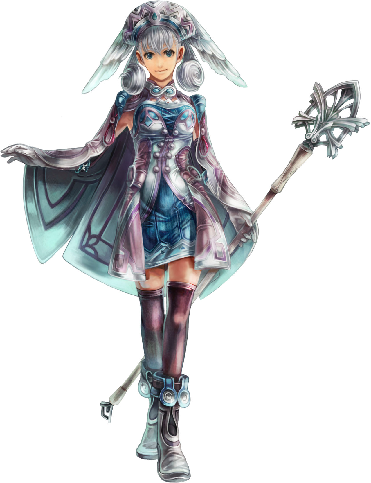
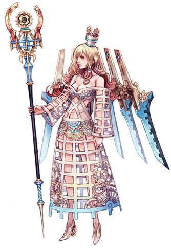
It looks like a paint-by-numbers anime JRPG as opposed to the last two games, which despite having their own design issues in places, managed to create a look that felt very unique and complex yet simple to read. Milia is a great example:
Is she over designed in some places? You could probably argue yes, but really she's constructed of a color palette of about 2-3 colors and your eyes can immediately read what is where through strategic use of how those colors compliment each other. You could easily make a sprite of Milia in an SNES game, working with a limited color palette. If you were to look at a silhouette of Milia, you could still tell it was Milia, which is the ultimate test of a character design. The same goes for most of the cast of Xenoblade, but particularly Milia and Dunban.
Not to mention the fact that those designs looks like nothing else out there. You stick them in a Smash game and they immediately have this look that feels unique to some of the other "anime" styled characters fighting alongside them.
XB2? If you had shown me these designs and said they were for Star Ocean 6, or Tales of Blahblahblah, or Sword Art Online, I would have believed you. There is nothing there that makes it it's own. It's a transparent and shallow attempt to appeal to a broader audience and yet they still went with (and this is very important) ASSLESS FUCKIN CHAPS.