Glass Shark
Banned
.
They might, but hopefully they'll think instead to take pride in every aspect of a game's presentation, including that which may seem most trivial.Yeah, it's really no big deal. One thing at a time. Just glad people are listening. Although I'm sure there are more than a few devs who are doing it through gritted teeth while thinking, ”You people are a bunch of weirdos."
Yeah, it's really no big deal. One thing at a time. Just glad people are listening. Although I'm sure there are more than a few devs who are doing it through gritted teeth while thinking, ”You people are a bunch of weirdos."
Exactly. No one is obligated to like a game. If someone cares enough about your product that they feel compelled to opine on certain elements of it, that's a compliment!A smart development team should be incredibly happy they're selling software on a platform full of engaged, passionate consumers.
")
I appreciate your take (even though I obviously prefer icons with titles), but I'm curious: You really preferred the original Lego World icon? The one with just grass and a river? I ask because that icon was simple to the point you would have no idea what it was without being told beforehand.
An animated gif, showcasing the upgrade in action:
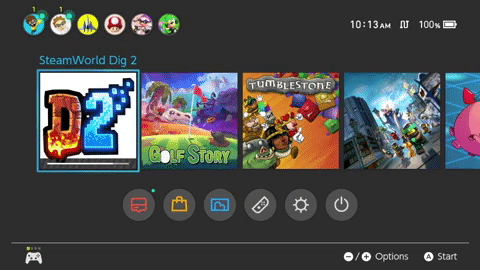
”A few of my coworkers had a hard time not reacting negatively," said Image & Form's Sigurgeirsson of the Reddit threads and Twitter responses to SteamWorld Dig 2's Switch art. ”And what were these people talking about? An icon!? What about the game, a magnificent game that we just spent 15 months making? Talk about style over substance... which wasn't right either, because the style of the game was magnificent too."
What did the original Steamworld Dig 2 icon look like?
E: Found it
Bunch of terrible icons
What did the original Steamworld Dig 2 icon look like?
E: Found it
Bunch of terrible icons
An animated gif, showcasing the upgrade in action:
using the light theme isn't helping
My avatar is art, fit to be framed in the Louvre! :-Onice
So when are you going to update your avatar to something equally appealing?
What's wrong with that Lego icon?! Why is there no logo... They just fixed the Lego Worlds icon and now mess up again with the next game?An animated gif, showcasing the upgrade in action:
They might, but hopefully they'll think instead to take pride in every aspect of a game's presentation, including that which may seem most trivial.
The icon is the first and last thing you see, on booting up and exiting to the home menu. It's the little details that add up to make a game feel like a true labor of love.
No, it's, the devs didn't clearly define their logos according to Nintendo guidelines. Extremely doubtful this thread exists if Snake Pass new icon still had the logo. What even is the original steam world dig 2 icon? It didn't even have an s, so for all you know it's not even the game you're looking for.Again with the "if I don't like how the icon looks the developers aren't taking pride in their game's presentation".
No, it's, the devs didn't clearly define their logos according to Nintendo guidelines. What even is the original steam world dig 2 icon? It didn't even have an s, so for all you know it's not even the game you're looking for.
I'll be buying it because I've been hearing people comparing it favorably to Samus Returns, but the new logo is super inviting. Just wish it had coop.Well I was waiting for them to update it before I buy it but now I am hooked on golf story so I guess I can wait for a little while longer
I'll be buying it because I've been hearing people comparing it favorably to Samus Returns, but the new logo is super inviting. Just wish it had coop.
This is fantastic, haha
Now I really want them to do this. I would laugh myself to tears if they did.
nice
So when are you going to update your avatar to something equally appealing?
Switch owners have got to be the most pedantic motherfuckers lmao.
The PS4 has loads of shit icons and there hasnt been 100 threads on those.
At least the PS4 displayed the title next to the tile on the library screen. The recently played list has the same issue but the Switch's one is throughout.The PS4 has loads of shit icons and there hasnt been 100 threads on those.
The PS4 has loads of shit icons and there hasnt been 100 threads on those.
Must be a massive update to be out next year
New levels for Snake Pass would be great. Lots of potential.Fingers crossed for more levels!
Anyone know if Kingdom New Lands updated its icon yet, or is it still just the yellow crown on a black square? They said they were going to fix it, they just didn't say when, and I don't know if it's already happened.
Sounds good. I definitely want to pick up Kingdom: New Lands when the fixed icon launches, presumably with the performance patch. It looks stunning. The atmosphere at night during a storm with the rain ripples on the water is just dazzling. It's not often I see a "retro-style" game look and feel so evocative.I don't believe so. They have a lot of work to do regarding the game's performance and my guess is the new icon + performance fixes will be included in the same patch.
Absolutely horrifying.Imagine Mario Kart actually having the icon we saw during the first Switch menu reveal.
Imagine Mario Kart actually having the icon we saw during the first Switch menu reveal.
Still way better than Stardew Valleys.Imagine Mario Kart actually having the icon we saw during the first Switch menu reveal.
This gif is the equivalent of popping bubble wrap.An animated gif, showcasing the upgrade in action:
Switch owners have got to be the most pedantic motherfuckers lmao.
The PS4 has loads of shit icons and there hasnt been 100 threads on those.
I know, right? It feels soooooo gooooood!This gif is the equivalent of popping bubble wrap.
