Meccanical
Member
I always thought those were pine cones.
But yeah they are apparently intercoms.
But yeah they are apparently intercoms.

While I appreciate the art as good art, it doesn't click with me. It doesn't make want to play the game, there's just something about it which I can't put my finger on.
You mean the paper filter? That's kind of essential to the artstyle. Like, it's a completely different look without it. The whole point is that it looks like an old Japanese painting. You remove the filter and it just looks like a stylised 3D environment, nothing special.that fuzzy smear all over Okami that does not allow me to see the art.

You mean the paper filter? That's kind of essential to the artstyle. Like, it's a completely different look without it. The whole point is that it looks like an old Japanese painting. You remove the filter and it just looks like a stylised 3D environment, nothing special.
Would be like wanting to turn off the dynamic lighting in Doom 3 so you could better appreciate the art. Or removing the colour red from Mario.
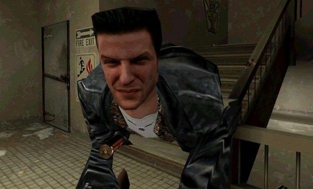
Max Payne's face in Max Payne 1.

For some reason I HATED Crysis 2's visuals. I played the beta and did not like the way the game looked.
Can't really say why. I think it was the brightness maybe... something like that.
Didn't like Blacklight: Tango Downs art style either. It was super bland and gray, and everything was made really grainy and the whole interference/blue screen of death/static effects they had when taking damage were annoying.

Final Fantasy 13
Anime-like characters, anime-like story, anime-like dialogue. Ultra realistic graphics. That game just looked and felt wrong.

Absolutely not. The "paper filter" just makes the whole game look blurry, not like paper. And the idea that the art is nothing special without the paper filter is quite silly.
I always thought those were pine cones.
But yeah they are apparently intercoms.
Anything designed by Nomura.
I don't think it's fair to just label XIII's plot as "anime." There's a lot of anime with mature, competent stories intended for older audiences. XIII's story is just bad. Were you trying to suggest that the plot was childish and the visuals should have been more kiddy to match that? I personally don't the think those gorgeous graphics should have accommodated that mess of a story at all. The story should have just been better to be on the same caliber as the visuals.
Specifically, what bothered me with this one was Guybrush's hair. Just what the heck did they do to it? The way it comes off of his forehead looks so unnatural that it almost comes off as a bad wig - the original graphics didn't have this problem at all.
It's like they set out to emulate Curse of Monkey Island's fucking incredible art style and somehow managed to fail in every way.
Final Fantasy 13
Anime-like characters, anime-like story, anime-like dialogue. Ultra realistic graphics. That game just looked and felt wrong.
To be honest, I don't think I'd hate 13 so much if it looked like one of the recent "Tales of" games.
Team Nora in FFXIII look really stupid, and not fitting the world compared to their peers.
Battlefield 3 hands down.
The game doesn't really have a style. While it has a beefy engine, the style of the game is bland beyond anything. It's so sterile and completely forgettable.
Star Ocean 4's Edge:


The biggest problem with Crysis is the hideous sickly-looking color filter.Crysis 2.
Hold on, hold on. Don't lynch me yet. I am perfectly aware of how excellent it is technically, but 2 things grate to a degree that ends up with me not liking the visuals.
1. The insistence on having to use a post process AA filter if you want to use DX11. Fuck that noise. And specifically fuck its ability to ruin any high res texture.
2. The overall picture quality. This is super hard to put my finger on. Look at the below:
I think it's the way in which things lose their detail in the distance. It could be an LOD issue and partly be related to the FXAA I've applied. But it's grainy, smudgy and just looks wrong.
Overall I prefer the look of Crysis. The image is more... consistent? I dunno:
The biggest problem with Crysis is the hideous sickly-looking color filter.
Almost ruins the game.
Color filters are ruining gaming.
Specifically, what bothered me with this one was Guybrush's hair. Just what the heck did they do to it? The way it comes off of his forehead looks so unnatural that it almost comes off as a bad wig - the original graphics didn't have this problem at all.
Monkey Island 2: LeChuck's Revenge Special Edition was better about this, fortunately, but admittedly I've been playing through that with the original graphics instead.


I can't believe I ever got used to Falco's enlargened forehead, which he's sported since Assault. Thing was borked over!
The art style of Star Fox Command was awful.
Any hair in UE3.
The dudebros in Gears of War. Something about their proportions just creeps me out.
^ UE3 game and with best hair in any video game/engine ever.
That's just the bulky armor they're wearing. They look like normal people without it.
http://www.lo-ping.org/wp-content/uploads/2011/09/max_payne_face1.jpg
Max Payne's face in Max Payne 1.

Max Payne's face in Max Payne 1.
This topic was made for Oblivion.