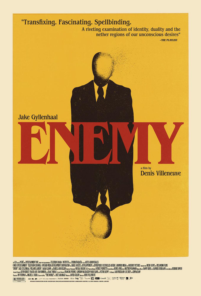
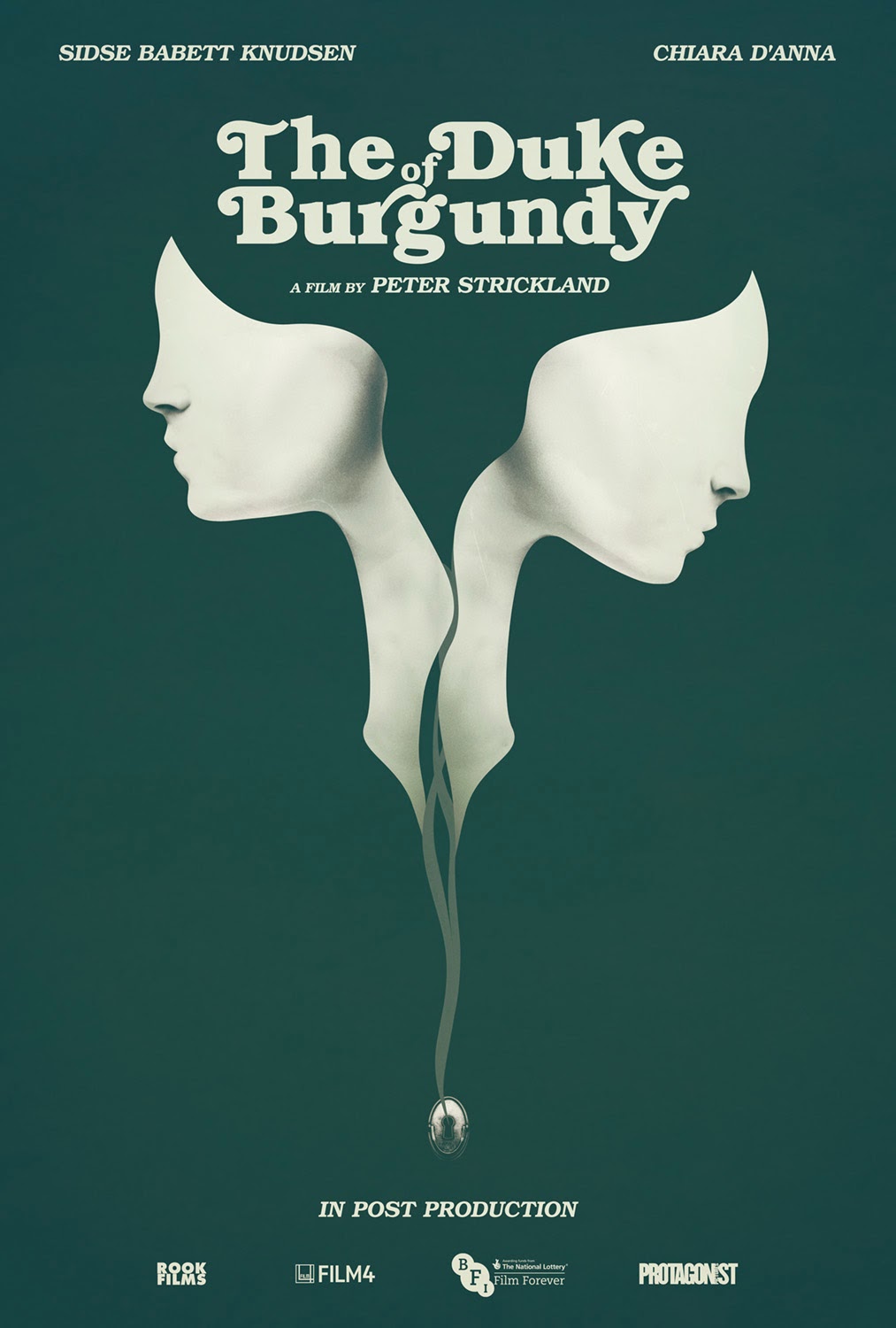
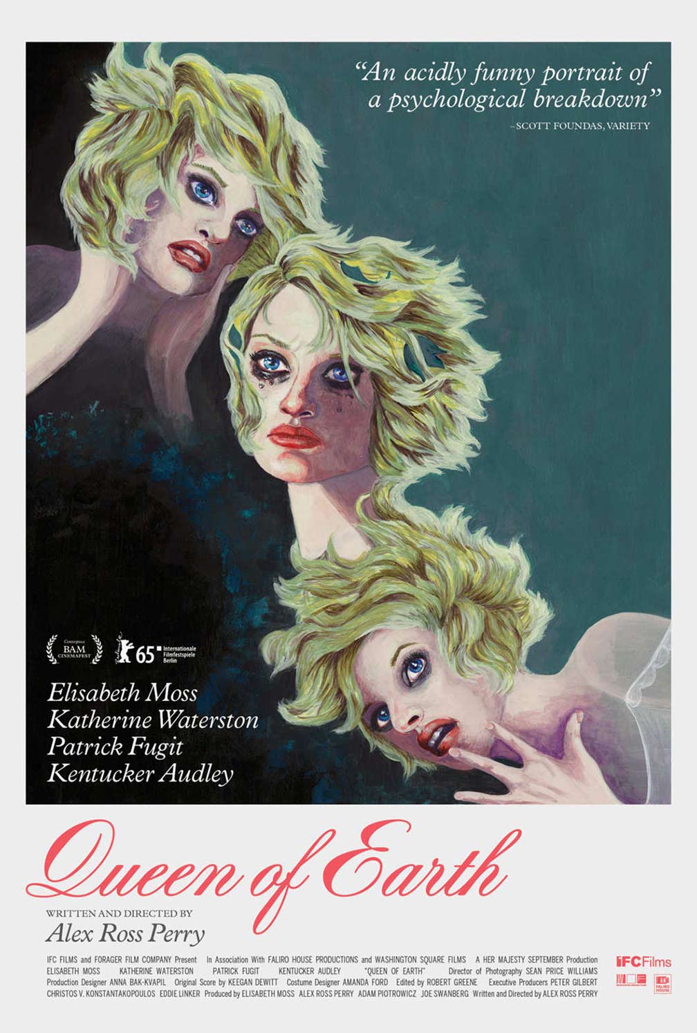
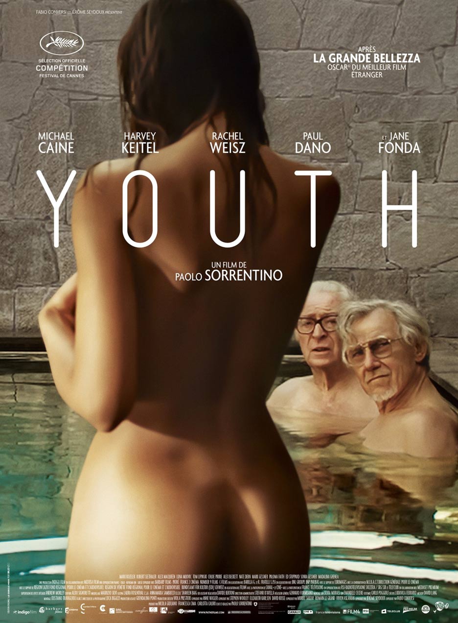
• Hey, guest user. Hope you're enjoying NeoGAF! Have you considered registering for an account? Come join us and add your take to the daily discourse.

Why do so many movie posters look like complete shit nowadays?

Status
Not open for further replies.

PSYGN

Member
The poster you disliked is the one that is probably more engaging and exciting to most people with bright, contrasting colors and actual people instead of a drawing. The ones you liked are great but are more on the artsy side and seem like something you'd hang on the wall of your home. I think you're exaggerating with the "complete shit" part of it, there's nothing really wrong with them, they just aren't tickling your artistic sensibilities.
 

mdubs

Banned
t1_Upload.jpg


Never forget.

But for real the episode 7 one you said is bad is really cool, plus it continues the artistic style of the other 6 movies
 

xxracerxx

Don't worry, I'll vouch for them.
Ok, my statement that all posters are shitty was a little bit exaggerated, you will probably find a piece of gold for every turd I guess. When I said 10 years ago I didn't mean exactly 10 years. What I meant was that a long time ago there was a shift from good to great to meh. Remeber going to the video store and rent a vhs, all you had was the cover(basically a poster) if you didn't know anything about the movie and oh man so many bad movies had good looking covers.

You are letting nostalgia cloud your memory of movie posters.
 

a916

Member
You are letting nostalgia cloud your memory of movie posters.

This. It's easy to forget the trash because they rarely are ever memorable... you think you'll remember Egypt: Gods Among Us 10 years later if it flops? Okay, maybe OP would because they might be like "I made a thread..." but still.
 
Even bad movies have great posters!

I'm this close to buying the Enemy US blu ray just because of that cover. I'll buy the US blu ray and replace the UK cover with it.

This is what UK gets for the cover, yuck.
118758_front.jpg


I remember an article of why DVD/Blu Ray covers are worse than the posters or why they don't use them, but it still sucks.

Actually now that I've found out that there's a (german) Steelbook for Enemy that has the cool silhuoette masking.
81r%2BN8juYRL._SX522_.jpg
 
I seem to remember seeing a biopic about the guy who did a lot of the old paintings they used as posters wherein it was said that the studios did studies and found out most movie-goers don't pay a sufficient amount of attention to anything but the name of the movie on the poster to bother putting any real effort into it.

I remember, at the time, wondering whether or not their methodology for the study was sound. I mean, I'm sure if you just ask people about whether or not movie poster aesthetics influence their likelihood of seeing a film they're going to say "No", but if that's all they did it's a pretty shite way to conduct the study.
 

n0razi

Member
The artsy star wars one is terrible at its job which is to be a marketing tool... yes it would look 100x better than the real one on my bedroom wall but thats not the point of a promotional poster.
 
Because they are an archaic tool of marketing. Less money allocated to that. Less artists dedicated to that. Probably a bunch of studios who monopolize the market with cheap labor end up with everything.
 
Even bad movies have great posters!


I'm this close to buying the Enemy US blu ray just because of that cover. I'll buy the US blu ray and replace the UK cover with it.

This is what UK gets for the cover, yuck.
118758_front.jpg


I remember an article of why DVD/Blu Ray covers are worse than the posters or why they don't use them, but it still sucks.

Actually now that I've found out that there's a (german) Steelbook for Enemy that has the cool silhuoette masking.
81r%2BN8juYRL._SX522_.jpg
Do you have a link to the article?
 

The Beard

Member
What do you consider the movie poster heyday? Surely that era had shitty posters too.

We still have great posters today, you just happened to cherry pick a shitty Feb throwaway movie that no one's ever heard of as your example. Your other example of a "bad" poster is just a throwback to the first Star Wars posters from the 70's & 80's.
 

DOWN

Banned
Strictly talking blockbusters, The Hunger Games had a lot of bad CGI posters but then blew me away with the minimalist and subtly branded first poster made to look like propaganda from the setting:

Em-Chamas-promo-22fev2013-02.jpg


My favorite modern poster is probably:

Bs1y0GZCEAEQDXA.jpg
 
Do you have a link to the article?
I'll keep on searching for that one, but here's a bit of the reasoning about being smaller and consumer already being familiar with material:

http://www.agonybooth.com/agonizer/Blu_Ray_Cover_Art_Depressingly_Bad.aspx

  • Over the years, I think we’ve all become desensitized to how bad most DVD cover artwork is compared to the original movie posters. Sure, most DVD covers are aimed at the lowest common denominator, but at least it’s easy to see the reasoning behind them: For one thing, a DVD cover is much smaller than a movie poster hanging in a theater lobby, so visual elements have to be bigger to stand out—hence, the usual “giant floating heads” you see on most DVDs.

    And whereas a movie poster’s job is to build up intrigue and curiosity about an upcoming film, a DVD cover is mostly there to remind you of what you liked (or at least remembered) when you saw the movie in theaters. Which is why a visual/story element that was only hinted at on the poster can sometimes become front and center on the DVD.

    With the advent of Blu-ray, we’re now seeing a wide array of films getting rereleased in the new format. But instead of simply reusing the (already substandard) DVD art, these releases often take things to a whole new level of suck, with lazy artwork that seems to have been slapped together in less than a day by unpaid interns.
 
It's because DVD covers sit on a shelf and try to hook passers by in with the characters or actors they remember from seeing the movie in the cinema. If you go too arty and obscure then they won't recognise it at a passing glance
I'll keep on searching for that one, but here's a bit of the reasoning about being smaller and consumer already being familiar with material:

http://www.agonybooth.com/agonizer/Blu_Ray_Cover_Art_Depressingly_Bad.aspx

  • Over the years, I think we’ve all become desensitized to how bad most DVD cover artwork is compared to the original movie posters. Sure, most DVD covers are aimed at the lowest common denominator, but at least it’s easy to see the reasoning behind them: For one thing, a DVD cover is much smaller than a movie poster hanging in a theater lobby, so visual elements have to be bigger to stand out—hence, the usual “giant floating heads” you see on most DVDs.

    And whereas a movie poster’s job is to build up intrigue and curiosity about an upcoming film, a DVD cover is mostly there to remind you of what you liked (or at least remembered) when you saw the movie in theaters. Which is why a visual/story element that was only hinted at on the poster can sometimes become front and center on the DVD.

    With the advent of Blu-ray, we’re now seeing a wide array of films getting rereleased in the new format. But instead of simply reusing the (already substandard) DVD art, these releases often take things to a whole new level of suck, with lazy artwork that seems to have been slapped together in less than a day by unpaid interns.
Interesting. Thanks.
 
Cherry picking the good posters from the last half century of film will definitely make the last few years of EVERY poster you've seen seem shitty.
It's naive to pretend shitty posters didn't exist because the ones you're used to seeing as representations of old films are good. The fact is that like film and music, people picked out the good shit and buried the bad shit. So the past seems golden.

I personally remember movie posters from about the last 20+ years or so and the quality has remained the same, which is 1 out of every 10 or so are actually more artistic and eye pleasing than the rest.
At the end of the day they're just marketing. They're not meant to be art, that's not why they exist. Thankfully some people try to mix the two and succeed.
 

Takuan

Member
It's probably because they aren't all that important. I've noticed that a lot of them are very same-y now (do the same few agencies handle all movie posters?), but a poster has never sold me on a movie, it's just made me aware of it. That's probably their primary objective.
 

Anth0ny

Member
lots of posters today are really poorly photoshopped. shitty photos of each actor clearly photographed by themselves just edited together into a bad, sterile, fake poster. less stylish, handdrawn posters like we saw back in the day.
 

WillyFive

Member
Posters are there to advertise a movie. Making it artsy or harder to tell what the movie is like or about is a bad thing for a movie poster to do, despite how good looking they could be.
 

RobotHaus

Unconfirmed Member
Posters are there to advertise a movie. Making it artsy or harder to tell what the movie is like or about is a bad thing for a movie poster to do, despite how good looking they could be.

I disagree. While true it helps for it to show what it is, I feel as though it's more important to stand out. If it draws the attention of a moviegoer and entices them to further invest their interest from curiosity then the end result should be what the designer desired.
 
I don't really have the time right now, but I don't agree with this generalisation. There are some amazing posters recently. I'll just list 10 movie posters off from 2015 for now.

The Lobster
lobster.jpg

Entertainment
wP4ELdY.jpg

Theeb
THEEB-poster.jpg

It Follows
it-follows2.jpg

The Forbidden Room
ForbiddenClara2.jpg

Duke Of Burgundy
DOB_FINAL.jpg

Queen Of Earth
queen-of-earth-2.jpg

Macbeth
20923019878-9486c9beac-o.jpg

Ex Machina

Trainwreck

The Tale Of Princess Kaguya
tale-of-princess-kaguya-blu-ray.jpg

The Martian
33_40414_themartian_v2.jpg

Red Army
red_army_ver2_xlg.jpg

Sicario
sicario-poster.JPG

Mad Max Fury Road


This actual goes along with something I've been thinking. I actually think posters are having a resurgence.

Here's four more that immediately came to mind:

youth-poster.jpg

youth-movie-poster.jpg

as_above_so_below_FridayONeSheet.jpg

thehateful8-teaser-poster.jpeg


But yes, the industry is still dominated by shitty posters. But I disagree when people say they are irrelevant. I see posters more than any other marketing for a movie when I check rotten tomatoes, imdb, or letterboxd. They all have the poster next to the name of the movie, and I absolutely judge by its cover.
 
Film posters aren't any worse than they have been for the past few decades. There are good ones and there are bad ones. Same as always. It's just that the more iconic ones float to the top in your memory. People have already posted some good ones, but I'll add:

e5Whbns.jpg


2uQ6TQP.jpg


And for what it's worth, I think the IMAX Star Wars poster in the OP ain't any better than the regular theatrical one. Just because it's illustrated doesn't mean it's good. It honestly looks like just a decent fan poster to me.
 

retroman

Member
I was browsing new movie posters on IMDb and was instantly reminded of this thread.

xcell_ver4_xlg-616x890.jpg.pagespeed.ic.IeNwcJsOPM.jpg


satanic.jpg


That has to be the most disinterested looking demon ever.
 

SeanC

Member
Yeah, most big studio movies are going to just slap something together to grab attention, not actually be artistic.

I think if you have a filmmaker doing their thing, they'll probably have a say in the artwork that reflects it. It's about oversight and they'd have input. Something that's all about producers and a check and left to a marketing dept. isn't going to have anything going for it other than try to be flashy.
 
Status
Not open for further replies.
Top Bottom