• Hey, guest user. Hope you're enjoying NeoGAF! Have you considered registering for an account? Come join us and add your take to the daily discourse.

Why the characters of Nintendo’s ARMS are designed to last

Cerium

Member
A thoughtful article about character design and simplicity.

Mario, Pac-Man, Link, Megaman, Scorpion, Sub-Zero, and Ryu are all iconic characters. Not Ubisoft iconic, but designs that have actually withstood the test of time, and still remain in the gaming public’s collective consciousness all these years later. A large part of why these characters have become such familiar faces is their visual simplicity and brilliant use of color, which makes it easy to conjure up accurate mental images of them. For that reason, among others, you can go ahead and add the cast of Nintendo’s ARMS to that list.
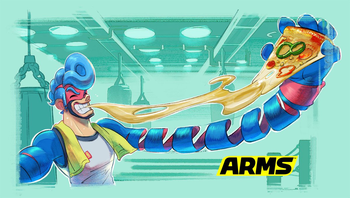
ARMS continues that trend, with little in the way of excessive or pointless detail. Each character has a gimmick, with an aspect of that gimmick reflected in their ARMS, and to a lesser extent in their secondary traits. Spring Man is a boxer with spring arms, but the trait also manifests itself in his spring shaped pompador, and his ability to bounce back from a beating, as seen by his powered up critical state in combat. Minmin has a Chinese theme going on, her arms are a reference to Dragon Noodles, and her hair is a bunch of noodles that flow from beneath her hat, which is an overturned ramen bowl. Naturally, she uses flying martial arts kicks to defend herself in the air, as a proper stereotypical Chinese fighter should.

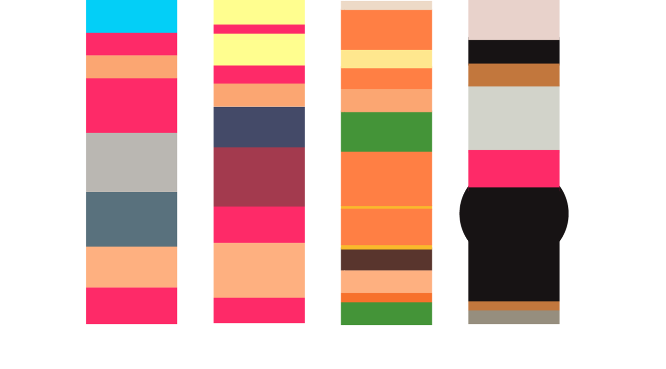
Boiling the designs down further, we can see the use of color is fantastic. It’s really reminiscent of the way Street Fighter II used simple color schemes to distinguish its characters. To highlight this, I stole the idea of Ashley Browning’s minimalist Street Fighter II characters, and applied it to a few members of the ARMS cast.
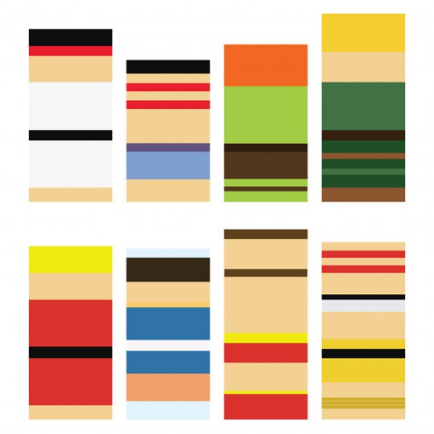
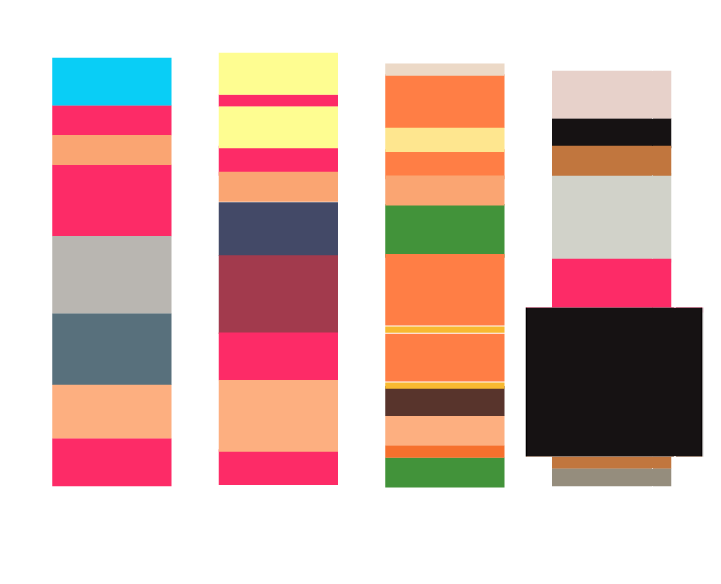
street-fighter-characters-minimalist-impressions.jpg

Ashley Browning’s minimalist treatment of Street Fighter II’s roster show how well designed they were.

arms-spring-man-ribbon-girl-minmin-twintelle.png

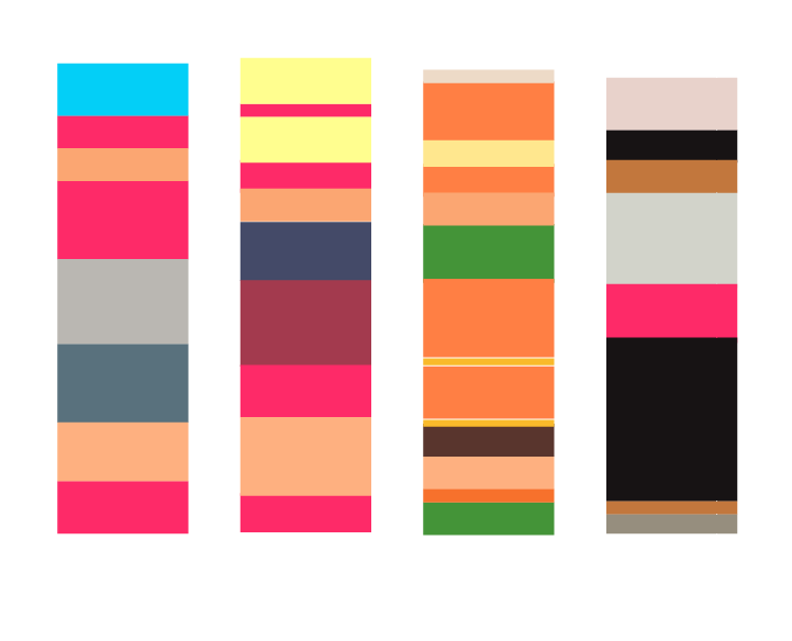
Four of the ARMS cast in a similar style, done by yours truly. Can you identify the characters?
I’m not an artist by any stretch of the imagination, so the ARMS cast could be represented better, but I feel they hold up amazingly well. I can easily identify any of the characters on the roster when reduced to rectangles of color, even without their defining ARMS. It just goes to show that Nintendo has smashed another one out of the park with the ARMS character designs.
 

Alienous

Member
Those minimalist treatments aren't very compelling.

Without the context of "these are Arms characters" I'd never make the connection.
 

Jawmuncher

Member
I know that's ribbon girl, but I feel like it's off for some reason. I dunno, like it doesn't gel with the rest. Might just be me though.
 

Papercuts

fired zero bullets in the orphanage.
Those minimalist treatments aren't very compelling.

Without the context of "these are Arms characters" I'd never make the connection.

Yeah, you could see a lot of the SF ones and connect it with no context but I wouldn't be able to do the same with the arms versions. I can barely tell that is Twintelle even with context.
 

Alienous

Member
to be fair the same could be said for most of the street fighter ones except maybe Ryu and Ken

Nah. Chun-Li and Zangief are pretty recognizable too.

I'm sure the popularity of the characters has something to do with it, but I don't really see how the ARMS characters are doing anything special with the colours. You could probably do the same for Overwatch, or any game with a cast of characters - colour variety is a common thing.
 

grandjedi6

Master of the Google Search
Pretty sure trying to reuse that minimalist example actually disproved the article's point. You can't tell any of them apart without directly comparing them to a character sheet and I doubt Arms does any better than most cartoony games.
 

Village

Member
The minimalism thing doesn't really make sense, because the reason people also remember characters because the thing they are in are good. There are a lot of outside factors to characters lasting outside of good design, although good design is definitely apart of it. It also doesn't work because a lot of people... can't remember most SF2 characters except for the more popular ones. Also there things like Tekken, who have changing character designs who remains extremely popular. What about mortal kombat who regularly does the same damn thing.

Not to be rude, but this feels like when you go to art school and someone explains to you what a silhouette is, and then because you new you think that's the greatest thing to ever happen and think all good character designs have goo silhouette, and a lot of times they don't.

Character design is a complicated bag that has a lot of elements outside of their character design that contributes to how the character is recived.

Like people just not liking arms and not remembering the characters at all, and that's it.

Like what would those iconic SF designs mean, if SF was bad and no one cared. Or if it were another time and place , and no one was into the designs. Its very much a time and place kind of thing.
 
well yeah
any good character design will use applied design theories including colour theory

theres a much better article involving the Dota2 characters
 

13ruce

Banned
What does not ubisoft iconic even mean lol? Mario and Link are more popular than Ezio and Rayman... And Sam Fisher is beaten by Snake.

Anyway yeah Twintelle, helix and Min Min and that robo cop will last.
 

Marcel

Member
Comparing Street Fighter II to ARMS isn't even fair. The former is a touchstone for fighting game character design while the latter is a fleeting spectacle.
 

lupinko

Member
Hey wait a minute, Ubi maybe Ubiquality with their sandbox games but Rayman is genuinely good and his design is pretty iconic.
 

watershed

Banned
Nice article. The character designs in ARMS are fantastic for sure, but let's see if the game is popular enough to even receive a sequel or character in Smash.
 
Those minimalist treatments aren't very compelling.

Without the context of "these are Arms characters" I'd never make the connection.

Yup.

As much as I like Arms this is very reaching, I don't think he has a case here. Arms character design is great, but only time will tell if these colors are going to stick with us, not some weird abitrary method (reducing them to minimalistic rectangles).
 

EulaCapra

Member
I came here to this thread just to trash Spring Man's uninspired design who really needs to step aside and let at least Ribbon Girl be the true face of ARMS (ahem, Smash Bros). Most of the rest of the cast is great.

Welp... that is all.
 

Village

Member
Comparing Street Fighter II to ARMS isn't even fair. The former is a touchstone for fighting game character design while the latter is a fleeting spectacle.

It also came out at a time where designs had to be more simplistic, and it was again basically the genisis of what modern fighting games are.

There are more examples of complicated examples like Tekken or MK who are also around and more popular than SF, who don't for the most part have simplistic designs or color pallets and have various outfits.

Varying outfits in a modern day and age is also another thing that makes this complicated,
 

Oddish1

Member
What does not ubisoft iconic even mean lol? Mario and Link are more popular than Ezio and Rayman... And Sam Fisher is beaten by Snake.

Anyway yeah Twintelle, helix and Min Min and that robo cop will last.

It's a joke about how Ubisoft will call things iconic when they aren't for marketing purposes.
 

Crayon

Member
I find the characters in Arms to look really creepy. They look like they've had both arms amputated and it's creepy to me.

It's worse. They are genetically engineered to be born with no arms. Right into the arms
ARMS
of the blood sport entertainment industry where they are dependent on these corporate sponsored prosthetics.
 
I find the characters in Arms to look really creepy. They look like they've had both arms amputated and it's creepy to me.
Glad it's not just me.

ARMS characters are not iconic at all, I have no idea what the author is talking about, let alone Mario or Kirby iconic. It's not even Splatoon iconic which is meme-y and kinda adorable in a retro kinda way.
 

HeelPower

Member
I dont think they will be as iconic ,because the "arms" themselves look pretty fucking weird. I doubt everyone likes how the stretchy arms look.
 

Jubenhimer

Member
I'll admit, when I first saw Spring Man and Ribbon Girl in action when ARMS was first revealed, the designs, Spring Man especially looked like they just walked off the NES/Famicom era. But not in a dated "product of the times" way, but more in a timeless "it's like these characters have always been with us" way. I think that feeling is a testament to how well designed these characters are.
 

LotusHD

Banned
I don't think the ARMS look creepy at all (Though amusingly Twintelle is my favorite design), but as for being iconic, guess we'll see.

Spring Man in particular I'll agree with the whole "He looks timeless" look.
 

ASIS

Member
Yeah the designs are good. They have a strong first impression. Iconic, though? I don't know about that.
 
Top Bottom