greycolumbus
The success of others absolutely infuriates me.
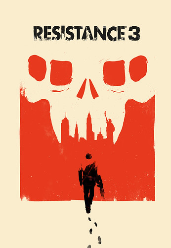
The Capelli alt is incredible. I would have much preferred it honestly. I think it would have balanced out all of the ugly logos on the cover.
Enosh said:I wonder where they will slap the ugly, unremovable big round PSN logo on the EU cover like they fucking always do -.-
His question was where.Xater said:Didn't you just answer your own question? Of course they will, that is how SCEE handles their fucking PSN branding.
I love this cover. Good job Olly Moss and IG! Fight these shitty generic render covers.
Stop being so awesome.jstevenson said:I will inquire about a cleaner in-lay version in case you want to reverse it. we'll see where we can go with it
The_Darkest_Red said:His question was where.
AWESOME.jstevenson said:I will inquire about a cleaner in-lay version in case you want to reverse it. we'll see where we can go with it
jstevenson said:I will inquire about a cleaner in-lay version in case you want to reverse it. we'll see where we can go with it
 SCEE always ruins game covers with the purple zit. It'd be nice to have a clean version on the other side that doesn't have that thing on it
 jstevenson said:I will inquire about a cleaner in-lay version in case you want to reverse it. we'll see where we can go with it
jstevenson said:I will inquire about a cleaner in-lay version in case you want to reverse it. we'll see where we can go with it
jstevenson said:I will inquire about a cleaner in-lay version in case you want to reverse it. we'll see where we can go with it
So good! I hope they give out posters at PAX.NotTheGuyYouKill said:Very awesome. I love it, though this image is my favourite:

I'll print this out and slip it in the front... Capelli being there makes it so much cooler.
But I love the art work, it's super-classy... I wish more games would do stuff like this.
Murkas said:Europe gets a shitty black text white background spine as usual :/
Japan has the same thing. I wonder why. No respect for the spine .Murkas said:Europe gets a shitty black text white background spine as usual :/
Yeah, that's kind of the feeling I have too. I think the better option would be to do some bombastic "shoot aliens with yer guns!" render on the front because that's gonna be what lures new people in, then put an alternate cover with this on the flipside, sans all the logo diarrhea, for those who want a more arty touch.FTH said:That to me looks like a product that is very hard to market. I personally don't like it over the previous covers, but whatever. It tries to be minimalist and artistic, yet there are several extraneous product promos placed over the actual work. As a poster great, but not a boxart for a videogame.

revolverjgw said:Why is this? I feel like crying every time I see a picture of a European PS3 game collection. It looks so bland and depressing.
K yeah I'm getting this printed.V_Ben said:Olly Moss! OLLY MOSS! I want it framed, I want it now. Oh my goodness.
(Link to a 8300X12000 version!)
Shig said:Yeah, that's kind of the feeling I have too. I think the better option would be to do some bombastic "shoot aliens with yer guns!" render on the front because that's gonna be what lures new people in, then put an alternate cover with this on the flipside, sans all the logo diarrhea, for those who want a more arty touch.
(Really, every game should do that.)