Dr. Zoidberg
Member
I like it. It's clean and different. I like the series okay, and while I may wait for "greatist hits" I'll be there eventually.
I guess you don't know it, then. That's Atlanta.EricHasNoPull said:I love it, (NYC skyline is the shit! you know it when you see it type of deal)

They're too used to the shitty cluttered CGI covers that are puked out there.Loudninja said:This is plain to some people? :0
jstevenson said:I will inquire about a cleaner in-lay version in case you want to reverse it. we'll see where we can go with it
criesofthepast said:K yeah I'm getting this printed.
Goddamn my iMac chugs like crazy when I try to open that lol
Nice. Totally expected a RE4 disparity in NA/EU covers.Loudninja said:
I agree 100%.Shig said:Yeah, that's kind of the feeling I have too. I think the better option would be to do some bombastic "shoot aliens with yer guns!" render on the front because that's gonna be what lures new people in, then put an alternate cover with this on the flipside, sans all the logo diarrhea, for those who want a more arty touch.
(Really, every game should do that.)
Loudninja said:This is plain to some people? :0
Ooo, wish I could've seen what those were...BobTheFork said:So much better than the other options.
NotTheGuyYouKill said:Very awesome. I love it, though this image is my favourite:
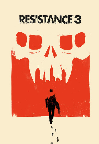
I'll print this out and slip it in the front... Capelli being there makes it so much cooler.
But I love the art work, it's super-classy... I wish more games would do stuff like this.
PortTwo said:This is why the Move logos and so forth don't really bother me. They have kindly provided a very hi-rez file of the above at flickr, so I will just size and print that out. Not hard to do.
It would be cool if Insomniac and others would offer ready-made PDFs of alt covers and the like for download, but there is probably some sort of legal issue there.
BobTheFork said:You don't need to lead people by the nose to get them on board. I think the RFOM cover is a good example of that. They really want to draw more eyes to the box and I think this cover does that while being interesting and original. I'm going to have a poster of that up on my wall without question.
Moss said:Glad you guys are digging it. We all liked the Capelli one for the actual cover art but the dimensions of the PS3 box and the amount of space required for the logos just wouldn't allow it.
Yes I seen them pretty odd thing to say.SolidSnakex said:Check the PSblog comment section. :/
Brandon F said:You don't play as Nathan Hale this time right? Awesome if so, that dude sucked.
Moss said:Glad you guys are digging it. We all liked the Capelli one for the actual cover art but the dimensions of the PS3 box and the amount of space required for the logos just wouldn't allow it.

