Let's see if I can offer my opinion without falling into the same sort of pitfalls some of the other guys in here have. I'm only commenting on ones I actually know about.
- Peach: But there's nothing wrong with Peach's design to begin with. Just make her playable and stop having Mario save her all the fucking time. She's a princess dressed like a princess. No needless T&A, nothing impractical about it other than her wearing a fancy ballroom dress but nothing else about that universe makes sense either, so fuck it? Let her be a fancy princess. (The real question is how come she isn't Queen Peach, but there may be an answer to that. I dunno, I'm not a huge Mario fan so I don't know the lore like that.)
- Polaris' re-design is fine and all...but Polaris hasn't actually dressed like that cover in a decade or two. (Sidenote: I'm continuing to make the point that the late 80's and 90's are the biggest offenders to female costumes. Notice how she's mostly clothed, isn't in a "brokeback" pose, and doesn't have wildly exaggerated curves in that old cover? There's a reason for that. Fuckin' Image creators set gender equality back a billion years.) Her latest design is a uniform her entire team wears, and it's
pretty functional.
- The problem with "Zero Suit Samus" is that Samus doesn't actually look like that normally. You need a real Metroid game where she's in her REAL iconic armor, wrecking shit. Someone call Nintendo.

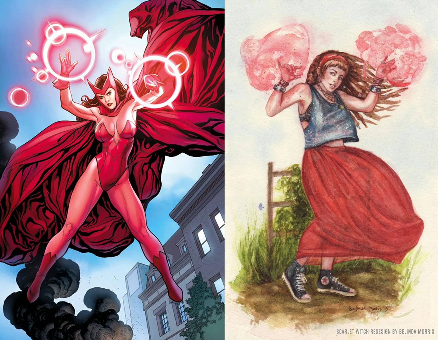
- That Scarlet Witch design is so Vertigo it hurts. That's definitely a version of her outfit, but it's certainly not one of the better ones. There's an Uncanny Avengers one linked earlier in the thread that's actually a lot better, and still makes it look like Wanda's a
superhero.
- Fuck that Storm design. But then, I've always hated "punk rock" Storm in the first place. My favorite Storm design will forever be the all-white Jim Lee outfit. Baller as fuck.
- Betty Boop was a reasonable improvement, so props for that.
- Morrigan's re-design is weird. Like, she wasn't exactly
underdressed in her Dragon Age Inquisition outfit, and you kept the plunging neckline so...what are we gaining here? I'm confused. If anything, she went from modern sorceress to classical which isn't necessarily an improvement.
- I can't place my finger on it, but I legit don't care for that Chun Li re-design. That Alpha design gets rid of the thong and still looks practical, though.
- Emma Frost's re-design is neat. I think it loses some functionality, but neither is particularly functional and its not like Emma's meant for actual fighting as a telepath anyway. So either's fine to me.
- Phoenix makes me sad...but moreso because they chose a Greg Land design instead of what she
actually looks like. Those spandex designs have become so much more form-fitting since the
late 80's and 90's than they were when that story was told. But I'm not really sure of the medieval look? If anything she's supposed to be an eldritch space goddess so maybe a look that highlights that would be better?
- Hated the Red Sonja look at first because Conan is usually running around in a freaking loin cloth, plus I think Gail's been
killing it on Red Sonja too much for people to still take shots at this character, but then I saw that dressed up Conan look and well...what's good for the goose.
- Fran's design is better than the original, but FF12 kinda fell out of favor with me so its whatever there. XD
- That Gamora re-design is terrible. First off, she hasn't looked like that first design in decades. However, I'll concede that the look I enjoyed when she was a part of the real Guardians is probably one of the more problematic female designs. But that one's so uninspired--you just put a gi on her and called it a day. Even the one from the current Guardians book is better.
- The thing about Power Girl is I hate all discussions regarding her, lol. Like, her N52 costume was
just fine but it wasn't good enough and we eventually went right back to the boob window so I was like, "fuck it". And I disliked this one at first because it went all super-realistic. But then I noticed she had a big 'ol Power sign on her back and chest, and that's so delightfully ridiculous that I did a complete 180 and loved it. Bonus points if that comes from a new comic where Power Girl is literally like a 10 year old who presses that button on her chest and becomes a superhero, Shazam-style. ^^
- Star Sapphire's look since GL: Rebirth has always been questionable to me. But its another one of those looks where I think if you just got rid of the plunging/non-existant neckline, she'd be fine. Still, the redesign looks neat.
Aaaand that's it. No opinion on the rest, save that they tried to reduce an actual person's boob size, presumably to make them more realistic and that's funny.


.jpg)