-
Hey, guest user. Hope you're enjoying NeoGAF! Have you considered registering for an account? Come join us and add your take to the daily discourse.
You are using an out of date browser. It may not display this or other websites correctly.
You should upgrade or use an alternative browser.
You should upgrade or use an alternative browser.
Indie Game Development Thread 3: Indie Jones and the Template of Doom
- Thread starter Makai
- Start date
Dynamite Shikoku
Congratulations, you really deserve it!
And is Snailzor McSlurrpykins going into a game?
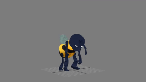
In the house level I'm currently working on, Clive comes across Papa Copeland. This bee father has had his wing damaged, and his kids are missing; it looks like he's going to need some help getting to them!
Yep
I don't have much of an eye for font styles either, so "the artist says this font is ok" is my primary resource. But browsing fontsquirrel and other sites often gives at least some ideas that can be quickly tested in the game.
Although not specific to game design, this may be of some use.
Thanks for these reponses, forgot to respond myself :/ We'll look into it!
On a similar topic, anyone familiar with icon design? We have some icons for our abilities, such as speed boost and "rewind". We've decided to put defensive icons in the bottom right, and offensive ones on the left side. But I'm a bit worried about players misunderstanding the icons because they aren't symmetrical. Take this speed boost example from google:
If I place that one in the bottom right, facing away from the middle of the screen, doesn't that kinda look like a "run away" or "retreat" icon instead?

The problem is two-sided for a typical rewind arrow, since if it's pointing to the left could be interpreted as both rewind and fast forward depending on positioning? If it's on the right side, it's pointing inward and thus could mean something else rather than its intent. But if I mirror it to look like a regular fost forward, it looks wrong from that perspective instead. Or am I over thinking it? :lol
Edit: Oops, to clarify, defensive abilities are in the bottom right, and we currently have a drain meter gauge for our offensives just next to the defensive icon. I want to change that gauge to icons as well like above. Other players that get hit by an offensive ability get an icon on the left side for the duration of the effect.
Speeding through level 5 to 11 seems like it took 35 minutes.
https://youtu.be/0_0CU5T1F0M
4K video files are huge!
https://youtu.be/0_0CU5T1F0M
4K video files are huge!
super-heated plasma
Member
I'm willing to share my design doc with anyone interested. It's going to be a humorous tower defense game.
Gingerbread Fetus
Neo Member
I'm willing to share my design doc with anyone interested. It's going to be a humorous tower defense game.
Does it have dating sim elements? I hate to disappoint, but I may be ahead of you there.

Astrael
Member
i made a snail

Love this, very cute haha. I want to be able to make appealing, clean designs like this one
My drawing style is too messy as it stands.Hey guys, just wanted to give a quick update:
Back in August, we attended our first Expo in Toronto, the CNE Gaming Garage. It was 3 days of showcasing shwip to folks who walked by. It was one of the best experiences thus far in my gaming career. To see the faces of people as they played and the reactions of their friends made the 3 days of standing worth it. I'd do it 100x all over again. Thankfully, we'll be at another expo later this month. If anyone is in London, Ontario on Sept 23rd, come check us out forest city comicon
Some pics of the event.
Our Booth & Yours truly and one of my lifelong friends helping out over the weekend.


If you guys/gals have the means and the cash to participate in an expo - do it.
And here's a short look at our mobile version, taking on enemies from the original game and making them work for mobile.
https://imgur.com/a/oKPPW
Back in August, we attended our first Expo in Toronto, the CNE Gaming Garage. It was 3 days of showcasing shwip to folks who walked by. It was one of the best experiences thus far in my gaming career. To see the faces of people as they played and the reactions of their friends made the 3 days of standing worth it. I'd do it 100x all over again. Thankfully, we'll be at another expo later this month. If anyone is in London, Ontario on Sept 23rd, come check us out forest city comicon
Some pics of the event.
Our Booth & Yours truly and one of my lifelong friends helping out over the weekend.
If you guys/gals have the means and the cash to participate in an expo - do it.
And here's a short look at our mobile version, taking on enemies from the original game and making them work for mobile.
https://imgur.com/a/oKPPW
Dynamite Shikoku
Congratulations, you really deserve it!
Love this, very cute haha. I want to be able to make appealing, clean designs like this one
Thanks. I started animating it


And is Snailzor McSlurrpykins going into a game?
In the house level I'm currently working on, Clive comes across Papa Copeland. This bee father has had his wing damaged, and his kids are missing; it looks like he's going to need some help getting to them!
that looks great!
Thanks. I started animating it
i like the style you're going for
I've posted a couple Game Jam things here, but I never posted the very first one I did!
What do you guys think?
https://www.youtube.com/watch?v=5D5NX5tPO2g
Like the other Game Jams I've done, this was about a weekend working on it here and there.
What do you guys think?
https://www.youtube.com/watch?v=5D5NX5tPO2g
Like the other Game Jams I've done, this was about a weekend working on it here and there.
Thanks for these reponses, forgot to respond myself :/ We'll look into it!
On a similar topic, anyone familiar with icon design? We have some icons for our abilities, such as speed boost and "rewind". We've decided to put defensive icons in the bottom right, and offensive ones on the left side. But I'm a bit worried about players misunderstanding the icons because they aren't symmetrical. Take this speed boost example from google:
If I place that one in the bottom right, facing away from the middle of the screen, doesn't that kinda look like a "run away" or "retreat" icon instead?
The problem is two-sided for a typical rewind arrow, since if it's pointing to the left could be interpreted as both rewind and fast forward depending on positioning? If it's on the right side, it's pointing inward and thus could mean something else rather than its intent. But if I mirror it to look like a regular fost forward, it looks wrong from that perspective instead. Or am I over thinking it? :lol
Edit: Oops, to clarify, defensive abilities are in the bottom right, and we currently have a drain meter gauge for our offensives just next to the defensive icon. I want to change that gauge to icons as well like above. Other players that get hit by an offensive ability get an icon on the left side for the duration of the effect.
You could mirror the speed boost icon when it's on the right side of the screen, but the rewind icon is the kind that'd get a whole different meaning if flipped, so the flipping might be best as set on a case-by-case basis. Maybe you could use an analog clock with its hands shown as moving counter-clockwise through movement arrows or something?
The Friendly Monster
Member
What kind of game are you making? One thing would be to make sure your game icons don't go against the gameplay. For example if you are making a 2d platformer which generally goes left to right, a boost icon should not point to the left. If you are making a wipeout style racer, the boost icon could point upwards, that is in the same direction the vehicle is moving.Thanks for these reponses, forgot to respond myself :/ We'll look into it!
On a similar topic, anyone familiar with icon design? We have some icons for our abilities, such as speed boost and "rewind". We've decided to put defensive icons in the bottom right, and offensive ones on the left side. But I'm a bit worried about players misunderstanding the icons because they aren't symmetrical. Take this speed boost example from google:
If I place that one in the bottom right, facing away from the middle of the screen, doesn't that kinda look like a "run away" or "retreat" icon instead?
The problem is two-sided for a typical rewind arrow, since if it's pointing to the left could be interpreted as both rewind and fast forward depending on positioning? If it's on the right side, it's pointing inward and thus could mean something else rather than its intent. But if I mirror it to look like a regular fost forward, it looks wrong from that perspective instead. Or am I over thinking it? :lol
Edit: Oops, to clarify, defensive abilities are in the bottom right, and we currently have a drain meter gauge for our offensives just next to the defensive icon. I want to change that gauge to icons as well like above. Other players that get hit by an offensive ability get an icon on the left side for the duration of the effect.
I would always try and conform to standards, if I want a settings icon I will first look at using a gear/cog rather than a lever for example. If this is impossible then try to make sure you don't use an icon that is strongly associated with something else. E.g. for me a fast forward icon means to fast forward in time, I would avoid using it for anything else, even (perhaps especially) something related like boost, as this could confuse users. My taste is against using icons containing animals or people unless that is what the game is about. A snail for slow or your example of the rushing man, unless the game is about a man, can usually be improved.
Finally you should think about which icons are important for the player to know what they do before they press them and which aren't. E.g. in menu UI it is fairly critical that the player understands what a settings button or exit button are before they press them, however if they are playing a wipeout style game for example there can be a lot of fun in trying out the different powers to see what they do, here it is not critical that the player understands them ahead of time, but they must be memorable and distinct.

electroflame
Member
What a PITA dealing with creating a Modal Panel on top of another panel in Unity. (I am using a controller...but would probably be worse with a mouse)
Edit: With a mouse it may be easier if you use a CanvasGroup (and block raycast) I will see if that works with a controller
I just did something similar, actually. Setting it up wasn't that difficult, but the handling the input is a bit annoying due to how Unity's Automatic UI controls work. I eventually decided to set up Explicit (i.e. Manual) navigation controls, so I can make sure you can't navigate out of the modal (i.e. onto a screen behind the modal).
For whatever reason, blocking raycasts and setting your modal to block input behind it only works with the mouse. Any keyboard or gamepad navigation will still be allowed to navigate "behind" the modal, so setting up Explicit navigation is the way to go, I think. As a bonus you can easily set up "wrapping" with Explicit navigation (i.e. go past the bottom and wrap to the top).
I imagine that if you disable the non-modal screen that it would block inputs as well, but if you can see the screen behind your modal that obviously won't work. I tried a couple of things, but setting up the navigation manually was the only one that worked well, and gave me the control I wanted.
JeffG
Member
I just did something similar, actually. Setting it up wasn't that difficult, but the handling the input is a bit annoying due to how Unity's Automatic UI controls work. I eventually decided to set up Explicit (i.e. Manual) navigation controls, so I can make sure you can't navigate out of the modal (i.e. onto a screen behind the modal).
For whatever reason, blocking raycasts and setting your modal to block input behind it only works with the mouse. Any keyboard or gamepad navigation will still be allowed to navigate "behind" the modal, so setting up Explicit navigation is the way to go, I think. As a bonus you can easily set up "wrapping" with Explicit navigation (i.e. go past the bottom and wrap to the top).
I imagine that if you disable the non-modal screen that it would block inputs as well, but if you can see the screen behind your modal that obviously won't work. I tried a couple of things, but setting up the navigation manually was the only one that worked well, and gave me the control I wanted.
What I did (Went through a couple of different things, but I think this will work. It did for my test case.)
Open main window...User does their thing and a Modal window needs to open (ie message box, or a confirm or a pick "how many" type windows)
I then find all selectable objects in the panel and turn off Navigation and Interactable for them.
Open up the Modal Window (user does their thing there)
on close of Modal...go back through the selectable objects and return Navigation and Interactable to their initial state.
Seems to work for both mouse and controller...also...should work if a modal opens a modal etc etc
electroflame
Member
What I did (Went through a couple of different things, but I think this will work. It did for my test case.)
Open main window...User does their thing and a Modal window needs to open (ie message box, or a confirm or a pick "how many" type windows)
I then find all selectable objects in the panel and turn off Navigation and Interactable for them.
Open up the Modal Window (user does their thing there)
on close of Modal...go back through the selectable objects and return Navigation and Interactable to their initial state.
Seems to work for both mouse and controller...also...should work if a modal opens a modal etc etc
That works too. That's kind of like the Explicit (manual) navigation, just a bit more work (although you get to keep the option of Automatic navigation).
Just finished skinning a new character to animate this week!
NSFW
https://giant.gfycat.com/VigorousDisloyalDarwinsfox.gif
https://i.imgur.com/UAevJ2Th.jpg
NSFW
https://giant.gfycat.com/VigorousDisloyalDarwinsfox.gif
https://i.imgur.com/UAevJ2Th.jpg
Dynamite Shikoku
Congratulations, you really deserve it!
oh, you literally skinned her
oh, you literally skinned her
wasnt sure how else to put it
wasnt sure how else to put it
Haha, I too was expecting to see you manipulated a new character rig
- Love the jittery style animation though, reminds me of Lisa from PT.Oh, and Papa Bee now has a happy ending!

^ She's pretty shavy! xD
yep
Haha, I too was expecting to see you manipulated a new character rig
Oh, and Papa Bee now has a happy ending!
Thanks!
Papa Bee & family looks good. How many levels will be in this miniature setting?
SquirrelWide
Member
wasnt sure how else to put it
Maybe she needs to change blades or something? That's a lot of shaving nicks.
Anybody implemented their own leaderboard?
For Horizon Vanguard I was initially thinking I'd simply have a SteamWorks leaderboard implementation and an Oculus leaderboard implementation, but given that I'll also be selling a standalone version on itch and maybe other storefronts, and given the relatively small userbase for VR, I'm leaning more and more toward rolling my own leaderboard so everybody could be in the same place.
Any pointers for this?
Thanks!
Papa Bee & family looks good. How many levels will be in this miniature setting?
Thanks back at ya! Just this one, most of the game is about time travel it's just the first one that goes inter-dimensional!
Been a while since I've dropped in on this thread.
Haven't had the time I wanted to work on this but I'm getting back to playable again with my new engine and I'm really happy with where it's going.
I did the collision and physics myself and got corner grabbing in and pallet controls and shit.
Here's the video I did, hope people find it interesting:
https://youtu.be/T34cQrFQP_8
oxrock
Gravity is a myth, the Earth SUCKS!
Anybody implemented their own leaderboard?
For Horizon Vanguard I was initially thinking I'd simply have a SteamWorks leaderboard implementation and an Oculus leaderboard implementation, but given that I'll also be selling a standalone version on itch and maybe other storefronts, and given the relatively small userbase for VR, I'm leaning more and more toward rolling my own leaderboard so everybody could be in the same place.
Any pointers for this?
I had a built in online leaderboard in my last jam game. I just used this site to handle the backend for me. It made things super easy. I don't know how viable it is with a commercial product but you could use it for testing at least.
Thanks back at ya! Just this one, most of the game is about time travel it's just the first one that goes inter-dimensional!
does this mean that we will also get a honey a blew up the kid moment too?
does this mean that we will also get a honey a blew up the kid moment too?
Haha, I hasn't considered it... maybe in the sequel!
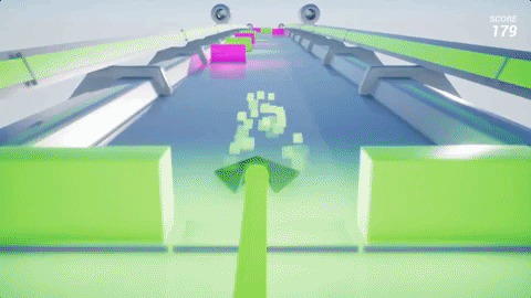
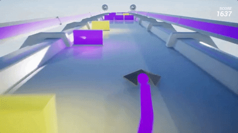
Testing out YouTube's 1080p 60 mode for the first time with a proper update video!
https://www.youtube.com/watch?v=uFn5Hs85e9Q
oxrock
Gravity is a myth, the Earth SUCKS!
does this mean that we will also get a honey a blew up the kid moment too?
Haha, I hasn't considered it... maybe in the sequel!
Testing out YouTube's 1080p 60 mode for the first time with a proper update video!
https://www.youtube.com/watch?v=uFn5Hs85e9Q
I actually really like that idea. I don't think it would work indoors very well but if you could make it take place in a village where you have to avoid accidentally crushing buildings/people it could have some interesting mechanics. Also, of COURSE you have to release a really good looking video the same week I finally decide to get one out finally ;p
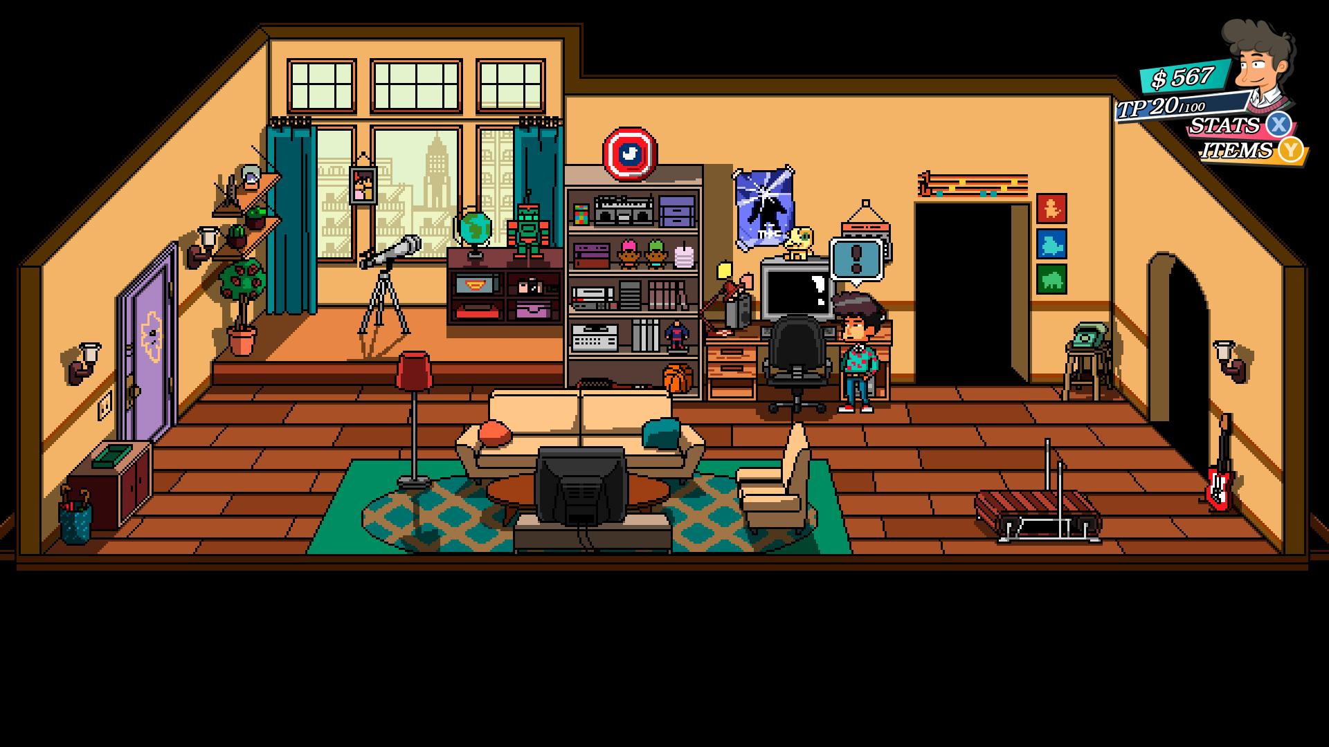
As for my game, Quests Unlimited, a lot has happened this week. I updated to unity 2017, got asset bundles working again and updated some mechanics that were bugging me. You can no longer complete/accept quests anywhere and everywhere. You actually have to walk to the town elder now. Same goes for selling items, you have to actually walk to the merchant. Oh, and completing quests actually gives exp/gold now, omg! What a novel concept, am i right? ;p
To top it all off, i spent some time tweaking post processing effects and updated a few spell effects. I made a simple condensed gameplay video to showcase how a quest cycle currently plays out in game. It's also an excuse to showcase some of the sound effects that haven't been heard yet since I always post GIFs instead of videos. I hope you all enjoy, here it is: Quests Unlimited Gameplay video
JeffG
Member
Its always nice when things start coming togetherAs for my game, Quests Unlimited, a lot has happened this week. I updated to unity 2017, got asset bundles working again and updated some mechanics that were bugging me. You can no longer complete/accept quests anywhere and everywhere. You actually have to walk to the town elder now. Same goes for selling items, you have to actually walk to the merchant. Oh, and completing quests actually gives exp/gold now, omg! What a novel concept, am i right? ;p
To top it all off, i spent some time tweaking post processing effects and updated a few spell effects. I made a simple condensed gameplay video to showcase how a quest cycle currently plays out in game. It's also an excuse to showcase some of the sound effects that haven't been heard yet since I always post GIFs instead of videos. I hope you all enjoy, here it is: Quests Unlimited Gameplay video
I was making good progress this last month or so. I was going to post a video up but my work on Modal windows has broken me while I refactor all my UI panels. lol Oh well
I did post this on twitter. The best I could do this week
https://twitter.com/OldVikingGamer/status/909063856537747458
I've posted a couple Game Jam things here, but I never posted the very first one I did!
What do you guys think?
https://www.youtube.com/watch?v=5D5NX5tPO2g
Like the other Game Jams I've done, this was about a weekend working on it here and there.
Hey not bad for a weekend's work, looked great once the speed started picking up in the video too. Would love to see a little camera reaction as you move around if you continue working on it.
Dlink16
Member
Hey guys, just wanted to give a quick update:
Back in August, we attended our first Expo in Toronto, the CNE Gaming Garage. It was 3 days of showcasing shwip to folks who walked by. It was one of the best experiences thus far in my gaming career. To see the faces of people as they played and the reactions of their friends made the 3 days of standing worth it. I'd do it 100x all over again. Thankfully, we'll be at another expo later this month. If anyone is in London, Ontario on Sept 23rd, come check us out forest city comicon
Some pics of the event.
Our Booth & Yours truly and one of my lifelong friends helping out over the weekend.
If you guys/gals have the means and the cash to participate in an expo - do it.
And here's a short look at our mobile version, taking on enemies from the original game and making them work for mobile.
https://imgur.com/a/oKPPW
How did you find FanExpo? Were the booth costs reasonable? I was there on the Thursday and saw like zero indie games. I assumed that Fri-Sun was when everyone showed up?
As for my game, Quests Unlimited, a lot has happened this week. I updated to unity 2017, got asset bundles working again and updated some mechanics that were bugging me. You can no longer complete/accept quests anywhere and everywhere. You actually have to walk to the town elder now. Same goes for selling items, you have to actually walk to the merchant. Oh, and completing quests actually gives exp/gold now, omg! What a novel concept, am i right? ;p
To top it all off, i spent some time tweaking post processing effects and updated a few spell effects. I made a simple condensed gameplay video to showcase how a quest cycle currently plays out in game. It's also an excuse to showcase some of the sound effects that haven't been heard yet since I always post GIFs instead of videos. I hope you all enjoy, here it is: Quests Unlimited Gameplay video
Ooh, looks like a lot of work! Is the juxtaposition between the voxel characters, props etc and the landscape a deliberate aesthetic choice, or are you planning on replacing it at some point?
oxrock
Gravity is a myth, the Earth SUCKS!
Ooh, looks like a lot of work! Is the juxtaposition between the voxel characters, props etc and the landscape a deliberate aesthetic choice, or are you planning on replacing it at some point?
You mean like having voxel character/items in a nonvoxel world? If so, deliberate. I don't know why but I just like it better this way. Do you think it's off putting?
Unity has released their own video recorder! Maybe now I can finally easily show you guys the progress we've been making and also show those pesky icons I talked about the other day :lol
I think i'd still just use OBS.
You mean like having voxel character/items in a nonvoxel world? If so, deliberate. I don't know why but I just like it better this way. Do you think it's off putting?
Oh no, sorry, I didn't mean off-putting; just unusual! It sort of reminds me of how Mario looks against the more realistic background of New Donk City or the forest area in Odyssey.
GroundCombo
Member
I really really wish Unity would get their final(*) asset bundle workflow ready. I'm trying to make our asset usage at least a little bit smarter, and the current state of bundles is more incomprehensible than flying to fucking Mars. There's a graph tool in some git repo and a browser in other and bits of conflicting and/or irrelevant documentation and it's just a goddamn mess. Forgetting (again) that Unity doesn't understand .lua files as assets unless I rename them to .lua.txt didn't help. >_<
(*) probably not final
(*) probably not final
oxrock
Gravity is a myth, the Earth SUCKS!
I really really wish Unity would get their final(*) asset bundle workflow ready. I'm trying to make our asset usage at least a little bit smarter, and the current state of bundles is more incomprehensible than flying to fucking Mars. There's a graph tool in some git repo and a browser in other and bits of conflicting and/or irrelevant documentation and it's just a goddamn mess. Forgetting (again) that Unity doesn't understand .lua files as assets unless I rename them to .lua.txt didn't help. >_<
(*) probably not final
I was dealing with asset bundle woes myself not long ago. It was driving me bonkers for a while and I kind of had to hack things to make them work awkwardly instead of things just working as it should out of the box. I imagine it'll still be a while until they get things working properly.
SpacePirate Ridley
Member
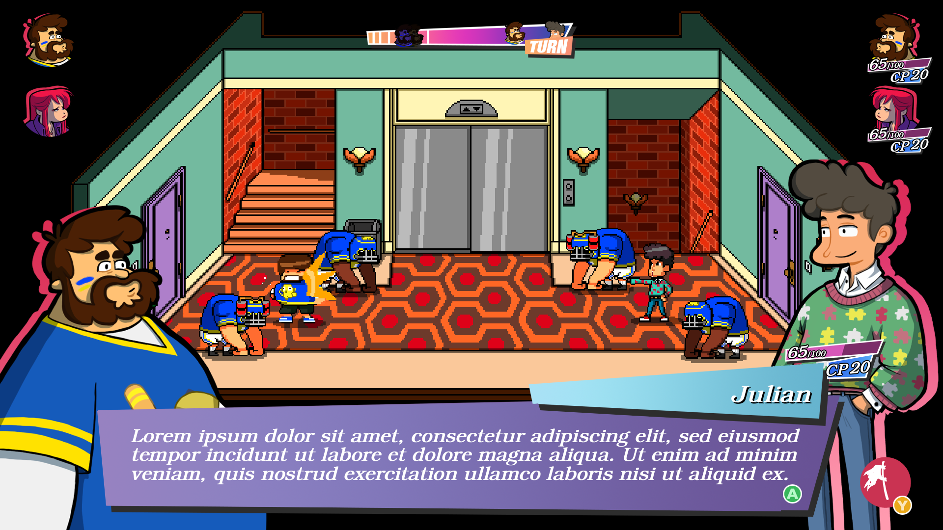
Guys I need to make a little survey. (IMPORTANT, read the last paragraph)
Do you think our game already works with this pixelart 2D artstyle:
Or more akin to what square has shown in Project Octopath Traveler (3D scenery with pixelart texture, 2D pixelart characters, 3D battle effects):
In my opinion its really not needed in our game, apart of changing it right now being a huge rework and hassle timewise, but I still need an outside opinion.
The opinion will be very much appreciated, so thanks in adavance.
Do you think our game already works with this pixelart 2D artstyle:
Explore:
Battle:
Or more akin to what square has shown in Project Octopath Traveler (3D scenery with pixelart texture, 2D pixelart characters, 3D battle effects):
Explore:

Battle:

In my opinion its really not needed in our game, apart of changing it right now being a huge rework and hassle timewise, but I still need an outside opinion.
The opinion will be very much appreciated, so thanks in adavance.
archangelmorph
Member
Guys I need to make a little survey. (IMPORTANT, read the last paragraph)
Do you think our game already works with this pixelart 2D artstyle:
Or more akin to what square has shown in Project Octopath Traveler (3D scenery with pixelart texture, 2D pixelart characters, 3D battle effects):
In my opinion its really not needed in our game, apart of changing it right now being a huge rework and hassle timewise, but I still need an outside opinion about it to convince the pixelart creator its a tremendously bad idea (o not). He never thinks his work is good enough (even if is) and was blindsided by the Octopath demo in a way I regret showing it to him (just wanted to show to the team how they use the supports and boost mechanics in battle).
We have talked already to him trying to explain why its bad, but as an art director for scenery and characters he still wants to try it becuase "we dont know if it going to work until we try it", so I think they only think it woill help is getting some opinions of the outside.
Please, do not mention him in your post when you write the opinion. Im going to erase the last paragraph of my post also, as I will probably need to show the opions of people in this thread. I just wanted to explain why we have this creative probalem right now where we need outside opinions of other devs that can understand how hard can a graphical change be mid development.
The opinion will be very much appreciated, so thanks in adavance.
I'd say don't change it almost immediately...
Your game right now has very hard lines, a lot of color, flat lighting (i.e. no light gradation at all) and hard shadows.
Whilst mocking the world out into 3D wouldn't do much to prevent it from working, you'd have to either change the overall visual design to make 3D lighting work, or end up with a very very flat looking 3D scene (i.e. poor depth perception, leading to the conclusion that the 3D would really add very little).
Octopath is very dark and moody and leverages the lighting to great effect (same with that Milkshake Duck game).
You could try switching the visual style to include single/double-step lighting gradation + doing the hard line edges in a post-process shader (think Team Fortress 2 or Guilty Gear Xrd) but it will take a lot of work, a lot of visual experimentation to get something that looks right, and you'd likely end up with something that looks altogether very different to what you have now, not to mention different to what Octopath is doing.
I think your game looks great (and unique) right now as it is. Your pixel art creator sounds a lot like some producers I've worked with in the in the industry in the past.
oxrock
Gravity is a myth, the Earth SUCKS!
Current art looks fine IMO. Other images look really cool but have a different feel than your's. Currently your's is more cartoonish which I imagine goes well with the theme of your game. IIRC it's supposed to be a 90's sitcom or something? Anyhow, goofy/fun fits that very well. Octopath looks impressive but it's almost like they're trying to make realistic images in pixel art format. That inherently gives it a more serious vibe which doesn't suit shenanigans as well.Guys I need to make a little survey. (IMPORTANT, read the last paragraph)
Do you think our game already works with this pixelart 2D artstyle:
Or more akin to what square has shown in Project Octopath Traveler (3D scenery with pixelart texture, 2D pixelart characters, 3D battle effects):
In my opinion its really not needed in our game, apart of changing it right now being a huge rework and hassle timewise, but I still need an outside opinion about it to convince the pixelart creator its a tremendously bad idea (o not). He never thinks his work is good enough (even if is) and was blindsided by the Octopath demo in a way I regret showing it to him (just wanted to show to the team how they use the supports and boost mechanics in battle).
We have talked already to him trying to explain why its bad, but as an art director for scenery and characters he still wants to try it becuase "we dont know if it going to work until we try it", so I think they only think it woill help is getting some opinions of the outside.
Please, do not mention him in your post when you write the opinion. Im going to erase the last paragraph of my post also, as I will probably need to show the opions of people in this thread. I just wanted to explain why we have this creative probalem right now where we need outside opinions of other devs that can understand how hard can a graphical change be mid development.
The opinion will be very much appreciated, so thanks in adavance.
On top of everything else, throwing out all your current art to redo it all would just be a horrendous setback. Blow sunshine up your artist's ass until he's happy with the current aesthetic.
Your graphics has much more breath then the 3D stuff, really! I had a look atGuys I need to make a little survey. (IMPORTANT, read the last paragraph)
Do you think our game already works with this pixelart 2D artstyle:
Or more akin to what square has shown in Project Octopath Traveler (3D scenery with pixelart texture, 2D pixelart characters, 3D battle effects):
In my opinion its really not needed in our game, apart of changing it right now being a huge rework and hassle timewise, but I still need an outside opinion about it to convince the pixelart creator its a tremendously bad idea (o not). He never thinks his work is good enough (even if is) and was blindsided by the Octopath demo in a way I regret showing it to him (just wanted to show to the team how they use the supports and boost mechanics in battle).
We have talked already to him trying to explain why its bad, but as an art director for scenery and characters he still wants to try it becuase "we dont know if it going to work until we try it", so I think they only think it woill help is getting some opinions of the outside.
Please, do not mention him in your post when you write the opinion. Im going to erase the last paragraph of my post also, as I will probably need to show the opions of people in this thread. I just wanted to explain why we have this creative probalem right now where we need outside opinions of other devs that can understand how hard can a graphical change be mid development.
The opinion will be very much appreciated, so thanks in adavance.
Octopath in motion, for me it looks kinda flat, i.e. the 3D stuff isn't worth
looking at if you ask me. The depth of field effect they use is also somewhat
irritating when looking at the scene for longer. And the surrounding doesn't
caught my eye the slightest, whereas with your graphics (esp. the first one)
my eyes get tracked around automatically, because there is always something
interesting to see, it's much richer and art driven. The only thing I would add
to your graphics is some fancy shading, dithering etc..
GroundCombo
Member
I was dealing with asset bundle woes myself not long ago. It was driving me bonkers for a while and I kind of had to hack things to make them work awkwardly instead of things just working as it should out of the box. I imagine it'll still be a while until they get things working properly.
Yep, things seem to be going that way after a day of headscratching.
Guys I need to make a little survey.
Do you think our game already works with this pixelart 2D artstyle:
Or more akin to what square has shown in Project Octopath Traveler (3D scenery with pixelart texture, 2D pixelart characters, 3D battle effects):
In my opinion its really not needed in our game, apart of changing it right now being a huge rework and hassle timewise, but I still need an outside opinion about it to convince the pixelart creator its a tremendously bad idea (o not). He never thinks his work is good enough (even if is) and was blindsided by the Octopath demo in a way I regret showing it to him (just wanted to show to the team how they use the supports and boost mechanics in battle).
We have talked already to him trying to explain why its bad, but as an art director for scenery and characters he still wants to try it becuase "we dont know if it going to work until we try it", so I think they only think it woill help is getting some opinions of the outside.
I agree with the above opinions: the two aesthetics are radically different and I don't think you'd gain anything by going the Octopath route, as your lighting is much more stylized than theirs. As a side note, I like Octopath's style but also think it's currently a bit overdone - it's a very nice direction, but it needs a lot of fine tuning to really work, as the lighting effects completely crush legibility in my experience, and the depth of field effects are much too strong, making the entire plane actually lack depth.
In your case, I'd personally keep the style, and if I were to change something, it'd be the discrepancy between UI and game: the game itself uses cel shaded pixel art (no dithering gradients, etc - the gradients you use are very light and not meant to convey actual light/shadow but just add a touch of volume). The UI, however, is all vectorial as far as I can see, and while it looks nice (and very Persona inspired :v) I don't think the two fit together all that well - though I'd say it works better than if you attempted to force Octopath's lighting and 3D stuff in there too :-D
SpacePirate Ridley
Member
Thanks guys really appreciate your comments.
Im not the programmer in the game but we are using unity, any idea about how to use some fancy shading and dithering and how would it looked if implemented to our game?
Oh man, and I was proud of my UI work lol
I can't really do pixel art, and im the one who works on all the UI and the game design. It was important to me that the UI was really poppy and 90's stylized, and to separate it from the theater of the game (the pixelart area), but still be on top without blending in (most games in pixelart tend to have all UI elements inside boxes or completley to the sides of the screen I thought a more traditional drawing style would work much better. If the style of UI I created was made in pixelart, it would start looking really blurry and everything blending too much. Our pixel artist is not really good making UI either so this is more like a teamwork of 3, where everyone brings what they do better, one is pixelart characters and scenarios, one is UI and the other is character designs for the portraits.
Ive showed it to a lot of people and they really liked how it worked with the game, said it was really poppy a readable, or liked how Persona inspired it looked (and thats was my intention lol), but hearing it from someone who I really appreciate art wise like you, still hurts a little becuase maybe the idea was not as good as I thought lol.
But thanks for the opinion
Your graphics has much more breath then the 3D stuff, really! I had a look at
Octopath in motion, for me it looks kinda flat, i.e. the 3D stuff isn't worth
looking at if you ask me. The depth of field effect they use is also somewhat
irritating when looking at the scene for longer. And the surrounding doesn't
caught my eye the slightest, whereas with your graphics (esp. the first one)
my eyes get tracked around automatically, because there is always something
interesting to see, it's much richer and art driven. The only thing I would add
to your graphics is some fancy shading, dithering etc..
Im not the programmer in the game but we are using unity, any idea about how to use some fancy shading and dithering and how would it looked if implemented to our game?
I agree with the above opinions: the two aesthetics are radically different and I don't think you'd gain anything by going the Octopath route, as your lighting is much more stylized than theirs. As a side note, I like Octopath's style but also think it's currently a bit overdone - it's a very nice direction, but it needs a lot of fine tuning to really work, as the lighting effects completely crush legibility in my experience, and the depth of field effects are much too strong, making the entire plane actually lack depth.
In your case, I'd personally keep the style, and if I were to change something, it'd be the discrepancy between UI and game: the game itself uses cel shaded pixel art (no dithering gradients, etc - the gradients you use are very light and not meant to convey actual light/shadow but just add a touch of volume). The UI, however, is all vectorial as far as I can see, and while it looks nice (and very Persona inspired :v) I don't think the two fit together all that well - though I'd say it works better than if you attempted to force Octopath's lighting and 3D stuff in there too :-D
Oh man, and I was proud of my UI work lol
I can't really do pixel art, and im the one who works on all the UI and the game design. It was important to me that the UI was really poppy and 90's stylized, and to separate it from the theater of the game (the pixelart area), but still be on top without blending in (most games in pixelart tend to have all UI elements inside boxes or completley to the sides of the screen I thought a more traditional drawing style would work much better. If the style of UI I created was made in pixelart, it would start looking really blurry and everything blending too much. Our pixel artist is not really good making UI either so this is more like a teamwork of 3, where everyone brings what they do better, one is pixelart characters and scenarios, one is UI and the other is character designs for the portraits.
Ive showed it to a lot of people and they really liked how it worked with the game, said it was really poppy a readable, or liked how Persona inspired it looked (and thats was my intention lol), but hearing it from someone who I really appreciate art wise like you, still hurts a little becuase maybe the idea was not as good as I thought lol.
But thanks for the opinion
Tumle
Member
Anyone have any knowledge about opentoonz?
Can it be used for making 2D animated assets ?
Here is a link:
https://opentoonz.github.io/e/
Can it be used for making 2D animated assets ?
Here is a link:
https://opentoonz.github.io/e/