-
Hey, guest user. Hope you're enjoying NeoGAF! Have you considered registering for an account? Come join us and add your take to the daily discourse.
You are using an out of date browser. It may not display this or other websites correctly.
You should upgrade or use an alternative browser.
You should upgrade or use an alternative browser.
Anyone else dislikes Nintendo's current love for washed out color schemes?
- Thread starter pixelation
- Start date
StrongBlackVine
Banned
If anything, Nintendo should work on their anti-aliasing solution
It doesn't look like they use any AA solution at all. The new Mario game looks particularly awful because of that. Probably looks OK in motion like Mario Kart 8 did, but in stills it looks really bad.
How About No
Member
So from switch to FB to imgur the compression sucks.. but it should be enough to demonstrate. Yeah the games weather can get hazy at times, but it's not a constant and personally I feel it adds to the aesthetic of the game. There's heaps of colour in BotW and the game is stunning.
Lawd this game
Jawbreaker
Member
I think the fog is egregious in Breath of the Wild because it's layered over really low resolution textures. The aliasing, bad texture filtering, and lower resolution don't make matters any better.
DAREALGUMMY
Member
what makes you believe the first technique applies to both but not the second one? And what was even your point of that quoted sentence then? Seems you're just moving the goalpost.
Well as someone said before, the camel is in a sandstorm and the elephant is in the middle of the water. That and the elephant shocks anything that gets near it. You were saying there's other tricks when the person you quoted already stated that it would look like a blown up model on a handheld.
primasaurus
Member
He doesn't have a Switch, or Wii U, and has never played the game.
Oh :/
Sure but it's not either/or. Who knows whether the trees are tiny too. Compound effects, which Zelda employs a lot of, is more powerful than a single one.....try to read directly after that
I mean birds are just one example, the important thing is to have a scaled anchor visual if only momentarily so that the mind can properly scale the object, can be passing birds, but it can also be grass, trees, mushrooms on a cliff, etc.
SpiceMelange
Member
Well as someone said before, the camel is in a sandstorm and the elephant is in the middle of the water. That and the elephant shocks anything that gets near it. You were saying there's other tricks when the person you quoted already stated that it would look like a blown up model on a handheld.
It would look like a blown up model with no visuals trick to help scaling. Anchoring a scaling visual aid is one way to combat this sensation of blown up model. That's how Star Wars space ships worked. Putting those tiny models on the backdrop of a planet. I haven't seen anything posted by you explaining why it only applies to art.
Sure but it's not either/or. Who knows whether the trees are tiny too. Compound effects, which Zelda employs a lot of, is more powerful than a single one.
Don't think anyone is saying its an either/or situation, just that there's other ways than haze to help visualize scaling
How About No
Member
Lame foggy version:
Code:[img]http://i.imgur.com/wOektjR.png[/img]
Lamp approved version:
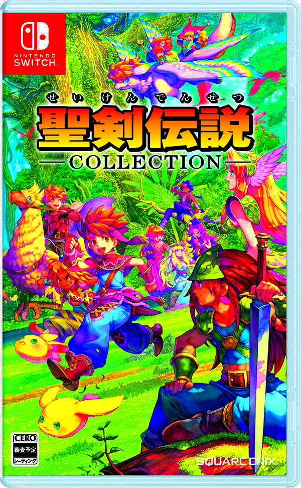
Code:[img]http://store.jp.square-enix.com/client_info/SQEX_ESTORE/itemimage/HAC_P_ADAVA/ITEM_IMAGE2.jpg[/img]
.
D
Deleted member 465307
Unconfirmed Member
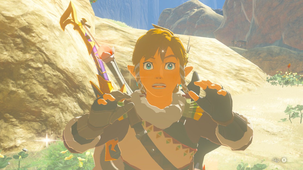
Breath of the Wild can be really vibrant at times. Sometimes you enter a large field on a clear day and the green is just gorgeous. Also, Chu Chu's and elemental Keese are cartoonishly colorful. A lot of the accent colors really pop. When it looks washed out, it seems to typically be a weather effect or, when viewing from a vantage point, a draw distance issue where they employed a haze to cover it up somewhat.
As for Super Mario Odyssey...that game is very colorful, especially in the desert world. The food world is colorful in another way. Even in the city, there's still colorful elements that pop.
So far, Nintendo has released Zelda, 1-2-Switch, and Snipperclips, which are all colorful, vibrant games in many regards and at least at the industry average. Up next is MK8D and ARMS, which are also colorful. After that is Splatoon 2. The only washed-out color scheme I see on the horizon for Switch from Nintendo might be Fire Emblem Warriors, a game I can't fully judge yet because we've seen very little of it.
I actually really like the HDR photography someone linked on the last page. The Lamp's alteration of the Temple of Time and even OP's "fix" to Mario Odyssey looks nice, too.
And I also hate the rather persistent filter in BotW. Also thought my Switch screen just sucked and was washed out, as my luck must suck because I kid you not, every time I play in handheld mode it must have been cloudy. It wasn't until I booted up Splatoon 2's Testfire one night and realized it must just be Zelda.
But that said, Nintendo's whole first-party output lacking color? Nah man. BotW even has a lot of color, I guess some people (me included in this one) just don't like a design choice with a dumb fog that's screwing with the colors. Glad Splatoon 2 got posted early on. There's your popping colors, right there. You nuts in the regard of a bland art Nintendo First Party, OP.
Since the OP doesn't specifically target BotW, I can't say I agree. OP hasn't played Mario Kart 8, Mario 3D world, or Splatoon, and those are very colorful games. It doesn't help him that there are screenshots here that shows variety in color grading for BotW.
OP's agenda is to shitpost Nintendo. Correct me if I am wrong.
OP's agenda is to shitpost Nintendo. Correct me if I am wrong.
professor denim
Member
What? BotW is not washed out at all.
Alter_Fridge
Member
Op you should at least waited a few months. BOTW is the bae' right now!

Is this vibrant enough for you?!?!?!
This pic wins GAF
i HeaR MusiC
Member
So I knew my Switch was set to full RGB. I decided to check and see if my TV was.. it wasn't. My mind is blown by how huge of a difference that is for Zelda... wow. Thanks for making me double check, lol.
Massive Duck. C.M.
Banned
It kind of fits considering the setup in BotW, but there are also a lot of vibrant colors.
Jawbreaker
Member
I hope people aren't mistakenly crushing their blacks by choosing the wrong combination of settings. You'll get a more "colorful" image, but you'll lose color accuracy and a ton of detail.
foxuzamaki
Doesn't read OPs, especially not his own
He doesn't have a Switch, or Wii U, and has never played the game.
What the fuck
primasaurus
Member
^ This, very nice video explaining the RGB option in Switch
Chmpocalypse
Blizzard
I am seeing this trend with Nintendo games where the color schemes are washed out and they seem to be overdoing the... bloom lighting? (WW HD), this seems to be continuing with BotW and the new Mario game, i think it does their games a disservice. They would look much better with more contrast while dialing down the bloom lighting.
I am adding a few comparisons between Switch and PS3 games as examples.
Switch:
PS3:
Thoughts?
Yes
yaffi
Member
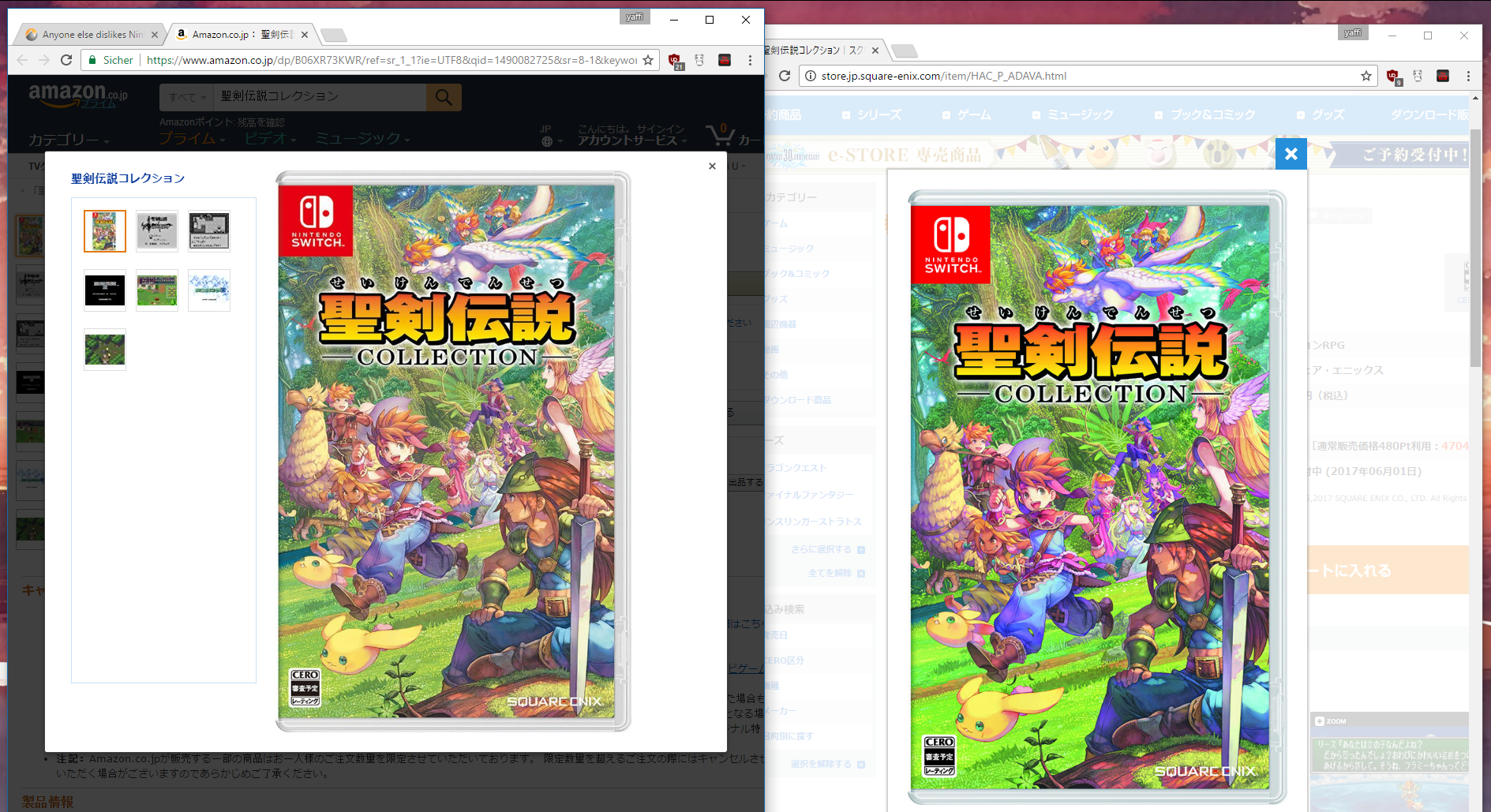
Lame foggy version:
Lamp approved superior version:
Well, the shot on Square's site is more saturated. So what's it going to be?
edit: Oh wait, you switched out the second pic shortly after. I wonder why.
KH3 (UE4)

Of course, it all boils down to developer's choices but I personally hate the "grey filter" trend. It's the new piss filter to me.
I find that example perfectly fine tbh.. It's still colorful and the light haze helps perception of distance, while still letting all colors show.
I have to agree with the complaint at BotW however, the haze is oftentimes excessive. Even worse, it's not just in the distance, but also between the camera and Link for what sometimes feels like half the time. At least at that distance one wouldn't expect the haze to completely grey out the image.
Minor visual niggle, still very much overdone imo. Mario Odyssey on the other hand seems to tone it done significantly and is therefore perfectly fine.
The part that saddens me is that the game looks so good when the weather clears up and that nasty haze is lifted like in the second pic. Wish they would have used that effect less frequently and just reserved it for rare weather instead of applying it to most scenarios like it currently is.Pics that I find "washed out" from the BotW screenshots thread

Pic that I find the colors not washed out

Rickenslacker
Banned
All about dat colour pop.
tiebreaker
Member
Only Zelda looked washed out really. Mario looks fantastic.
TheMagician
Member
At times yes it's okay, but it's only in foreground/midground that the haze is minimal (just like in Beijing). The background is always a nearly monochromatic smog.
Not in my version.
Do you own the game?
SinCityAssassin
Member
Anyways, my answer continues to be no. Regardless of remembering your bad attempt in correcting such effects a month ago.
why does BotW take place in Beijing
hideous
lmao you haven't played it have you.
TheMagician
Member
lmao you haven't played it have you.
Correct.
He's seen a picture of early morning and presumed it's like that the whole game.
Octavianus
Banned
Op you should at least waited a few months. BOTW is the bae' right now!

Is this vibrant enough for you?!?!?!
Too foggy
why does BotW take place in Beijing
hideous
The fog does a good job of hiding the acid green LOD textures though
snow in jamaica
Member
The temple of time feels like an imposing structure in the first shot and a maquette in the second one.
This particular shot doesn't evoke anything to me. I don't feel like the distance or angle serve the atmospheric scattering or scale well, and it wouldn't work as suggestive fog because the effect is too uniform.
Now my eyes are bleeding
There is way to brighten up the colours that have been talked about in this thread
http://www.neogaf.com/forum/showthread.php?t=1353442
Basically in Switch System settings Turn RGB from Auto to Full, it's night and day if your TV supports it
Are you actually suggesting forcing blacks into being crushed?
You think you've heard everything...
Similar threads
- 41
- 3K
March Climber
replied


