• Hey, guest user. Hope you're enjoying NeoGAF! Have you considered registering for an account? Come join us and add your take to the daily discourse.

Anyone else dislikes Nintendo's current love for washed out color schemes?

Honestly I see what's being said about Zelda. I had the same thoughts about it feeling washed out.


Mario O though? You're crazy, it's still very colourful.
 
Zelda's decision makes sense once you're in game, it makes all the glowing beacons and points of interest much more prominent and easier to spot in the distance. It's a gorgeous combination in terms of art direction.

Mario...looks colorful to me.
 

Yarbskoo

Member
All of these look off and unnatural.
Ever watched a Miyazaki movie? That is the look the devs went after.
2017031822241400-f1c11lunm.jpg

But I also would have preferred less hazy and more clear weather.

I dunno, I was outside a few hours ago and there wasn't a horrible yellowish tint on everything when the sun was coming up.

I don't remember Spirited Away being that green either. Maybe a little during the night scenes, but not that much.
 
I dunno, I was outside a few hours ago and there wasn't a horrible yellowish tint on everything when the sun was coming up.

I don't remember Spirited Away being that green either. Maybe a little during the night scenes, but not that much.

i mean howl's has higher contrast but the background haze is clearly what they were going for

ghibli films often have a warm tint to them, like botw, too:
 
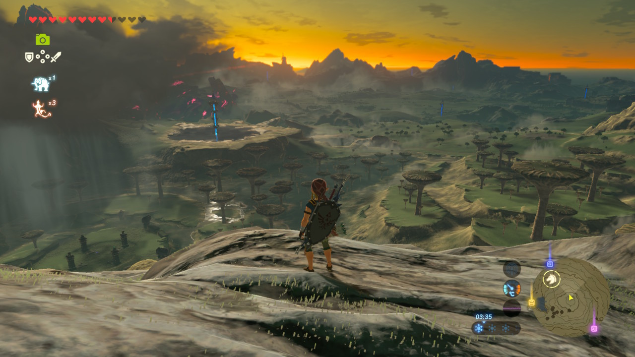
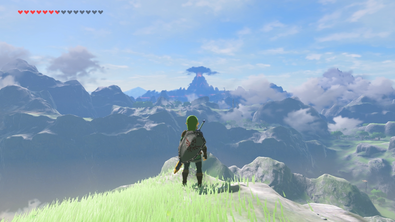
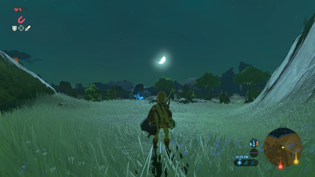
The colors in Zelda are super bright, saturated and pleasing when they need to, but there are also subdued, earthy tones and plenty of nuance in the sky, etc. There's bloom after heavy rain, amazing PBR materials and what I think are all in all great colors, from my photography background.
The biggest problem for me is, sometimes the atmospheric light scattering is overdone, making distant objects a tad too blue and washed out. But maybe it's a tech limitation, and maybe it can be fixed.
The lighting is excellent, and I think it uses a sort of bounce lighting. (One of the first things I saw was earthy tones reflecting on the rocky Boboklin skull-shaped camp in the Plateau)
 

Neo_Geo

Banned
BoTW does not have washe out colors. Check your eyes.

The game, with a properly calibrated television, does indeed look slightly washed out, but that is a stylistic choice made by the devs. I don't think it is an issue honestly as it overall looks really good with a great variety of pastel colors.
 
I think Zelda BoTW looks like ass. Looks incredibly dull and grey. I know I'm in the minority but I don't see what all the fuss is about. Other Nintendo titles on Wii U looked much better and vibrant.
 

CrazyHorse

Junior Member
OP makes a valid point about BotW and WW HD had it too.

I think this is Nintendo's way of dealing with inferior power. Adding bloom / washed out effect because the console is not powerful enough.

BTW BotW is a great game so don't hate me for this view.
 
I'm traveling for work this week and seeing the Switch on the hotel TV finally made me understand why people have been complaining about BotW IQ. Either my Bravia is considerably cleaning up the IQ/aliasing/color palate in this game or the Switch is having issues passing accurate color info over HDMI to certain sets. The game looks like a Studio Ghibli film at home on my 4K TV and like it's been run through a sharpening and bloom filter on the hotel's 1080P TV. They've got the menu locked on the TV so I can't adjust any of the settings.
 
Also, why is it that as soon as someone says something that is even remotely critical about anything Nintendo related guys jump at you like you ran over their cat?, is this not a discussion board?

It's the the criticism but the quality of it. You haven't played these games and yet started a discussion about them featuring cherry picked examples about stuff you mostly have no idea about. People aren't being defensive, your initial point sucks.
 
For the most part, BotW looks perfect colots wise. But there are a few instances where I think it needs some tweaks as I do a double take and check if my RGB settings are proper.

It's not even particularly outdoors but some stuff indoors which isn't as dark as it should be.

Which is hilarious as I just finished up something in the game where I felt they went way overboard in the opposite direction and reminded me of XB1s crushed blacks.
 
Seems to me there's a big difference between this:


And this:


Or these:


If that's the look they were aiming for, they didn't really aim very well.
really? i think the first two screenshots you compared are very similar. no pure white - it's yellow; and that screenshot is taken during a sunset in zelda vs midday in mononoke so the sky is naturally more yellow. i'll go to that field now and try and get a daytime shot.
 

Geg

Member
Actual in-game visuals


What BotW should look like


You can't see the difference?

I thought it was a joke because most of the environments in those screenshots were affected by weather. One was in a goddamn sandstorm

Also the actual game doesn't look anything like what's in the first screenshot you posted
 

Yarbskoo

Member
really? i think the first two screenshots you compared are very similar. no pure white - it's yellow; and that screenshot is taken during a sunset in zelda vs midday in mononoke so the sky is naturally more yellow. i'll go to that field now and try and get a daytime shot.

I bet you can't find a Ghibli sunset that yellow.
 
I found that BotW only looked a bit hazy when certain weather was around. On clear sky areas the colors are fine to me. Also every other Switch game looks beautiful in color.
 

Parapraxis

Member
The BotW team can claim they were going for a Ghibli look (did they actually claim that or are posters here just saying that??), but they are not really that similar.

BotW is absolutely "smoggy" a lot of the time, people are cherry picking examples in both directions, but anybody with a properly calibrated TV will see that it is often the case, not ALWAYS, but often.

pretty fuckin close
 
Top Bottom