The game seems to have an intentionally flat, washed-out look a lot of the time, as it changes so much with time of day and weather.
I agree that they probably went too far with it, as my first impression of the game had me wondering if I had the video levels set incorrectly since it had been so long since I turned on my Wii U. (they were not)
It's more of a contrast issue than a color issue though, and I think that the look can be improved without having to completely crank up the saturation or make the image really dark.
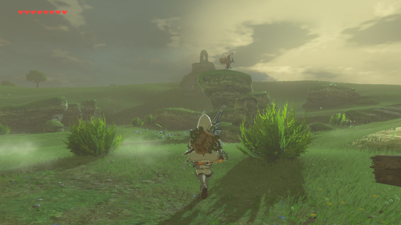
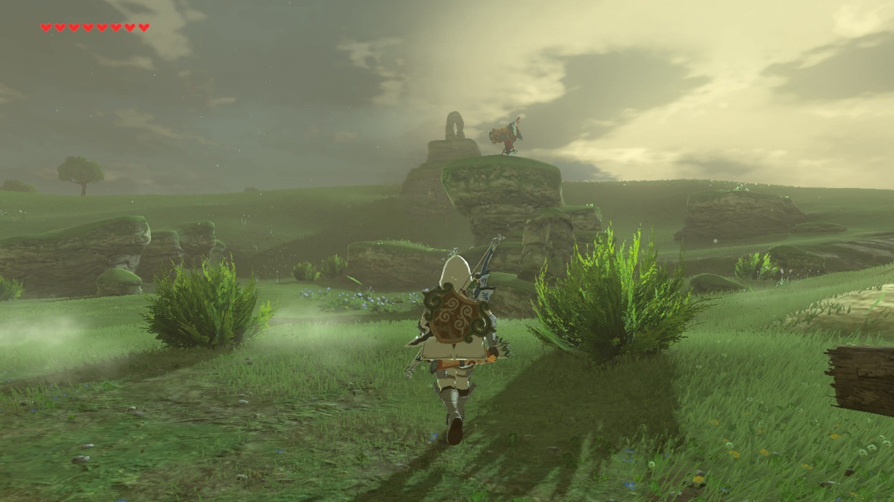
Using an example image from earlier in this topic:
Original:
Subtle adjustment:
Less-subtle. (probably went too far with it - I only spent a few seconds on these examples):
Those still convey the same "look" to me, without feeling washed-out.
Zelda is the first game I've had to play with some of my TV's enhancements switched on.
The framerate is so bad that I need to have the motion smoothing options turned on, and the TV's "black corrector" to prevent things from looking completely washed out. (without completely sacrificing the intended look)
Well he sounds very pleased with himself for someone that appears to have things set
incorrectly, as his examples of the "correct" levels appear to be clipping.
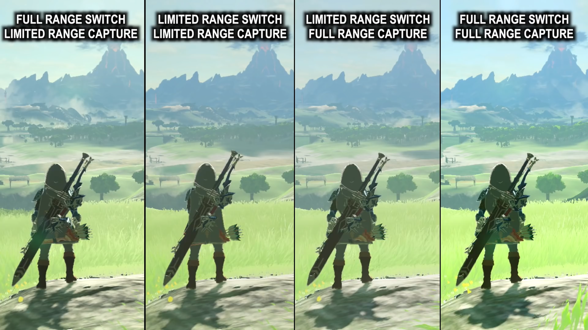
Just look at this comparison shot:
The highlights are clipped, causing the grass to turn into a solid mass of neon green.
Limited output + Limited capture should look virtually identical to Full output + Full capture, which is clearly not the case in his video.
The only difference between the two is that you have the potential for smoother gradation with a full range output. (256 levels vs 220 levels)
Image brightness/contrast should not be changing. If it is, you have something wrong in your setup.
To me, it looks like he's mixed up the labels on his images. The pair in the middle are most likely the correct captures where the levels match.
That one on the right looks like Full range output + Limited range capture.
The image linked from the Square-Enix site is encoded in CMYK.
If your browser doesn't do proper color management, color will look ridiculous.
Here's the image as it looks in Chrome:
And here it is with a proper sRGB conversion - as it should appear in a properly color managed browser:
I'm guessing they were using Chrome when they posted that image.