• Hey, guest user. Hope you're enjoying NeoGAF! Have you considered registering for an account? Come join us and add your take to the daily discourse.

Best and worst videogame character redesigns

Village

Member
Ugh please the original look like proper villains while the new look like a bunch of idiots that work in a circus.


Uuuuuuh what?
Sugimori/Pokémon art downfall began with Emerald

Essentially after gen 3 Pokémon's art style could be summed up to this image (slurs aside)
qOoF2OJ.png

The old style before the revamp is filled with unmemerable designs in a style trying to ape akira toryama hard

The new style actually has a unique look that creates a narrative about the world, of pokemon that isn't just RPG but a look specific to the world of pokemon whilist incorporating real world stuff. Its why Red now looks like a dude instead of "GENERIC RPG CHILD" peopel actually wear real things people would wear and look interesting. And when people do branch out and wear something unrealstic its way more noticeable. Pokemon's design of characters and its world is problably some of the best stuff that has ever happened the pokemon, we wouldn't have the amazing design in GO if it wasn't for that. But even more so, it was amazing for diversity because it saw the inclusion of different types of people,from across the world with different colors.

Old pokemon designs are genric JRPG hat, and should be left in the dust,
 

Vlaphor

Member
Nearly every Killer Instinct character was improved. The original designs were atrocious.

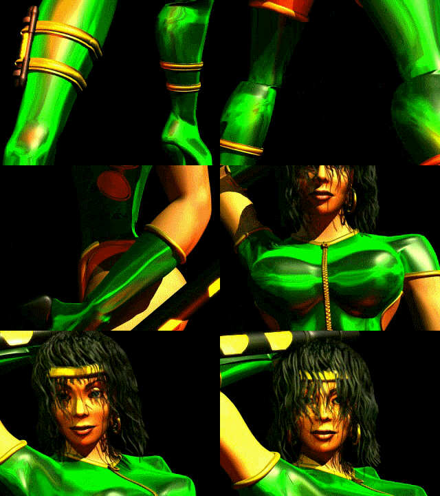
Killer Instinct 2's B Orchid is god tier.

orchid-ki2-animation.gif


To be fair, it's Janet Jackson who's god tier and KI2 B Orchid is clearly modeled after her,

but I'll take it all the same. KI3 Orchid however

Orchid_Portrait.jpg


is just hot garbage. While the design itself come across as weirdly reptilian with the segmented armor, her face is terrible, and those goggles look stupid, my biggest complaint is with the single knee pad...that also looks like a car windows that got knocked off and she decided to wear it for some reason.
 
Uuuuuuh what?
Sugimori/Pokémon art downfall began with Emerald

Essentially after gen 3 Pokémon's art style could be summed up to this image (slurs aside)
qOoF2OJ.png

Like I said, I love old Sugimori art. Gen 1 and 2 are really good. But Gen 3 is just plain bland art-wise until Emerald.

And that image, aside from being hilariously biased (which is the point I guess), also gets some weird traced art of Ethan from Soul Silver. His actual illustration has better shading and colors.
 

Synth

Member
Killer Instinct 2's B Orchid is god tier.

orchid-ki2-animation.gif


To be fair, it's Janet Jackson who's god tier and KI2 B Orchid is clearly modeled after her,


but I'll take it all the same. KI3 Orchid however

Orchid_Portrait.jpg


is just hot garbage. While the design itself come across as weirdly reptilian with the segmented armor, her face is terrible, and those goggles look stupid, my biggest complaint is with the single knee pad...that also looks like a car windows that got knocked off and she decided to wear it for some reason.

I did say "nearly" Every character was improved. Orchids face is an unfortunate casualty. I think the rest of her design is fine though really.

But characters like Glacius, Sabrewulf, Cinder, Jason, Mays and especially Eyedol are leagues better than the original designs. New characters like Sadira, Aganos etc are basically all better than the original games' designs too.
 

Vlaphor

Member
I did say "nearly" Every character was improved. Orchids face is an unfortunate casualty. I think the rest of her design is fine though really.

But characters like Glacius, Sabrewulf, Cinder, Jason, Mays and especially Eyedol are leagues better than the original designs. New characters like Sadira, Aganos etc are basically all better than the original games' designs too.

It was more where you said the original designs were atrocious that I disagreed with. KI2's B Orchid, Maya, Kim Wu, Sabrewulf, Fulgore, and Spinal are all designs that I actually like more than the KI3 designs, though I do like Spinal's KI3 design as well.
 

Synth

Member
It was more where you said the original designs were atrocious that I disagreed with. KI2's B Orchid, Maya, Kim Wu, Sabrewulf, Fulgore, and Spinal are all designs that I actually like more than the KI3 designs, though I do like Spinal's KI3 design as well.

Ah ok, that was maybe a bit strong. Though I do actually think most of the original designs are pretty bad. I don't think KI2013's designs are amazing either... but when compared with those of other prominent fighters, they at least no longer look ridiculous in comparison imo.

I'm legitimately surprised there's a single person on the planet that likes Maya's KI2 design over her KI3 design though, lol.
 

Nottle

Member
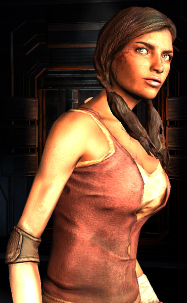
Overall the designs after Mass Effect 1 are trying to be a little too cool.

In ME1 it felt like you were using utilitarian gear. You didn't need armor that was bulky because you had energy shields.

ME2 and 3 had designs that didn't seem like they came from some organized future military. You could have big bulky armor. Some characters dressed more like they were going to a fashion show rather than battle.
 

rhandino

Banned
ME2 and 3 had designs that didn't seem like they came from some organized future military. You could have big bulky armor. Some characters dressed more like they were going to a fashion show rather than battle.
It is quite hilarious when you do the the
derelict reaper
mission in ME2 and you bring Miranda or Mordin with you. How are they surviving? a;sldk;aslkda;
 

Morrigan Stark

Arrogant Smirk
Of course there's a difference in clothing, and personality it seems,
Ya think?

but I don't see how it's 'even worse' than the V design. The Maria from SotN example posted earlier is what I'd call eye gouging.

This is her appearance in game. Looks chibi to me.
The V design at least isn't completely generic moeblob waifu shite.

And yeah OK that one you posted is chibi, but then so are the in-game sprites for BoFII, III, etc. We are comparing concept arts/designs with one another, not one game's concept art vs one game's in-game sprite.

Thanky you for reminding me BoFVI exists.
FUCK.
Sorry :( It hurts, I know.

I think that's alcohol markers, but I could be wrong.

I'm surprised that so many people love the Hyrule Warriors designs. I think they're disappointing. Impa is alright, although I much prefer the Skyward Sword design she's based on, which has more interesting proportions and shapes.

I don't like Zelda's magical girl design at all. They went for that fake warrior look, where she's got armor in all the places that don't matter (ah, of course, the boob plate) but naked arms and legs. I'm not a fan of the colors either, but I can live with those.
(By the way, corsets are underwear, not something you wear to battle)
Impa just looks really badass, though I admit the original one is cool as fuck too. I agree with you on Zelda though. I think it's because Zelda looks even lamer in other games, so now that she looks a bit more kick-ass people prefer her? I dunno. That "armour" does look stupid as fuck, but this is the same game that has this character, so... baby steps? xD

Uh, more that she should be wearing actual clothes over the corset.

Although I'm not sure how corsets are necessary in battle either.
Trust me, they really aren't. Corsets aren't necessary for anything
except arguably oppressing women
, really.
 

DemWalls

Member
I find the "first" Nina to be just as generic as the most recent one, only it's "generic '90s anime" rather than "generic '10s moe". From this point of view, I appreciate Dragon Quarter's design the most, although that's not much in absolute terms.
 

pashmilla

Banned
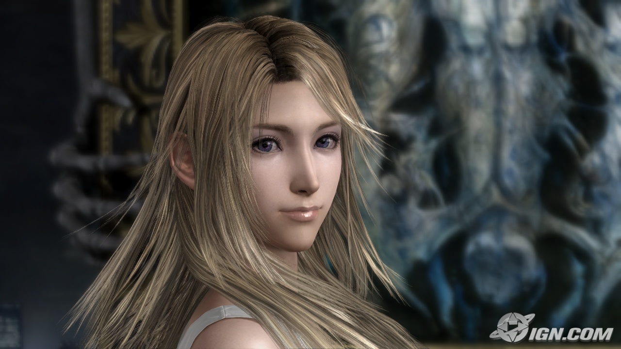
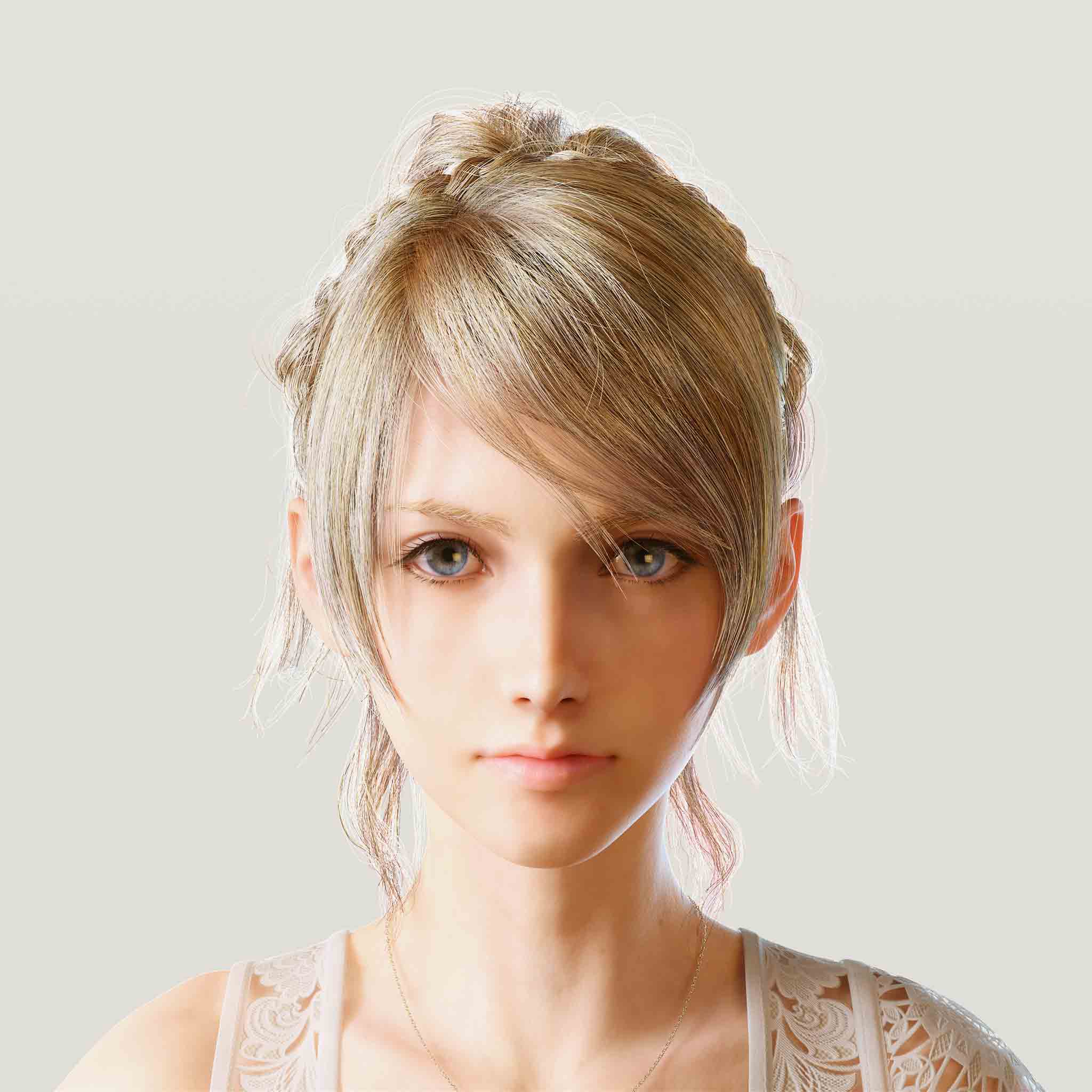
This is stupid as hell because they look almost the same and in fact when
her hair is down Luna looks just like Stella.
.

No? Their facial structures are pretty different.


Also was in part referring to their clothes; Stella's modern feminine look is far more interesting and unique than Luna's long white dresses. Dat black ruffled skirt ;A;
 

Jobbs

Banned
It always pains me to look at this abomination:

ding ding ding.

When my niece was 5, she loved Spyro. She played the original PS1 game over and over -- It was her first real video game.

When she eventually saw.. That... She cried and stopped caring about Spyro :(
 
The Nina example is bad indeed, but I guess at least there's something... different, or unique, about the redesign that makes it less generic. It's not much (design is still awful) but it's something.

If you want something even worse still... how about Breath of Fire VI's redesign? Warning, you may want to gouge your eyes out:

We don't discuss Breath of Fire VI. Because they never made it. That's my story and I'm sticking to it.
 

Syril

Member
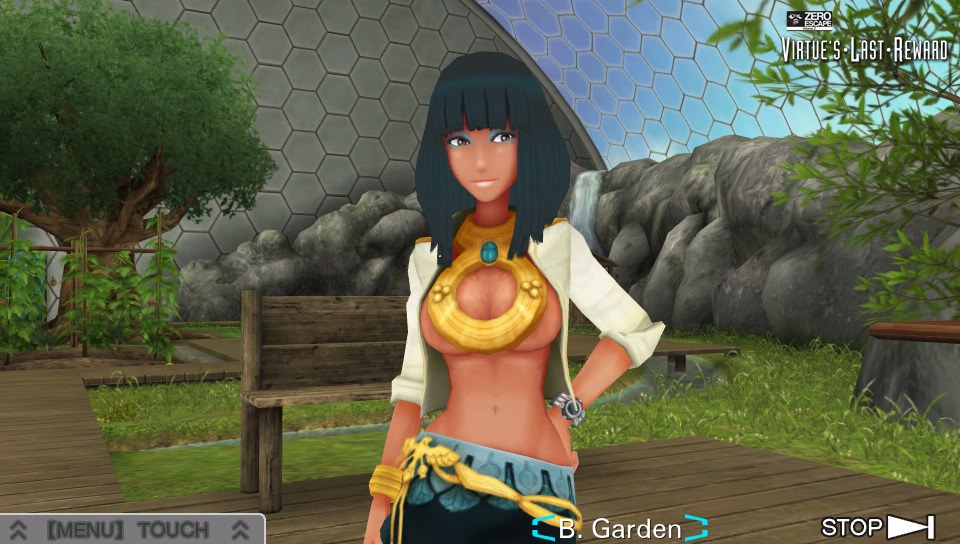
From Alice's "Original, but still in obnoxious wankfest territory" to Lady McChaferton from the Land of Bloody Nipples. This was literally a shirt away from being good design.


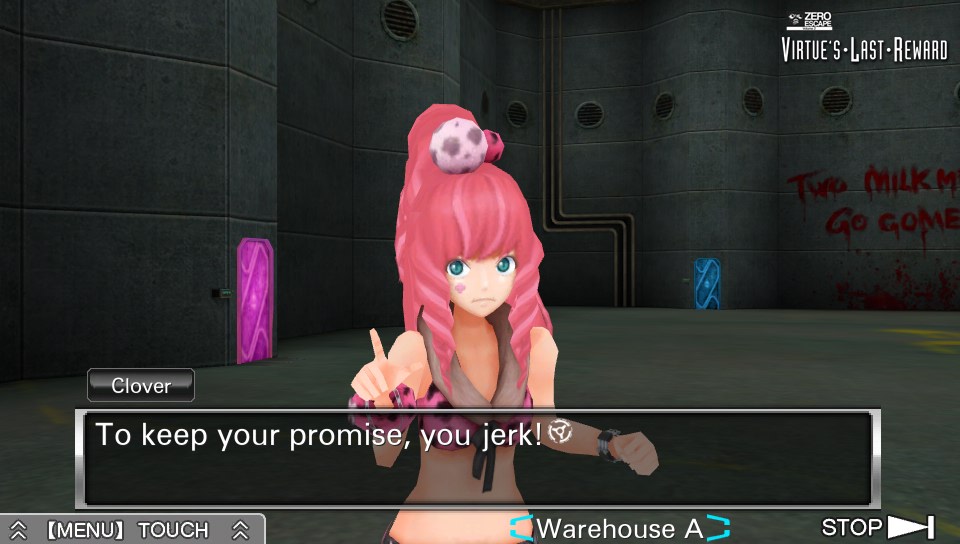
And Clover's redesign almost made me quit VLR altogether.

I spent the entire game not even realizing she was wearing a mini skirt (which is fine, if a bit odd with the heavy jacket)
Kinu Nishimura seems to enjoy pinballing between sensible-looking and batshit insane designs. We're talking about the artist who when she had total creative freedom did Code of Princess.
 
Kinu Nishimura seems to enjoy pinballing between sensible-looking and batshit insane designs. We're talking about the artist who when she had total creative freedom did Code of Princess.

Googled to refresh myself. It looks like someone said mashup etrian odyssey and tactics ogre and give it the shitty armor design sensibilities of everquest. Yeesh.
 

daTRUballin

Member
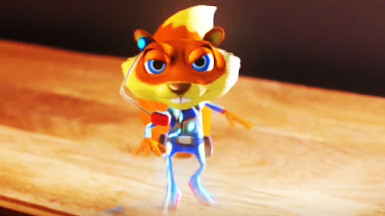
You know, I've never really minded Banjo and Kazooie's redesign in Nuts & Bolts and I was surprised at how many people were using it as an example of a bad redesign in this thread. But after looking at pictures of the old and new design side by side, yeah........their design in N&B is pretty terrible lol. It's not Young Conker bad, but it's pretty bad.
 

Mephala

Member
This atrocity is one of the reasons why I refuse to play the PSP version of the game. That and they got rid of the hilariously bad voice acting from the original.

Yeah, I just play Claude and try my best to ignore her. I miss old Lena though.
 

HTupolev

Member
Unless I missed it, we went 4 pages without Cortana.
Terrible redesigns.
Halo 3's is probably my least favorite, at least from the mainline games. It's a weird design, and like a lot of human(oid) character stuff in that game, the implementation is pretty iffy.

Halo 4 Cortana isn't necessarily the direction I would have taken the character, but it's a design that does play to Halo 4's strengths and hardly looks out of place.

Nefertiti Cortana > Halo 2 Cortana > Halo 4 Cortana > Cortana from the game with LordHood.jpg
 

MoonFrog

Member
Impa just looks really badass, though I admit the original one is cool as fuck too. I agree with you on Zelda though. I think it's because Zelda looks even lamer in other games, so now that she looks a bit more kick-ass people prefer her? I dunno. That "armour" does look stupid as fuck, but this is the same game that has

? I don't get this. Nothing wrong with a (good) stereotypical princess design. I think Zelda has seen plenty of those.
 
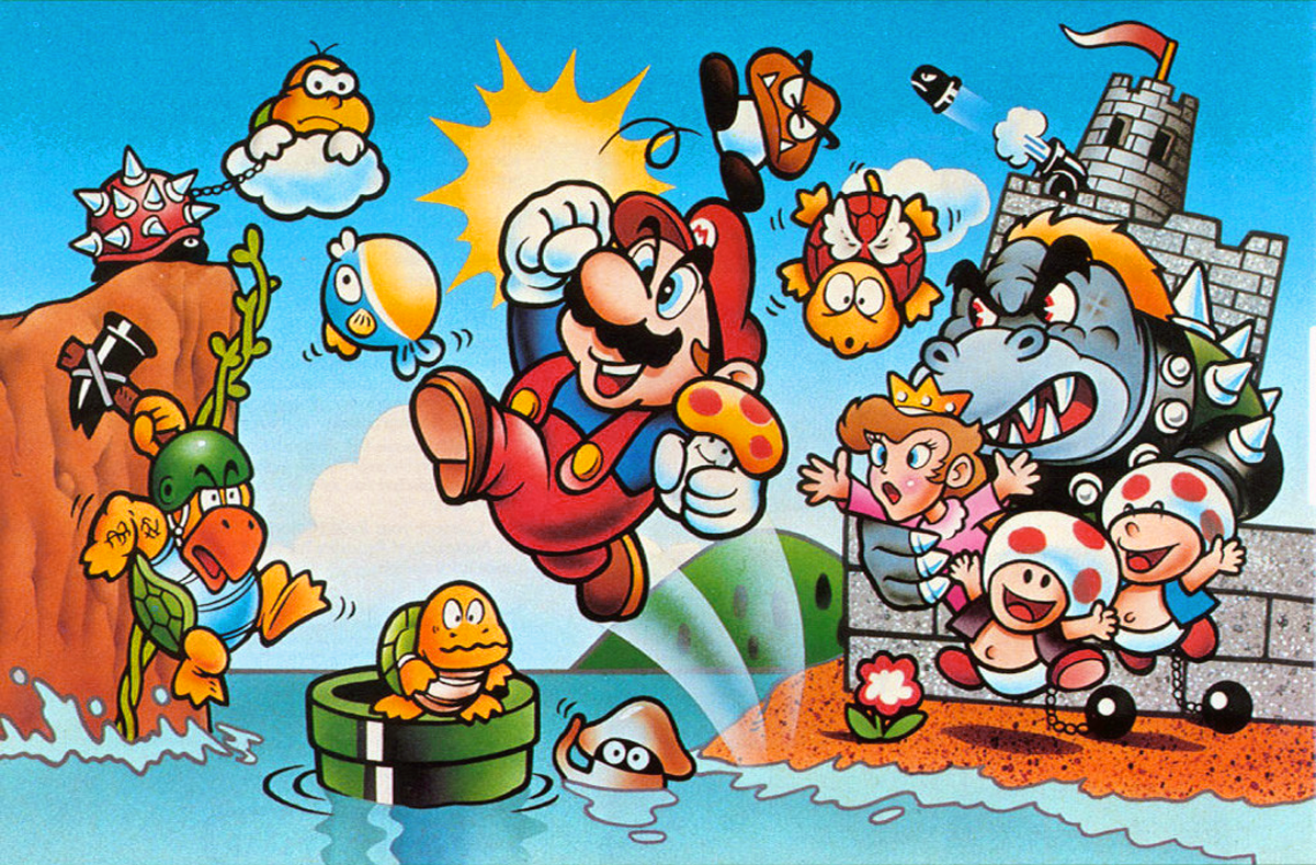
Bowser's earliest design by Miyamoto was weird :

super-mario-bros-japanese-box-art.png


It wasn't till his later re-design by Yoichi Kotabe that his look became the canonized version we all recognize

tVGG_8849.jpg


(also, that Peach)
 
Top Bottom