Morrigan Stark
Arrogant Smirk
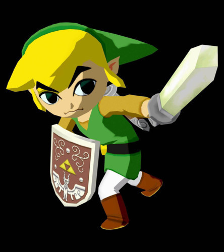
Impa, Sheik and Ganondorf from Hyrule Warriors, are the best versions of each character.
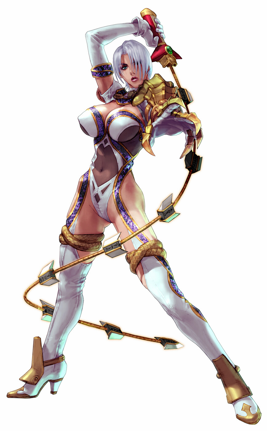
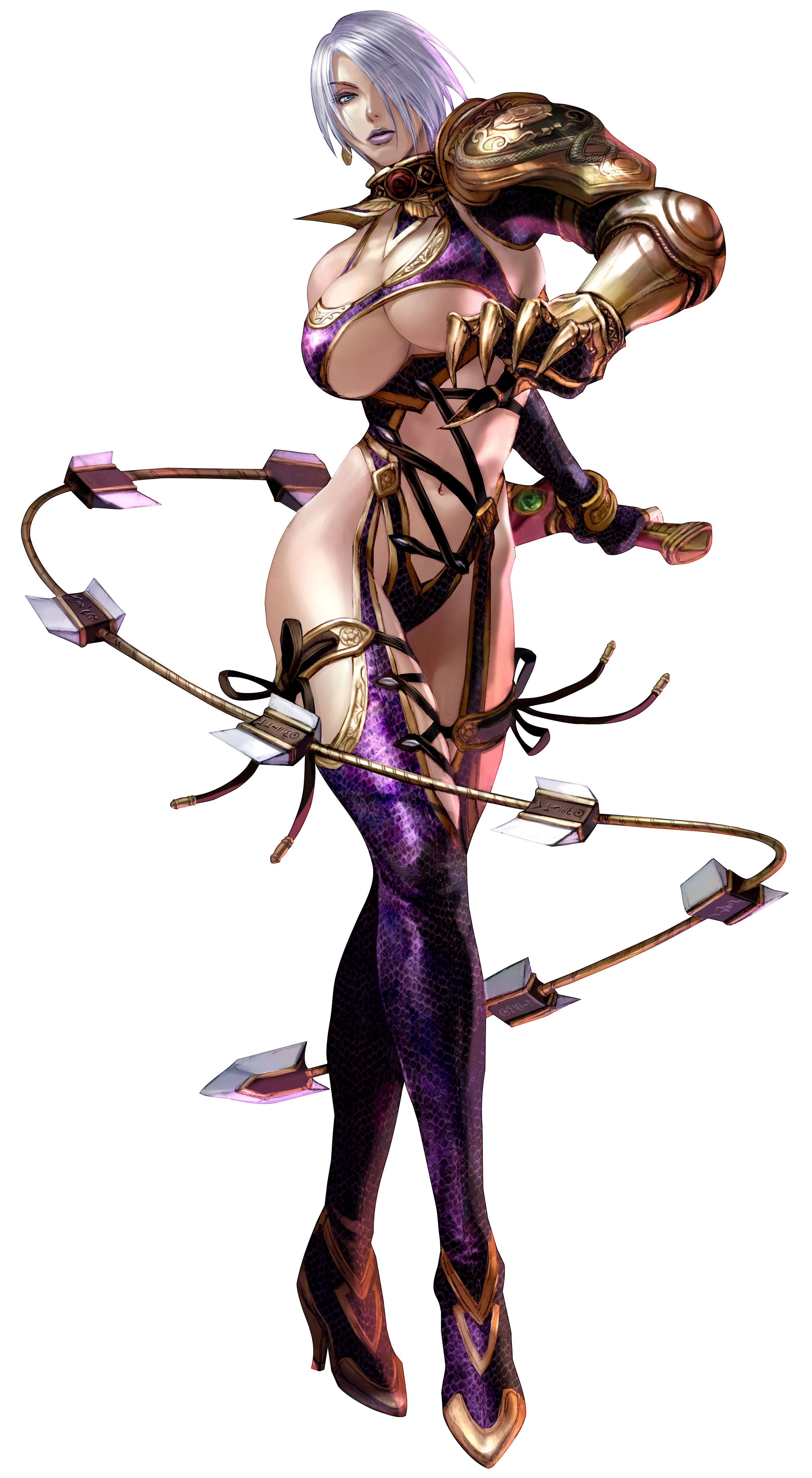
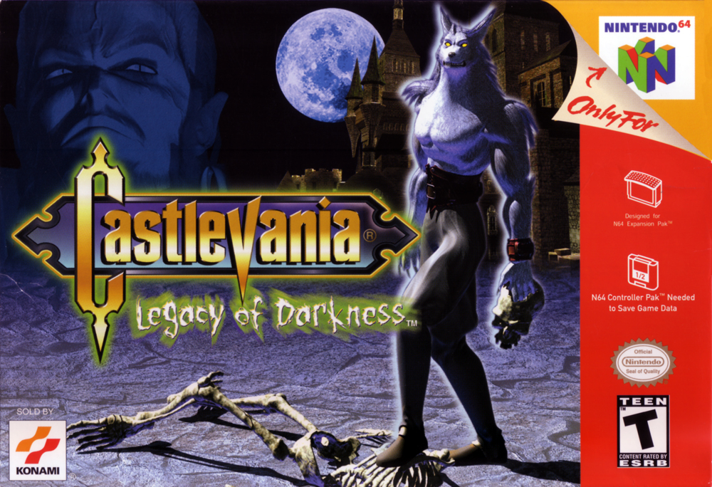
One of the worst redesigns ever is Shanoa. From this (Order of Ecclesia):

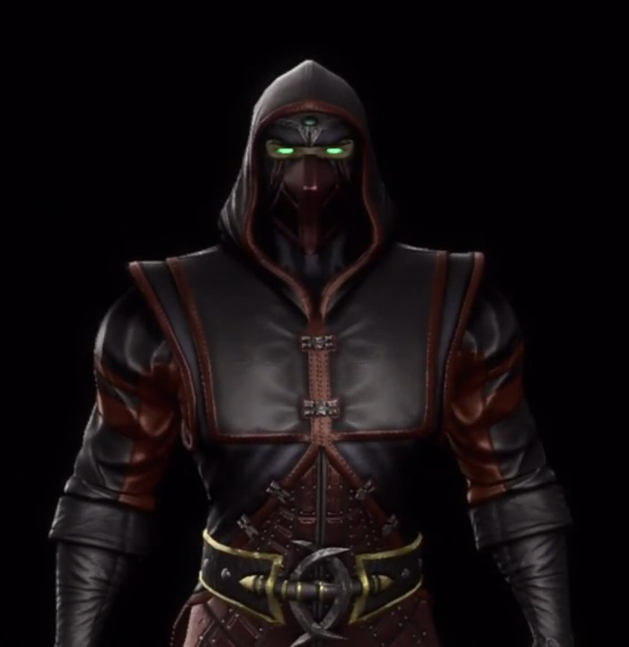
To... this abomination (Judgment):


One of the worst redesigns ever is Shanoa. From this (Order of Ecclesia):
To... this abomination (Judgment):
The original design had "spunk and personality", how, exactly? A nonsensical shirt with boob socks and a mini-skirt that makes no sense for a martial artist? I'm not a big fan of the redesign either (the back part of the shorts, like a butt cape, is kind of silly), but let's not kid ourselves, the original was even more absurd and goofy looking.I can't stand any variation of AC Tifa. It's such a boring design. You can gripe about how revealing the original FF7 design is for Tifa, but it has spunk and personality. The all black apron is just lame as hell with no spark to it at all.
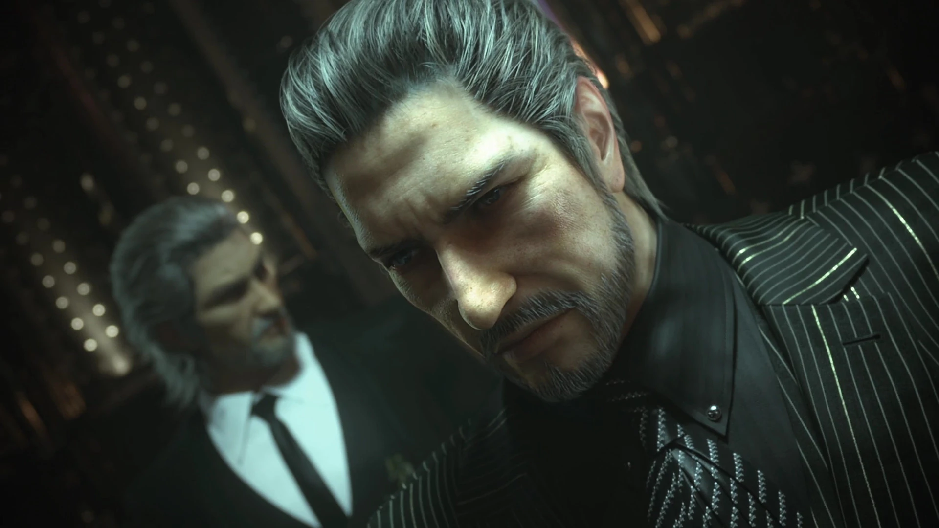
No way, the worst is this piece of trash. *shudders*Granted, it was meant to take place over millenia, but another Worst to best for Kain from Blood Omen to Soul Reaver.


.png/revision/latest?cb=20150116014728)