Best:

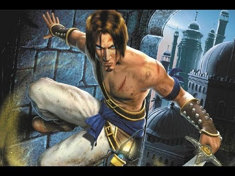
Chris from RE1 has a bit of the woodland elf about him..
Not that the steroid special in 5 is any better, in fact it's worse
Best:
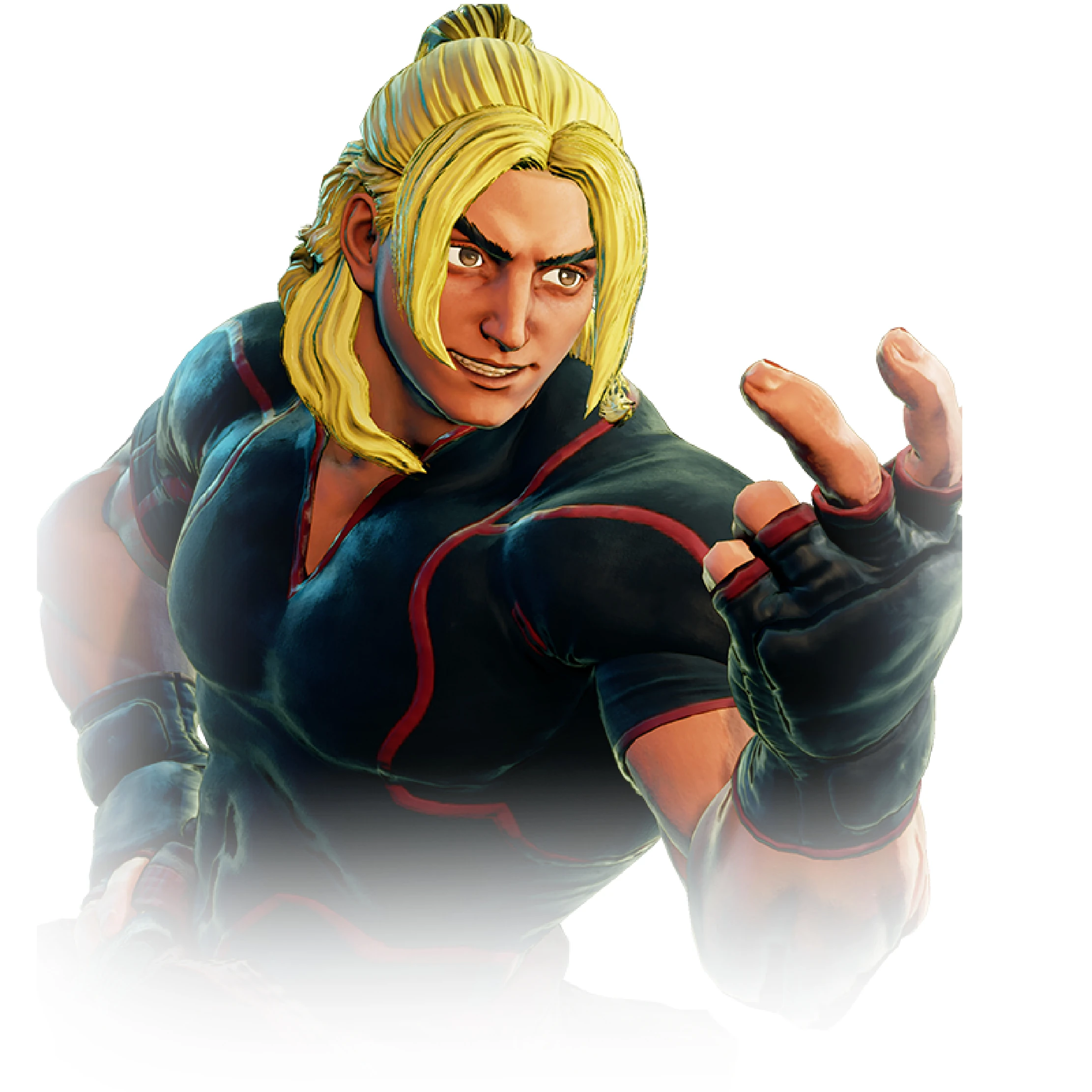
Ken's SFV design is kind of hit-and-miss in-game, but in fan art/basically anything where he doesn't have banana hair and a busted face model, he looks pretty great IMO.


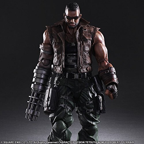
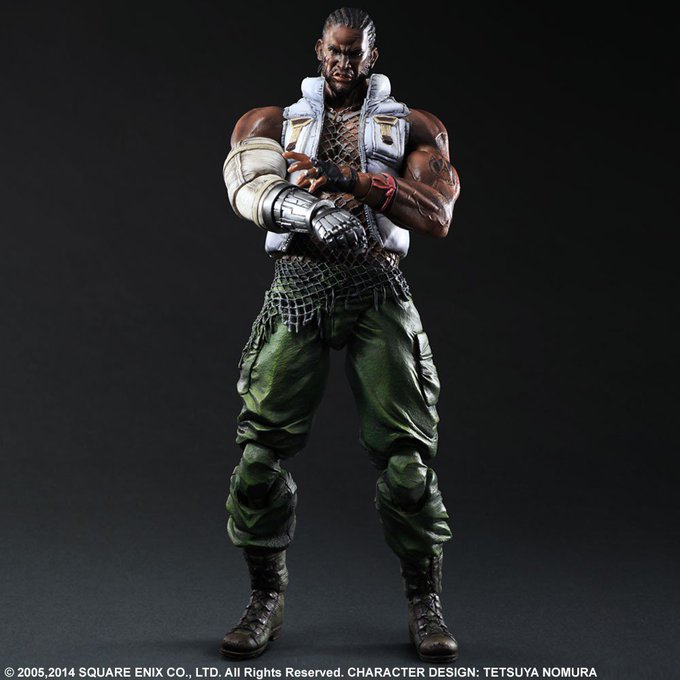
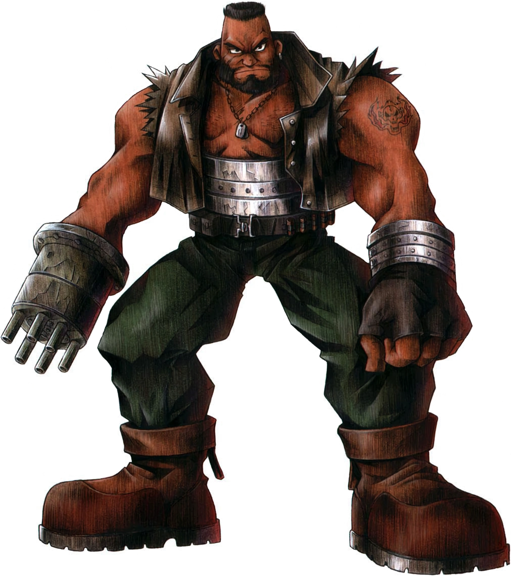
I dont know if anyone had posted this yet but The new Barret is so good it looks like someone other than Enix designed him.
vs old and older.

Anyone remember the Goemon redesigns?

Starts off as your average buff bandit in Ys I

First major design buff is making him...well...more buff, which is his staple characteristic. This artwork is from Ys VI, but it's more or less what his original design was shooting for for in Ys I, II, and IV. Perfection.

What he actually looks like in VI is a modest update to the design, one which is also used in Felghana albeit younger.

Then comes Ys Seven, which uh....what's wrong with your faceeeeeeeee and where's your iconic green????

Lastly Ys VIII, which takes place before Ys VI, and Dogi has fully embraced what I guess is the modern aesthetic.

Anyone remember the Goemon redesigns?
How in the flying blue fuck did they go from that to this?
The character designer upon seeing the final model:
Great:
http://i.imgur.com/PMD3mEO.png[/IMG
Cecil (Final Fantasy V)
Bad:
[IMG]http://i.imgur.com/fuBfdTQ.png[/IMG
Tidus (Final Fantasy X, or, when the ff series started to die)[/QUOTE]
This is the general redesign thread. Not the ff protagonist thread.
Why is the reason people hate Vaan original design? It is true that his abs looked kind of funny but beyond that is not really a bad design compared to the rest of the cast.
That shirt does looks mighty nice on him tho and I lowkey hope that they give you that as an alt costume (along with Penelo dancer costume) in The Zodiac Age even if it does not make sense =P
This is the general redesign thread. Not the ff protagonist thread.
The metal vest looks ridiculous
I mean, it's not as ridiculous looking as Ashe skirt/pants/fabric...The metal vest looks ridiculous, plus the armoured trouser he seems to randomly be wearing despite living in the desert
What? I mean Cecil isn't really a redesign it's just the same design as amano's done by nomura but that's not even what i was trying to say.Cecils Dissidia redesign is still great though, as it improves upon the original art while moving away from the weird ass sprite.
This is the general redesign thread. Not the ff protagonist thread.
There are much worse in this thread.The fucking worst.
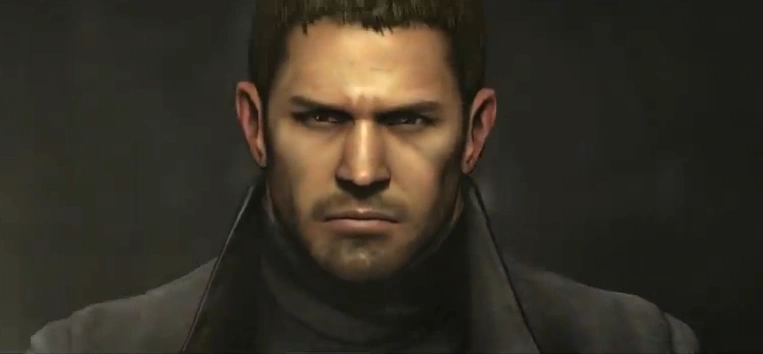
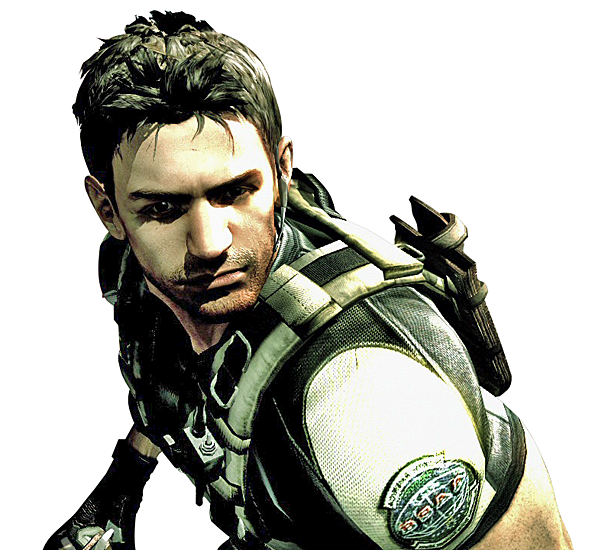
Chris Redfield has already been brought up, but can we talk about his redesign from RE5 to Resident Evil Vendetta (CGI movie)? Holy crap he looks even worse in Vendetta.

Cecils Dissidia redesign is still great though, as it improves upon the original art while moving away from the weird ass sprite.
I honestly can't think of a single FF character that doesn't look better in Dissidia. And if you can, they probably have an alternate costume that fixes what you don't like.
It looks great over his white pirate shirt though.

Cloud.
Pretty much just his posture through. His design is the same.
Chris Redfield has already been brought up, but can we talk about his redesign from RE5 to Resident Evil Vendetta (CGI movie)? Holy crap he looks even worse in Vendetta.
For Worst Redesign... one that really gets me is Boo from early Paper Mario to new:

All of Killer Instinct 2013 is the best.
Controversial statement: I prefer Millia Rage's Xrd design to her original

I think every single design in Castlevania Judgment is pretty damn fucked up.
Isn't that basically the Yoshi's Island design for the boo?


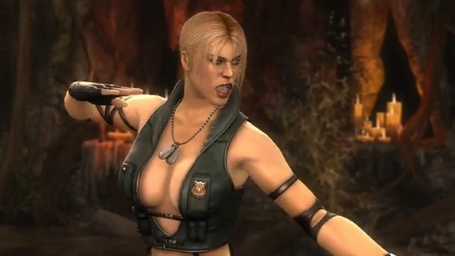
Those tan lines. I know Netherealm are very hit and miss with their character designs and I personally hadnt really liked a Sonya design until MKX came around, but this one takes the fucking cake. Just...come on.
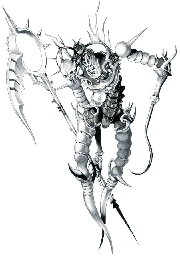
The Halo Jackal/ Kig-Yar.
Bungie era

343 Industries abomination

Also, Shred-Zero is best Sub design.

And at least it actually attempted to innovate a little, unlike every single primary outfit he's had since.
Funny how this thread is literally the first time I hear this complaint. Back in the day people hated Vaan because they said he looked <homophobic slur>.Yes it really was noticable. He was the only male in the game with that weird skeleton texture on his stomach . It looked gross.
She was my favourite in GGXX, but now she's ruined. That hat looks fucking stupid.Controversial statement: I prefer Millia Rage's Xrd design to her original

I don't believe that. Him being a shirtless bishonen is what made people uncomfortable for the most part, that much is obvious. Not like bad textures were that noticeable in-game were they?
All these men are "manly men" and are considered acceptable to be shirtless. Effeminate pretty boys? Nope! xD
Not to mention, nonsensical anatomy has never stopped anyone from loving the hell out of female designs, sooooo
The redesigns from Rondo of Blood to Dracula X Chronicles were really good. Maria and Dracula in particular, Rondo has the laziest-ass bishounen Dracula design.
I really like her Xrd design. One of the big issues I had with Xrd initially is how they they had the opportunity to start from scratch with every single character and for a lot fo characters used it to just make the exact same designs and even animations in some cases as in Guilty Gear X.
lol, no, I wasn't saying thatI agree with you: we need more shirtless bishounen characters in our games.
:3
Impa, Sheik and Ganondorf from Hyrule Warriors, are the best versions of each character.
One of the worst redesigns ever is Shanoa. From this (Order of Ecclesia):

To... this abomination (Judgment):

The original design had "spunk and personality", how, exactly? A nonsensical shirt with boob socks and a mini-skirt that makes no sense for a martial artist? I'm not a big fan of the redesign either (the back part of the shorts, like a butt cape, is kind of silly), but let's not kid ourselves, the original was even more absurd and goofy looking.
No way, the worst is this piece of trash. *shudders*
This
To this
I expect to catch a lot of flak, but I loved Zero going from angry 90s anime cartoon robot w/ giant limbs to his more streamlined appearance in Mega Man Zero games. Not that I think original Zero is a bad design - it's classic, really - but I love me some MMZ.
>>>>
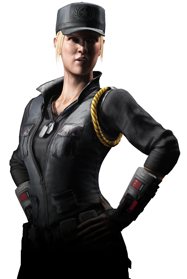
Sonya Blade went from looking like a porn star in MK9:
to an actual special forces agent in MKX
Steady progression here m8Jill Valentine for both best and worst:
Best:
to
and then we get to this...
Worst:
Wait the remaster face is the one on the left right?? That looks way better. One of the right looks like Meg Ryan.
I hate the remaster face so damn much.
Tidus in FFX has 3 different faces - in game face that barely animates, in game face that fully animates during certain cutscenes and CG cutscene face. They all look somewhat different and the remaster face doesn't resemble any of them. I have no idea what the fuck happened.
The messed up thing about it is that they came up with some new art at the same time that looks tons better.