• Hey, guest user. Hope you're enjoying NeoGAF! Have you considered registering for an account? Come join us and add your take to the daily discourse.

Can you make DKC2 look good again?

Maybe ! I don't know ! :messenger_smiling:

But when I see this video, I have a doubt :messenger_neutral: :


Not only Sega used the dithering technique.

But really, I don't know ! Everything is possible !
 

MP!

Member
Not DKC2, but DKC3:

dkc19jueh.jpg

dkc2fvu6y.jpg


*Original assets only :(
Oh man... how awesome would an HD remaster be using the original renders.... man... this will never happen
 

theclaw135

Banned
Maybe ! I don't know ! :messenger_smiling:

But when I see this video, I have a doubt :messenger_neutral: :


Not only Sega used the dithering technique.

But really, I don't know ! Everything is possible !


That'd need a more intelligent filter to fix. Composite is "dumb". It smears the entire screen, without regard for what's dithered.
 
Yes. I agree !

But with this video, I wanted to say that the technique of dithering was probably used by the developers because they had in mind the degradation of the picture. It's why I don't think that these games were thought to be played on PVMs or BVMs.

In fact, maybe there wasn't a good way to be played ! :messenger_smiling_with_eyes:

On a professional CRT with RGB cable for example, the picture is sharp, but the dither isn't hidden. And on a classic CRT, with a bad connexion like composite, the shades of the dither are blended to give new colors or new effets like transparency.

We can see in the video above that some effects like the waterfalls in Sonic don't work when the picture is too sharp.

So, we have almost the same problem now with these games on our modern displays ! :messenger_squinting_tongue:

Should we hide the aliasing or not ? Should we add scanlines or not ? Should we degrade the picture or not ? :messenger_neutral:

A sharper image can show more defaults, and a blurry picture can show more qualities...

Both are degrading the picture !

From a mathematical point of view, a perfect picture is :

- the source untouched
- the picture upscaled with a "Nearest neighbor" filter by an integer number

The rest is purely subjective !

And I must admit, that from a subjective point of view, I'm never satisfied ! :messenger_grinning_smiling:
 
Last edited:
The French Wikipedia is very interesting about the subject of "Pixel art", and particularly this part :messenger_winking: :

« Le choix esthétique des gros pixels
Du fait de la disparition des contraintes techniques, aujourd'hui s'exprimer en pixel art n'est plus une nécessité, mais un choix esthétique, culturel, parfois commercial aussi. La plus commune des méthodes artistiques repose ainsi dans ce domaine en la réduction volontaire de la quantité de pixels pour un même sujet représenté (plutôt qu'en la diminution de sa palette de couleurs, puisque les changements y sont moins perceptibles, en général). Par ce type de filtre intentionnel, qui n'est dégradant que superficiellement (voir le paragraphe sur l'intentionnalité des détails), l'image suffisamment crénelée peut finalement porter la mention : à « gros pixels ».

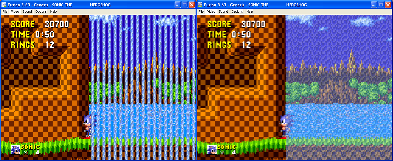
L'agrandissement devient généralement nécessaire, sur les affichages haute résolution modernes (2, 3, 4 fois, voire davantage comme dans l'illustration de l'alien plus haut, et préférablement sans flou, pour mieux apprécier le travail pointilleux et sans altérer la palette notamment). Cet étirement sans perte accroît nécessairement l'effet pixelisé initial, parfois exagérément jusqu'à le rendre presque grossier par la visibilité excessive des carrés. Il s'agit alors d'un effet pervers, qui dégrade la qualité esthétique de l'œuvre originelle. Cette perte de fidélité sans précaution, loin d'être moderne, est parfois oubliée collectivement par d'adoption, voire la revendication de blocs disgracieux quand ce n'est pas du tout nécessaire. À moins que cela ne soit intégré à un argument commercial tout à fait assumé. En cela, la mode des très gros pixels se réfère davantage à la préhistoire des jeux vidéo, à la Pong (tout point composant le dessin est restitué comme un large rectangle de plusieurs pixels sur les vieux écrans), plutôt qu'aux systèmes postérieurs dont la résolution écran était voisine de celle native matériellement (1 pixel logiciel est rendu par exemple en 2×2 physiquement). Le flou automatique lors de l'agrandissement est généralisé sur les navigateurs internet ; il l'est aussi sur la plupart des visionneuses d'images bitmap (où IrfanView permet a contrario de désactiver le filtre, sous Windows). Dramatiquement pour la diffusion des œuvres en pixel art de très faible résolution, les logiciels de retouche bitmap laissent encore trop souvent place à ces visionneuses “modernes”, tout à fait inadaptées en l'occurrence.

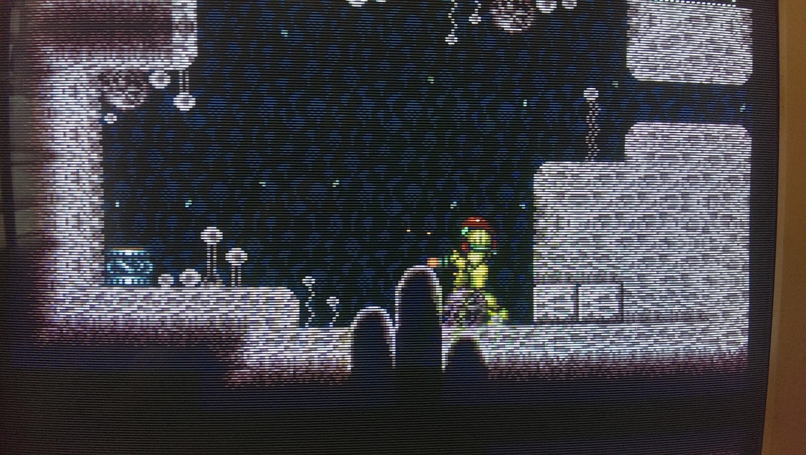
Cette apparence carrée, plate, froide ou austère est le souci majeur des connaisseurs des premiers jeux vidéo sur les machines d'origine. Ils recourent de nos jours à des filtres logiciels, sur les émulateurs récents principalement, afin de voir simulés les luminophores de leurs écrans cathodiques d'antan (télévision domestique ou poste d'une borne d'arcade). Ces divers filtres adoucissent (brisent etc.) les carrés de pixels, jusqu'à restituer le lissage naturel du fameux balayage électronique, ce qui rend l'image aussi “chaleureuse” qu'à l'époque, dans un contexte nostalgique surtout.

Les algorithmes de lissage des agrandissements, hormis ceux à base de vectorisation partielle dans certains logiciels dédiés en photographie, se retrouvent compilés (en dehors des émulateurs spécialisés ci-dessus) dans des interfaces telles que l'outil Image Resizer (alias 2dimagefilter) sur Windows (Inkscape, éditeur vectoriel multiplateforme, recèle depuis peu un tel convertisseur de pixel art). Si le résultat est parfois surprenant de poli (quand l'anticrénelage disparaît totalement, à la mode des jeux vidéo actuels, après celle des animations Flash en vectoriel), l'intérêt de supprimer aveuglément les arêtes des gros pixels, ou de détériorer l'image à divers niveaux dont les trames, repose la question de la prévalence des pixels précisément disposés en pixel art. Par exemple, les points (de pixels) abusivement connectés entre eux (afin de produire le lissé) : tant que les algorithmes actuels ne disposeront pas de reconnaissance à base d'images (et en étant optimiste sur la faisabilité à cette très petite échelle), l'agrandissement sera tantôt déformé, tantôt lissé correctement, sans possibilité de prédire le bénéfice (sur un échantillon quelconque d'images), ni d'affirmer que la méthode (chirurgicale ou seulement esthétique) ne cache simplement pas une curiosité passagère, voire une lassitude des gros pixels. Ce type d'agrandissement remplace une stylisation humaine par une artificielle, en y ajoutant souvent des erreurs d'interprétation. Un peu comme pour le cas des filtres de flou d'agrandissement (upsampling), son utilisation est donc sujette à caution : elle serait à éviter absolument pour toute restitution fidèle. Le public néophyte en pixel art pourrait cependant apprécier cette transition en douceur. »

Link : Le choix esthétique des gros pixels


------------

Translated into English with Google Translate (maybe it's not perfect :messenger_confused:) :

« The aesthetic choice of big pixels

Due to the disappearance of technical constraints, today to express in pixel art is no longer a necessity, but an aesthetic choice, cultural, sometimes commercial too. The most common of the artistic methods thus rests in this field in the voluntary reduction of the quantity of pixels for the same subject represented (rather than in the reduction of its palette of colors, since the changes there are less perceptible, in general). By this type of intentional filter, which is degrading only superficially (see the paragraph on the intentionality of details ), the sufficiently crenellated image can finally be labeled: "big pixels".

Magnification usually becomes necessary on modern high resolution displays (2, 3, 4 times, or more as in the illustration of the higher alien , and preferably without blur, to better appreciate the picky work and without altering the pallet in particular). This lossless stretching necessarily increases the initial pixelated effect, sometimes to an exaggerated extent to make it almost coarse by the excessive visibility of the squares. It is then a perverse effect, which degrades the aesthetic quality of the original work. This loss of fidelity without precaution, far from being modern, is sometimes forgotten collectively by adoption, even the claim of disgraceful blocks when it is not necessary at all. Unless this is integrated with a commercial argument that is fully accepted. In this, the mode of the very large pixels refers more to the prehistory of video games, the Pong (any point composing the drawing is rendered as a large rectangle of several pixels on the old screens), rather than later systems of which the screen resolution was close to the native one (1 software pixel is rendered for example in 2 × 2 physically). Automatic blur during enlargement is widespread on internet browsers; It is also true on most bitmap image viewers (where IrfanView allows a contrario to disable the filter, under Windows). Dramatically for the diffusion of works in pixel art of very low resolution, bitmap editing software too often leave room for these "modern" viewers, quite unsuitable in this case.

This square, flat, cold or austere appearance is the major concern of connoisseurs of the first video games on the original machines. Nowadays, they use software filters, mainly on recent emulators, to simulate the phosphors of their old cathode screens (home television or an arcade terminal). These various filters soften (break etc.) the squares of pixels, to restore the natural smoothing of the famous electronic scanning, which makes the image as "warm" as at the time, in a particularly nostalgic context.

The algorithms for smoothing enlargements, except those based on partial vectorization in some software dedicated to photography, are found compiled (apart from the specialized emulators above) in interfaces such as the Image Resizer tool (aka 2dimagefilter ) on Windows. ( Inkscape , a multiplatform vector editor, has recently had such a pixel art converter). If the result is sometimes surprisingly polite (when the anti-alias disappears totally, the fashion of the current video games, after that of vector-based Flash animations), the interest to delete blindly the edges of the big pixels, or to deteriorate the image at various levels including frames, based on the question of the prevalence of pixels precisely arranged in pixel art. For example, (pixel) points that are mis-connected (to produce smoothness): as long as current algorithms do not have image-based recognition (and being optimistic about feasibility at this very small scale) , the enlargement will be sometimes deformed, sometimes smoothed correctly, without possibility of predicting the benefit (on any sample of images), nor to affirm that the method (surgical or only aesthetic) does not simply hide a temporary curiosity, even a weariness of big pixels. This type of enlargement replaces a human stylization with an artificial one, often adding errors of interpretation. A bit like the case of upsampling filters, its use is therefore questionable: it should be avoided absolutely for any faithful reproduction. The neophyte audience in pixel art could however appreciate this transition smoothly. »

Link : Pixel art (French Wikipedia translated into English)
 
What do you think about that ? Is it a good compromise for you ? :messenger_smiling:

Aq8eDQ.png


I upsized the picture 2X with a "Nearest neighbor" filter, then 2X with a "Gaussian" resizer, and finally a "Bilinear filter" to get a resolution of "2820 x 2160".

After reading the text on Wikipedia above, I thought that there is really no possibility to get a perfect picture ! On a modern display, it's just a compromise between a pixelated image and a smooth image ! But you all know that ! It's totally subjective ! :messenger_hushed:

AdnIKP.png

Original picture


Adntqo.png
 
Very interesting ! :messenger_grinning:

A pixel artist renounces pixel art

HD is the current buzzword used to market both hardware and software. The "high" in "high definition" is relative. Twenty-five years ago, "16-bit graphics" was the operative phrase, but it was ultimately the same concept; 16-bit graphics was just the the HD of its time.

If the artists of the time had access to better production tools, I'm sure they would have been thrilled. "Pixel art" was never a thing — nobody was thinking, "I think we'll go with pixel art for this game." Rather, they were simply working in the "H-est D" available to them.

Earlier I said that every medium has limitations. I also mentioned that artists endeavor to eliminate these limitations so that nothing comes between them and their vision. Paradoxically, good artists also embrace limitations. Limitations force ingenuity and innovation, and push a form forward.


Pixel artists appropriate the limitations that existed 25 years ago and self-impose them. Though this causes confusion among general audiences, it has made for some of the most advanced, ingenious pixel art yet (art by Fool on Pixeljoint).


Keeping the color count low, as mentioned before, isn't just for the sport of it. A harmonious palette creates a cohesive piece (art by Thu on Pixeljoint). This principle, along with many others, applies to all visual art, pixel or otherwise.


No matter the period, there were artists who embraced the limitations of their time. That could mean using pixel art techniques to make the most out of a low-resolution screen...

Evidently, even some retro game enthusiasts want to get rid of pixels so badly that they would rather have a computer smear the art like runny makeup than appreciate the pixel art for what it is. A few years back, the Hebrew University and Microsoft set out to "depixelize" pixel art through a new anti-aliasing (pixel-smoothing) algorithm.

pixel23.0.png


I don't care what you have to do, just GET RID OF THOSE SQUARES!


The hand-placement of the squares is precisely what makes this kind of art valuable. If anyone besides artists should appreciate that, it's retro game enthusiasts. When even they are splintering on this issue, I think it's time to face the chiptunes.

Anyone think those smoothing algorithms above actually improved the pixel art? I wouldn't blame you, as the smooth lines are speaking a more modern language. That said, I'll close by illustrating my larger point with, well, an illustration. Pixel art, 3D art, mosaic art, stop-motion art, etc. are just mediums. Don't let the medium come between you and your audience. Speak in a language people can understand so that they can actually see what makes your work great without a tax.


Working at a high resolution doesn't prevent us from making great game art. The things that made pixel art great are the same things that make "HD" art great. Artists must make the decisions, not computers. Instead of hand-placing squares, hand-place curves. Good art is good art, and nothing beats the real deal. Embracing the medium simply ensures that everybody else knows it.

pixel24.0.png


Embrace the medium!


Another interesting thing about pixel art :messenger_winking: :

Today’s Computer Displays Distort Pixel Art Designed for 1980s CRTs

As a kid, I remember studying my CRT displays with a microscope. Each pixel that I could control with BASIC on my TRS-80 or Atari 800 or Commodore-64 was made up of tiny arrays of red, blue, and green dots that I could not control directly. There was one display mode of the Atari 800 that officially offered 4 colors — black, red, blue, and white. My brother and I noticed that the “white” dot triggered more green subdots or more red subdots depending on whether the x coordinate was even or odd, so if we placed the pixels carefully enough, we could turn this quirk into an exploitable feature, and squeeze an additional color out of a very limited pallete.
A Tumblr post, “Designing 2D graphics in the Japanese industry,” exposed me to this side-by-side comparison showing the way a 1980s pixel drawing appeared on a contemporary CRT, with blurring and smoothing that was a feature of the analog display of a digital image, and how the exact same image is rendered as much more blocky and flat on a modern display.
When viewing the artwork on the display for which it was designed, the eye supplies missing curves and a coherent topology; we could imagine a much more detailed Platonic ideal as the pure source of the image that our flickering CRTs displayed imperfectly. The perfect clarity of a modern display invites no such participatory co-creation.

tumblr_inline_phiwexvGTu1w169t0_500.jpg
 
Surprise ! :messenger_tongue:

When I have read this topic on a forum and saw this picture, I wanted to try to upscale an image of "Super Metroid" (I love this game :messenger_smiling_with_eyes:) to get the closest picture that I can. I don't know if it's good, but I will show you ! :messenger_winking:

Correct brightness/contrast setting for CRTs and scanline variability

IMAG0083.jpg


And now my upscale, step by step !

I used an AviSynth script to do that.


Step 1 : I double the resolution of the picture by 2 with a "Nearest neighbor filter" (so the resolution is 512 x 448)

AqCwEC.png


Step 2 : I add light scanlines (I wanted to try, but just to have a better comparison, because finally I don't want scanlines)

AqJQHc.png


Step 3 : I boost the gamma with 50% (I know the colors are a bit weird, but the problem is that the fake scanlines affect the gamma)

AqJBNm.png


Step 4 : I double the resolution with a "Lanczos3" filter (so we have a resolution of 1024 x 896)

AqJsii.png


Step 5 : I upscale the picture to a 2160p resolution with a "Bilinear" filter

AqJ39o.png


Aspect ratio 4:3 (in fact, 64:49 is more precise, so the resolution is 2820 x 2160)

AqJ4L9.png


Aspect ratio 8:7 (the resolution is 2468 x 2160)


What di you think ? :messenger_grinning:

Of course, there is no miracle ! It's not perfect ! :messenger_neutral:


For the curious, here is the AviSynth script I did :

AviSource("H:\metroid.avi")
PointResize(512, 448)
Scanlines(STRENGTH=50)
Levels(0, 1.50, 255, 0, 255)
Resize8(1024, 896, kernel="Lanczos3", kernel_C="Lanczos3")
Resize8(2820, 2160, kernel="Bilinear", kernel_C="Bilinear") or Resize8(2468, 2160, kernel="Bilinear", kernel_C="Bilinear")


You can find some of the filter I used here :

http://avisynth.nl/index.php/Scanlines
http://avisynth.nl/index.php/Levels
http://avisynth.nl/index.php/Resize8


I will come back soon with the "Donkey Kong Country" of course... ! :messenger_winking:
 
Ah ah ! I don't remember ! :messenger_grinning_smiling: Maybe ! It's old now ! :messenger_smiling_with_eyes:

I just want to show the previous pictures without scanlines too :

AqJUPQ.png


AqJXia.png


8:7 Aspect ratio


And now, that Cranky Kong intro which looks like shit ! :messenger_tongue::messenger_grinning_smiling::messenger_winking:

(I used a softer gamma boost, just 25% this time, to preserve the colors !)

AqJwMk.png


AqJxax.png


And some other pictures from DKC 2 :messenger_grinning: :

AqJ56H.png


AqJGz1.png


AqJabc.png


AqQ2tK.png


AqQ8KZ.png


AqQAPP.png


AqQijm.png


AqQjqi.png
 
Last edited:
Hello everybody :messenger_grinning:

I tried some new tests on the image, just for fun ! :messenger_tongue: I don't know if it's good. It's something... ! :messenger_smiling_with_eyes:

I did this with AviSynth scripts again : one for a picture with scanlines (and gamma corrected), another without scanlines.


Script with scanlines :

AviSource()
PointResize(512, 448)
Scanlines(STRENGTH=75)
Levels(0, 1.25, 255, 0, 255)
Resize8(1024, 896, kernel="Blankman2", kernel_C="Blankman2")
Resize8(2820, 2160, kernel="Bilinear", kernel_C="Bilinear")


Note : The scanlines plugin only works with the 32 bits version of VirtualDub, not the 64 bits.


Script without scanlines :

AviSource()
Resize8(1024, 896, kernel="Blankman2", kernel_C="Blankman2")
Resize8(2820, 2160, kernel="Bilinear", kernel_C="Bilinear")


Some screenshots of the 3 DKCs !:messenger_winking:


AqFVAq.png


AqF9VA.png


AqFdnM.png


AqFq5Q.png


AqFsOe.png


AqF3ck.png


AqFKZx.png


AqFlVK.png


AqFS5P.png


AqFo32.png


AqFPV5.png


AqFFGT.png


AqFXH7.png


AqFbXr.png


But to be honnest, everything is equivalent. It's a totally subjective balance to find between aliasing/details and blur/relief !

I can do very nice images, but there is zero depth of field and relief. Nice, but flat ! I think it's one of the reason why some persons like the big pixels, because even if it's nice (subjective), there is a depth. On a CRT, there was all in the same time ! The best picture us definitly the picture untouched ! But it's not adapted to our modern displays ! :messenger_neutral:
 
Last edited:
Hello there ! :messenger_tongue:

I come back here to expose new screenshots from scripts AviSynth that I did. I remind you that it's only to upscale videos from games captured in their original resolution !

I know you will think it's always post the same result, but it changes, but it's more noticeable in movement, in a video ! Anyway, it's the last time I will post my results, because I don't want to pollute this topic, and there is no miracle !

I still try to get a picture close to a Sony PVM, so I used scanlines, but my goal is to remove them at the end. It's just to have benchmarks !


Here is for example a screenshot from a video on YouTube, that I took as a reference :

A49yco.png


This is original picture from Super Metroid :

A49Gg9.png


To get visible pixels, I began in my script to double the resolution of the picture with a "Nearest neighbor" filter :

A49a32.png


And then, I added 25% of scanlines and boosted the gamma with the same percentage :

A49hDv.png


To soften the picture, I doubled the resolution with a bilinear filter :

A4d8WC.png


Without bilinear filter, I think that the pixels are distracting and almost un sightly. CRTs vere a bit blurry too, so I blur a bit ! :messenger_grinning_smiling: In addition, we don't lost any detail with the bilinear filter because it's a resizer ! The bilinear filter keeps even more details than the bicubic !

Beyond that, I tried to resize to a resolution of 1234 x 1080 instead of 1024 x 896 (X4 the resolution from the original), but I found it's wasn't perfectly natural.

So the goal was now to find a resizer which stays natural when I want a resolution which isn't a multiple of the original resolution anymore ! I think the most balanced filter for that is the "Catmull-Rom" (it's a sharper bicubic filter). I tried "Lanczos3", "Spline", "Blackman", etc., and it's the best !


So I increased the resolution to 2468 x 2160 with a "Catmull-Rom" filter :

A4dAV5.png


To get a 4:3 aspect ratio like the Sony PVM, I simply used a bilinear filter (it's the best for that) :


A4dWvz.png


Here is the picture without the scanlines :

A4diGT.png


I precise that normally, I wouldn't have chosen this aspect ratio for this game, but I would have kept the 8:7 aspect ratio, because with a 4:3 aspect ratio, we can see that the morphball of Samus is distorded :


Other clarification, I create a script for the 240p contents (or smaller) and one for the 480i/480p contents !

With the 240p contents, I begin to double the resolution with a "Nearest neighbor" filter, but not with 480i/480p, because it's logic ! :messenger_smiling_with_eyes: My goal was to be close to the Sony PVMs, so...


Here is for example a screenshot in a resolution of 640 x 480, from "Super Smash Bros. Melee" on the GameCube :

A4dIH7.png


With my script and scanlines :

A4dZXr.png


The result of my script without scanlines :

A4drgF.png


And now, the script I used for "Super Metroid", that I consider like a 240p content (the resolution is 256 x 224) :

ImageSource("G:\Super Metroid.png")
PointResize(512, 448)
#Scanlines(STRENGTH=75)
#Levels(0, 1.25, 255, 0, 255)

BilinearResize(1024, 896)
Resize8(2468, 2160, kernel="Catmull-Rom", kernel_c="Catmull-Rom")
BilinearResize(2880, 2160)

The script for 480i/480p contents :

ImageSource("G:\Super Smash Bros.png")
#Scanlines(STRENGTH=75)
#Levels(0, 1.25, 255, 0, 255)

BilinearResize(1024, 896)
Resize8(2468, 2160, kernel="Catmull-Rom", kernel_c="Catmull-Rom")
BilinearResize(2880, 2160)


So voilà ! I think I can't do better ! :messenger_grinning:

I have just one old script that I did a long time ago, with a more modern look :messenger_winking: :

A4d0Eb.png


A4dt33.png


To differentiate this one from the other, we will call the other "Old style" and this one "Modern style".

Here is the script for Super Metroid :

ImageSource()
Resize8(1234, 1080, kernel="Spline64", kernel_C="Spline64")
Resize8(2880, 2160, kernel="Bilinear", kernel_C="Bilinear")

And for Super Smash Bros. Melee :

ImageSource()
Resize8(1440, 1080, kernel="Spline64", kernel_C="Spline64")
Resize8(2880, 2160, kernel="Bilinear", kernel_C="Bilinear")


But with hindsight, I rather would have done this :

ImageSource()
Resize8(1024, 896, kernel="Spline64", kernel_C="Spline64")
BilinearResize8(2048, 1792)
Resize8(2468, 2160, kernel="Catmull-Rom", kernel_c="Catmull-Rom")
BilinearResize8(2880, 2160)

And this :

ImageSource()
Resize8(1280, 960, kernel="Spline64", kernel_C="Spline64")
BilinearResize8(2560, 1920)
Resize8(2880, 2160, kernel="Catmull-Rom", kernel_c="Catmull-Rom")

And maybe I would have chosen "Spline36" instead of "Spline64", softer...
 
Last edited:
Can you tell me what do you prefer please ? :messenger_winking:


The old style ?


Or the modern syle ? :messenger_smiling:


Yes, I know ! I gave to my scripts some strange names, but it's to better remember... :messenger_grinning_sweat:
 
Some screenshots now ! :messenger_winking:

I will post the original picture, the old style and the modern style done with my scripts.


I begin with "Beauty and the Beast" (YouTube suggested me a longplay from this game yesterday, and because everybody saw the movie, I thought it was a good idea to use it like an exemple, to see, what reminds you maybe the most, the original movie) and "Super Mario World" which are apparently designed with a 8:7 aspect ratio (circle aren't perfect with 4:3 aspect ratio). So the output resolution is 2468 x 2160 with my script.

Beauty and the Beast :

A4d1N0.png


A4dTWD.png


A4dE9q.png


Super Mario World :

A4dkLA.png


A4d6GM.png


A4dJkQ.png
 
And now, games designed with 4:3 aspect ratio in mind (64:49 is more precise for our digital displays)... like "Donkey Kong Country 2" and "Donkey Kong Country 3" for example :messenger_winking_tongue:


Donkey Kong Country 3 :

A4dQHa.png


A4dVXe.png


A4ddrk.png


A4dq3x.png


A4dBNH.png


A4dsi1.png


And the best for the end... :messenger_grinning:


Donkey Kong Coutry 2 :

A4d39c.png


A4d4LK.png


A4dKaZ.png


A4d7kP.png


A4dxhA.png


A4qK03.png


A4qpB0.png


A4q7YD.png


A4qH2q.png


A4qlJA.png


A4qzSM.png


A4qSxQ.png


I have finished... and I'm finished ! :messenger_grinning_smiling: Good night !

Don't hesitate to tell me what you prefer (even nothing) ! Thanks ! :messenger_winking:
 
Last edited:
Hello,

I found some trailers from Super Nes games and the DKCs and I wonder : were the pixels really supposed to be visible ? I'm really not sure ! :messenger_confused:
I think more and more than "pixel art" is a current deformation and was a term born with the modern displays !

See this :messenger_winking: :


(Donkey Kong Country at 9 min 58)


And I think, that when we were kids, if some pixels were visible, we have found this ugly and would'nt want to play these games ! What do you think ? :messenger_smiling:

And they weren't thought to be played on Sony PVMs or BVMs...
 
Last edited:

nkarafo

Member
Hello,

I found some trailers from Super Nes games and the DKCs and I wonder : were the pixels really supposed to be visible ? I'm really not sure ! :messenger_confused:
I think more and more than "pixel art" is a current deformation and was a term born with the modern displays !
No, they weren't supposed to be so visible. Old CRTs had their way of filtering them, due to how they worked. Many games also took advantage of said filtering to make the graphics look a certain way so displaying them in modern 1080p panels makes them look not only bad, but also wrong. There were even some consoles, Like the Mega Drive/Genesis, that took into account the fact that most people were using either RF or composite cables. High quality RGB TVs were the minority you see. So they actually used the color blending of said composite cables to create transparencies or blend dithering into new colors. Many Mega Drive games look completely wrong in modern displays.

This is why i dislike modern "retro" or "8-bit" indie games. Because almost all of them try to push this obnoxious art style were everything looks extremely pixelated. This isn't how old games looked, except maybe some sprite scaling games that used zoomed sprites a lot. Not to mention some indies that don't want to bother with graphics at all so they make some stick-men out of a handful of pixels and and then passing it as "retro art direction".

So, the best way to display retro games now is either use an old CRT or a good scanlines filter and in the case of some games also a composite filter, but make sure the scanlines are even (use integer scale to be sure). Unfortunately, this will only make those games look decent in still screenshots, LCD motion blur will still make these games look not as good as a real CRT in motion.
 
Last edited:
Yes, I agree. The big pixels aren't what I remember :messenger_confused:


If i try to get a picture close to this (it's a screenshot of the trailer)...

Az0mVm.png


... I think this is the best I can have !

Az0svi.png


But, yes, it never looks natural ! :messenger_neutral: I'm never satisfied ! :messenger_downcast_sweat:

If the problem was just to find the best way to play these games, yes, no doubt that we only need to play the original console on a CRT. But the current problem is : how to represent these games on modern display at best, for YouTube for example, to preserve the legacy of this time and his history, without betraying it ! Hard question ! :messenger_tongue:

It's sad, but I wonder if it's possible ! :messenger_anguished:

Even the "Super Nes Classic Mini" doesn't represent these games as they should, whereas they are part of the Nintendo history :

AzZ7B5.png


Even with fake scanlines, I don't think we are close ! I don't remember the scanlines, if it's just when I was very close to the screen.

If somebody has the solution... :messenger_smiling_with_eyes:


And I'm agree with you, even if there are big gems with the indie games, they betray the history of these old games too ! :messenger_neutral:
 
Last edited:

Gavin Stevens

Formerly 'o'dium'
Ugh... scan lines... my pet hate in retro gaming haha!

It’s no secret that when I played these games as a kid I played them on a shitty 14 inch hiv ass tv that blurred the picture anyway. But over the years, I’ve grown to appreciate the hard pixels so much that, to my eye, a sharp pixel perfect image beats ANY of these efforts hands down.

To me at least, the only way to make pixel perfect better is to use higher resolution assets. I still hope that one day, Nintendo will release a Mario brothers game with the art style they used for the Mario world manual. They hinted at it a lot with the player icons in Mario 3D world... I just want a whole game like that.

But increasing resolution and detail doesn’t make for a guaranteed winner either. To me, Mario world and mario bros 3 look far, far superiour than the hideous new super Mario brothers art style.

Bottom line though is you could ask me to play DKC2 on a damn toaster and I would still be in love... one of my all time fave games.

Yes. I agree ! :messenger_tongue:
 
It would be cool ! :messenger_tongue:

Otherwise, I had an idea when I saw the trailer of "Tintin in Tibet".

I was looking for some picture of this game, when I found a picture of the title screen of "The Adventures of Tintin: Prisoners of the Sun". I decided to try to get a picture comparable to the cover of the comic :

Az7DN0.jpg


The original picture from the Super Nes game :

Az7PWD.png


My result :

Az7f9q.png


The script :

ImageSource("H:\The Adventures of Tintin - Prisoners of the Sun - Original picture.png")

Resize8(1024, 896, kernel="Catmull-Rom", kernel_c="Catmull-Rom")

Resize8(2048, 1792, kernel="Spline16", kernel_c="Spline16")

BilinearResize(2468, 2160)


I keep the 8:7 aspect ratio to have perfect cicles !


But I changed it with "Donkey Kong Country" :

Az7FLA.png


The script :

ImageSource("H:\Donkey Kong Country.png")

Resize8(1024, 896, kernel="Catmull-Rom", kernel_c="Catmull-Rom")

Resize8(2048, 1792, kernel="Spline16", kernel_c="Spline16")

BilinearResize(2820, 2160)


But in truth, I should stop to try ! I believe too much in miracles... :messenger_downcast_sweat:

Always the same ! :messenger_smirking:

We can't get a better result than the original picture ! It's a fact !
 
Hello dudes ! :messenger_beaming:

I just let my madness talk one last time... because I needed to do a final choice ! :messenger_smiling_with_eyes:

I think the result isn't bad ! Anyway, I will have to be satisfied with that ! :messenger_tongue:


Games with 8:7 aspect ratio :

ASvCLF.png


ASvJa3.png


ASvV60.png


ASv9lD.png


AviSource()
PointResize(512, 448)
Resize8(1024, 896, kernel="Lanczos3", kernel_c="Lanczos3")
Resize8(2048, 1792, kernel="Spline16", kernel_c="Spline16")
BilinearResize(2468, 2160)


Games with 4:3 aspect ratio (64:49 is more precise and is used by Higan and the Super NT) :

ASvdbq.png


ASvBtA.png


ASvm4M.png


ASvsPQ.png


ASv4ia.png


AviSource()
PointResize(512, 448)
Resize8(1024, 896, kernel="Lanczos3", kernel_c="Lanczos3")
Resize8(2048, 1792, kernel="Spline16", kernel_c="Spline16")
BilinearResize(2820, 2160)


Voilà ! :messenger_winking:
 
Last edited:
Top Bottom