1940 and 1950 are super classy.
I'm partial to 1950 due to the old Buffalo Bisons hockey logo though

I'm assuming this was at a Caps game, unless there are Maryland fans who actually live up in Buffalo.
1940 and 1950 are super classy.
I'm partial to 1950 due to the old Buffalo Bisons hockey logo though
2006

Da fuck is that? Is it a wind power company? Critics called the new logo "penis propeller".
Pretty sure he's trolling.
Anyway, I found this cool site that lets you make your own "Crap" logo (based on the infamous GAP logo redesign).
Made one for GAF:
And here are some funny parodies from the Gapify Tumblr:


I don't even know what it's supposed to be. EVE from Wall-E?
Examples?
Ah, yes, the classic "You're all wrong / Heaven forbid you become [x]" argument.
Fine choice, sir.
Yeah, we should dump all creativity, join the latest bandwagon and produce boring soulless 2.0 looking logos for top dollar.
Most of the newer logos are much better than the older ones posted in this thread. Except for GAP, that one is just awful. Unless they were trying to pull an "Urban Outfitters", what with their wordart styled logo:

I'll preface this with saying I don't really care what their logo is... and I am not a fan of either. But the updated logo is just pure fucking laziness.
Before:

After:

I can't remember the name but that is a free font. It's so... ugh.
I suppose that's better than having to pull a Prince and go with "The Channel formally known as Sci-Fi"Sci-Fi Channel only became SyFy because they weren't allowed to trademark the term 'Sci-Fi'... which is...fyne by me.
 or
or 
I'm assuming this was at a Caps game, unless there are Maryland fans who actually live up in Buffalo.
Which NeoGAF Web 2.0 Edition logo looks better?
I tend to think that the one on the left is more pleasing to look at, but it kind of makes more sense for the "N" orb to take place of the N in NeoGAF. There are a lot of GAFers who still don't realize that the white zig-zag is supposed to be an N.
Which NeoGAF Web 2.0 Edition logo looks better?
Sci-Fi Channel only became SyFy because they weren't allowed to trademark the term 'Sci-Fi'... which is...fyne by me.
Now if the N in that ball was, say, blue, and the rest of the word was then blue then you could connect the two. I'd still use a much "sharper" font for the rest.
I used lowercase Helvetica somewhat ironically since that seems to be the trend for everything from movie posters to company logos these days.

Yeah that new Comedy Central logo is garbage. It doesn't exhibit comedy at all. The old one looks wacky and fun, which a tv network that showcases wacky and fun things should be.

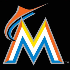
It's not an M
it's a bird squawking at another bird
Of course, nowadays calling it "Cartoon" Network may be a misnomer.
I want them to move to this logo. It looks so much better.old

new


I tend to think that the one on the left is more pleasing to look at, but it kind of makes more sense for the "N" orb to take place of the N in NeoGAF. There are a lot of GAFers who still don't realize that the white zig-zag is supposed to be an N.
Here's a blog post with 20 such evolutions. I prefer Microsoft's 1975 logo to the one they have today, which is just awful.

The DC comics logo I posted was a Saul Bass design.


What's funny is that some designer got paid the big bucks to type "Gap" in Helvetica and place a blue gradient square in the back corner.
I know you're joking, but I thought it was supposed to signify a tiger and the white of the M is the stripes. That's the way I always saw it, so I loved it. Really fun use of type.
Graphically, the Animal Planet logo embodies the brand - bold, robust and animal-centric. According to the team at Dunning Eley Jones, the sideways 'M' is the "animal heart of the logo. It is instinctive, gut-driven; it 'feels before it thinks'. Like any other wild animal or pet, it lies where it pleases - on its side."
Graphically, the Animal Planet logo embodies the brand - bold, robust and animal-centric. According to the team at Dunning Eley Jones, the sideways 'M' is the "animal heart of the logo. It is instinctive, gut-driven; it 'feels before it thinks'. Like any other wild animal or pet, it lies where it pleases - on its side."
I
A friend of mine works at the company that designed that logo. It was a last minute add-in that no one expected to be chosen then... yea.
And no they didnt get paid "big bucks", lol.
I want them to move to this logo. It looks so much better.
But instead they're going with this. (For the network at least.)
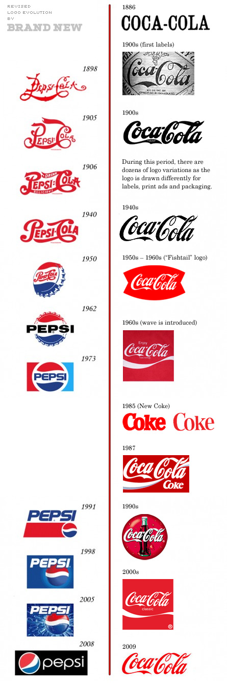
Also, since I'm shocked no one's posted the bullshit "Coke never changed their logo but pepsi changes it every 5 minutes picture," I'm gonna post the real changes pre-emptively:
The type has remained remarkably consistent, but there is definitely more to the Coke logo than just the type most of the time.
I already posted that a few pages back.
Edit:Beaten