-
Hey Guest. Check out your NeoGAF Wrapped 2025 results here!
You are using an out of date browser. It may not display this or other websites correctly.
You should upgrade or use an alternative browser.
You should upgrade or use an alternative browser.
Company logos that changed for the worse...
- Thread starter ScOULaris
- Start date
- Status
- Not open for further replies.


Haha what the hell

Originally called Phoenix. They changed it after trademark issues to Firebird. They changed it again after pressure from another company to Firefox.
D
Deleted member 57681
Unconfirmed Member
Never knew that. Phoenix looks shitty man.Originally called Phoenix. They changed it after trademark issues to Firebird. They changed it again after pressure from another company to Firefox.
opticalmace
Member
The new Tropicana logo might look nicer than the old one when comparing them side by side, but in the grocery store I find the cartons with the new logo don't stand out nearly as well. The vertical green "Tropicana" text is harder to pick out from a distance than the old text in my experience. But YMMV.

ThatObviousUser
ὠαἴÏÏιÏÏÎ¿Ï Ïαá¿Ï εἶ
Haha what the hell
FF's new logo is a lot better (it's more noticeable at lower resolutions though.)
The new Tropicana logo might look nicer than the old one when comparing them side by side, but in the grocery store I find the cartons with the new logo don't stand out nearly as well. The vertical green "Tropicana" text is harder to pick out from a distance than the old text in my experience. But YMMV.
And that's why it failed so badly. In addition to completely scrapping the iconic orange, consumers couldn't figure out what juice is what until they got in close and compared everything side by side. It was the epitome of form before function.
It's all nice and dandy when people want to wax poetic about good design principles, but when your design causes sales to drop precipitously and for everyone and their mothers to complain, you pretty much came up with some shitty ass design.
Liu Kang Baking A Pie
Member
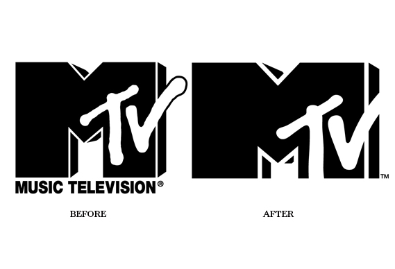
The new one is much, much better. It got rid of the inaccurate description, and it made the big M much stronger. It only looks cut off rather than strengthened if you compare them side-by-side.How the fuck has this not been posted?
NervousXtian
Thought Emoji Movie was good. Take that as you will.
Comedy Central new logo is the shiz.. the old one sucked ass.. to say it wasn't is just being nostalgic and used to the old one.


Liu Kang Baking A Pie
Member
Comedy Central is a TV network. The logo is amazing when used in motion on TV.
http://vimeo.com/groups/18604/videos/17771161
The idea is that they have copyrighted comedy. They stamp the logo like a (C) on top of their characters and situations.

If you look at it as just letters on a message board, you don't get the context and don't get to understand why it's awesome.
http://vimeo.com/groups/18604/videos/17771161
The idea is that they have copyrighted comedy. They stamp the logo like a (C) on top of their characters and situations.
If you look at it as just letters on a message board, you don't get the context and don't get to understand why it's awesome.

desertdroog
Member

the suggested one in the news was much better


This... this needs more love, this is incredible and I laughed so much at the news anchor looking at it
ThatObviousUser
ὠαἴÏÏιÏÏÎ¿Ï Ïαá¿Ï εἶ
1927 is the best. If they went back to that it would fit with the current trend of simplification.
Blame Vince/WWE for that logo. And they actually went to the logo below before Vince/Shane(lol) changed it to the Alliance angle logo.
-to-

I hated this logo.Uh, never saw it like that. I always remembered HOLY FUCK WHAT IS THAT THING! WHAT DOES IT EVEN MEAN? WCW nitro logo.

MikeE21286
Member
It sounds like you've never seen Demolition Man.
Fix that.
Lol. nailed it.
Bitmap Frogs
Mr. Community
Some of you are fucking insane. Heaven forbid you become graphic designers.
Majority of people here are stuck in te 80s/90s and/or smitten with nostalgia.
Yeah, we should dump all creativity, join the latest bandwagon and produce boring soulless 2.0 looking logos for top dollar.

Why do so many of these seem to take the old logo, tilt it, change the style to some brushes, or change the font, or some other small change, and call it new and better? Shit is stupid.
Ignatz Mouse
Banned
1927 is the best. If they went back to that it would fit with the current trend of simplification.
I find the 1912 one to be pretty boss!
MidnightScott
Banned
Let me guess that taco bell logo is from Demolition Man?
GoldenEye 007
Member
No, Back to the Future.Let me guess that taco bell logo is from Demolition Man?
Liu Kang Baking A Pie
Member
There's no such thing as a "2.0" design. Web 2.0 refers to users interacting with and adding to the web rather only reading it.Yeah, we should dump all creativity, join the latest bandwagon and produce boring soulless 2.0 looking logos for top dollar.
I don't see many soulless logos. Are you just basing this on the Gap? Does the simple Nike swoosh remind you of a bad childhood?
Liu Kang Baking A Pie
Member
Looks have nothing to do with a logo. The McDonalds golden arch isn't an aesthetically pleasing work of art. Logos are about brand recognition and memory. You will never forget the looks of the McDonalds, Nike, Pepsi, Starbucks, New York Yankees, Apple, or even the classic WWF logo, and you will always associate an emotion or opinion with them. Reactions go deep when a company changes their logo not because we were previously admiring a work of art but because we associate so much with what they're taking away.Why do companies think, simplistic logo = better looking logo?
Liu Kang Baking A Pie
Member
I see a person on a stretching torture device.
GoldenEye 007
Member
Kirby as Sonic.

......

Forever in my heart.
starchild excalibur
Member

I don't even know what it's supposed to be. EVE from Wall-E?
I'd guess a flower.
There's no such thing as a "2.0" design. Web 2.0 refers to users interacting with and adding to the web rather only reading it.
This is kind of like saying there is not Victorian or Elizabethan art because Victoria and Elizabeth were Queens. Obviously there is an aesthetic associated both with those eras and with visual design in the current era of computer technology.
StoppedInTracks
Member
Damn, 1973 Pepsi is still the best one. The very definition of iconic.
I don't even know what it's supposed to be. EVE from Wall-E?
http://www.news.com.au/business/new...on/story-e6frfm1i-1225790269154#ixzz1f5KfPX2vIT IS just three elegantly curved blue shapes appended to 'ANZ', but chief executive Mike Smith believes it reflects a world of difference at his bank.
ANZ Bank's new logo, proudly unveiled yesterday by Mr Smith at the group's new headquarters in Melbourne, will be backed by an initial $15 million marketing spend, The Herald Sun reports.
On Sunday ANZ (anz.ASX:Quote,News) will begin selling the new brand through a wide-ranging television, billboard and newspaper advertising campaign in Australia, New Zealand and Asia.
The global brand-building comes after 18 months of research in which customers, staff and advisers from M&C Saatchi concluded the bank needed to streamline its brand as it widened its push into Asian markets such as Cambodia, Vietnam and China.
The strap-line of the brand will be: "We live in your world".
"In recent years, the ANZ brand has become fragmented," Mr Smith said.
"To deliver on its growth strategy and regional aspirations, ANZ has to look like one bank and provide a consistent experience for our customers and our people wherever they come into contact with the bank."
The three shapes in the new signage reflect ANZ's three core markets - Australia, New Zealand and Asia Pacific - while the central human shape represents customers and staff.
Mr Smith, who took over the reins of the country's fourth largest bank two years ago, said the rebranding was driven by the company's values which put people at the centre of the organisation.
revolverjgw
Member
I see a person on a stretching torture device.
I see a lady with an afro just chilling on a couch
Examples?
people defending the old pizza hut logo. Looks so out of place today.
Also I agree that the 1973 Pepsi logo is best, but you have to admit the new one is way ahead of the 90s shit. I really don't blame all the companies coming into the 2000s dropping their 80s/90s logos as fast as possible.
Damn, 1973 Pepsi is still the best one. The very definition of iconic.
And let me guess, you were born some time between 1965 and 1985 (not a hard bet given the demographics of this forum, which tend towards the late end of that range). In which case, of course it was iconic, it was everywhere and Coke was at a nadir because of the New Coke debacle.
I think the most aesthetically idealized Pepsi logos are the 1940 or 1950 versions, respectively for the pre- and post- bottle cap design shift.
DiipuSurotu
Banned

to

For the sake of the cola wars.
-imgsnip-
My favorite thing about looking at the Pepsi logos over time is you essentially see the evolution and the capabilities of mass graphics printing for food products improve over time.
Wait.
Is this real?
It looks more like an early 90s Packard Bell logo
It is from the future of Demolition Man, a movie from 1993
Really? It's bland as hell and doesn't make any sense to someone viewing it for the first time.
Here is another example of a pointless change. Why is the M bigger than the other letters and lying on its side? There's absolutely NO reason for it. If I'm wrong, please enlighten me.

It's not an M
it's a bird squawking at another bird
Chuckie
Member

Wtf is this shit. The guy on the third pic is wearing something totally different. Inconsistent as hell.
The old logo with the Marlin is so much better but it is kind of weird they put it on 1 of 3 uniforms.
acheron_xl
Member
This was just as bad as the Miami Marlins new logo.

I own something like 20 of those jerseys in my closet.
I'm also getting a new Marlins cap in the mail, probably tomorrow.
Needs a consistent Font and the baseball doesn't connect to the Maple Leaf like the original did
Agree totally. It's the only part of their rebrand that I don't like. It wouldn't have been that hard to do.
acheron_xl
Member
oops, doublepost.
ElectricBlue187
Member
I hate the new starbucks logo. I should've bought up all the merch with the old logo
Turn of the century Pepsi logo is a million times better than the current logo.

I loooove the 1991 logo. It's so ninetees.
- Status
- Not open for further replies.