A Pretty Panda
fuckin' called it, man

This image looks like it would be from Back to the Future II or something.
That Marlin's logo might look alright if they stuck with the Teal based color design rather than.....that
I didn't notice that until I was like 12 or 13. Anyways, you will be happy to know that most brewers fans here in wisconsin tend to prefer the mit mb logo.It's a sports logo but it needs to be posted.
Milwaukee Brewers

to this:

The glove logo is fucking brilliant. It's an "M" and "B" that looks like a baseball glove catching a baseball. Why even try and improve on that?
I actually haven't watched Nick since the logo change so I don't know how it looks on TV.

to

AND

This is a great blog covering logo design (I believe I actually discovered it on GAF a while back):
http://www.underconsideration.com/brandnew/
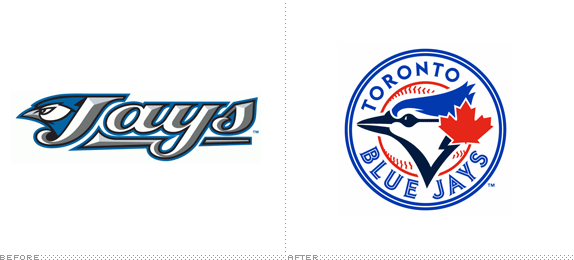
The most recent one that has affected me is the new Blue Jays logo: http://www.underconsideration.com/brandnew/archives/hi_hi_birdie.php
Looks nice and definitely an improvement over the old one, but something looks off compared to the original.
This image looks like it would be from Back to the Future II or something.
Old

New
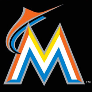
Ughh...I'm a Marlins fan, but...I just don't know.

cartoon network has actually changed again since the 3D cube style.. really great rebranding.
http://www.underconsideration.com/brandnew/archives/cartoon_network_enters_the_grid.php
it was used for the alliance angle. So if you missed that, then you missed this.
This real? I still see the one on the left.
Total downgrade. Looks like a logo for a blood bank rather than coffee.
This image looks like it would be from Back to the Future II or something.
Really? I've never seen that on wcw before the invasion angle. It looks like I'm gonna have to do some research.I hate to differ with you there, but that logo was used on Nitro broadcasts many months before the takeover of WCW.
Still don't know why they simply couldn't do this.
Its not like the old logo had a bad history. 2 WS titles in 10 years is pretty awesome.
If were talking about color.
That new one looks like shit. Why would they get rid of the icon yellow running man logo? Also, I'm not a fan of the all lowercase look in general.Not really liking this:
http://www.underconsideration.com/brandnew/archives/aim_logo.gif
although I don't see how it's really bad in any way.
They actually changed it to this which while still being bad is not close to as terrible as the my ___

Both Carton Network logos look fine...I actually haven't watched Nick since the logo change so I don't know how it looks on TV.
to
That's the same as the Starbucks approach.How the fuck has this not been posted?
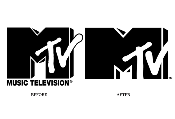
http://www.creativereview.co.uk/images/uploads/2010/02/mtv_0.jpg
That's the same as the Starbucks approach.
Ad Executive: We need a new logo. I'll pay top dollar for the best new design!
Graphic Designer: How about we just zoom in on the old one?
Ad Executive: It's so simple, it just might work... *maniacal laughter*
quoted for truth that's so truthful it's physically jarring. and people are brave enough to WEAR it?
......

How the fuck has this not been posted?

Not trying to prove anything, I just wanted to try.
This almost looks real.

I don't get why companies re-brand unless there is something negative tied to old identity. Coca Cola has kept that script font logo for decades, it's iconic.
The new Comedy Central logo is terrible, it looks like a logo for a coffee shop chain.
Turn of the century Pepsi logo is a million times better than the current logo.

Actually, Starbucks approach is inspired from Nike's "swoosh": remove of the name, emphasis on main color and symbol (in this case, the siren).That's the same as the Starbucks approach.
This is a great blog covering logo design (I believe I actually discovered it on GAF a while back):
http://www.underconsideration.com/brandnew/
The most recent one that has affected me is the new Blue Jays logo: http://www.underconsideration.com/brandnew/archives/hi_hi_birdie.php
Looks nice and definitely an improvement over the old one, but something looks off compared to the original.

I'd like to point that the logo isn't everything in a visual identity, it's very prominent yes, but take it as the cherry on the cake.
People judges very hastily basing only on a logo, and this how the world works, but visual identities do work when the whole corporate design is planned adequately and specifically.
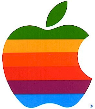
I'd love to see the rainbow logo again, but would look so weird on modern electronics. Even looking at my original iMac G3 in my closet, which started the solid color logo thing, I can't imagine them coming out with that design today.
Same.I like the 2012 Olympics logo.
Same.I preferred the old Google Chrome logo.
Turn of the century Pepsi logo is a million times better than the current logo.
......
Yes. Of course.NeoGAF really did have that dino logo at some point?
Yes. Of course.


