You know that "Of course" makes the statement sound like a cover up or something like that...
You are needlessly being overly suspicious.
You know that "Of course" makes the statement sound like a cover up or something like that...
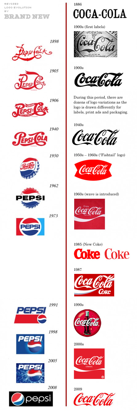
For the sake of the cola wars.

The old one is so iconic. I love seeing it scattered throughout old Konami games. The new one is barely a logo.
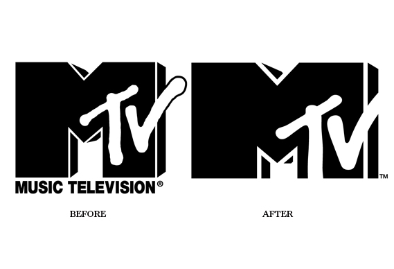
old

new

Spiderman font is what made it so great!
AOL:


NeoGAF really did have that dino logo at some point?
Some of you are fucking insane. Heaven forbid you become graphic designers.
Majority of people here are stuck in te 80s/90s and/or smitten with nostalgia.
Turn of the century Pepsi logo is a million times better than the current logo.

the comedy central rebrand is one of the best i've ever seen
This thread makes me miss the purple themes labels/cans for Cherry Coke. It actually made it taste even better.

I like My____
I think it is clever
Some of you are fucking insane. Heaven forbid you become graphic designers.
Majority of people here are stuck in te 80s/90s and/or smitten with nostalgia.
Old Bucs uniforms were terrible, though. UGH creamsickle and red? *BARF*
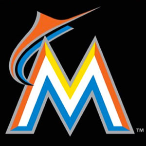
This was just as bad as the Miami Marlins new logo.


At least Capcom is smart enough to never change their logo.
the comedy central rebrand is one of the best i've ever seen
To

The old one is so iconic. I love seeing it scattered throughout old Konami games. The new one is barely a logo.

I have a feeling a lot of you people are dissing new logos thanks to our friend 'nostalgia'.
Regardless. I'm not sure how the new Comedy Central logo is any better, really. It's boring and bland and certainly does not remind me of "comedy". That's not to say the old logo was perfect. But at least it was more playful and wacky.
The Cartoon Network logos I've always found really bad. They were often saved thanks to some animations made my the network. But that didn't stop them being rather dull in stills.


Always liked this one the best
My Blank
My Underline
My Put Something Here
Confusing, not clever. My Space is meant as a personal place, area or spot. Not a gap between words.
They don't even understand their own brand.
You should read the thought process/design manual Rand made for Steve Jobs when pitching the logo.
For its time, it was quite progressive. In fact Rand was doing the minimalist "flat" logo which are such a craze in the past decade back in the 60s-70s!
I have a feeling a lot of you people are dissing new logos thanks to our friend 'nostalgia'.

How the fuck has this not been posted?


this is worse than the gap WTF
Wait.
Is this real?
It looks more like an early 90s Packard Bell logo

Because that's what she is doing, even in the new logo.