GalacticaN7
Banned
Have had my PS4 for little over a week now.
I don't hate the updated version of the XMB (honestly not sure if that is what Sony is calling the OS), but I was a big fan of the clean, crisp look of the PS3 UI. Everything was filed nicely, ready to be accessed. Now It seems as though everything is just out there waiting to be scrolled to. Even the friends list feels like far more of a chore compared to PS3 XMB. Mind you, I don't think the new UI looks terrible, as not much info is shown until you scroll over an item, and I love the tidbits of info that pop up for every game, quick access to DLC, etc.
Just wondering if I'm alone, and if not, what are some things you would like to see Sony improve on the UI side? For me, I would revert to the old XMB almost completely.
And just for obvious comparison sake:
PS3:

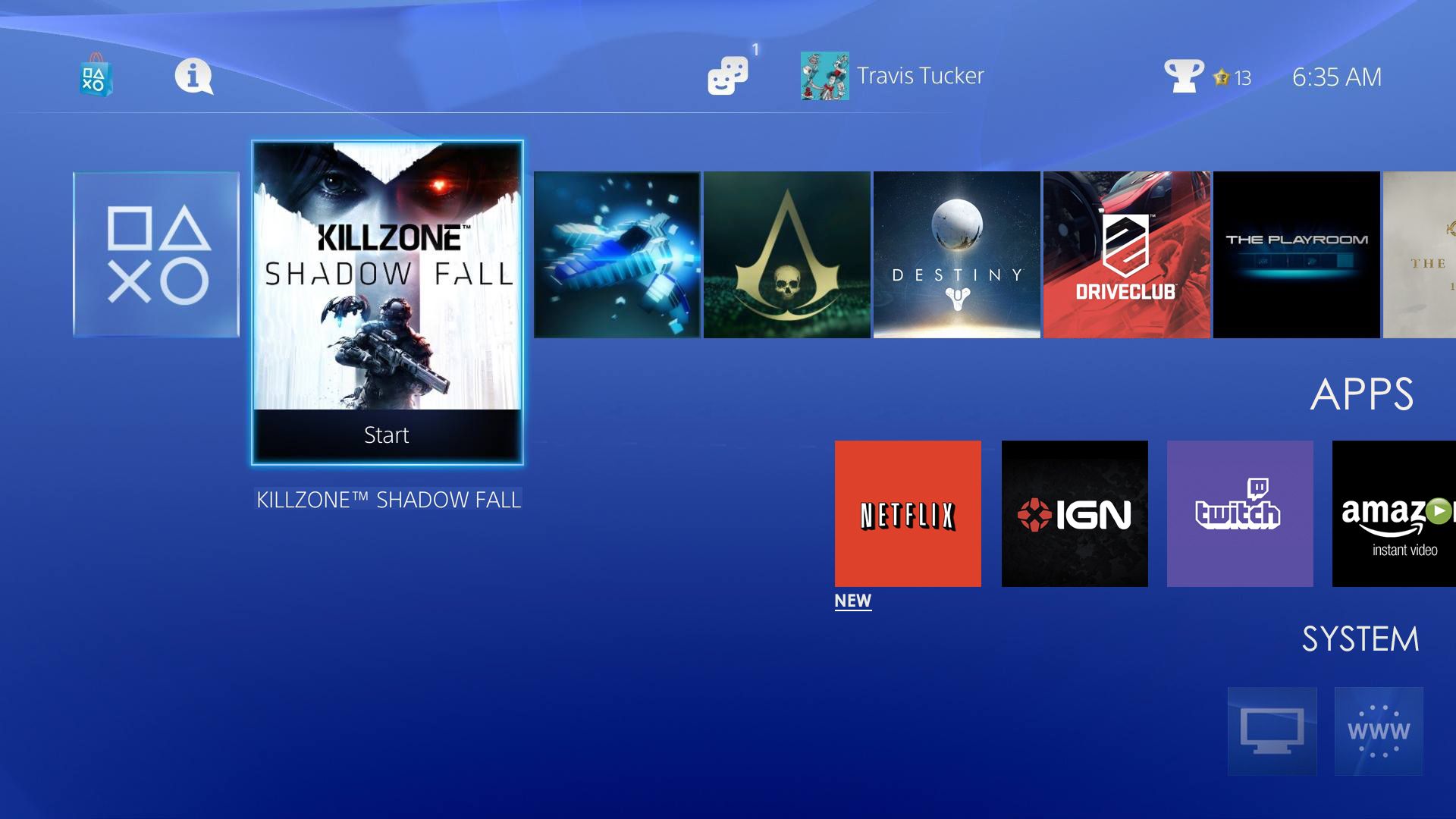
PS4:

I don't hate the updated version of the XMB (honestly not sure if that is what Sony is calling the OS), but I was a big fan of the clean, crisp look of the PS3 UI. Everything was filed nicely, ready to be accessed. Now It seems as though everything is just out there waiting to be scrolled to. Even the friends list feels like far more of a chore compared to PS3 XMB. Mind you, I don't think the new UI looks terrible, as not much info is shown until you scroll over an item, and I love the tidbits of info that pop up for every game, quick access to DLC, etc.
Just wondering if I'm alone, and if not, what are some things you would like to see Sony improve on the UI side? For me, I would revert to the old XMB almost completely.
And just for obvious comparison sake:
PS3:
PS4: