-
Hey, guest user. Hope you're enjoying NeoGAF! Have you considered registering for an account? Come join us and add your take to the daily discourse.
You are using an out of date browser. It may not display this or other websites correctly.
You should upgrade or use an alternative browser.
You should upgrade or use an alternative browser.
Etrian Odyssey IV: Legends of the Titan - Official for NA - 2013
- Thread starter mollipen
- Start date
To be fair Nintendo gave the Etrian Odyssey series a chance in Europe by releasing the first title (and even translating it to the usual Multi-5 languages) and it bombed pretty hard.
I DID MY PART, I BOUGHT IT DAY ONE. ;_;
Thankfully, the DS doesn't have region lock, and I imported II and III. No luck with IV though.
Magicpaint
Member
I DID MY PART, I BOUGHT IT DAY ONE. ;_;
Thankfully, the DS doesn't have region lock, and I imported II and III. No luck with IV though.
EOI came after (almost) everyone that actually wanted it had imported. It's no surprise it tanked.
I was so pumped when this was revealed! Now if we can only get Rune Factory 4 and Bravely Default announced as well... I've never played an Etrian Odyssey game before, but after playing and loving SMT: Strange Journey and Legend of Grimrock, I've been wanting to dive in.
Should I hold out for this one or pick up one of the earlier games? Also, which earlier game?
Should I hold out for this one or pick up one of the earlier games? Also, which earlier game?
Each one has gotten more accessible to newcomers than the last, so I'd recommend starting with EO 3. Features like a reduced penalty for class switching, better mapping tools and dungeon autopilot reduce the tedious parts of previous games without making it any less challenging.Should I hold out for this one or pick up one of the earlier games? Also, which earlier game?
Each one has gotten more accessible to newcomers than the last, so I'd recommend starting with EO 3. Features like a reduced penalty for class switching, better mapping tools and dungeon autopilot reduce the tedious parts of previous games without making it any less challenging.
I saw that EO4 has a casual mode as well, so that's what was making me think that maybe I should just hold out. Any opinions on the casual mode guys?
SatelliteOfLove
Member
I saw that EO4 has a casual mode as well, so that's what was making me think that maybe I should just hold out. Any opinions on the casual mode guys?
Easy mode was well-thought out. I like the fact it reduces backsliding in progression but still has the barriers to progression.
slaughterking
Member
We'll get a bunch of English screens soon.
Atlus U.S.A., Inc. ‏@AtlusUSA
Members of our #ATLUS Faithful mailing list are about to get exclusive first English screens of #EtrianOdyssey IV!
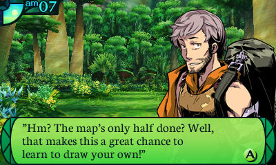
Learning how to draw a map in EO for the fourth time. Yay!
Atlus U.S.A., Inc. ‏@AtlusUSA
Members of our #ATLUS Faithful mailing list are about to get exclusive first English screens of #EtrianOdyssey IV!
Learning how to draw a map in EO for the fourth time. Yay!
Wow, I'm really impressed by that font. So much better than Devil Survivor Overclocked...
Hahaha. The subject line for the new EO e-mail i just got is "Picking a font." Email is all about the font it seems.
I'm cool with that if it's the European EO1's font!!Casual mode should use the EO 1 font as punishement.
Just finished reading the same email. It's kinda cool of Atlus to give a little peek behind the curtain with their regular emails. Kinda wish other companies would put this much effort into marketing their products.Hahaha. The subject line for the new EO e-mail i just got is "Picking a font." Email is all about the font it seems.
hosannainexcelsis
Member
Other screenshots:


I approve of this font.
I approve of this font.
I approve of this font.
But does Aeana!? Don't leave me hanging here.
It's very nice. You did good, Nich.But does Aeana!? Don't leave me hanging here.
")
Though the "NEXT:" text looks oddly out of place.
But does Aeana!? Don't leave me hanging here.
I feel like that email was made specifically for her.
I just now received the e-mail. It's pretty awesome.I feel like that email was made specifically for her.
The E and the X need some kerning apart.It's very nice. You did good, Nich.
Though the "NEXT:" text looks oddly out of place.
I think all video games should use Comic Sans. It's the perfect font. Whimsical, yet down to earth. It has an aroma of sophistication, but isn't afraid to state, "hey, I can have fun too".I approve of this font.
Well, it's set in a different typeface for some reason. I wonder if it's an oversight.The E and the X need some kerning apart.
I think all video games should use Comic Sans. It's the perfect font. Whimsical, yet down to earth. It has an aroma of sophistication, but isn't afraid to state, "hey, I can have fun too".
http://www.behance.net/gallery/Not-strong-mark/5226613
It really makes everything... Better?

I actually think some of those logos look retro-chic with comic sans, but--wait, did I just say that out loud?
It really makes everything... Better?
I think it was a joke...I hope.
Other screenshots:
Don't know why I thought I'd have things easier for figuring out skills this time around.
Oh boy, all the testing to be done. Makes me kind of regret not having been there to import and get it all done ahead of time.
jaundicejuice
Member
I am excite. Seems to always take the announcement of the next EO's releaase to get me to finish the previous one.
Femmeworth
Banned
That is a nice font.
Surely you are not suggesting that someone could only appreciate the playful workmanship of Comic Sans as a joke. You, sir, are a font snob.I think it was a joke...I hope.
SecretMoblin
Member
What a beautiful font!
EO fans are the best.
EO fans are the best.
perfect free
Member
Adding my voice to the font love-in. That green color scheme in the skill tree screenshot is really nice, too.
cj_iwakura
Member
I actually kind of liked EO1's font, it was... off-kilter, and it worked.
Persona PSP's on the other hand...
The new one is hot though.
Persona PSP's on the other hand...
The new one is hot though.
idlethreats
Member
Huh, after playing the first three games with the much tighter fonts, the new one looks a little jarring and out of place to me at first glance. I think I would have gone for the Thyssen font that they showed in the email, to maintain more of a visual continuity with the previous games, but in the end it's just font - as long as it's readable, I don't really care. Super interesting to read about the font selection process, though, thanks Nich! It's always fun to learn more about the behind the scenes process with localization.
vagabondarts
Member
Love the original EO games... and their fonts...
But you know what? This font is righteous. Great choice!
But you know what? This font is righteous. Great choice!