Huh, I like the Mario + Rabbids font. LOL It's kind of futuristic like Beep-O itself and it is clean and easy to read.
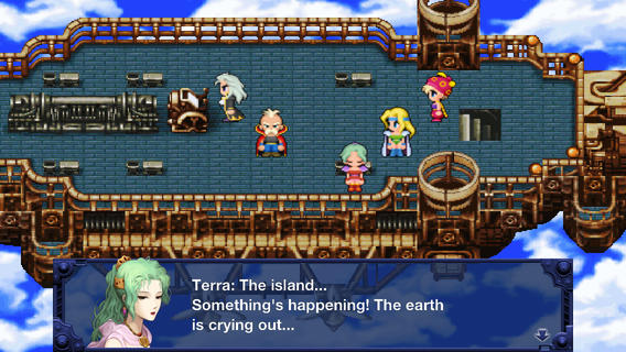
One of my biggest pet peeves are 8/16-bit style games that use super-sharp high-resolution fonts, which happens a lot with mobile ports of old console games.
I think, for me, it's not so much the generic font that's annoying, but rather it's the juxtaposition of the high-res, anti-aliased (vector, even?) font with pixel art. It's such a huge clash of style.
I just started playing Mario Rabbids and immediately noticed the horrible font. It's easy to read, but just so out of place in this particular game.
My personal choice is the font in either of the Lunar games on Sega CD. I guess Working Designs really wanted to get the point across with the CAPS LOCK!
I just started playing Mario Rabbids and immediately noticed the horrible font. It's easy to read, but just so out of place in this particular game.
My personal choice is the font in either of the Lunar games on Sega CD. I guess Working Designs really wanted to get the point across with the CAPS LOCK!
Haha... yeah, caps lock didn't bother me too much back then since not too long prior I was accustomed to the Apple II and caps lock being required for a lot of things (mostly BASIC programming)... and for several years, all of my Genesis playing was on a tiny 13" color monitor, so the actual font size in those Lunar screens was appreciated. Might be eye-searing on a modern display though!





-6.jpg)


