• Hey, guest user. Hope you're enjoying NeoGAF! Have you considered registering for an account? Come join us and add your take to the daily discourse.

Halo 5 Concept Art

SpartanN92

Banned
Add "Halo CE's enemy encounters" and change "visual design (including the AR) to CEA's" and we're good. I would like a few of Reach's weapons though (Needle Rifle done better and the grenade launcher, and Halo 4's DMR [that looks like Reach's DMR]).

Otherwise I agree perfectly.

You do mean BR starts only in BR game types right? Like, don't replace AR/pistol starts.


I'm a big fan of Reach's visuals. Take the color scheme of CE I suppose but character and weapon models I've gotta give to Reach. Reach NAILED that militaristic Sci-Fi look. The Covies look amazing (Slight exception being the brutes) The Spartans look AMAZING! The weapons looked amazing!


Also in my Halo dream masterpiece BR starts always because the default team slayer mode is MLG...Did I not mention that? AR/Pistol starts are for social slayer ;)
 

Overdoziz

Banned
I wonder if Halo 5 will feature Covenant environments. Reach and Halo 4 combined only had about half a level worth of those.
 

LastNac

Member
I'm a big fan of Reach's visuals. Take the color scheme of CE I suppose but character and weapon models I've gotta give to Reach. Reach NAILED that militaristic Sci-Fi look. The Covies look amazing (Slight exception being the brutes) The Spartans look AMAZING! The weapons looked amazing!


Also in my Halo dream masterpiece BR starts always because the default team slayer mode is MLG...Did I not mention that? AR/Pistol starts are for social slayer ;)

I think it was a very appropriate look given the story and the perspective. Reach was the least Romantic game in the series and I am glad it visually represented that. It always reminds if of what Republic Commando did to the Star Wars universe visually.


That said though, given the way the story is going, I dont know if the gritty, grounded visuals should come back. "The Chosen One" is quite the trope of romanticism, be weird for everything to seem gray now.
 

SpartanN92

Banned
I think it was a very appropriate look given the story and the perspective. Reach was the least Romantic game in the series and I am glad it visually represented that. It always reminds if of what Republic Commando did to the Star Wars universe visually.


That said though, given the way the story is going, I dont know if the gritty, grounded visuals should come back. "The Chosen One" is quite the trope of romanticism, be weird for everything to seem gray now.

Did you not read my bit about "Take the color scheme from CE?"
 

Chettlar

Banned
I'm a big fan of Reach's visuals. Take the color scheme of CE I suppose but character and weapon models I've gotta give to Reach. Reach NAILED that militaristic Sci-Fi look. The Covies look amazing (Slight exception being the brutes) The Spartans look AMAZING! The weapons looked amazing!


Also in my Halo dream masterpiece BR starts always because the default team slayer mode is MLG...Did I not mention that? AR/Pistol starts are for social slayer ;)

I do agree though. I like the models. A lot of people dislike the covenant in Reach, but I actually really like them.
 

SpartanN92

Banned
I do agree though. I like the models. A lot of people dislike the covenant in Reach, but I actually really like them.

I think the Brutes in Reach were a bit of a step back from the Halo 3 brutes, but the Elites, Jackals, Grunts, Hunters etc... were PERFECT!
 

Chettlar

Banned
I think the Brutes in Reach were a bit of a step back from the Halo 3 brutes, but the Elites, Jackals, Grunts, Hunters etc... were PERFECT!

I agree. Hunters, imo, are pretty much the only enemy in the series that haven't gone through some terrible aesthetic changes.

Which is awesome, because I enjoy fighting hunters more than just about every enemy in Halo.
 

SpartanN92

Banned
I agree. Hunters, imo, are pretty much the only enemy in the series that haven't gone through some terrible aesthetic changes.

Which is awesome, because I enjoy fighting hunters more than just about every enemy in Halo.


Have you been reading the new Halo Comic series 'Escalation'?

The artist uses a mix of Halo 3/Halo 4 designs.

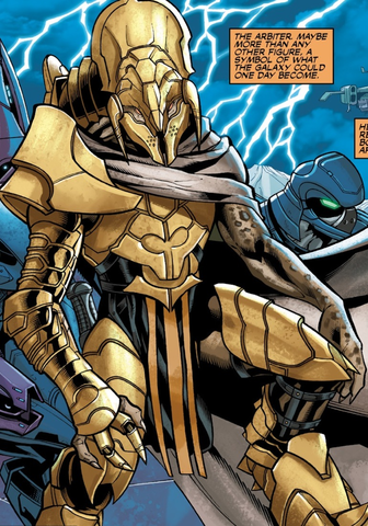
The Arbiter is redesigned but his Elite guards are from Halo 3. The new main Brute Chieftain Lydus is a redesign but his guards are Halo 3 Brutes....Then the Storm faction from Halo 4 arrive but they now have Skirmishers... It's quite odd. I wonder if that is intentional by 343, or if the artist simply liked the styles?


Stinkles, any insight on this?
 

Chettlar

Banned
Have you been reading the new Halo Comic series 'Escalation'?

The artist uses a mix of Halo 3/Halo 4 designs.

The Arbiter is redesigned but his Elite guards are from Halo 3. The new main Brute Chieftain Lydus is a redesign but his guards are Halo 3 Brutes....Then the Storm faction from Halo 4 arrive but they now have Skirmishers... It's quite odd. I wonder if that is intentional by 343, or if the artist simply liked the styles?


Stinkles, any insight on this?

I have done little bit play most of the games and read some wikis. I would if I had more time.

And yes...interesting.
 

Slightly Live

Dirty tag dodger
Have you been reading the new Halo Comic series 'Escalation'?

The artist uses a mix of Halo 3/Halo 4 designs.

The Arbiter is redesigned but his Elite guards are from Halo 3. The new main Brute Chieftain Lydus is a redesign but his guards are Halo 3 Brutes....Then the Storm faction from Halo 4 arrive but they now have Skirmishers... It's quite odd. I wonder if that is intentional by 343, or if the artist simply liked the styles?


Stinkles, any insight on this?

It's pretty deliberate and sends a pretty clear message.
 
Have you been reading the new Halo Comic series 'Escalation'?

The artist uses a mix of Halo 3/Halo 4 designs.

The Arbiter is redesigned but his Elite guards are from Halo 3. The new main Brute Chieftain Lydus is a redesign but his guards are Halo 3 Brutes....Then the Storm faction from Halo 4 arrive but they now have Skirmishers... It's quite odd. I wonder if that is intentional by 343, or if the artist simply liked the styles?


Stinkles, any insight on this?
Holy shit, Arbiter's new armor looks slick as hell. Definite improvement over Halo 3, that was just...ehhh.

I don't pay attention to the comics so I'm not up to speed on the backstory in them. Chances he'll show up in this next one?
 

SpartanN92

Banned
Holy shit, Arbiter's new armor looks slick as hell. Definite improvement over Halo 3, that was just...ehhh.

I don't pay attention to the comics so I'm not up to speed on the backstory in them. Chances he'll show up in this next one?

I couldn't say. This current comic series is 12 issues of which we are only on issue 2. But he is definitely a main character in this story arc.
A lot can happen in the next 10 months.

I'm pretty certain the Spirit of Fire from Halo Wars will appear in issue #5. The blurb for it on their web site details a missing ship and it sounds like SoF.
 

Mistel

Banned
Should I play Halo 4? I have it, won it in a competition ages back. Didn't like the original Halo games, but the movie was the first time I was genuinely interested in the lore (obviously it wasn't an amazing movie but still, first time Halo was interesting for me).

Why didn't you like the original games? Halo 4 isn't at all like any of the other games it took the worse elements from reach and expanded on them. Matchmaking wise we've got ordinance, loadouts, generally awful balance and bad maps. Campaign it's not exactly to good either. I hope this is of some help.

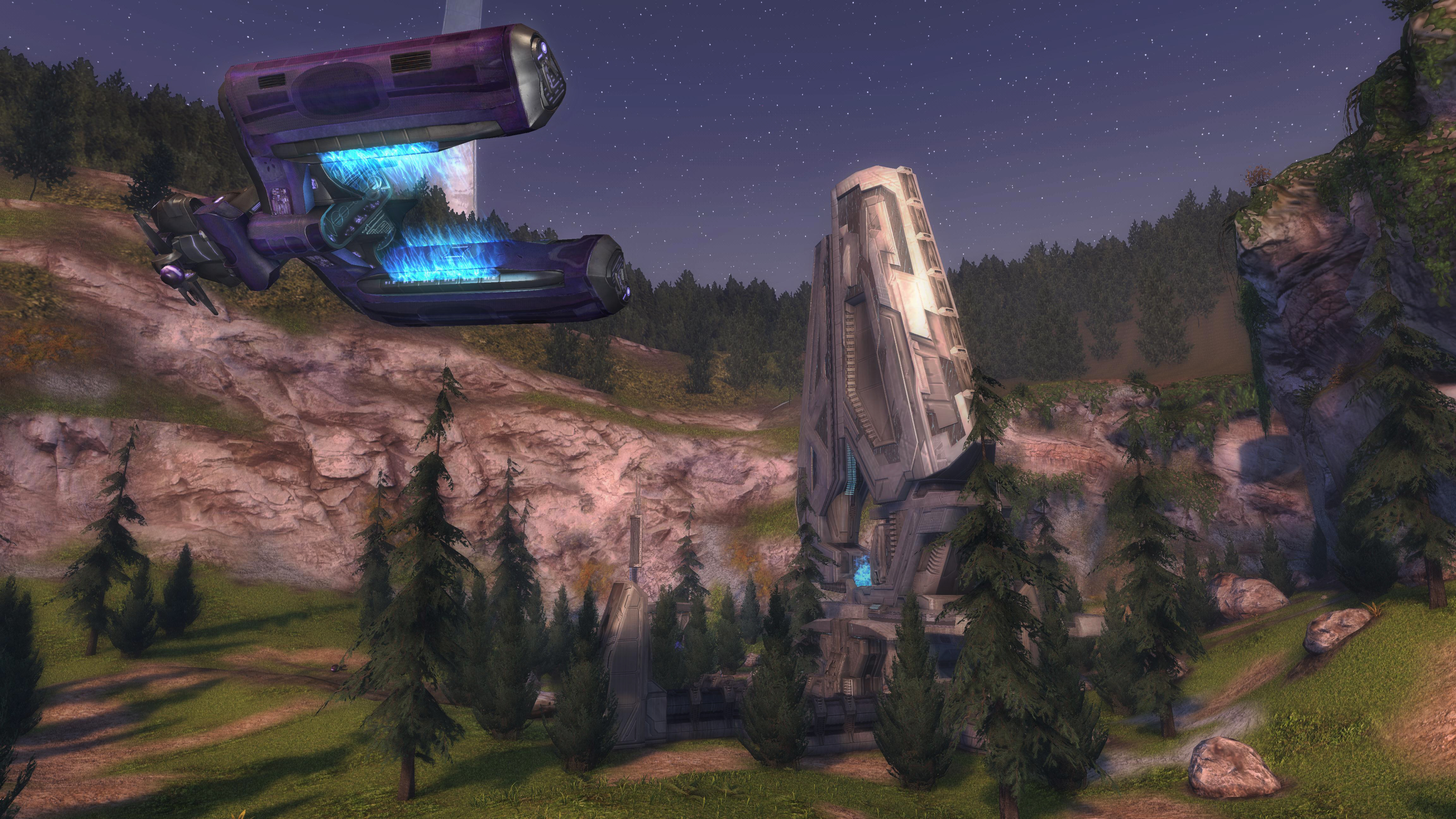
As for the brown nature of halo 4, 5 needs to use anniversary's art style:
haloanniversary4kbsoo.jpg
Vibrant color's and nice and pretty much better than halo 4.
 

Chettlar

Banned
Holy shit, Arbiter's new armor looks slick as hell. Definite improvement over Halo 3, that was just...ehhh.

I don't pay attention to the comics so I'm not up to speed on the backstory in them. Chances he'll show up in this next one?

Do you have an image link? I am currently obsessed with all things Arbiter.

i expect this game to look awesome 2014 is a packed year for good titles

2014 is going to be such a good year for games, movies, and tech in general.

Why didn't you like the original games? Halo 4 isn't at all like any of the other games it took the worse elements from reach and expanded on them. Matchmaking wise we've got ordinance, loadouts, generally awful balance and bad maps. Campaign it's not exactly to good either. I hope this is of some help.

As for the brown nature of halo 4, 5 needs to use anniversary's art style:

Vibrant color's and nice and pretty much better than halo 4.

Into my veins, oh lord please! Anniversary really looks good on (the start of, but throughout the rest, sure) Truth and Reconciliation.
 
Why didn't you like the original games? Halo 4 isn't at all like any of the other games it took the worse elements from reach and expanded on them. Matchmaking wise we've got ordinance, loadouts, generally awful balance and bad maps. Campaign it's not exactly to good either. I hope this is of some help.

As for the brown nature of halo 4, 5 needs to use anniversary's art style:

Vibrant color's and nice and pretty much better than halo 4.
This is one of the things that made the original series so great. Look at that color. Its amazing. I'm not really a huge fan of all this silver and gray which the series has been turning into since Reach.
 

OverHeat

« generous god »
Do you have an image link? I am currently obsessed with all things Arbiter.


2014 is going to be such a good year for games, movies, and tech in general.


Into my veins, oh lord please! Anniversary really looks good on (the start of, but throughout the rest, sure) Truth and Reconciliation.

O3PUxd1.jpg
 
As for the brown nature of halo 4, 5 needs to use anniversary's art style:

Vibrant color's and nice and pretty much better than halo 4.

Anniversary had way too much brown or washed out colors in comparison to the original Halo CE:
Halo_HD01.jpg


I actually like the way Reach looked. But Halo 3s color palette was great too
 

Mistel

Banned
Do you have an image link? I am currently obsessed with all things Arbiter.
Into my veins, oh lord please! Anniversary really looks good on (the start of, but throughout the rest, sure) Truth and Reconciliation.
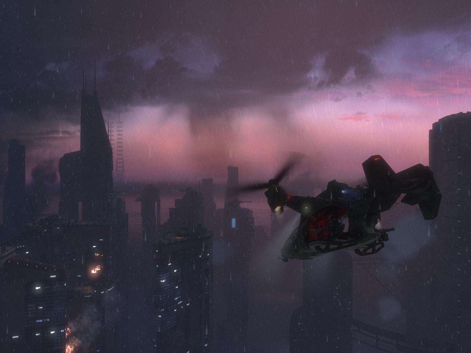
Assault on the control room also looks pretty as well:
The arbiter is now Kiadon.

This is one of the things that made the original series so great. Look at that color. Its amazing. I'm not really a huge fan of all this silver and gray which the series has been turning into since Reach.
It's a shame that anniversary's art style which is vibrant and different was not carried on for halo 4, although it wouldn't make a difference on how it played, it would be nicer to look at that the same color palette for all the maps.

Anniversary had way too much brown or washed out colors in comparison to the original Halo CE:
Halo_HD01.jpg
I didn't think it was that bad I prefer it to the original minus the complete lack of fog and some other thing's. Reach's visual appeal only was New Alexandria and Tip of the spear for me.
 

Ghazi

Member
Anniversary had way too much brown or washed out colors in comparison to the original Halo CE:
Halo_HD01.jpg


I actually like the way Reach looked. But Halo 3s color palette was great too

What? Reach was way too bland with it's colors. Anniversary has much more color in comparison to it! To be fair, it's more on a level by level basis. Some of the Reach levels did have lots of colors while Anniversary's might not have. But, Reach had way too much gray and brown. The colors also look way too washed out in Reach.


Chettlar

Banned
Ah... New Alexandria (the level). Probably the most atmospheric and beautiful Halo level ever, so underrated.

Def one of my favorite levels. It's just pure fun for me. Went on a 3-player scored co-op with some friends and it was simply amazing. I love that level.


^ And m-mm, that Anniversary. I really like the original too though. I get upset every time I think of how ugly they made it look if you press back in Anniversary. The lack of fog in Two Betrayals is horrible. :mad:
 

Mistel

Banned
Ah... New Alexandria (the level). Probably the most atmospheric and beautiful Halo level ever, so underrated.
It's arguably reach's best looking level.
Not the best screen shot but still it doesn't look that bad.

As an example of the difference's between the game's visually and graphically watch this AR comparison Halo 1 to 4.
Although it's a single environment each it shows how different the art styles are. (no ODST) Anniversary and ODST looked the best overall to me.
 
I always found it funny how halo 2, 3, 4, and Reach all release screens that are like... much higher res than the game rendered.

All of those PC versions that could have been....

I personally loved Halo Reach's art Style the most. Seemed the most matured...
 
Top Bottom