noDid it really look like that?
Ahh yes phoenix games purveyors of games that are of as questionable legality as they are of being games.
noDid it really look like that?
Ahh yes phoenix games purveyors of games that are of as questionable legality as they are of being games.
Not even close.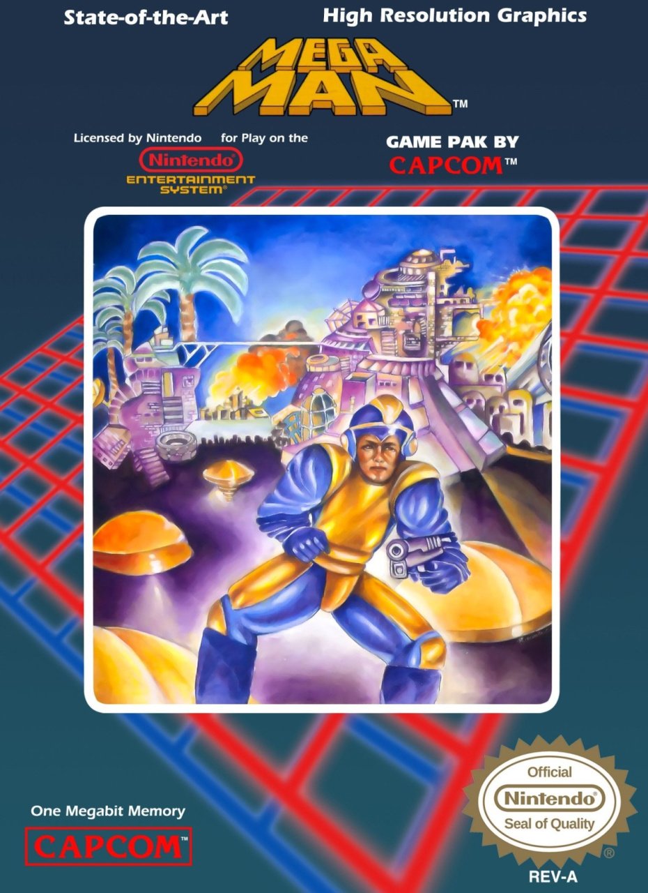
Surely there's nothing worse than this one, right?
It's the actual box art from the North American release of Mega Man on the NES. Is it a monkey? Is it a man?
Does Mega Man actually use a handgun?

So, GAF, my challenge is to present a box art even more ridiculous than the infamous MM1, if you can!

This one takes the cake. Old man with the banjo takes 60% of the photo and the space ship looks like a magical sword being thrown towards him.
I gave up on Amnesia early because I was bored, but I'd reinstall it here and now if the enemy(s?) make duck sounds like this suggests they shouldNot even close.

This box art was created by Marc Ericksen
This man is a complete fucking super chad who created more box art than most of us have played games.
It was completed in a span of two days* based off of an art brief provided by Capcom USA.
Details from "The Art of The Box" highly recommend a purcahse.

Other covers created:
After Burner
Strider
2020 Super Baseball
Thunder Force 2
Herzog Zwei
And mutherfuckin' Bad Dudes just to name a few.
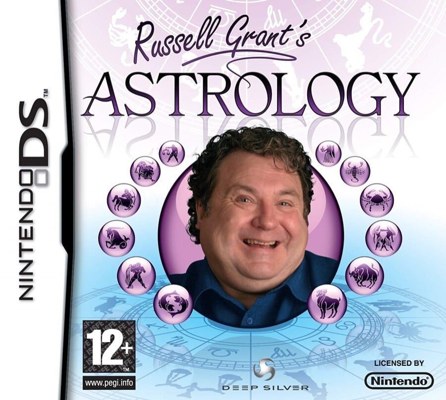
It's a dictionary. So the name, on DS, where touch was very novel at the time, makes a lot of sense. It's Korean, too, so it wouldn't surprise me if that it was actually not intentional.
Now that's some hilarious subliminal messaging. Kinda would've been funny if they hadn't revised it just for the sake of the reactions people would have upon seeing the cover.
really?

or this
No, it's one of the best.
The point of box art is to be eye catching and memorable, and you just made a post about a box made almost 40 years ago.
But it is state of the art and high resolution
Surely there's nothing worse than this one, right?
It's the actual box art from the North American release of Mega Man on the NES. Is it a monkey? Is it a man?
Does Mega Man actually use a handgun?
So, GAF, my challenge is to present a box art even more ridiculous than the infamous MM1, if you can!

Still looks better than Disney's upcoming live action
Superman 64 is horrible, cousin.Maybe they were onto something when they made Superman 64 because there's a reason I always remember that game as well...
Superman 64 is horrible, cousin.
This is an excellent write-up, to the point that the parody is so real it will inevitably become true.4 white men + 4 white women =8-12 white babiesa classic display of hetero-normative micro aggressions towards vulnerable lgbtq populations, to say nothing of the ablest assumptions that everyone has the cognitive capacity to play board games thus betraying a neurotypical-favoritive-development-starting-position, with additional layers of added in BIPOC discrimination stretching from presumably development through marketing, and at this point I wouldn't be surprised if they used slave ships to bring the copies of the game from Japan to America. Going forward, we we might as well call "Nintendo" "No, I Never Thought Everyone Needed Discrimination Options" to remind them that we want to just play video games, not have KKK recruiting ads shoved in our faces. Does anyone have the likedin of the person who made this cover? Or know their socials? Maybe we need to amplify our voices collectively to, ya know, prevent every trans aligned ally in America from being exposed to this level of targeted trauma?
Good bean counters. They're satisfied being mid. They don't take risks.P.S How the fuck is Kemco still in business but weve lost so many of the good ones?
!? That’s the GOAT of box arts. We are looking for the worst box arts, not the greatest.And this...
really?
or this

That’s amazing. I still think it’s ugly but charming. Like some weird Soviet-era bootleg or something.This box art was created by Marc Ericksen
This man is a complete fucking super chad who created more box art than most of us have played games.
It was completed in a span of two days* based off of an art brief provided by Capcom USA.
Details from "The Art of The Box" highly recommend a purcahse.
Other covers created:
After Burner
Strider
2020 Super Baseball
Thunder Force 2
Herzog Zwei
And mutherfuckin' Bad Dudes just to name a few.
Oh hell naw
It has really solid box art thoughSuperman 64 is horrible, cousin.

Loool what a fucking graphic design nightmare.When I wanted to get a copy of Dawn of Sorrow I actively sought out this version because it's so hilarious.

Jesus that is the most painfully 80s thing I’ve ever seen.
Megaman 1 is the most baffling to me for sure. Because it's not a case of bad or weird "artistic impression" like most others. It's not even a lazy ass effort like those early Master System covers where it's obvious they didn't care.
It's just a bad/amateurish drawing. Someone made an effort to draw this. But it was either a kid or someone completely talentless/unprofessional.
So i wonder what's the story behind this.
As part of the rushed localization, the president of Capcom U.S.A. told the marketing representative to have a cover done by the next day, so he had a friend draw it within about six hours.[13] Inafune blamed the game's relatively poor North American performance on its region-specific cover art,[14][15] which visualized elements not found in the game: Mega Man himself resembles a man rather than a boy, his costume is colored yellow and blue instead of being entirely blue, and he is holding a handgun rather than having his arm cannon. Over the years, the cover art has been infamous in the gaming community.
I just imagine they're all looking at their very first black person from their ET-ass suburban home in Wisconsin.Jesus that is the most painfully 80s thing I’ve ever seen.
really?
or this
Yeahhhh, I don’t know if the word existed at that time in history lol….. I was 10 when the fist game released and we’re talking like Christmas time 87’ here.Yeah they evidently removed the pole that was stuck up his ass but he still has that handgun. At least it has some recognizable characters + locale from the game.
Because I guess we American dudebros would never buy something that looks like this


If you squinted and used your imagination really really hard, it’s Arnold in his Conan the barbarian days….I don't know that it's one of the worst in history, but I'm going to nominate it simply because it's attempting to market games to teenage boys using Fabio, a guy mostly known for being on the cover of women's romance novels at the time.
Yes...... yes it is.Is that Fabio??
Yes...... yes it is.

Totally, everyone I know started with 2 then went back to play 1.Yeahhhh, I don’t know if the word existed at that time in history lol….. I was 10 when the fist game released and we’re talking like Christmas time 87’ here.
In fact I don’t think anyone over the age of 18 played video games lol I jest.
For the record, this box art turned me off from this gme that it wasn’t until I played the second game around my 12th birthday that I went back to this game. 2 years felt like 10 back then..
As it stands today… I think it’s the greatest box art ever.
I spent way too much time wondering what the problem was before realizing this wasn't a picture of an in store display or online posting.When I wanted to get a copy of Dawn of Sorrow I actively sought out this version because it's so hilarious.
This is actually genius BTW

Phalanx is infamous for the incongruous box art in its American release: it displays a bearded, elderly man dressed in overalls, wearing a fedora and playing a banjo while a futuristic spaceship flies in the background. The popular media site IGN named it their fifth "Most Awesome Cover" in a top 25 countdown on their website.[4] The advertising company responsible for the box art later admitted that they had deliberately chosen this theme in order to attract the customer with something original, considering there were many space shooters in the market that looked alike.[5] The Game Boy Advance release redesigned the cover in favor of a prominent spaceship image.[6]
When I wanted to get a copy of Dawn of Sorrow I actively sought out this version because it's so hilarious.

1988 release, so checks out.Jesus that is the most painfully 80s thing I’ve ever seen.