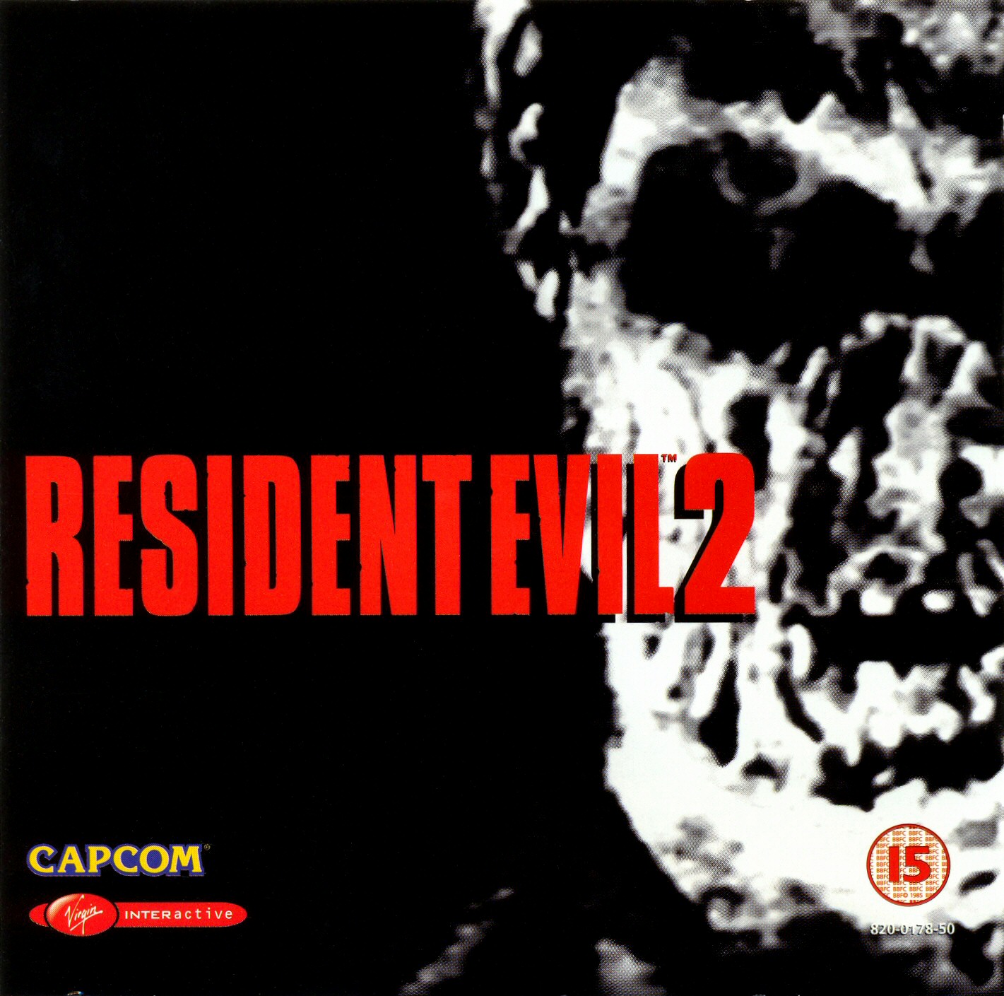
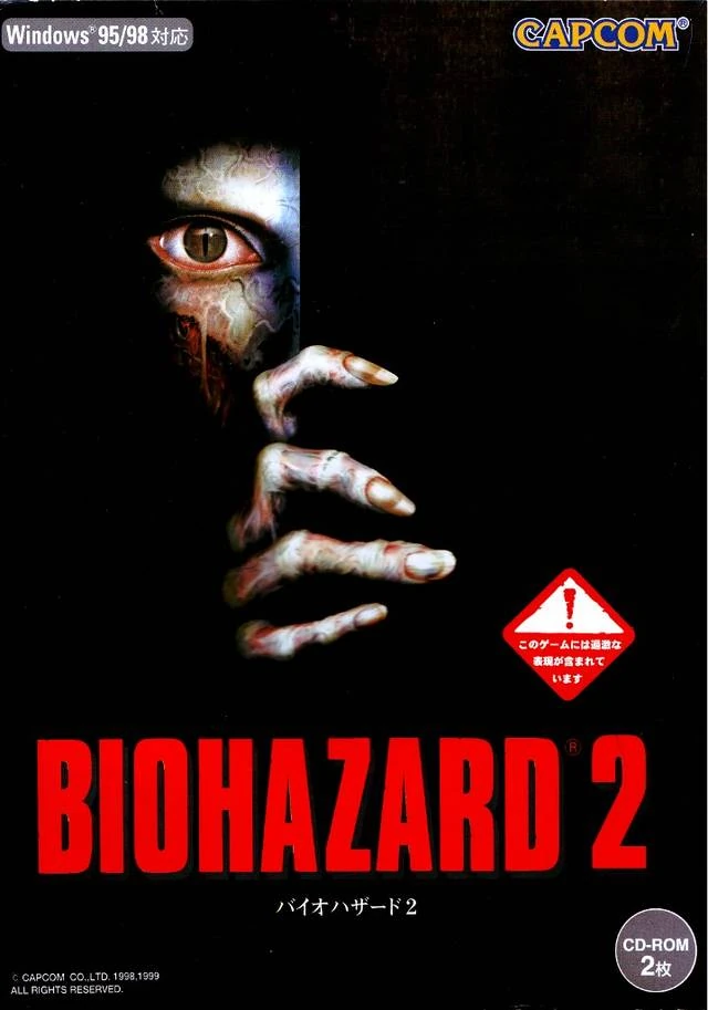
Madness. I appreciate that youu have the right RE4 cover as your avatar, but the Biohazard 2 cover--while certainly grisly and evokes low budget zombie movie fair such as Zombi 2--simply doesn't compare the menace and mystery of the zombie peeking out from behind the wall. The RE2 cover is super iconic, and if I saw that game in the store I would probably buy it even if I knew nothing about it simply because it's so good. The Biohazard cover is kind of cheap and garbled looking.
The only thing that would make the RE2 NA cover better is if the title weren't plastered all over the amazing image. The Biohazard 2 PC release actually has the best version of the cover (despite the worse title, because Resident Evil is so much better than the generic 'Biohazard')


_(JP).jpg)


")