

S0ULZB0URNE
Member
Waiting for a proper physical copy.


Everyone can release a dud, and Mina sounded in some sort of development hell for a while.Even after how much love Shovel Knight has gotten over the years?

Exactly my thoughts as well, and I would also add that most of these small teams tend to be much more passionate. As a result, we get more detailed experiences to really sink our teeth into. They see video games from a different angle, and that passion transpires into the musical score, the sound effects, the physics, the animations… Everything is taken into consideration, and in the end, you get a product made with passion.All I get excited for nowadays are Indies tbh. AAA game's budgets have ballooned so much that the devs are forced to play it safe and produce formulaic experiences that cater to the widest audience and it often results in an experience that doesn't deviate much from it's inspirations. Indies seem to take more risks to differentiate themselves from the pack and, in the right hands, can produce more unique, original, and/or memorable experiences.

I'm exactly thinking about doing this but add Destiny 2 first, then 007, Mina, Crimson Desert.Can't wait for this. 007 then this back to back for me. Then I probably get to Crimson Desert finally.

Yeah I'll wait for the physical Switch 2 versionDAY. ONE.
Now...where's the physical version!?!?


you guys will fucking hate me but I cant go back to these graphics. Not now. Not even with the nostalgia feeling.
I think I may finally have morphed into a filthy casual. If they had given it graphics like Silksong I would have been all over it

Game looks incredible, I am super into this.
And this is one game you guys cant call Woke Slop (I hope)

It has an empowered female mice as a protag so...And this is one game you guys cant call Woke Slop (I hope)

IGN: 10/10 Calls it a masterpiece of an adventure and, despite its retro visuals, scratches the same itch as Breath of the Wild and Elden Ring.
![L*][*N*K](/data/avatars/m/842/842515.jpg?1779351226)
It has an empowered female mice as a protag so...


you guys will fucking hate me but I cant go back to these graphics. Not now. Not even with the nostalgia feeling.
I think I may finally have morphed into a filthy casual. If they had given it graphics like Silksong I would have been all over it

This was my take too. It was kinda fine. Didn't hook me like Shovel Knight.Played the demo, it was ok.


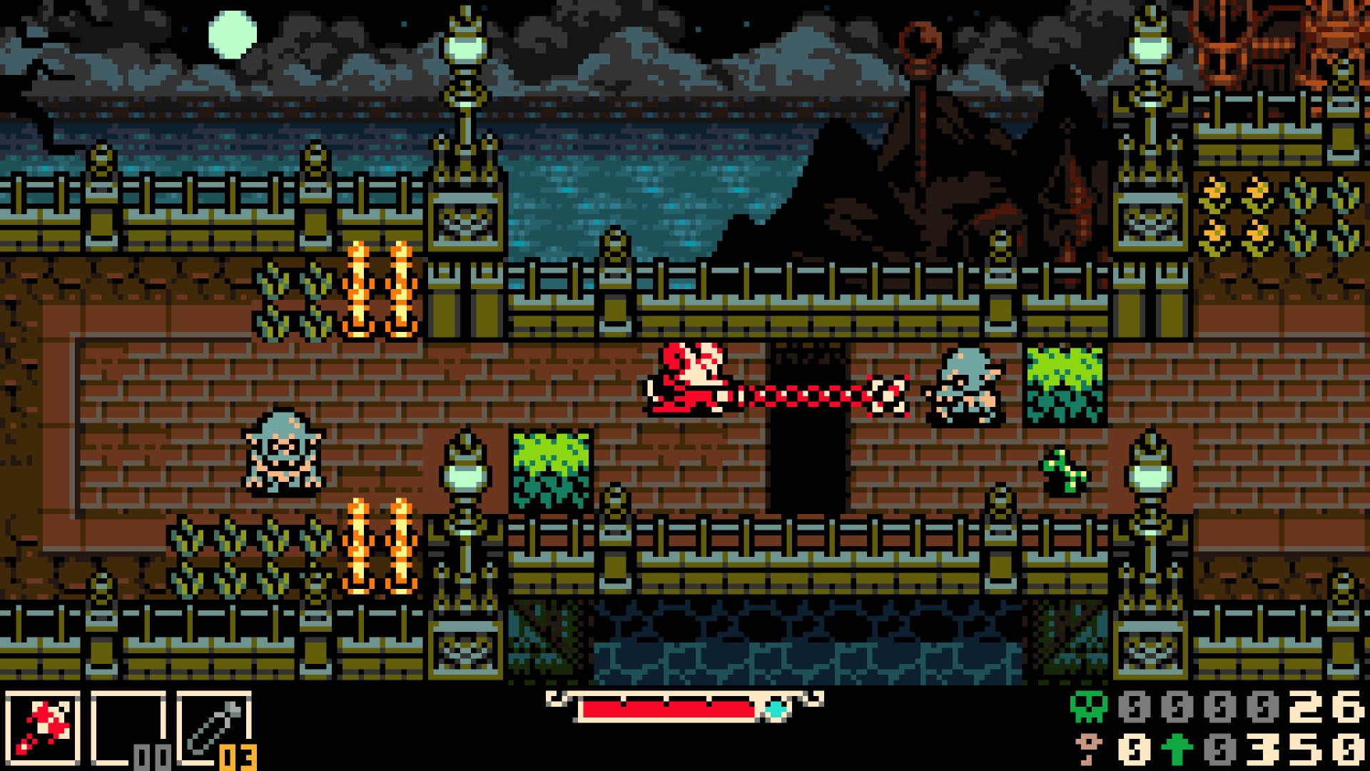
I think that screenshot looks nice. What asset are you talking about? The tiles on the ground?This developer should have made decent money off Shovel Knight. So what's up with the design of this game? It having a low bit art style is fine, but why the lazy effort in spamming the same assets with a tilemap?
Look at this for example, they couldn't afford to have similar assets to have slightly different coloring or animations? Having the same asset 4 times in row beside each other just looks bad.
I think it's highly inspired by the limited GBC graphical capabilities!This developer should have made decent money off Shovel Knight. So what's up with the design of this game? It having a low bit art style is fine, but why the lazy effort in spamming the same assets with a tilemap?
Look at this for example, they couldn't afford to have similar assets to have slightly different coloring or animations? Having the same asset 4 times in row beside each other just looks bad.


