Good job, all! And thanks to those who've voted for me.
")
My votes:
First Place:
Very nice image all around. Wonderful colours, perfect composition. My only complaint, and one that can be levelled at my own entry, is that I wish the scene was placed in better relation to a city, better capturing the feeling of developed 'greenspace,' rather than nature.
Runner-up:
In a lot of ways, I'm voting for this photo for the exact opposite reason as Pringles'. It's gorgeous, and just as nicely composed as Pringles' shot and really captures that developed 'greenspace' feeling, but I felt that the black and white conversion held it back from really embracing the theme. Monochrome grey is the colour of concrete and steel, cities, urban architecture and industry, all of which the theme is looking to displace.
Comments:
Xun - Lovely colours, nicely exposed, super crisp. No complaints, just didn't excite me with regards to the theme.
Aguila Blue, green and red are an interesting colour combination. It feels over-saturated to me, though, and I think the composition could use some work.
Jasoneyu - It's a nice photo, creamy bokeh and all, and I like your take on the theme.
Lumix - I like the composition, and the sense of scale, but it feels like the photo is trying to be a super-wide fisheye photo... but isn't. I think the photo also would have worked better at a different time of day, so the boughs of the tree wouldn't be lost in shadows.
DD Love the post-processing + subject. Feels a little under-exposed, but that also sorta works. An honorable mention from me.
subversus - Great photo. I love the soft focus. It doesn't quite touch close enough to the theme for me, but I like it regardless. I think this would work really well as a black and white.
BlueTsunami - Something about this photo makes me vaguely uncomfortable, though I can't put my finger on what. Reminds me of a Miyazaki movie.
QualityPixel - Great colours, nice bokeh.
Damaged - I like the composition, especially the leaves trailing out of the frame, but I'm not digging the exposure.
pixelated - Perfect Focus, nice colours. I wish there was a bit more context to the photo, however. A bee, some waterdrops?
RayStorm - A nice idea. I didn't see the folks sitting at the picnic bench until the 3rd or 4th time I looked at the picture, though! A step or two to the right would've made all the difference.
guess - Great take on the theme. Would've loved to have seen the phone being lifted against an urban backdrop, though.
My votes:
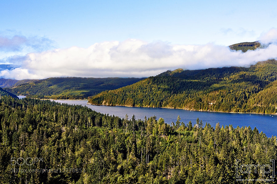
First Place:
Nikon D7000
12mm
f/11.0
ISO 640
3 exposures (1/100s, 1/200s, 1/50s)
Very nice image all around. Wonderful colours, perfect composition. My only complaint, and one that can be levelled at my own entry, is that I wish the scene was placed in better relation to a city, better capturing the feeling of developed 'greenspace,' rather than nature.
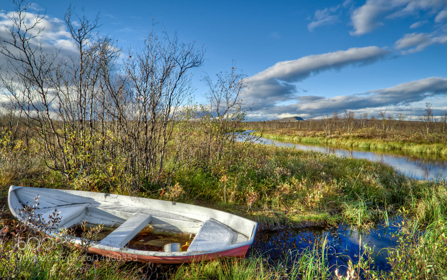
Runner-up:
Something a little different:

Canon QL17 and Ilford HP5.
In a lot of ways, I'm voting for this photo for the exact opposite reason as Pringles'. It's gorgeous, and just as nicely composed as Pringles' shot and really captures that developed 'greenspace' feeling, but I felt that the black and white conversion held it back from really embracing the theme. Monochrome grey is the colour of concrete and steel, cities, urban architecture and industry, all of which the theme is looking to displace.
Comments:
Xun - Lovely colours, nicely exposed, super crisp. No complaints, just didn't excite me with regards to the theme.
Aguila Blue, green and red are an interesting colour combination. It feels over-saturated to me, though, and I think the composition could use some work.
Jasoneyu - It's a nice photo, creamy bokeh and all, and I like your take on the theme.
Lumix - I like the composition, and the sense of scale, but it feels like the photo is trying to be a super-wide fisheye photo... but isn't. I think the photo also would have worked better at a different time of day, so the boughs of the tree wouldn't be lost in shadows.
DD Love the post-processing + subject. Feels a little under-exposed, but that also sorta works. An honorable mention from me.
subversus - Great photo. I love the soft focus. It doesn't quite touch close enough to the theme for me, but I like it regardless. I think this would work really well as a black and white.
BlueTsunami - Something about this photo makes me vaguely uncomfortable, though I can't put my finger on what. Reminds me of a Miyazaki movie.
QualityPixel - Great colours, nice bokeh.
Damaged - I like the composition, especially the leaves trailing out of the frame, but I'm not digging the exposure.
pixelated - Perfect Focus, nice colours. I wish there was a bit more context to the photo, however. A bee, some waterdrops?
RayStorm - A nice idea. I didn't see the folks sitting at the picnic bench until the 3rd or 4th time I looked at the picture, though! A step or two to the right would've made all the difference.
guess - Great take on the theme. Would've loved to have seen the phone being lifted against an urban backdrop, though.