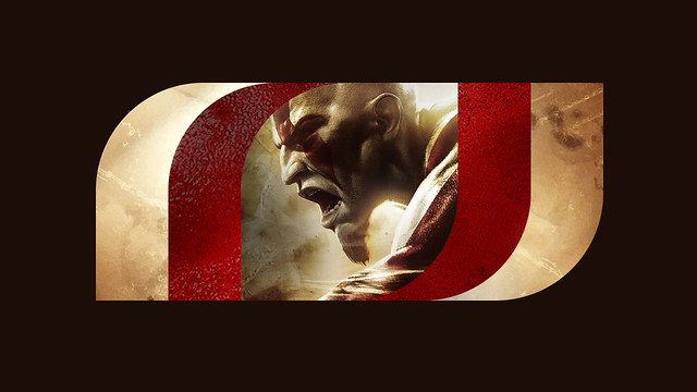
Looks nice. Not as bad-ass as the older one.
https://twitter.com/SonySantaMonica/status/491299300958154752
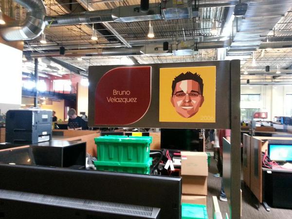
Who is the other guy beside Cory Barlog?
https://twitter.com/SonySantaMonica/status/491299300958154752
Who is the other guy beside Cory Barlog?