• Hey, guest user. Hope you're enjoying NeoGAF! Have you considered registering for an account? Come join us and add your take to the daily discourse.

Rumor: we might be getting a new PS Store layout

Remember old Bluey?

2376548231_e0e3384485.jpg
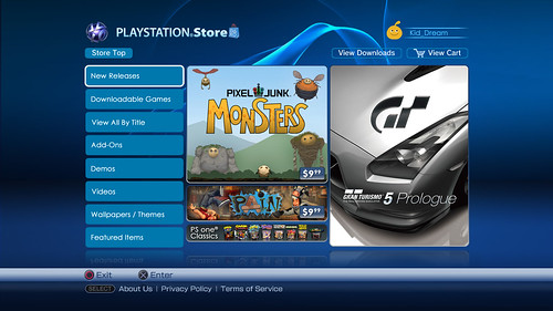
My favorite storefront for any system, best of all time. May not be a looker but it was perfectly organized and ran smooth as butter. Shame we've gone backwards since.
 

etta

my hard graphic balls
Sooooooo...is it out yet? The store was taken offline yesterday, presumably to update it to this design.
 

double jump

you haven't lived until a random little kid ask you "how do you make love".
As long as it's fast and easy to navigate I don't care what they do to it.
 

Cleve

Member
I dunno how I feel about this. I like the current store, but then again I liked the old one too, at least that didn't run like shit on ps3.

I hope they're not investing a lot of resources in to this given the incredible number of other UI improvements that need to be made.
 

jediyoshi

Member
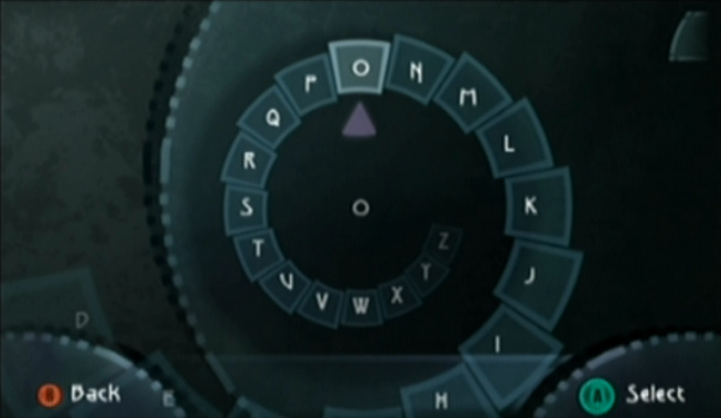
I mean, it's like the actual least efficient method of text-entry ever devised. Maybe that's hyperbole, I haven't done the research, but shit's ridiculous. If I know I want it to search for 'Uncharted', I don't want to scroll through a vertical list of every letter in the alphabet to 'U', wait while it searches for everything in the store that starts with 'U', move on to 'N', wait for it to find everything starting with 'Un', move on to 'C', etc etc.

Insert plea for the Beyond Good & Evil text entry system here:
bge-screenshot-1.jpg

Do you see the irony of picking what is literally a less efficient method of text entry? The baseline for both of these is that you're moving through a linear list of characters, the actual benefit from the current search is that it only populates in characters where their entry would bring valid results. Less user inputs = more efficient.
 

Malcolm9

Member
https://twitter.com/NoteWise1/status/707346140941918209

Reminds me of the Xbox Store. Not exactly sure how I feel about it. Looks nice, but I need to see if it functions well. I hate what they've done with the current store. It's a chore finding demos.

Yeah, clicking on "Games" then "Demos" is really difficult to do.

The only thing I'd like improved is the search option, you have to wheel through each letter and I'd rather use the virtual keyboard input like you do when you send messages (this is via the console version of the store).
 
Just fix the BS search function with the current one..

A
B
C
D
E
F
G
etc

Really Sony..

It's not the greatest search function in the world but ppl seem to ignore the fact that once you select two or three letters, the exact thing your looking for will most likely show up on the suggested list.

Also it removes letters that would lead to an empty search. Works well imo
 

Kysen

Member
Let us use a keyboard to search like on the JP store.

Also the web store login window barely functions on mobile. If you have multiple accounts it will hang when you try and switch.

What the hell is up with multiple store layouts? UK/US/JP all have very different layouts even though they share the majority of the games.
 
I don't care for layouts, just make it snappy and user friendly as possible. Hope something will change about that as well

Lol, this is contradictory as layouts are fundamental to it being snappy and user-friendly.

I'm indifferent to this, I barely use the PS Store as is.
 

DeviantBoi

Member
Don't care much for the store on the PS4.

Most of the time I can't access it if I've been playing a game for a while. I have to do a Connection Test to have the connection reset before I can access the store.

I buy everything from the web store, so no big deal.
 
I dont mind a redesign but if it becomes what the xbox store is like then that would be a travesty. The Xbox one game store with multiple entries of the same game is shockingly bad!
 
All consoles have crap store fronts now. 360 circa 2007-2009 is still the best imo. It's not just layout that matters, but content and marketing. Microsoft had an amazing marketing and storefront combination back then. The xbox website displayed information well too. It was easy to find something you wanted through the website or console.
 
It's not the greatest search function in the world but ppl seem to ignore the fact that once you select two or three letters, the exact thing your looking for will most likely show up on the suggested list.

Also it removes letters that would lead to an empty search. Works well imo

Yeah except you then see a list of trailers, games and DLC that you aren't looking so you have to go through finding the letter(Hoping it doesn't crash on the Ps3) until you find what your looking for. Almost every time I see LBP3 clogging up the search results.
 

khaaan

Member
Guess it doesn't look bad. If it works, great! It's not like I actively use the store though. In the worst case scenario it continues to be a hunk of junk and I'll carry on with the web store as usual.
 

vypek

Member
Minimalism is the hot new thing nowadays.

evolution-microsoft-logo.png

I think there was a study done that looked at how over time logos would get more and more minimalist. It was pretty interesting. Not too long after I read a little of it I saw a commercial on Adult Swim showing how the Cartoon Network logo got more and more simple.

I like the minimalist style
 
Do you see the irony of picking what is literally a less efficient method of text entry? The baseline for both of these is that you're moving through a linear list of characters, the actual benefit from the current search is that it only populates in characters where their entry would bring valid results. Less user inputs = more efficient.

It isn't though, not by a long shot, because the BG&E spiral is uniquely suited to the use of an analogue stick. You can blast through that thing and stop on exactly the letter you want every single time in a way that you just can't with the vertical list. Even with no changes, I guarantee you could type out a whole word and search for it with the BG&E method faster than you can with the current PSN Store search function.

Now, if they took the BG&E spiral and applied the current predictive text program and the way it cuts down on letters as you go, you'd be on easy street.
 

Melchiah

Member
I dont understand why people need such huge thumbnails and banners. Just the game, its price and maybe a small video. thats it.

Same here, and speaking of videos, I wish Sony would use HD game trailers in the store. When you're selling something, it would be better to present the product in the best possible way.
 

NJD316

Neo Member
Why would you ever look at the Xbox One store and think "Hmm yeah that's a great idea"?

Reminds me of when they moved the PS Store from the top menu to the bottom list, among the games and apps, so you have to scroll all the way to the beginning to reach it. Just made it less ergonomic.
 
As long as it's fast and it works I don't care what it looks like. I do like the current one as far as functionality goes, sometimes.
 
Going by those screenshots it looks even with the new layout they won't add the wishlist feature from the web store?!
That's super lame..
also the design itself is neat but it doesn't look like the PS Store anymore, not sure they would want that effect.
 
No no no don't copy the Xbox Store as its awful. I hate it.

However PS store needs a redesign it's even worse than the Xbox Store.

I want something simple, with easy to see genres, and above all else no PS3 games lurking about
 
I will never understand why they got rid of this, was so fast, responsive and worked fine. The new store on PS3 is shocking, how did they release it and not know it runs like shit and crashes every 5 minutes?

the new formats (on both systems) allow for a lot more advertisements and "special treatment" to certain games. thats also why it runs slow as shit.

money > all
 

Arttemis

Member
So this is now in effect.

Opening the store will look the same, but when you look at a game's store page, it takes you to the OP's ipictured design of having a large, game-specific background, lots of wasted screen space, and you press up/down to scroll through the media, game description, add ons, bundles, etc.

It's very jarring going from the store home page to the new game pages.
 
Give me the old ugly PS3 store. It was fast and functional.

^

I'm over all these shiny layouts that companies keep rolling out at the expense of performance.

I work in IT and the changes Microsoft has made to the Office 365 portal / exchange interface slowed it down so much.

Give me functionality and efficiency pls.
 

Arttemis

Member
This is no longer a rumor - it's implemented into the PS4's store page.

Should I request a mod to change this, or create a new thread?
 

On Demand

Banned
So it looks like everybody has this now? Was looking at the store and noticed all game pages got updated.

I don't think i like it. It feels very crowded and not seamless to browse through. It also doesn't match the rest of the store. Everything else is the same except game pages.
 

sugarless

Member
Same here, and speaking of videos, I wish Sony would use HD game trailers in the store. When you're selling something, it would be better to present the product in the best possible way.

Man I thought I had connection issues with how blocky the videos were coming out. How crappy that you can get a much better version when you check official YouTube channels fr the HD versions.
 
Top Bottom