• Hey, guest user. Hope you're enjoying NeoGAF! Have you considered registering for an account? Come join us and add your take to the daily discourse.

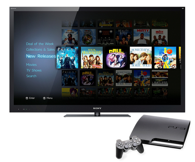
Sony reveals new PSN store

Wow they actually improved it a lot. Which in itself isn't a big achievement as the PSN Store was a complete mess before.

It looks great and inviting now. A huge upgrade.
 

btkadams

Member
i would have been fine with them jsut fixing the organization on the current ps store. i don't know what happened with it. it was totally fine a couple years ago and then it just became so messed up.

i really like the look of the new one. i hope it is well-organized and fast.

i think they need to have it so that your shopping cart is saved upon exit. sometimes i quit out of the store and then come back and it bugs me to have to add everything to the cart again. every online store has this feature, so i don't see why a shopping cart can't be saved to the account.
 
I don't get it too.

a large part of the Metro design language is that you make it obvious that there is more off the screen than you can see by showing a thin strip of cut off content on the side. another large part of metro (at least in apps and on phones) is a list of options in simple white font against a dark background in a column view.

that's going back to Metro on Zunes and looking at the continued look of metro and metro apps on Windows Phone 7 and 8.

it definately looks very Metro, whether intentionally or not. but that's a good thing in my eyes. mainly though, i don't care about cosmetics, i just want it to be a lot quicker to use the damn thing. and yes, i had a PS3 early enough on to remember the web based store and how shitty that was. it doesn't change the fact that here in 2012 the sony store is terrible compared to most other things (including things that run on the PS3 like the Vudu app which may not be pretty but it's much quicker to load thumbnails and respond when i try to select things).
 

Shahed

Member
And also, I wouldn't really mind ads so much. Loads of things do it so I'm used to ignoring them, so they wanna get some extra money fine. Just at least make it so those who pay premium ( i.e. PS+ users) don't get ads like most other's. The ads on Live don't bother me. It's more the fact Gold users still get them
 

edgefusion

Member
a large part of the Metro design language is that you make it obvious that there is more off the screen than you can see by showing a thin strip of cut off content on the side. another large part of metro (at least in apps and on phones) is a list of options in simple white font against a dark background in a column view.

that's going back to Metro on Zunes and looking at the continued look of metro and metro apps on Windows Phone 7 and 8.

From looking at the screenshots I think the tiles just slide off to the right when you open the navigation menu, that's all. I don't know what you mean by "simple white font against a dark background in a column view", you're just describing a menu.
 
Goddamnit!


Someone post that stupid Dolan Duck comic where he walks into a building then walks back out empty handed.

Make the caption: "Everything was Metro".


Getting sick of everyone copying that style, I absolutely hate it.

still better than original store
 
And also, I wouldn't really mind ads so much. Loads of things do it so I'm used to ignoring them, so they wanna get some extra money fine. Just at least make it so those who pay premium ( i.e. PS+ users) don't get ads like most other's. The ads on Live don't bother me. It's more the fact Gold users still get them

If they implement ads, and I think they are coming, everyone would get them. You are paying for + for free games and exclusive services such as cloud storage and automatic downloads. Likewise you are paying for online multiplayer on Live, that's why you still see the ads.

Though one reason why Sony might not have ads is that they don't have an "ad" company like MS does that takes care of all ads on XBL.
 

Number45

Member
http://www.eurogamer.net/articles/2012-10-11-settling-the-stores

Reading now. Says 17th.

Load up the store, and the left side of the screen shows you What's New, divided neatly into Games, Movies, and TV. That movies and TV are getting such high billing is itself pretty interesting, I guess, but what's far more pertinent is what happens when you click on a section.

Click on Games - don't worry, no mouse pointer, you're just moving the highlight around - and you get an above-the-line and below-the-line set-up. The above-the-line stuff is all featured content: New, PS Plus, Top Sellers, and that kind of thing. Below the line you get the standard categories: PS3 Games, Demos, Add-Ons, Classics.

Drop into a category like PS3 Games, and you can finally sort and filter properly. Filtering allows you to pick between categories like Game Type, Price, Play Type - i.e. online multiplayer - and Release Dates, and even which accessories it uses. Sorting, meanwhile, allows you to order your results based on the alphabet, what's newest, and that manner of jazz. Within seconds of using the new system, you can find the newest multiplayer-only games released on PS3. You don't have to browse any horrible A-Z category tiles.
 

Liquidus

Aggressively Stupid
Any chance of having actual purchases being separated from every download you've ever made? Never understood that.
 
From looking at the screenshots I think the tiles just slide off to the right when you open the navigation menu, that's all. I don't know what you mean by "simple white font against a dark background in a column view", you're just describing a menu.

http://en.wikipedia.org/wiki/Metro_(design_language)

Wp7_musicvideo.jpg


that's very similar looking, though if you're right about the tiles only sliding off screen like that when the search menu is brought up that would be slightly different i guess, unless 'brought up' means scrolling to the left a bit.

like i said, i'm not knocking it at all. i like it and i'm not saying Sony are copying anything. i'm just saying the similarities are certainly there.
 
Nice to see add-ons finally being tied to the game pages. God knows how many unrelated add-ons I'd see in the related items field on the current store.

Hopefully it fixes the random image loading issues the current store has.
 

Number45

Member
Looks like the 360 UI without all the goddamn ads.

So what about the other three quarters of the screen when you aren't tucked away in a specific product? This generally displays games (or movies or TV), via huge, poster-type panels. It's a carousel set-up, and each page has a "hero" title, with a character who moves in parallax as you scroll. On the FIFA page, it's Messi, for example. It's not messy, though: it's definitely rather Metro-ish (I know Microsoft can't call it that anymore, but old habits die hard), yet it's a lot more orderly that the 360's front end. On that note, I asked if they're going to be selling ads, and got a "no comment".

Watch this space!
 
Looks a lot like metro :p

Which is a good thing, beautiful designs should inspire others. And the Ps store was dreadful xD

Hopefully they will have a whole dashboard facelift too :p
 
What the hell took Sony so long to improve the store? I will guess because the backwards SCEJ is in control of PSN. Dammit Sony give PSN to SCEE, and they will do wonders with it.
 

edgefusion

Member
http://en.wikipedia.org/wiki/Metro_(design_language)

Wp7_musicvideo.jpg


that's very similar looking, though if you're right about the tiles only sliding off screen like that when the search menu is brought up that would be slightly different i guess, unless 'brought up' means scrolling to the left a bit.

like i said, i'm not knocking it at all. i like it and i'm not saying Sony are copying anything. i'm just saying the similarities are certainly there.

Check out the last screenshot posted, there are 3 'pips' at the bottom, ala the iPhone home screen, indicating pages rather than a scrollable horizontal view.
 

Dragon

Banned
Check out the last screenshot posted, there are 3 'pips' at the bottom, ala the iPhone home screen, indicating pages rather than a scrollable horizontal view.

Yeah not sure why everyone thinks Metro (it's not called that anymore last time I checked) is the greatest UI component. Nothing has even shipped regarding Windows 8, and Xbox Live I find to be harder to find content than previously with the Blade system.
 

Jucksalbe

Banned
LOL

It's as simple as saying what you want on the 360 (with kinect). Or simply typing in a search with the keypad.

If I want to watch something, like The Avengers. I just say "Xbox, Bing The Avengers". It then shows me every Avengers movie, game, music, etc...item available. It's great.

I could/can ignore them on PSN too. Do you people freak out during TV shows when the ads (on a service you pay for and CAN'T ignore) come on?

That statement was of course an exaggeration, mostly because of the comment I replied to. But still I want to write something about your points there.
You say the 360 UI is good, because you can easily bypass it. That doesn't really make sense. I don't have Kinect by the way and don't watch movies on my 360 (the prices for that are ridiculous, at least here in Germany). I sure as hell would never start a search just to find my games.
My main gripe with the 360 UI is that it combines the Marketplace and the "normal" console UI into one. When I log in with my account, I'm presented with the store. When I want to launch a game (without the "Quick Launch" shortcut button), I'll be at a store page. When I start my 360, it doesn't even feel like "my" console anymore. On most pages only a small button leads to content I actually own.
That's at least where the PS3 is different, the store is still separated (for now). If I want to buy something I will have to deliberately open it.
 

Valnen

Member
I don't want to search. I want it to filter at least by console type ( PS3, PS2, PS1).

Filtering by console type isn't even good enough because chances are demos will still show up. We should be able to filter our download list by something like Full Game (by console), Demo, Premium Avatars, Premium Themes, and so on. The more filters the better.

The store itself is fine and didn't need to be changed. Waste of resources.
 
Check out the last screenshot posted, there are 3 'pips' at the bottom, ala the iPhone home screen, indicating pages rather than a scrollable horizontal view.

similar 'pips' exist in places in Metro, not that they're exclusive to it. again, many people are seeing the similiarity. i just tried to explain what they're seeing that makes them think it looks similar since you seemed to not 'get' any similarity.
 

Valnen

Member
It's not a waste of resources if they ask customers what they want and one of the biggest things was redesigning the store.

They'd be better off using those resources on PS4, though. Ah well, maybe that's why they're doing this to begin with.
 

Dragon

Banned
They'd be better off using those resources on PS4, though.

You mean the console that hasn't come out and wasn't relevant when they asked customers what they wanted? Seriously man, it's not a waste of resources, their business comes from customers and making things easier to find in their store will result in a lot more revenue. This should have been done a long time ago (at least grouping all a game's content into a single page).
 

SykoTech

Member
Liked the blue look better, but speed's all that matters in the end.

Though it's the download speeds that really bother me, not the store.
 

see5harp

Member
Looks much better. Grouping demo's, full games, and DLC has needed to be done for A LONG TIME. I never had issues with the speed of the store.
 
I'm not sure why people are acting like discoverability wasn't a problem? I guess no one here had games on the PSN Store? All of these web interfaces need to keep evolving in order to make finding digital downloads easier.
 

CorySchmitz

Junior Member
Haha. Microsoft has tricked all you guys into thinking anything simple with a sans serif font is a Metro ripoff.

This doesn't look like Metro. I've worked under the Metro brand guidelines and I'd say this is pretty clearly it's own thing. It still has the Sony design flare to me.

It's not amazing looking but it's better than before and better looking that what little competition it has from the Wii and 360's digital storefronts, IMO.
 
Top Bottom