I feel like they meet a few criteria really as to why they're so memorable.
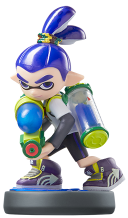
- Their designs are simple. It's easy to remember them. There'd be no mistaking them and it's also easy to adapt them to most situations.
- However, they're also unique. They have a defining key feature to them that can serve as a symbol or trademark. In terms of the Inklings it's partially their faces but also the tentacles and general squid iconography.
- Their designs are informed by game play. The design came after the concept itself, and Nintendo designed a character that is fully integral to the core experience. They are humanoid squids, and they act like it as a result - spraying ink and also swimming through them by transforming. They have a key ability.
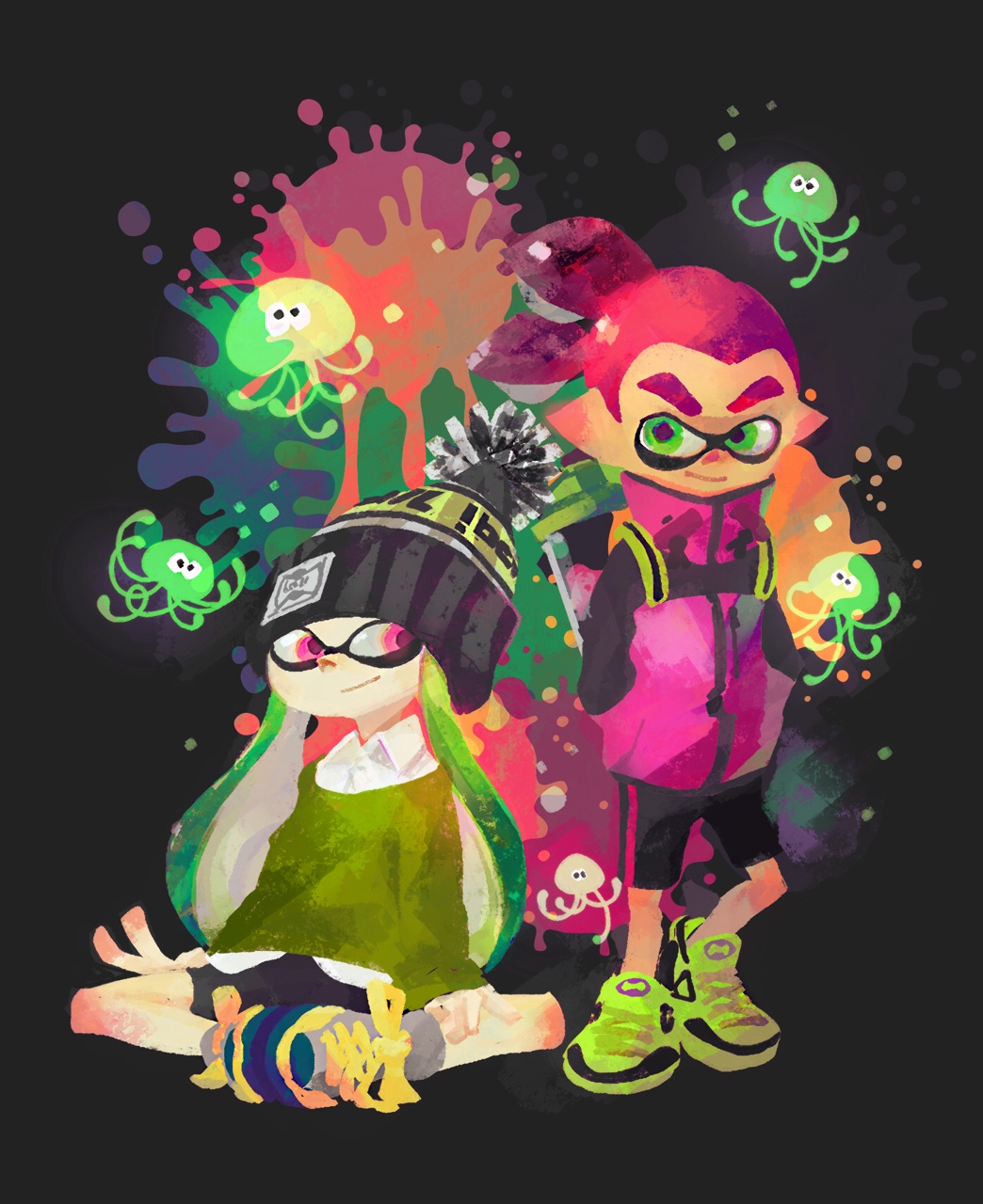
- The supporting cast is fully informed by the aesthetic. Clever things like a humanoid anemone with the anemone itself as hair, a crustacean with a tempura coat, they go a long way.
- They have personality. Even if the Inklings have minimal dialogue this is made clear through subtle features. The way they all have different attire in different images can tell the viewer that clearly, they love fashion, and being stylish.
- They're inclusive towards different demographics. There are Inkling girls, boys and they also come in different skin tones. Which ties into the last point -
- They have universal appeal. They're colorful without being childish. They represent features that can be grasped by all. They're mascots for a wider audience.
Nintendo really nailed them.


")